Microsoft readies app folders in Start, new gestures, and more for Insiders on Windows 11
Prepare for new features.
What you need to know
- New features are on the horizon for Insiders in the Dev Channel.
- Features include app folders in Start, new gestures, a new snapping UX, and more.
- These new features are expected to show up in the next number of weeks.
Microsoft is gearing up to release a handful of new features for Insiders in the Dev Channel on Windows 11, many of which will re-introduce functionality that was missing in the original shipping build of the OS. It's been two weeks since the last Dev Channel build was released, which got me wondering if anything is going on internally to warrant this pause in build releases.
After asking some contacts, I'm told that Microsoft spent the last week or so adding in a bunch of new features and changes to the public preview branch of Windows 11 (known as rs_prerelease.) This could explain the lack of Dev Channel builds, but there was also a big jump in build numbers (up to 250xx) to mark the beginning of a new development semester, which may have also played into it.
Either way, new features are on the horizon. According to my sources, the big new changes coming to Insiders in the next handful of weeks include the ability to create app folders in the Start menu, support for file drag and drop on the Taskbar, new acrylic/blur effects in legacy title bars, a new snapping UX called "Snap Bar," and new gestures for opening Start and the Quick Settings panel using touch.
App folders in Start is a highly requested feature from Insiders that works just as you'd expect; dragging an app icon over another will create a folder that you can click into, allowing for better organization of your Start menu layout. There's also the new Snap Bar feature, which I'm told introduces yet another way of snapping multiple app windows to the built-in snapping grid system on Windows 11.
Right now, we have two on-screen ways of doing this, via the drop-down menu that appears when hovering over window controls, or via dragging an app window to the top or sides of your screen. The Snap Bar introduces a third UX for this, with a "bar" panel that drops down from the top of the screen whenever you grab and move a window around your display.
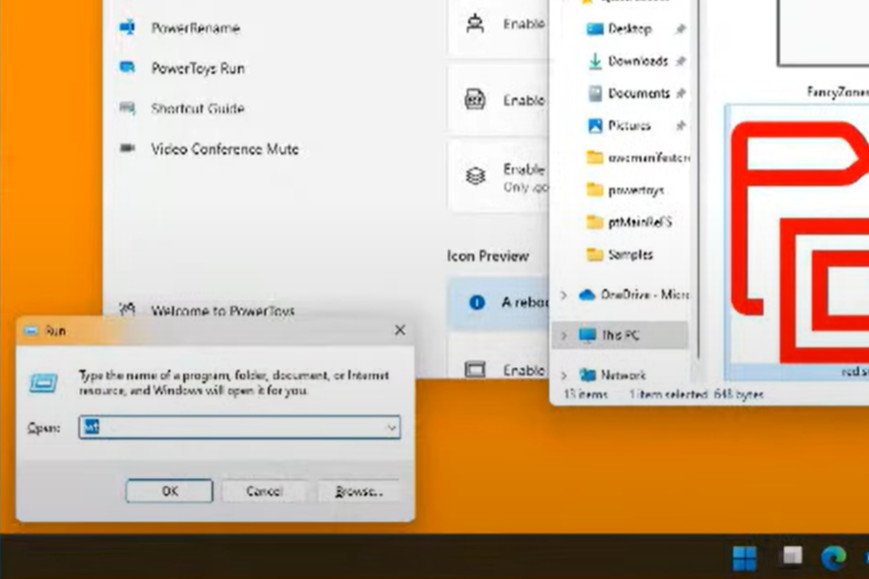
Elsewhere, new acrylic/blur effects in legacy title bars is a small UI change that will replace the white title bar design you find in most Win32 desktop apps today with something that looks more "Windows Aero" esq, albeit with a Fluent-inspired take, just like the rest of the blurred translucent interfaces on Windows 11. In fact, this was already briefly shown off in a Microsoft livestream, albeit in super low-quality.
A big improvement for tablet users is coming in the form of new gestures that will provide access to the Start menu and Quick Settings panel by swiping up from the bottom of the display. Swiping up from the System Tray will open Quick Settings, and swiping up anywhere else will pull up the Start menu, just like on Windows 10X.
Finally, the Taskbar is getting souped up with returning functionality that was missing in the original Windows 11 release. These include support for dragging and dropping files into open apps via their Taskbar icon, a better UI for overflowing app icons, and the automatic hiding of the Taskbar when using your device as a tablet.
Of course, there's likely to be more features that I've not yet heard about, so don't expect this to be everything. Here's all the things I'm told is planned to show up for Insiders in the Dev Channel over the next handful of weeks once builds resume from the rs_prerelease branch:
- App folders in Start
- Drag and drop on Taskbar
- Quick Settings / Notification Center improvements
- Pinned files in File Explorer
- Acrylic title bars
- Snap Bar snapping UX
- Gestures for Start/Quick Settings using touch
- New live captions feature
Many of these new features will be what shapes the next major release of Windows 11, codenamed "Sun Valley 2" and expected to ship in the second half of this year. I suspect some of these improvements, namely drag and drop support on the Taskbar, will make their way to the current release version of Windows 11 before then however.
As always, Microsoft may decide to cancel or postpone any of these new features before they are unveiled, so keep that in mind.
Get the Windows Central Newsletter
All the latest news, reviews, and guides for Windows and Xbox diehards.
Zac Bowden is a Senior Editor at Windows Central. Bringing you exclusive coverage into the world of Windows on PCs, tablets, phones, and more. Also an avid collector of rare Microsoft prototype devices! Keep in touch on Twitter: @zacbowden.
-
The only thing which still grinds my gears that I haven't seen coming (or in dev builds) is the ability to not combine windows on the taskbar. But with the lack of titles too, I don't know a design that would make that make sense with just icons? I'd love to see a concept to prove me wrong. The whole rollover-look-click thing is for me much slower when I have windows of the same app, than the old "never combine" behaviour. But otherwise I like the simplicity of the new taskbar!
-
Oh and was I hallucinating or very briefly did they have taskbar window middle-click-to-close in a prerelease build (something that I loved in Windows 10 via 7+ Taskbar Tweaker) but it's gone in the current release build (and again makes much more sense when each window is a button rather than each app)
-
Oh no wait, it's back again when you middle-click windows in the hover thing
-
How do you mean combine windows on the taskbar? Since Windows 7 windows combine into one icon from the same app. I like the simplicity too. Lots of the Right Click Taskbar features are very legacy like Cascade windows, it date back to Windows 3.0. Maybe even Windows 1.0.
-
Yeah I've always had it switched off so that all windows are listed separately, but now the option to switch it off is no longer there. I found the benefit of being able to use spatial memory and jump straight to the right window really useful, and having them all folded away in a flyout wastes time
-
100% agree about the forced auto-combine of windows on the taskbar being a pain. Between that and the lack of labels, it's just never going to fit my workflow.
-
Isn't it great getting old basic functions back and see a big "NEW" slapped on each of them ? Love Microsoft <3
-
tbf, as we have remarked previously, Microsoft didn't remove things, so much as re-write old code e.g. Taskbar for Windows 11. Striping things down, rewriting it, and now building back up in a measured, good way to ensure the OS is modern (meeting today's demands), while also not being bloated (a long bugaboo of Windows legacy code).
-
FWIW, it is a normal business requirement to refactor code without losing functionality customers require. I do credit MS for cutting out code bloat and improving maintainability; the proof is when the windows install size is obviously reduced. Track record goes against that claim and they have made that claim before.
-
I get it and I appreciate the fresh code. What I find frustrating about the approach is that I miss knowing about features if I don't follow Windows Central or @JenMSFT. Windows doesn't have any sort of an onboarding walkthrough to introduce new features. When those new useful features are introduced, I won't know about them unless I actively keep on top of Windows development through social channels.
-
Usually the tips and trick app has all the updated features in it for the build. They even have a what's new section for the build. It's a feature that most people don't know about but is useful when trying to find out what changed without using external sources.
-
Love the way they are going. The only problem I have with this is question if they are ever to finish with it. My look on things is that they are having Windows 11 rather as a beta now. Maybe it will have all useful features that Windows 10 had by the time Windows 10 support expires. Which is fine. Unless Windows 11 becomes the abandonware that Windows 10 is currently.
-
Honestly I don't blame the rewrite, I'm all for it and understand that it takes time, especially for security reasons.
What really grinds my gears is the way I feel misled with the promise of next-gen, "rebuilt", smart, amazing nonexistant perfect UX that understands everything I could possibly need and want, but we end up with a half-baked extremely inconsistent mess, beautiful, yes sure it is, but with a lack of attention to detail and pre-made unchangeable choices that tell me the exact opposite of the idea they are trying to sell.
I am all for going forward, but avoiding taking steps back. -
Well yes, but they technically are new because the Taskbar and Start menu run on a new code base compared to the Windows 10 and earlier versions. I believe it's written as part of C-Shell now so that they can be updated independently of the OS, which is why they had to start from scratch. It's not much of a consolation, but it means truly new features should be able to be added much faster in the future.
-
The app folders are great! The only other two things I'd really like to see are changing the swipe-from-the-left gesture to act as a back button instead of opening the widgets (honestly who does that?) and letting users completely remove the Recommended section of the Start Menu.
-
I agree about having a different gesture system for the left edge. I'd personally like something more W8: cross the left edge twice gets you to your last used app. A single swipe for back is good, but it could aslo bring up the task manager like in W10, which worked pretty well (better than a widgets gesture for sure).
-
I guess those will not come back due to having 2 different app switching interaction isn't a good UX in theory I guess. App switching now should be done using Taskbar and Task View. So that task switcher bar from Windows 8.X may not return. But the gesture could come back though, the issue with Windows 10 is that gestures don't follow the finger so they all felt unnatural and feels like it slapped on and done with it. Though now thats occupied by Widgets so at least with Windows 11, we might going to see this for this series. Unless they put Widgets back to Start menu, like Live Tile was.
-
I'm really *just* looking for the gesture, not any additional app switching system. I suppose one can dream. I have to say I'm a bit disappointed in Widgets. They just seem to be in the way. One of the handful of things holding me back from upgrading (that and I don't want to play around with my one and only Windows system in any way that could disrupt work).
-
Widgets are holding you back? You can unpin the widgets button and never see it again, it doesn’t get in the way…
-
That's good to hear. Will that stop the widgets gesture too? That won't be enough though. A lot of these right click menu things that I hear are missing, plus app folders in Start (coming soon I guess) plus just uncertainty about how fast I adjust. I only have one device for my work and I don't want to risk down time.
-
Unfortunately it only disable the button, the gesture is still there and pressing Win+W will show up the Widgets pane stil.
-
Thanks for that. Eh, I was hoping for more customization. Don't get me wrong, I can see plenty of benefits to moving to W11 and it'll happen eventually. I just want it to be the right time.
-
Actually, come to think of it, I'd like at least some of the touchscreen gestures to be as or more *customizable* as touchpad gestures. I know this might be asking a lot though (a lot of things can go wrong).
-
Me! I use the swipe-from-the-left gesture T o open the widgets. I also use the Recommended section. I just restrict it only to show my must usdd documents and restrict it to one row. I use the more button to see thr rest of my must used documents. The rest of the Start screen is filled wit pinned apps.
-
I'd like to be able to right click anywhere on the Taskbar and be able to open Task Manager again but it's not a big deal just to right click on the Start button instead. It does also make more sense there.
-
Just make search better. Taskbars and start menus - who cares, they are borderline useless. Windows key + S and type the first few letters of the app you want to launch. Boom, done.
-
Try powertoys search. It's really good.
-
Because not everybody workflow does what you do. Also for touch users liek tablets, typing is less efficient which is why surface level UI improvements is paramount to operate the OS more efficiently with touch.
-
whats the difference between windows+S to search and simply pressing windows and typing away what i want to search?
Also, one small request to windows central team- is there a way to get notified about reply to my comments? if there is one already, someone let me know please. thanks. -
They used to have an account option for reply notifications, but it seems to have been removed. I miss it too.
-
lastmessiah, that requires you to know the name of every app you use. For me, there are dozens of small, function-specific apps that have no meaningful name to me. I find them easily in Widows 10 by positioning them in groups in the Start menu based on function. They can take nearly a minute to find by scrolling through hundreds of apps and would be impossible if I had to get them by name (to be fair, if I had no other choice, I suppose I would learn at least most of their names for faster access, but for now I'm using Start 11 on Windows 11 and sticking with Windows 10 on my main systems). Folders in Start will restore this... not as fast as grouping like in Widows 10, but probably good enough.
-
Yeah, there are some apps I have installed that are not meant or designed to be use often and I may tend to forget their name, so searching won't work. (Not to mention sometimes Windows Search don't instantly shows up the result, thinking that I might not have that app. Or I have to type exactly first few characters of the title and Windows Search isn't always smart enough that I misspelled or something) So ability to actually organized apps into groups in Start menu is a game changer for us. This what Windows 8 with its grouping and Windows 10 with both grouping and app folders does for us. For those who don't need it can easily ignore that feature. It's not on your face feature to begin with.
-
Coming along nicely.
-
Microsoft rewrote Start menu in Windows 11 mostly for new UI design, but didn't have enough resource to implement all existing features in Windows 10. It's really hard to keep functionalities and apply new design to both novice users and power users, they easily conflict and developers have to drop something. Start menu in Windows 11 still lacks many features.
-
Please fix the taskbar calendar so that it's useful! (Like in Windows 10)
-
So much this!
This feature alone keeps me from upgrading my main machine to Win11. -
they should allow app folders not only in start menu but also on desktop. imagine the desktop being like the homescreen of your android phone- with app folders and widgets panel.... it will be so easier to organise apps and files and folders right there instead of start menu, which is also nice.
-
Well, you can already have folders on the desktop. It's just that they open in new windows rather than expand in place. Agree with you on Widgets on the Desktop (thought the same for Live Tiles).
-
Try Stardock Fences 4
-
The benefit it of the startmenu is that you can easily reach it by icon or keypress (even when you have many windows/programs open), it also makes sense for people that start typing to search. I do not think the desktop can be changed enough to completely replace the startmenu without agitating older users (eg currently pressing a key when on the desktop highlights folders, that is completely different behaviour than a search command).
That being said, it would nice if widgets would be made available for both widget panel and desktop. I can see both new & legacy users would like to that. -
This is good news, everyone.
-
App folders are finally coming.
-
Folders in Start may resolve my biggest problem: no way to find apps by function. I'll still miss just organizing them in place and by size like in Windows 10, but folders will probably be good enough. Start 11 resolves this, but it's slow and crashes a lot (though to be fair, it gets better with updates, so maybe it will be fixed soon too). So really need this in the core OS before I can switch my main working PCs over.
-
Looking forward to this update with start menu app folders, sounds like a good time to upgrade my Go 2 to W11.
-
I hope at some point they add the option to turn on and off tablet mode in settings. I understand that my 4 year old spectre is evidently unsupported 😒.... But it's still annoying that Windows 11 won't allow me to manually turn on tablet mode so I can actually rotate the display orientation when I fold it over and try to rotate it.
-
I hope Folder content preview icon will come back as well for next release. The loss of that feature actually makes me feels slower to find the folders when using File Explorer. This feature is a thing since Vista until 10, and even XP had it if the folder contains images. It was a unique thing on Windows and actually serves as a visual cue for each folder what contents they have. Shame that current Windows 11 have plain folders that now all looks the same, gotta have to read file name each.
-
This makes me happy to hear about these upcoming changes. My first impression of Windows 11 was a loss of functionality compared to Windows 10. The new Windows 11 tablet gestures are very much welcome. I have a Surface Go 1. I want to get the Surface Go 3, but feel Windows 11 is weak without a keyboard. So maybe after these changes Windows 11 will be fine as a tablet. If the swipe up actually opens the Start Menu and Taskbar, that will be better than Windows 10. In Windows 10, you just get the Taskbar exposed with a swipe up. You have to then tap the Start button to get to the tile Start page. That is three movements to open an app if an app is already open. On Windows 10, it is one movement if no app is open. In Windows 11 it will be two movements to open an app regardless if one is open or not. A swipe left on Windows 10 tablet mode will enter Task view. Something like this is sorely needed in Windows 11. Right now in Windows 11, a swipe left opens the Widget panel. A swipe left on Windows 10 allows you to switch apps in just two motions (swipe left and tap the app to switch to). In Windows 11, switching apps is lame without a keyboard. You have to swipe up to expose Taskbar, tap Task view icon, tap app to switch to). The swipe left to open Widgets is a complete waste. I never use the Widgets.
-
When I said swipe left, I meant to say swipe right from the left.
-
You may want to tryout GestureSign, its a free app on the ms store which allows you to create custom gestures (including multiple thing ones). I use it on my W10 Surface Go (have not tried it yet on W11). It would be nice if MS added some basic customization for gestures.
-
I use TouchMe Gestures. Shady name, good touch gesture engine.
-
It's not about the keyboard. It's about the size of the touch areas and small UI controls dating back from the 80s. 99.9% of software written for Windows desktop is written for mouse and microscopically touch poinst. Not that it works nowadays, but software like Tunatic for example is exactly what I mean. And tons of others
-
It's good to see them focusing more on the touch aspect. That was on of my first issues with the Start Menu, when I first installed Windows 11. It wasnt intuitive for touch screen, at all. Ease of access and adding folders is a step in the right direction.
-
MS already screwed up when they over reacted to the W8 backlash and completely ripped out the absolutely fantastic tablet mode UI with W10. That is not what people demanded, they just wanted a choice and UI for desktop mode. Sometimes MS just seems like a schizophrenic development company.
-
Some welcome features for sure. The Start menu needs the category ability added back. Being able to group icons right on the menu based on use and type. The folders will add organization but with more clicks.
-
We need Microsoft to bring back tablet mode. 11 sux in the living room with a remote.
-
Already using Start11 and Groupy from Stardock... glad MS could do the job too. (still no tabbed file manger though) It is amazing to me, that several commenters are giving MS a pass on this, hell their own Android launcher is better than what they gimped us with for WIndows 11!
-
It's still a crappy start menu, more ChromeOS then Windows. Hell, the W11 start menu actually makes the previously feature deficient Mac OS Dock look down right productive and feature rich. Why is MS chasing after Google and ChromeOS UI design? Be yourself, be Windows. You are running on over a billion computers worldwide for a reason.
-
Finally, showing folder contents in File Explorer rather than making it feel like we'd gone back to the Windows 95 days of file management!