Microsoft Store updated for Insiders with Fluent Design flourishes and more
Some additional Fluent Design flair has made its way to the Microsoft Store for Insiders.

Microsoft has been gradually adding more aspects of its new Fluent Design language to its own apps on Windows 10. The latest app to see such attention is the Microsoft Store, which now sports some added Fluent Design elements thanks to its latest update for Insiders.
Spotted by Aggiornamenti Lumia, the latest update to the Microsoft Store for Insiders in the Fast and Release Preview rings sports fluent flourishes on both Mobile and desktop. On mobile, the menu now features additional acrylic and reveal effects that are a hallmark of Fluent Design.
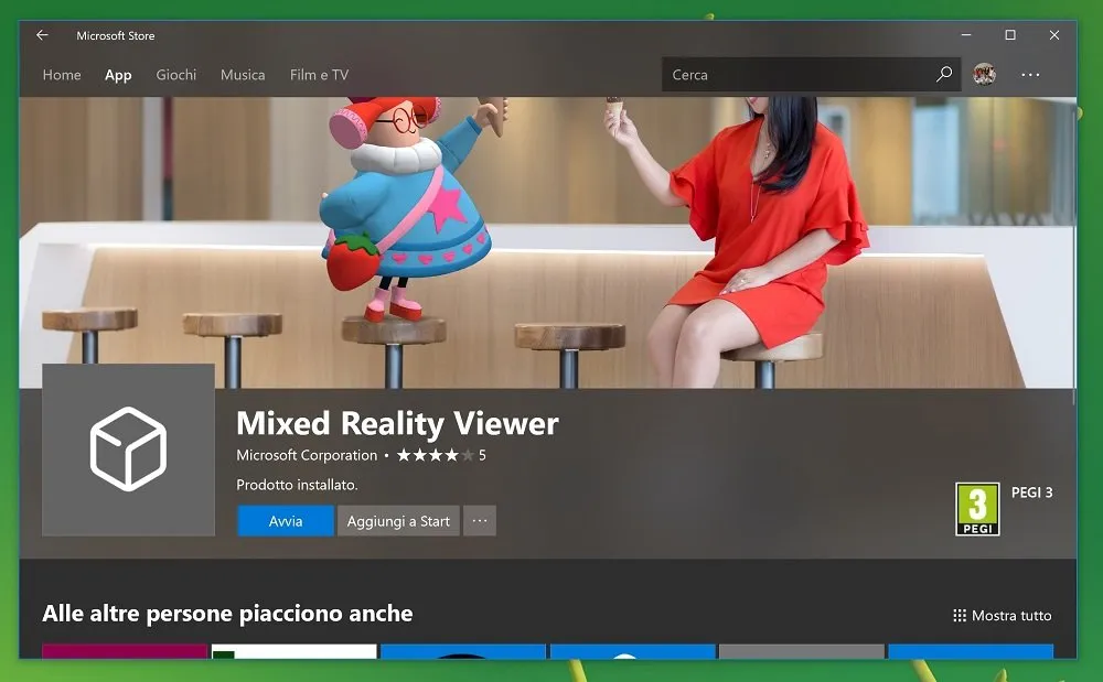
As for the desktop Store, a more prominent acrylic transparency effect is now visible on app pages, providing a layering effect that allows the background image or video to show through the top of the page.
In addition to the additional Fluent Design elements, some smaller tweaks have also found their way into the latest update. If the Store's autoplay videos on app listings frustrate you, there's now a toggle to disable video autoplay in the Store settings. Additionally, a new status message will now appear on the "Downloads and updates" page, ensuring you that "you're good to go" when you check for updates and none are available.
Other, smaller tweaks abound, including a move of review stars to display next to the developer name, along with some font tweaks.
The latest Store tweaks appear to be rolling out with version 11710.1000.94.0 of the Microsoft Store. Though they're only available to Insiders for now, we should see these tweaks make their way to everyone before too long. Also expect to see more bit of Fluent Design, like those included in the recent Mail and Calendar update, make their way to additional Microsoft apps in the coming months.
Windows Central Newsletter
Get the best of Windows Central in in your inbox, every day!
Dan Thorp-Lancaster is the former Editor-in-Chief of Windows Central. He began working with Windows Central, Android Central, and iMore as a news writer in 2014 and is obsessed with tech of all sorts. You can follow Dan on Twitter @DthorpL and Instagram @heyitsdtl.
-
Getting rid of the horrible greys and bringing back real black would be a huge step forward...
-
I disagree, I think the grey looks much better and is easier on the eyes.
-
I was going to say something else but someone else already described the horrible design perfectly: "TFT simulator 2017".
-
I call such backgrounds "TFT Screen Simulator 2017". They are awfual and look dirty.
-
I agree, greys are much more pleasings on the eyes. I hope they roll out the full fluent treatment by next update. I am loving the new visuals.
-
In which case they better have a solution for those of us with a sense of taste. Be it making the disgusting grey a theme separate from dark (because it's anything but), or via an easy way to roll back to Windows 7.
-
Thats one opinion.
-
On mobile, this Fluent Design makes things slower, not fluent. Same thing happens on desktop, but it's harder to observe.
-
A update has rolled out to fix it 11710.1001.13.0 Remove the reveal effect Animation
-
This style has been around for what seems like a couple of weeks now...
-
nvrmnd I now notice I'm wrong
-
Interesting. I got the update to this version in the morning, but my Store looks the old way. Maybe it only activates on other rings than Release Preview...
-
It's weird that the image doesn't quite sit right in the frame but I'm sure they're still working on it
-
Still waiting for this update
-
How about adding ability to change sys font. Can't hurt anyone now to give us that and add some fluent to the phone dialer while they're at it.
-
M loving it :D
Has the the spinning wheel problem solved in this update?? It's annoying to see it on each page once triggered in downloads and updates page
Thank you for signing up to Windows Central. You will receive a verification email shortly.
There was a problem. Please refresh the page and try again.