Microsoft Teams public preview gets refreshed look to feel 'more modern and lightweight'
Microsoft has a new look for Teams, including an improved dark theme and Fluent icons.
All the latest news, reviews, and guides for Windows and Xbox diehards.
You are now subscribed
Your newsletter sign-up was successful
Join the club
Get full access to premium articles, exclusive features and a growing list of member rewards.
What you need to know
- Microsoft Teams has a refreshed look rolling out to public preview users.
- The refreshed look includes adjusted dark mode colors and drop shadows between panels.
- The new colors are in public preview now, but the other changes start shipping in mid-February.
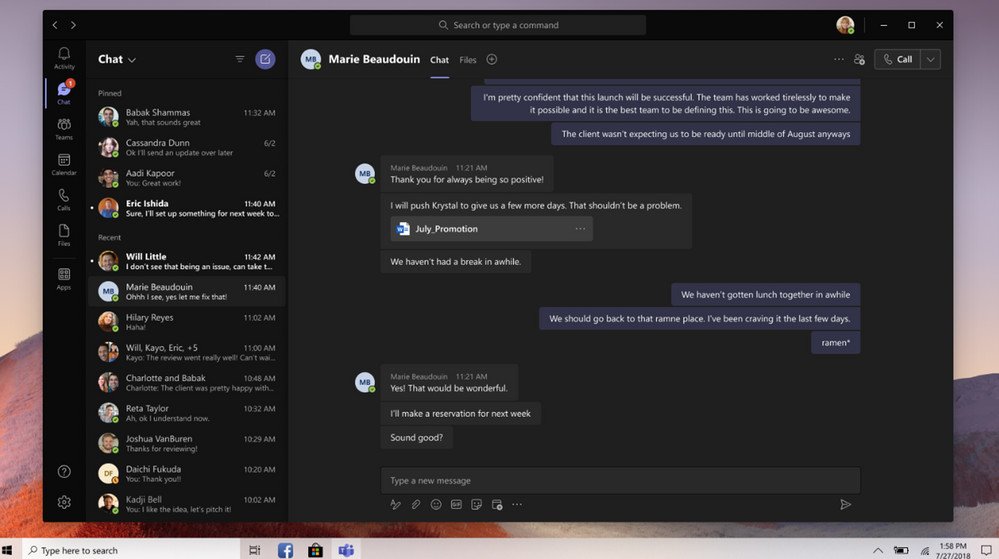
Microsoft is rolling out an improved look for Microsoft Teams to public preview users. The improved design is built to feel "more modern and lightweight," according to Microsoft. Teams users in public preview should soon see an improved dark theme, drop shadows between panels, and icons with Microsoft's Fluent Design language.
The color and styling changes, including a darker dark theme, are already rolling out to public preview users. The other changes, including the new icons within the app, should start shipping in mid-February.
Here are the specific changes, as outlined by Microsoft:
Article continues below- Color adjustments to the default and dark themes
- Added drop shadows between panels
- Icons updated with Fluent icon set, emphasizing rounded corners
One of the more noticeable changes is that the dark theme of Microsoft Teams appears to be significantly darker than the previous dark theme.
The changes are enabled by default if you are in the public preview for Microsoft Teams. To check out the changes, you can join the Microsoft Teams public preview program.
What do you think of the new changes? Do you think they're improvements over its old design? Let us know in the comments below.
All the latest news, reviews, and guides for Windows and Xbox diehards.

Sean Endicott is a news writer and apps editor for Windows Central with 11+ years of experience. A Nottingham Trent journalism graduate, Sean has covered the industry’s arc from the Lumia era to the launch of Windows 11 and generative AI. Having started at Thrifter, he uses his expertise in price tracking to help readers find genuine hardware value.
Beyond tech news, Sean is a UK sports media pioneer. In 2017, he became one of the first to stream via smartphone and is an expert in AP Capture systems. A tech-forward coach, he was named 2024 BAFA Youth Coach of the Year. He is focused on using technology—from AI to Clipchamp—to gain a practical edge.
 Windows Central Insider


