Microsoft is working on a new design language for Windows 10 codenamed Project NEON
Microsoft has made several adjustments to its design language over the last few years, starting with Windows 8 and evolving into what we now know as "Microsoft Design Language 2" or MDL2 in Windows 10. With MDL2 being the current design language used throughout Windows 10, Microsoft has plans to begin using a much more streamlined design language with Redstone 3, codenamed Project NEON.

A Metro 2.0?

Cassim Ketfi at Numerama.com confirms our information and has heard Project NEON called "basically Metro 2". That designation refers to the first Metro design language (née Modern) that harkens to Windows Media Center up through Windows Phone 7 and Windows 8.
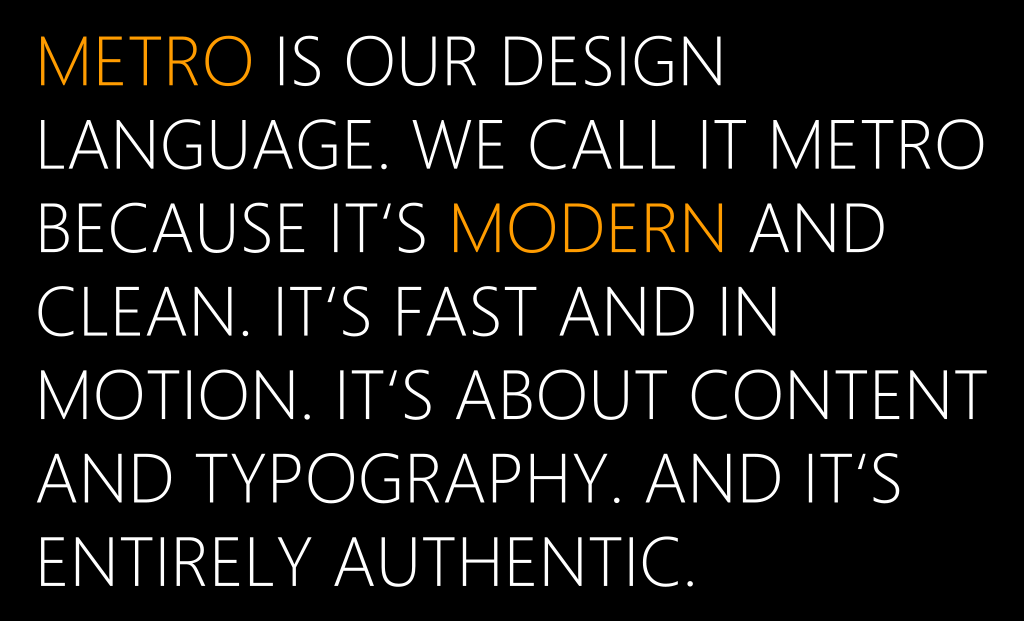
Microsoft's Metro was a strict codified theory about modern design language

Microsoft's Metro was a strict codified theory about modern design language

Metro was the defining look of the Windows Phone OS with strict principles and guidelines. It also kicked off the design movement of flat, chrome-less design focused on simplicity that even iOS and Android now mimic.

Per our sources, Project NEON has been in the works for over a year internally at Microsoft. It builds upon the design language introduced with Windows 10, with its simple and clean interfaces, but adds some much-needed flair to the UI that the current design language just lacks.

Details are still scarce, but we hear some of the new designs in the plans include adding more animations and transitions, with the overall goal of making the UI very fluid and "beautiful" compared to the current, almost static UI that is MDL2. One source familiar with Microsoft's plans described NEON as "Very fluid, lots of motion and nice transitions."
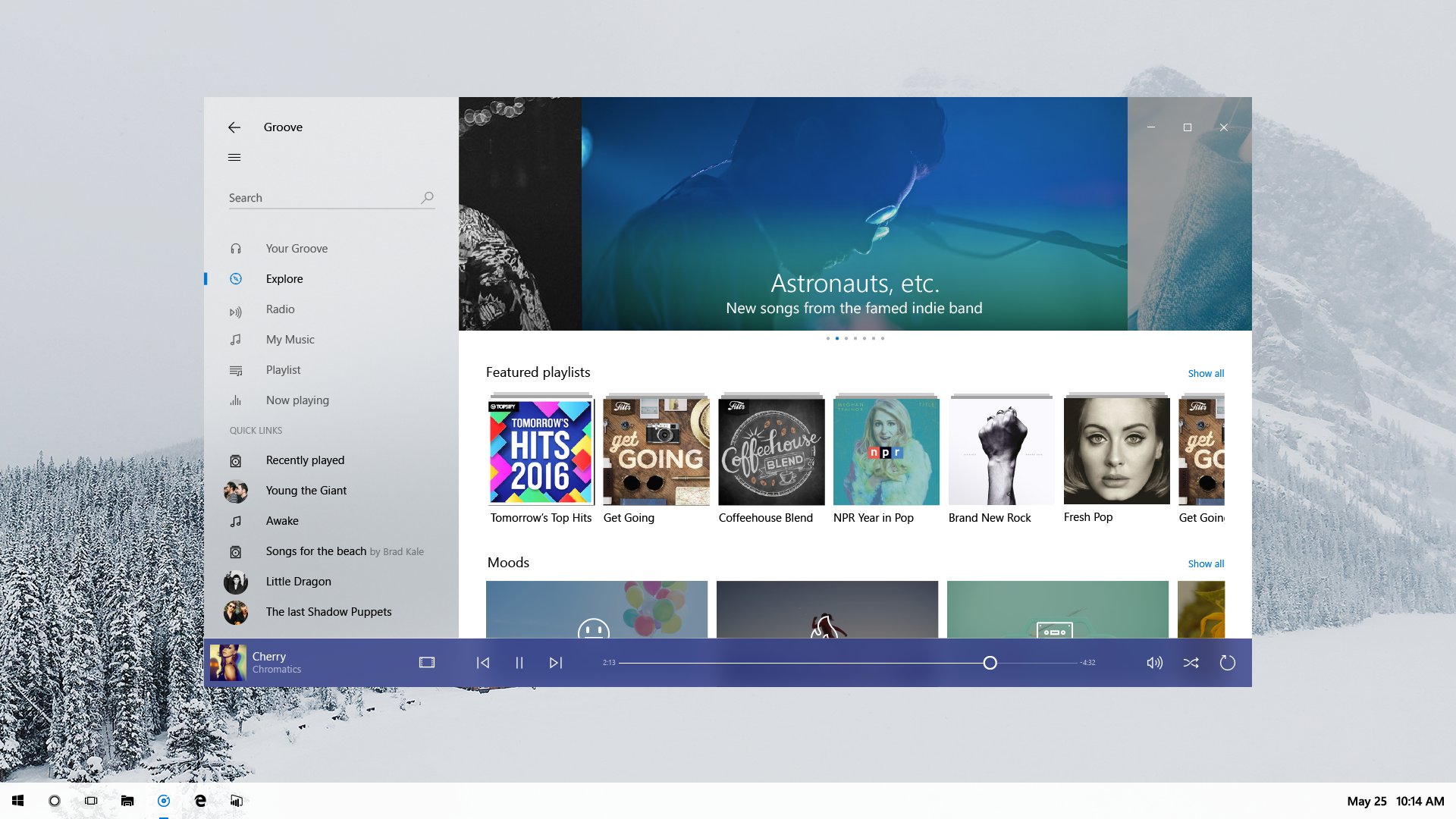
Other things we've heard include app-elements being able to "escape" the borders of a window making for a much more unique experience.

Update: Some more information about NEON reveals that it serves as a bridge between holographic and augmented reality (AR) and the desktop environment. It's a "UI that transports across devices" with a UX that maps to the physical world. It uses textures, 3D models, lighting and more.

We're still digging for more info regarding what other new improvements are in the works, but from what we've gathered so far, Microsoft is interested in making the UI in Windows 10 far richer, which is excellent news.

For those who like MDL2, don't worry, Project NEON intends to build upon the current design language rather than replace it entirely. This new design language will be a natural evolution to the UI rather than a complete redesign like the transition from Windows 8 to Windows 10. Developers building apps with MDL2 in mind won't have their apps look out of place when Project NEON arrives, but will, of course, have the option to add new design language elements if they wish.
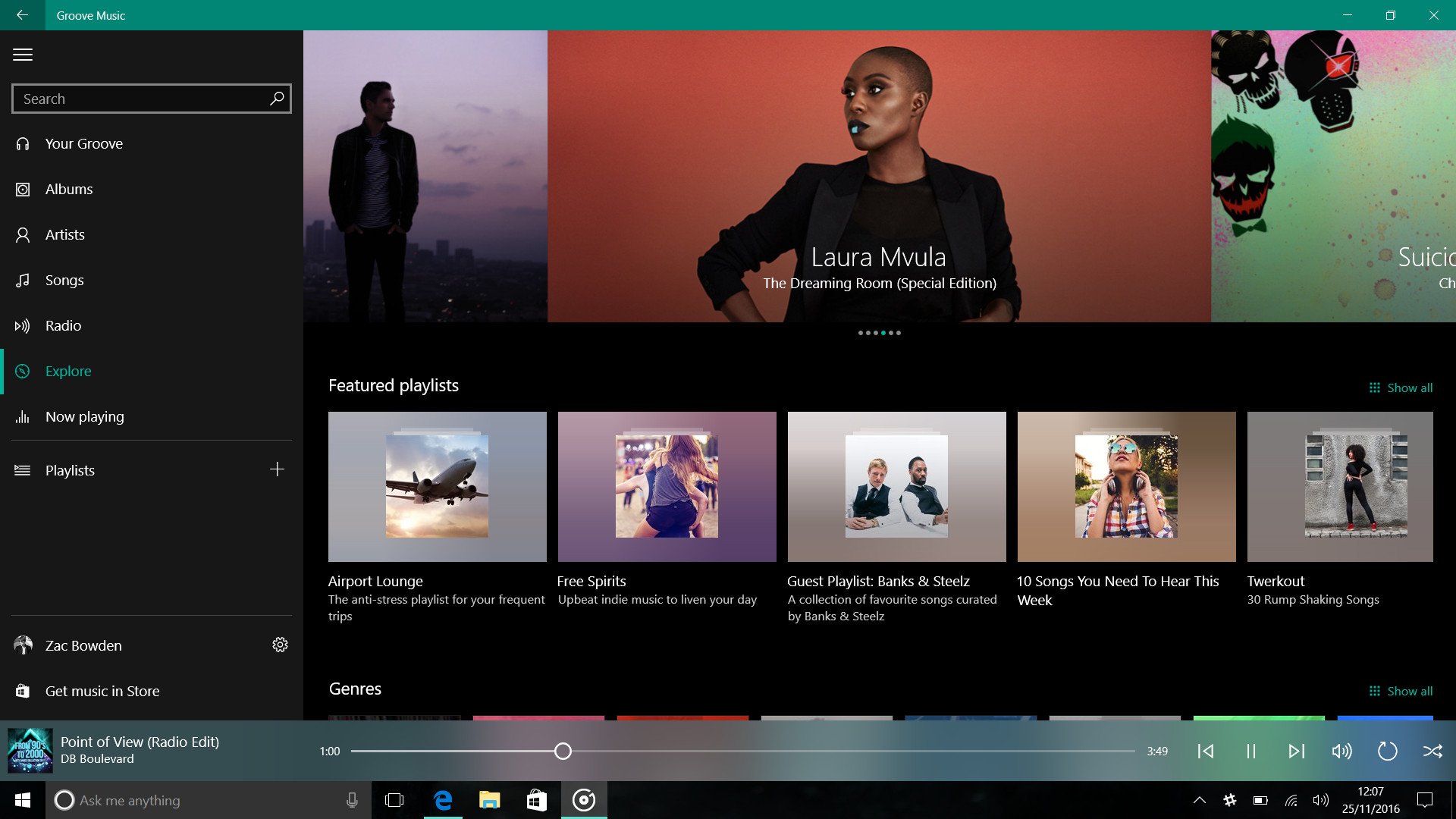
Microsoft also wants to clean up the so-called inconsistencies that MDL2 possesses. As it currently stands, developers can build apps that feature their own context menus, app bars, hamburger menu designs and more, causing for some odd inconsistencies throughout the operating system. Project NEON aims to clean all this up by providing developers with clear and consistent guidelines when designing their apps.

Timeline

Internal plans appear to suggest that the bulk of this new design language will start showing up with Redstone 3 in the early Fall of 2017, but Insiders will likely start seeing these new changes a lot sooner, as Insiders are supposed to start receiving RS3 builds in April-May. There is also a reasonable chance we may see some NEON bits begin to appear in Redstone 2 in early 2017.

Microsoft will continue working on Project NEON throughout Redstone 3's development cycle and leading into Redstone 4 in 2018, where 3rd-party developers will also be able to take advantage of the new design language.

Microsoft has a lot in the pipeline for Windows 10 over the next 18 months, with Redstone 3 seemingly turning out to be a pretty big update for Windows 10, Windows 10 Mobile and Xbox One.

Stay tuned at Windows Central for more scoops regarding upcoming releases of Windows 10!

Zac Bowden
Senior Editor

Zac Bowden is a Senior Editor at Windows Central. Bringing you exclusive coverage into the world of Windows on PCs, tablets, phones, and more. Also an avid collector of rare Microsoft prototype devices! Keep in touch on Twitter: @zacbowden.

239 Comments
  • you gotta be kidding
  • I'll put you down for not wanting smoother transitions, animations and adding some polish to Windows 10.
  • As long as they do not cause delays, I am ok. But if they do, I will head into the feedback hub.
  • "apps being able to "escape" the border of a window" Is that like chatheads on android?
  • TBH, it's a bit unclear. We'll learn more in the coming months.
  • Why the thumbs down on this comment? Seriously, explain please?
  • The comments on up/down votes humor me greatly.
    glad I don't see them on my 950 app. Who cares about them that much to look for them and even complain?
    it's your opinion, not everyone will love it, no big deal man.
  • Heck you talking about?
    I see them fine on mine.
    Simply reading in a comment section, inherently the purpose of the section, is quite different than searching for something to complain about.. Unless you struggle with reading comprehension, with comprehension being something am very adept in.
    Where in my comment or the corresponding comment did anyone leave an opinionated statement?
    You've got to be deemed as a clown on this site. Your comment is so mistakenly out of place, I seriously question it's relevance.
  • Cool story bro, 950 win10. shows reply. If I have replied it shows edit or delete.
    Mauxiis ignore my comment since it sends you on a tirade.
    You and mister burns are a couple mimes
  • Clown
  • You are using the WP 8 app I assume?
  • No. You've assumed incorrectly
  • Not you, 707wpfan who can't see votes. This was the older app's comments that displayed like this.
  • Yes, you are correct. I'm confident 707wpfan is a clown
  • @707wpfan, it's no different than leaving a comment/replying to it. One could leave a comment saying, "So you want them to NOT evolve and keep a design language that could get stale and left behind? Should they not be evolving and ahead of the curve? Is technology so stagnant that a new design language is unnecessary? Did you even consider why this is important and needed? I think you just wanted something negative or ignorant to say!" Conversely, one could have 'signified' sentiments as such by just pressing the down vote icon. Why up vote? Well, if they supported his statement, agreed, supported, was going to say the same thing, etc., then... The press the up vote button... I mean... The ability to express your reaction exists EVERYWHERE: "like" (Facebook), "love" (Twitter), "+1" (Google), applause (real life), booing (real life), etc. Why is this continually a question of Windows Central?! Like... Get over it!!! Just ignore it if it zaps all life out of you. *exhale* Now, can we focus on the article(s)?
  • Is this response to me or 707wpfan?
  • Affirmative.
  • Yea lol the first comment was pretty vague idk what was so bad they had to downvote for lol
  • Lol and then start downvoting me because I didn't understand the downvoting of a very relevant question that the person asked. Clowns here in this site love to honk their noses.
  • yea some Winkids are pretty sensitive about Win10 so anything that questions it they downvote. They'll probably downvote this too.
  • i would also think about thinks like the widgets in vista or win7 maybe... probably the quicknotes app built in win10 is already based on sth like it...? Anyway I am looking forward to it since it means much greater flexibility for developers. but still I wonder how it could look like on mobile... (yes I am still thinking about win10 mobile :D )
  • Yes, this border "escaping" is the only thing here that gives me pause. I'm all for the rest of it, but weirdly shaped Windows have always bothered the hell out of me. I remember a lot of motherboard utilities used to have goofy, non square borders.
  • I dont think the "escaping means we have irregular shaped windows, based on the article as interpret is the UI element as it animates may escape beyond its parent window container giving a sense of depth and layers. Especially the statement "it serves as a bridge between holographic AR and VR and desktop environment, which sounds like an inspiration from HoloLens UI in a single perspective 2.5D of a desktop. The elements flying away from its window container concept would be even trace from Metro UX of Windows Phone OS. Remember the days when you open the app and instead of seeing a single rectangle of that app just zooms in, on WP every UI element such as list animates like a turnstile? That philosophy of animations looks like those UI elements are not "contained inside of an app", the elements just flies in and out seamlessly as if ots floating on your display. So I dont really think we will have irregular shaped windows based om that statement. Irregular shaped windows are not that practical for the most cases or at all. Not to mention that sounds already too drastic and revolutionary.
  • Oh god MSI comes onto mind
  • You guys never used any skins for Winamp? :P
  • Ha! I didn't even use winamp, It's skin feature was always really cool to me but I was content with the rainbow slider in WMP (2lazy2install)
  • Ah, yeah I got ya. :) I was brought down into the skin-addiction before ever considering WMP. :/
  • Maybe. Groove music maker had elements popping out of windows too.
  • I always had this idea that after flat design it will be flat design + lightning effects. This neon name could actually be that. I imagine glowing effects, motion effects, like a light bulb moving across lines, other lightning and shadow effects. But still very flat.
  • that sounds pretty cool.
  • Basically it will be something akin to HoloLens UI but without 3D perspective. Though frankly I personally dont want to go back with too fancy lighting reflections like from AERO. Those were nice but we've been using AERO for very long time and it started to get stale. Its way too fancy for fancy sake and tends to cause visual distraction which contradicts on what Metro philosophy was or why we went to flat-design (WP Metro were in the extreme flat though). The reflections are fin e on HoloLens since it meant to blend better on real-world environment. On 2D displays like we use are in their own environment and their "flatness" make sense which feels 'aunthentic' for what it is that UI feels like its baked to the glass of our displays, rather than pretending to be real objects. Shadows though are fine since its a visual necessity for desktop environment where stacked windows are its nature. The absence of shadows on desktop that use flat-design isn't always ideal.
  • Any hope for interactive tiles. Pls just let me know. Interactive tiles are the reason why started following MS on WC man;")
  • This is what I also want to know if how much progress they got on this. Interactive Live Tile are much needed evolution for Live Tiles since its introduction. It will literally make Live Tiles super useful than just being glancable information dashboard only.
  • There was a video from MS with it fully working on 8.1. Not sure what it takes so long :D
  • I know the video but it was a concept from Microsoft Research years ago during Windows 8.1 era.
    https://www.youtube.com/watch?v=oEkIbUWzkLU https://www.youtube.com/watch?v=dGMEXtPRT_I https://www.youtube.com/watch?v=aUfMszCJSwI There was an update about that last year. It only confirms they are "still in development" which is rather concerning since it's almost 2017 and there is no hints about it so far on its progress or if was being killed again. :/ https://www.youtube.com/watch?v=1WWVZw8H_LQ Maybe they are having an issue how it will work on smaller display like on smartphones. But, there is a way for that to interact and just like how the Microsoft Research demoed, it doesn't have to make all Live Tiles interactive at all times. It can be manually triggered by the user with gesture (can be a new hardware requirement) or something already exist and just replace the current Tap-and-Hold on Start screen. which I think would be the best approach.
  • It sure will show up soon, I think this will be their most valued weapon when they wanna sell their future surface phone
  • After many days Microsoft has made "both" consumers and Enterprise guys happy about about something....i mean ...who doesn't like new UI
  • Everyone who's stuck in the w7 era. I rather liked w8-8.1 myself.
  • Me too.  8 was way better than 7
  • I liked Windows 7 because of the aero effect. But upgrading to windows 8, the new design was stunning
  • I actually liked 8 myself. Even using a mouse and not touchpad or screen.
  • My memories are still sweet when I think about how Vista looked. It was finally a nice, clean UI after the cartoonish one of XP. Only if it performed better :D Win 7 was a bit too transparent for me, but it grew on me, mostly because I loved the ability to pin apps to the taskbar. After this, I avoided Windows 8, because of the tile UI. But after I got tired of android and bought my Lumia 535, I felt in love with live tiles, and see Windows 8 as a step forward rather than backwards now. And Windows 10... It's beautiful since the day it came out, at least I think so. So every new Windows was a step forward in my eyes, and I'm looking forward to what neon brings to the table. So long story short, those guys should stop living in the past :D
  • I remember I fell in love with Windows with Vista, it was gorgeous, fun, shining all the time for you, I loved it's type of glass, and the Windows Media Center.. I don't get still why they got rid of such great ideas in Seven.
  • Pre Windows 8 I usually skinned my Windows to look like OSX, but, when Windows 8 came... I've never installed an icon pack.. And Since I upgraded to Windows 10, I've not even changed my wallpaper from a hero Wallpaper. The OS feels perfect. And for mobile, I was one of those that nagged about the hamburger menu stuff, but, I am really loving it now.
  • Slimchap, Exactly the same as I did. xp/vista/7 all got OSX skins. windows 8 arrived....It was perfect!
  • During late Windows 7 days, I was already using some flat-design skins especially since the introduction of Zune Software. Many DeviantArt community were inspired from Metro, especoally paired with Rainmeter. Its like having Windows 8 before it was announced. :D
  • Yeah I remember that rainmeter skin it was lit
  • I did skins up until W7
  • Oh! What skins?
  • I tried an OSX skin on XP, but I didn't like it, so I searched for another. And after Vista came out, because my PC was too old to run it, I used XP with a Vista skin until I finally installed it :D But never installed skins on any other Windows.
  • Haha! I also did that back then on XP! I don't remember what software tweaks I used but I manage to make the menubar separate from their parent window and have it on top just like on OS X. Some of my friends even thought I was using a Mac. :P During the early introduction to Vista, I was also customizing my XP to look and feel like Vista, even with blur effect. That last until I built a new PC then install Vista on it. Fortunately, I didn't experience the issues like what most people thought or experience about Vista. It does feels bit slow to startup but actual performance when actually using the PC was way better than my old XP machine since of course better specs, but not monstrous. I did get BSOD but that was about 3 in total, 2 of which because of my older printer. Heck, I experience more crashes on Windows 7.
  • 8 was so fluid and well polished its a shame the average user was too stupid to figure out where the start button was hidden.
  • Yeah, we would still be using the MS DOS green screen with original commenters who think "they gotta be kidding."
  • And you gather that how? Lol
  • getting hyped already.
  • Are they rewriting Skype for a third or thourth time too ?
  • I don't see how rewriting a program has anything to do with improving upon a design language.
  • Because app design follows the design language.
  • but we're not talking about the app design, at least to me the comment implies rewriting the program as Zac Bowden responded.
  • Did you see the skype UI on Win7, then Win8, then Win10??? In Microsoft Language=UI
  • What's rewriting got to do with anything? They aren't rewriting the design language, they're further developing it. It's called development for a reason
  • Does this hold water? http://www.trendbase.org/2016/11/25/microsoft-surface-phone-2017-release...
  • Off-topic and no. Please stick to the article here, thank you.
  • Is this for W10 Mobile too?
  • It's Windows 10, it's all the same now. Some day you will all grasp this concept ;)
  • I personally get it, but Microsoft really doesn't help us grasping it with some things working differently between Desktop and Mobile, like lack of support for transparent live tiles in Desktop Start Menu/Screen and Sections/Headers and context menus in the Mobile one. Hopefully we'll see more feature consistency between the two of them by the end of next year.
  • That's the whole point of having a consistent style guide, these sort of things will come together. However there will have to be differences due to different hardware but they should be less different. They should have done this a lot earlier but I think they were caught off guard by the hate for Windows 8
  • Almost everything is consistent, save the start screen.
  • Lol
  • i will still argue it's not since a lot of apps are not available on mobile hence mobile is not the same as windows 10
  • Well, honestly MS sometimes does differentiate the two themselves, so you can't really blame them too much.
  • People like to preach about how it's "all the same now", but the fact that there are apps and features on Windows 10 PC that aren't on Windows 10 Mobile, and vice-versa, suggests otherwise.
  • I wouldn't be so quick to chastise your readers - who are leaving in droves as it is.
  • They are leaving in droves? Last time I looked WC was growing each month.
  • Look again.
  • Just did, still growing.
  • They are not leaving in droves. If you are speaking of the 1% of phone users, it is not quite damaging our bottom line lol. Posting off topic comments is a violation of ToS. I politely reminded the person that the comment was off topic and answered their question and yet you feel free to chastise me adding in some false information as well. Can't say I'm impressed.
  • But why add to it? You know you have a history of comments in poor taste. I recall, after you were called out by another tech site, you settled down a bit after that, but here we are again.
  • Hey daniel, just forgive that fellow! U and ur team are doing a gr8 job, dont get distracted by the negativity. Haters gonna hate, progress must continue. All the best!!
  • Yeah, it's all the same now... for instance Windows 10 for PC has had app reset for a long time... Windows 10 Mobile will get it this spring... but yeah... it's all the same now... ​perhaps someday we will all grasp that two things can be very different and out of sync and yet be the same... but hey thanks for the condescenion.  
  • Metro was beautiful and fluid. Sure, it was not perfect, but instead of improving upon it MS dumbed it down into MDL2. Let's hope MS come to their senses and make project Neon into the true successor of Metro that we should have got.
  • The design in Windows 10 is far, far better than what Windows 8 had to offer, with its square buttons and whatnot.
  • You are crazy. W10 is an inconsistent, ugly, mess.
  • It's inconsistent, yes, but ugly and messy? No, I don't think so. The UI elements are sharp and clean, with thin borders and proper colors. Windows 8 had such thick-lined elements and the colors were limited to a select few hues. Believe me, Windows 10's design is better. Have you tried going back to 8 after using 10? It's torture.
  • Agree in terms of Windows 8.X in several cases, though the issue was more of the disconnect of design and feel between Desktop and the Metro/Modern environment that it clearly shows how the teams don't communicate with single cohesive design language. The desktop of Windows 8 is basically was a lazy flattened Windows 7 UI, it didn't exactly make it cohesive to Metro Design Language at all. Metro was best represented by Windows Phone and Zune. Zune Software should've been a representation of how Metro translated to larger screen such as for tablets and desktop, especially on windowed environment. Windows 10 design issue is really on the lack of cohesion and vague vision of what its must be. It's a "designed by committe" approach rather than from a talented designer that applied design and aesthetic technicalities. This what destroys Microsoft "Design Language" because of lack of cohesion and lack of attention-to-details. Though at least Windows 10 is at least solved the two-face disjoint of desktop and new design. They just really need to agree in a single cohesive philosophy and better design aesthetic, which Metro was at least able to achieve. Metro wasn't perfect, but it was at least cohesive and thought-out down to attention-to-detail even only trained eye can sense. Hopefully this Project Neon (I hope this will be an official name) will have the best of both worlds from MDL more familiar design (which is not too alienating as Metro was) but with Metro philosophy and cohesion.
  • The issue was Microsoft and other app makers barely followed Metro guidelines when it came to Windows 8. I had an Xbox 360, a Windows Phone 7 and a Windows Phone 8 device, and I was absolutely befuddled as to how Window 8 came to be based off of Windows Phone and Xbox 360 and yet barely looked like it and barely functioned like it. On Windows 10 I'm still confused as to why XP and Vista interfaces permeate through the OS.
  • Metro and Windows Phone were designed by a different team then the one working on Windows 8 which is why they varied. As to why old interfaces persists is because of customers.
  • If you can call out of reach hamburgers and inconsistent menus design then you'd be right.
  • Get over it
  • The hamburger is bad on every platform due to the location being on the top left corner. Also the pivot screen approach is better on mobile. The difference in using Bing on W8 is so much faster than on W10 because you just swipe verses pressing the Windows button to bring the screen down, then pressing the desired category.
  • Even Apple is cracking down on the hamburger menu its like ms was caught with their pants down
  • Hamburger menu is bad design, period. It just shunts a horizontal menu to vertical and seems like it was created and used by developers that disdain touch, since it apes WIMP.
  • I kind of winder if they will at least remove it from the start menu soon. The hamburger literally serves no purpose in start other than showing the names of icons. There must be a better way
  • Sure, the desktop environment has improved on Win10, but "Tablet Mode" is still a long way from matching Win8.1. Lack of gestures, buttons too small to easily touch, non removable taskbar on the start screen with redundant buttons. It's almost as if they just built Win10 for desktop and at the last moment thought: "Oh, this is supposed run on touch devices too? Better add a Tablet-Mode then, which really is just a Start-menu blown up to cover the whole screen." Please just give us back the swipe-to-go-back action and give us the option to turn off the task bar entirely!
  • Lmao no, get some taste
  • I remember articles saying Microsoft purposely made MDL2 familiar with design elements from Android and iOS to make switching easier for the consumer. Sure it's a little messy now but they obviously know that from our feedback and their own usage of the OS. Changes are coming. Good ones.
  • MDL2 has more to do with "Metro" than the parts Ios/Android copied. The thing they couldn't get people to appreciate was the lack of a hamburger menu.
  • I also remember this statement something like this. It sure not a bad goal and that wasn't really the problem there, the issue was they went follow too much from Android nor iOS even their bad sides, not just good sides. Also the issue is because they didn't make it well consistent and not as well thought as Metro and Aero was. It feels like a rush job just to make Windows 10 looks different ad sake of addressing previous issues while unintentionally making new issues that wasn't present or avoided before. Gladly with this news, good changes is finally coming. Hopefully that this will be a well thought one and not just trying to show us that they are doing something. Also Neon sounds cool, it now reminds me of Tron.
  • Apple didn't do this with macOS though, and people still switched.  All they changed was keyboard commands.  Samsung didn't do this with Galaxy devices, and people still switched from iOS.  All they changed was the look of the device. So the idea that it was necessary to change the interface just doesn't hold water, especially since it didn't do anything to attract developers. The things developers have been constantly requesting Microsoft to change they have steadfastly refused to do, and it has always had to do with OS function and ability, and nothing to do with design. App developers can make their apps look however they want, as this article details.
  • Who cares about users? It's all about the journalists, the bloggers, the influencers. Most of them use a system for two hours to write something like a review. And in two hours you usually don't catch up with a big change. So they pleased the journalists to influence the weak. And it worked.
  • I do agree that Metro looked better, but that's only because I used it for 4 years before heading to Windows 10. Within no time, I'll be loving the Windows 10 Design.
  • I read an article yesterday somewhere saying that live cubes are in the works. That would be interesting to see.
  • Url or it didn't happen
  • He's talking about this concept: https://www.behance.net/gallery/45642165/Windows-10-Mobile-Parallel reddit link: https://www.reddit.com/r/windowsphone/comments/5eq9ox/windows_10_mobile_...
  • Lol "or it didn't happen"
  • Lol !!!
  • It did happen, but it was a concept. I'm glad someone thought that line was funny
  • Interactive Live Tiles still haven't materialised, and those would have been more useful. Heck, Microsoft getting Live Tiles to work correctly on desktop would be a miracle at this point.
  • Good! Not exactly sure what it'll bring. But I think the transparent live tile in tablet mode is a nice to have for me.
  • Folder Live Tiles on PC/Tablet would be nice, too.
  • I was waiting for this! Finally!
  • I hope we get an option for colored icons/tiles for the apps, like the ones we see in File Explorer. I enjoy the flat design quite a bit, but I rather prefer the icon style we see there than the dual color one from Windows 8/8.1 and Windows Phone we see in the app tiles.
  • Really looking forward to improvements in the Mobile version. Would it be too much/out of place to hope for newer devices with Windows 10 Mobile in India?
  • I dont think any OEM would launch a W10 phone in India and if they do launch it has to be a budget phone. I have the lumia 650. If unfortunately anything happens to it in the near future i dont know which phone to turn to (in the same price range) which MS would keep supporting for a long time
  • Yes Seriously they should launch some mid-ranger in India. I have Nokia Lumia 730 and I am yet to find an replacement for that in India!
  • Well 730 can be replaced by a 640, 640xl. But i would recommend 650. I love the phone.
  • "has heard Project NEON called basically Metro 2"
    "For those who like MDL2, don't worry, Project NEON intends to build upon the current design language rather than replace it entirely."
    Those two statements contradict each other. Anything built upon MDL2 can't reasonably also be called Metro 2.0. It's either one or the other!
  • This is an opinion, not a fact.
  • Read the design guidelines for Metro and MDL2. Some of those guidlines are mutually exclusive. That means an app can conform to one set of guidelines or the other, but it's impossible for one app to conform to both. For a design language called Metro 2.0, it's fair to assume that it fully contains and extends (or builds on) the concepts of Metro 1.0. If a design language builds on Metro, then it can't simultaneously build on MDL2. It's either one or the other. If you do NOT think about guidelines and standards in such rigid terms, then phrases like "building on a design language" or "extending a design language" become meaningless. You might as well not use them at all. I think pretty much anyone who regularly deals with technical specifications and guidelines would consider that to be fact, not opinion.
  • To put things into context, I believe they call it Metro 2.0 in terms of the concept rather than the actual guidelines and UI elements, I.e. the goals behind the design. And as for building on MDL2, I think they mean that literally, I.e. icons will stay the same but have animations or colour added consistently across the entire design. So in essence, MDL2 built upon metro UI elements but lost some of the original concept and strict rules found in metro so you can easily say that Metro 2.0 builds on MDL2 UI and goes back to Metro concepts / guidelines and consistency which in my view is like taking the best of both design languages and converging to make something better.
  • I have only one disagreement. Little of the original Metro guidelines can be found in MDL2. That's why it's incorrect to say that "MDL2 builds on Metro UI elements" (some UI elements specific to Metro were actually removed). MDL2 is in fact a new design language that borrows various concepts from many different platforms, including iOS, Android, Windows and Metro as well. That MDL2 is something new is somewhat betrayed by the fact that there is no MDL1. Those who remain unconvinced need only consider what we are now calling Metro 2.0. That's right! Apparently NEON is Metro 2.0. Not MDL2. Anyway, as for everything else, yeah, you could be right. I have no idea if that's what is actually meant. If it is, then I'd just wish for it to be written out as clearly as you just have. ;-)
  • Agreed and very good point!
  • It actually make sense to think that way. I think the consistency, philosophy and concepts more like from Metro while its still feels like evolution of MDL2. I actually prefer if it was bit more strict but not overly too restrictive. This way we have clearer and solid vision of what is the design language is like and must be implemented, not a wild-west based on subjective interpretation of the developer or designer. Still allowing some liberties to make some unique things and improve upon it, not where 3rd-party apps fix the issues of the design that their apps looks more worthy than what MS presenting. I really miss when Microsoft make actually the design a big deal with Metro and even Aero. MDL2 feels really a rushed job for Windows 10, not a proper evolution from Metro/Modern.
  • You are wrong. Get over it. Just stop.
  • Whatever they end up calling Neon it will be an update to MDL2 which is Metro 2.0; it may not feel that but that us what it is. MDL2 was built on top of Metro but was designed around mobile and desktop. From what I gather Neon is more of a spiritual successor to Metro and built to incorporate not only mobile and desktop but mixed reality.
  • Indeed, Design Language is there for a reason, it is a set of guidelines and standards that needed to be followed, so it will be indeed rigid but for a good intention. It helps the developers and designers to conform to communicated to the single design language so the end-result will be cohesive, familiar, predictable and also beautiful. This is even why I sorta don't even considered Microsoft Design Language as a design language, its not well-thought out and very inconsistent that even Microsoft themselves can't conform or show what it really is. MDL basically just flat-UI that tried to mixed elements from Metro, Android (not even Material Design which may be secretly inspired from Metro), and iOS7, but the mix was rough and rushed. Unlike when Metro and even AERO introduced since Vista were well thought-out designs from simple looks of the button to the animations. Every element has a story and reason. Aesthetic isn't just about the visual fancy flair or putting more colors or making more effects, it is not about the visual complexity of lack of thereof, but how it all puts together harmoniously that makes it not just subjectively beautiful, but even technically and objectively beautiful. So things like inconsistencies is another factor of "ugliness", unless otherwise intentional for special purpose.
  • Please unify the language of the start menu for both PC and mobile by which I mean, let us have transparent tiles on PC as well
  • +730 Why aren't we doing this anymore?
  • The Start menu on PCs is different from Windows Mobile
  • And folders in start menu
  • No, l hope this will never happens, transparency tiles are boring soulless tiles
  • It'd be nice to at least have that option - for the people that like it
  • Please unify the language of the start menu for both PC and mobile by which I mean, let us have transparent tiles on PC as well. ***Sorry for the double post***
  • Sections with headers would also be nice to have in Mobile! :)
  • That would be better implemented in a landscape start menu.
  • I think it would work equally well in both landscape and portrait. You can kind of test this by resizing your start menu on desktop and for me at least both work great and don't end up looking out of place.
  • You can already put headers in the mobile folders. Speaking of, I hope MS introduces Mobile app folders on PC too.
  • Very good news. Personally I think that Metro was way better than MDL2. Current design language lacks that authentic feeling that Metro had.
  • MDL2 is just here to please WinXP/7 users and journalists (which in case have been mostly such users).
  • Actually it was just a concept.
    http://technsafe.com/2016/11/25/windows-10-mobile-gets-livecubes-and-pre...
  • More animations. More Transitions. Well, I hope they work on the freaking formatting first. I really don't want more animations or transitions. I don't even like the zoom in on the Photos app thumbnails.
  • I've started to hate animations recently. On the Moto G4, when you activate the battery saver mode, there are none. Everythings just pops up in place - beautiful and time effective.
  • I like them, but they should have the ability to be turned off for those that don't want them.
  • Okay, I was a little harsh in that last comment.
  • This is why I ain't giving up on MS just yet. So believe that MS can do is so proud to have stuck around. Only obvious issue is why did it take so long to even think about doing this. Rome wasn't built in a day but when you want the world to have a choice of destinations to go at least make ours worthy of being able to compete.
  • Article said they've been working on it for over a year. How old is w10? I just don't understand the concluded logic that resulted in you typing the "obvious issue". Either I'm blind, or the obvious isnt obviously there.
  • In laymen's terms what they're talking about didn't start ONLY FROM W10. Tiles were from W8 until now. W7/W8/W8.1/W10/W10M, so correct me if I'm wrong but I don't think none of that occured in a YEAR!!!! So to help you understand it better why take so long to see that over time updating the UI or UX would've made the changes from 7-10 that much more obvious and clear than just adding what they have so far and leaving the UI basically the same. If that didn't explain it then NOTHING will.
  • I agree with all you said. What this article did was specifically set parameters to w10 so although you are correct, w10 is what this article places the context on. If you don't understand THAT, which is probably why you worded your comment on the manner you did, then NOTHING will get you to
  • Lay that foundation MS, when done not even a size 10 on the richter scale would be able to shake it.
  • This is it boys: https://blogs.bing.com/search/2014/02/13/thank-you-for-your-cooperation-... But seriously, polish, consistency, more colors and beautiful fast animations are really needed. Great news.
  • in fact i like MDL2 more than metro.
    'For those who like MDL2, don't worry, Project NEON intends to build upon the current design language rather than replace it entirely.​' yes we need some changes, polish instead of replace the whole design, but i wonder why microsoft doesn't implements small required changes in their apps? like groove music you can swipe right to show the hamburger menu but you can't do that on most of their apps like  store, file explorer and outlook...etc
  • Because there is still work to be done regarding "one Microsoft"
  • That Hamburger swipe gesture is really a big oversight! As if there wasn't anybody implement that before they decided to make it as part of MDL and Windows 10 new standard UI. It's well-known fact that one of the issue with Hamburger menu is that it required to access the button which is typically at the top left hand of the screen, which is a problem for bigger devices. Sliding gesture tries to solve that issue at least but somehow MS forgot to implement it as part of the standard UI. It requires for developers to have their own implementation, which is just another time and effort to make when it should've been a standard. This hopefully Project Neon will not just polish the visual and design inconsistencies. but also fix the usability issues of MDL in Windows 10. They somehow forgot the importance of ergonomics which is rather one of the essential things in UX design.
  • Thank you for the clarification, I hope that too
  • nobody said anything about replacing. Thats just the egos of children that love to rant about nothing. They have family issues....
  • There was a video about this from some guy from Microsoft.
  • I'm all for smoother transitions and animations AS LONG as we see the "flat" designs DIE. Because they're absolutely awful. No, Windows's "Metro" isn't as horrible as Google's "Material Design", I'll give you that. In fact, there are tons of things that Material Design should copy from Metro, starting with the bloody dark theme. That said, I prefer Aero and Glass. I like what Microsoft did on the Notification centre with the transparency and if that's the path forward, I'm in.   However, "Other things we've heard include app-elements being able to "escape" the borders of a window making for a much more unique experience." THIS is the recipe for disaster. It's a painfully BAD idea. The windows serve a purpose. If programs start violating the confinements of the window, it renders the window useless.
  • They do unless you want to view them while working on something else or in a mixed reality environment.
  • I agree. The windows do serve a purpose in a 2d way, but with things evolving towards AR/VR you don't want to be confined to windows. I mean things like chat heads on android/iOS(not sure if iOS has it actually?) that float around the screen are already starting to happen. This will be a major transition and for some people a jarring one. Also, that statement of app-elements being able to escape the borders of a window is pretty vague. I'm not putting too much thought on it for now, as my interpretation could be wrong.
  • "but with things evolving towards AR/VR"   Things aren't evolving towards an AR/VR environment. Let's be realistic. Just because Microsoft and some companies are doing experiements with AR, consumers will NOT be adopting it anytime soon. In fact, if AR is still around by 2020 it'll be a miracle. And there's absolutely no evidence that people are willing to make that transition. The Google Glass was a complete flop with consumers, HoloLens isn't going out to consumers anytime soon and everyone else is more interested in VR for gaming. No one, and I'm prepared to bet on this, will want to use their Windows machine in VR mode.   "I mean things like chat heads on android/iOS(not sure if iOS has it actually?) that float around the screen are already starting to happen." Those chat heads (and the only one on Android I've ever seen is the Facebook Messenger one) aren't the apps violating the confinements of their windows. They're floating widgets. That's not what's described in the article. Yeah, it's vangue but to me "app-elements escaping the borders of a window" seems pretty straight-forward. It's like you having Chrome open in window mode and the search bar expanding beyond the window.
  • I know AR and VR are different, but I'll sometimes be referring to them together because I think one will essentially be the gateway for the other regardless of which one becomes mainstream first. Some experiments? I think it's farther than the experimental stage at this point.You currently have occulus rift, HTC vive, Samsung gear, playstation VR, google carboard, google daydream, PCs/Laptops that are advertised as VR ready, even backpack VR computers that are being made. Microsoft announced they are partnering with companies to produce more affordable VR headsets not too long ago, which will help further push VR into to the mainstream. In fact, I was at six flags in California recently and they have a VR rollercoaster that I think uses the Samsung gear. They also have a new VR rollercoaster opening up in Jan 2017 there too. Now, sure, all these uses are primarily for gaming but Kinect was also made for gaming and plenty of people used it for other innovative purposes. People are far more imaginative than to just use VR/AR for gaming purposes only. I do think that VR/AR is still in its infancy and has some ways to go in terms of convenience and ease of use, but there is definitely a shift going on. If you asked me this a while ago when there really was only the rift or vive on the table, I would've been more skeptical. I'm not saying that suddenly tomorrow people will want to be using their computer in VR/AR mode because I don't think it's developed/easy enough to use yet, but I don't think it's as far off as one would think and making these more affordable/accessible will only help their development. I guess my interpretation of that phrase is a bit different. I know what widgets are, but you could also conceptually think of widgets as "app-like elements" that are extensions of a regular app as well. It might be straightforward like you're saying, but it might not be.
  • DJCBS... How can you be so stupid, honestly? You think someone using their PC with an actual desktop wouldn't get HUGE? Can't wait to screenshot your brick wall of foolishness for the future ^_^
  • Dickhead, don't start necro-ing an ancient thread, anyone with half a grasp of common nettiquette, know that's just dick behaviour, especially if it's several posts or more!
  • Skeptical about the transitions, I've turned off all iterations of transitions in Windows ever since I knew I could. If it's lightweight, tactful, subtle and appropriate I may consider them. Looking forward for a little flair however.
  • The current design language should've been an evolution of Windows 8 to begin with. Microsoft is pulling a Skype again.
  • maybe you should do some research as these are just guideline principles for a new management system that runs on XAML...
  • This is actually up there in the excitement chart with Surface Studio and final fantasy xv, great news.
  • I would welcome any change that would bring more color and beauty to the UI of Windows. I personally consider Windows 7's UI drop dead gorgeous. XP was way too candy like, Vista a step in the right direction. Windows 8 made the UI bland and drab, boring. 2 color icons, while our PC's graphical power has only improved/increased, it would be capable of much more beauty than what it is now being asked to show.
  • I'll probably like an exception for more colours for tile/icon art but nowhere else. Light and particularly dark theming option with an accent color is drop dead gorgeous.
  • I personally don't like tiles. I think it's the fact that they're filled in with color. A tile with a very bland monocolor icon and tiny text and solid background color; is pretty lame. Just build a grid of icons. They'll look better and are easier to identify. As an example, pretty much every Microsoft desktop application that uses a "refresh" button, paints that button with recycling green arrows. It's so freaking easy to identify. A row of monocolor icons requires scrutiny to figure out what's what. That's not saying that the tiles need to go away completely. If you're going to fill the tile with "live" data, that's fine. Just find a way to do so without that colored fill. FLAT sucks.
  • I'd love to have "metro" back with a proper implementation on pc, without killing functionality in the process, wp7-8 looked SO DAMN GOOD, I always wished I could have a full desk UI that looks just like that but with lots of functionality I mean just look at explorer.exe, its a pain in the eyes, but "files" on wp8 while looking cool is just not enough on pc, I guess it must be hard to make software that is both extremely good looking and fully functional, and a shame that w10m just made it worse with barely any hint of extra functionality compared to wp8.1, so essentially a wasted effort
  • Yes, I miss metro. It was a solid, clean, beautiful design language and the apps that came followed and were consistent to and true to it. Totally not getting that vibe from windows 10. Not as pretty IMO, less touch friendly imo, and only a handful of devs seem to have bought into it. It just all seems rather uninspired, whereas metro had a real presence and statement that people engaged and followed.
  • critics said being a pretty but odd beauty wasn't doing any good, and microsoft listened, so now we got the "functional" look, the "easy to learn" look = similar to OLD ALREADY HATED INEFFICIENT UIs like ios, and yet apps are still kind of blank in functions compared to the competition so essentially nothing was achieved while sacrificing a VERY good and strong point of w8 and wp
  • no.. you're just crazy. IT's EXACTLY THE SAME. IT'S JUST SMALLER NOW.
  • Where can I get that darker version of the Win 10 wallpaper?
  • This seems good. When I first saw the title, I though it was a replacement for xaml. More UI options is always good.
  • That is very good news as I joined WP bandwagon only because I loved its design.
  • What about teh apps? Lol
  • What about them?
  • They're great. All 2 of them.
  • 2?
  • hes salty because he got banned for using snapchat on windows phone. All these kids do is cry about the lack of "apps" with no proof/sources...
  • I hope that interactive tiles are part of this :D I'd love to finally see them in action.
  • I'm so excited for this. Can't wait to see what they have in store for us.
    Tl;dr Let's hope it is as good and thought out polished reveal as Google's recent design language. Whatever its name was.
    I for one have so many preferences for it. I miss large typographic centric headers from Modern UI 1. I don't like tab buttons as headers like in phone app. I don't like accented borders around windows, context menus. I miss swipe gestures for navigation. I want bottom half centric UI in phone/portrait orientation. I don't like side pane controls/buttons in portrait orientation. They are better suited for landscape/wider orientation. I want hamburger menus to have tree mode navigation and used for navigation only. All other app actions and settings under app bar and ellipses menu at bottom on phones and in portrait orientation. I even want hamburger button to be placed there on bottom left side of bottom app bar opposite to ellipses button. Carousel/swipe/pivot navigation on app bottom app bar for action buttons. Large typographic headers on top. Top headers and bottom app bar vanishing/reappearing out of the screen/window while scrolling to give full screen space to content. Alphabet jump lists grids and jump to top and bottom buttons mandatory. True blacks and whites for dark and light mode. Not different shades for different menus, panes, borders, backgrounds, buttons. A subtle contrasting shade of white or black may be used as borders to seperate between foreground/background menu/window/app bar. Transparency sliders for backgrounds (notification center), app bars, menus. Start screen, start screen background (dashboard for XBox) app/live tile transparency consistencies between windows 10 on PCs/tablets, mobile, XBox etc. Consistent context menus particularly word engine/text editing/compositor engine. I personally like round wireframed iconographic buttons just like copy button because they cover less screen space which is better for smaller screen phones. Would want another round ellipses button to expand into vertical triangle context menu with more options. Not a fan of context ribbon menu in word engine for highlighted text tasks. Bigger better button and controls for cursor control and text highlight. Then I need more customization options for touch keyboard and its improvement on PC/tablets. Something akin to google keyboard. With true blacks and whites, bordered/borderless keys, backgrounds, split,compact,arc resizing options, more PC key layouts and shortcuts universally. And an overall better experience of text compositing/editing on phones/smaller screens. Universal UI elements, controls, buttons, menus across all screen types. Better clipboard functionality, syncing. I have high hopes for this stuff.
  • Re: DoctorSaline,
    "Tl;dr" = too long, didn't read.
    Do you mean the article or are you giving us, the readers a fair warning about your comment?
    Just curious.
    Best Wishes
  • @Kevin Rush, it's a warning about my long comment full of personal preferences. Haha!
  • Oh great, in addition to three dots vs hamburger menu we will have some new unfinished mess and no one will know how it supposed to work. #cantwait
  • MDL2 is a bit of a Frankenstein, with so many ideas and elements taken from many other disparate OS languages without a strong design vision/standard across board. I moved my taskbar to the left of my screen and find that I need to use a horizontal scrollbar to move between my many pinned apps (three columns). When I have several apps open, I would think the OS would group them (temporarily) on the first screen so that I can just switch using the mouse to click, instead they remain locked in the order they were pinned, so you can never see all your open apps at one glance (without using task view, etc.). Does MS need n overall design lead, or a strong (small) design team to monitor the UI/UX standards across all form factors and device modes? I guess the challenge with MS is they are trying to be so many things to so many types of people, hence the confused identity. Some things work well together and others are just jarring and weird: compromises.
  • Lol.. You call it confused identity? I call it intuition. Once I learn ONCE, it sticks. You just forget too quickly/arent "OS coordinated"
  • As long as this new language brings top apps from big names then it doesn't matter. Glad to hear Microsoft making tweaks to UI.
  • This is great news; I'd been wondering if they'd update the UI given the expansion of Continuum and VR/AR. And in my opinion this means some major changes to Mobile beyond just interactive tiles.
  • Oh and with new Information, Windows UI/UX is going 3D. VR is gonna be dope now. Imagine Star Wars crawling UI menu items coming out of a real hamburger hologram. And actions, elements placed on different places in your virtual environment. Like a hologram for drawing board, paint brushes, paints hologram on the table, clock calendars on the wall. Mixing reality with virtual elements in 3D. Remember exploding live tiles anyone? Now you would be able to explode a samsung note 7 and it will sprout rainbows, unicorns and 3D UI elements for us to use. Haha! And this comment is written in a light mood. No sarcasm intended. I'm really excited for what they come up with for a 3D Holographic UI. AR/MR/VR is a go.
  • Zune 2.0, bring it!!!
  • Re: Akira X,
    Yes Zune 2.0! I'm looking forward to something that looks good and makes design sense.
  • thats called groove music. And it will receive an update as they just simply are creating a resource dictionary management system to sync styles system wide.
  • I really like the windows 10 design language, can't wait to see it! :D
  • They should release a hype building trailer as a Christmas present.
  • First of all Windows 10 doesn't even have a design language. It has some incoherent and poor design elements and accents thrown around all over the place. They took "flat" way to seriously and made everything basic. It's like calling 2+2=4 a math formula when it's only orders of operation.
  • Very nicely said, and so true.
  • Lmao... "well said".. The charlatan decided to speak! So what do you call XAML? And XAML Resource dictionaries? or what about UX to UI binding through CPU/GPU interactions? W10 is entirely rendered in DX12 and under the hood it's XAML. (GPU shaders can be literally DOWNLOADED / CONVERTED from any node based editor like Unreal Engine's...) They've just finally made a system to manage it. You're actually chicken ****
  • Happy to hear that some consistency is on its way for OS and apps.
  • Please, I hope they bring back ease of one handed use. Preferably switchable between left and right handed use.
  • Also with this, there are more improvements coming to the Ligh/Dark theme's too.
  • I still love Windows vista. Wish to see those kind of effects in neon
  • Just don't remake another Vista.
  • Or ME!
  • It would be great if you could add a section to your website that gathers all these rumours and puts it in a global timeline like this: https://arma3.com/assets/img/post/images/a3_post_launch_development_road...
  • Long live Metro
  • Hopefully this addresses one of my main complaints with Windows 10 at the moment - smooth and seamless transitions. I like the design language of Windows 10 and apps and UI generally look great, but there are some jarring screen flashes and glitches when resizing apps windows and when moving around tablet mode that make the experience feel less polished than say iOS or MacOS. Hopefully this is improved as well as moving the rest of the older Windows UI over to modern.
  • Have to agree with this. Barring the obvious app gap, the only thing that I envy users of other mobile operating systems is their smoothness. Windows 10 Mobile is an absolute embarrassment in that area - sluggish and glitchy. On my Lumia 950XL, since the day I first switched it on, Start has had a bug in which the tiles suddenly jump some distance while being scrolled up or down. I mean, really? Come on. It's bad enough that the ports of major apps to W10M are slow and feature-deficient without having the operating system itself be unpleasant to interact with.
  • I'm talking about desktop Windows 10. Mobile Windows 10 has actually been really smooth and pleasant for me and I'm running it on a 735, so I find it weird you have complaints. If they could get desktop Windows 10 to feel as polished in the small details like the mobile version, that would be a great start.
  • I've never seen this jump while scrolling behavior on my 950xl or my wife's 950.  Nor can I think of a W10M app that is slow.  On second thought, Windows Central seemed unusally slow a while back.  I uninstalled it and reinstalled it and that fixed the problem, though I don't know why.  Probably has something to do with the app itself.
  • Metro ("typography and content"), especially on a phone, for me was the pinnacle of ui.
    Whenever I play around with my Win10mobile I feel utter deprivation.
  • Re: qbrick,
    Yes, I agree.
  • Does this mean they finally get rid of the hamburgers? Also, is the UI gonna look like those old motherboard utilities, with the ui elements escaping the window borders and all that?
  • Too early to say. However, I may have just had my first look at NEON concepts and there are no hamburgers yet.
  • Any chance of these concepts coming out via screenshots soon?
  • Hope that project hits win10m
  • I hope this is done in a way that will not  cause Windows 10 mobile smart phone users to have to get new smart phones or cause folks to have to buy New PC's. because these things will hurt FULL Desktop/Tablet  Window 10 operationg system deployment and the Windows 10 smart phone OS sales and usage 
  • I hope they get rid of hamburger menu and bring back panorama design
  • Re: Rahul Dhakne,
    Yes, I agree.
  • Yes, they'll do. In 5 years, when Apple did it first, so the journalists are used to the design.
  • Finally, this is a much needed change for Windows 10. iOS has plenty of small animations and details that make every app feel great.
  • "Metro is our design language. We call it Metro because it's modern and clean. It's fast and in motion." Really? I've always associated Metro, as a word, with dank, grimy, and dark spaces, and the use of it for modern Microsoft and Windows has definitely made Microsoft products seem less attractive, and even repulsive, to me .
  • Where do you live? Like Detroit?
  • Finally! In windows 10 the whole design is a freakin' mess.
  • Very interested in this. Glad to hear it. Please keep tracking this!!
  • Thank goodness...seems like they have ironed out enough of the backbone to focus on UX/UI. Very nice.
  • agreed,i loved win8, and i understand perfectly what they are trying to do. I am glad theres a focus not only on the more outward UI but underlying UX too(because lets be real, UI developers often contradict themselves, technology  improves providing new ways of interacting with things, etc.).So I am all for the reduction of inconsistencies and redundancies introduced trying to please too many people. Hopefully they'll get it right and  it will eventually spread to other platforms for everyone to enjoy.
  • All these reminds me of SAA, IBM's failed attempt at unifing it's infinitely diverse  computer line in the 1990s. The System Application Architecture was basically a Windows inspired language that supposedly would easily adapt to the text dumb terminals of the era while keeping full responsiveness. As we all found out, you can't combine a rich windowed system like the one created at Xerox's PARC and a dumb terminal. Microsoft with Metro did exactly the same, failing to combine the tablet and the desktop experience.  
  • If anyone has played with the new API's, especially the new composition API's, you can already guess what is coming. but will be interesting to see how the designers @ msft put it together
  • Windows 10 really needs it. It has never been a completed OS (as MS has been saying). I just hope they will apply the design throughout the OS and not leave old elements here and there.
  • Agreed! I mean, look at the old computer management! Even maOS in El Capitan updated their goddamn disk utility, which is already beautiful at first.
  • MS already had a beautiful and well thought out design language and they dumped it for Windows 10 garbage. Hopefully this new design language will be closer to Metro/Modern and less half-assed Android. I have serious doubts with the current clueless dumbass in charge though.
  • Great news
  • They should have just left Windows 8/Metro and expanded on it instead of wasting years on Win10. Don't get me wrong I like Win10, but Win8 was way ahead of it's time and is still superior in many ways. Just the metro browser alone trounces today's Edge browser. Sigh I do miss Win8, I really hope MS brings some of those elements back.
  • Windows 8 was the worst windows of all time even worse than Vista for simple reason that it was made for touch screen and abandoned users using mouse and lots of multitasking and being able to see things on the fly!
  • Windows 8.1 was good. But it lacked colors. It was plain black with white tect on it. Fluent Design addresses that.
  • I hope they make consistent UI for the whole Windows 10 system and for each app.