A look at the evolution of the Windows 8 Start screen
Windows 8 is widely regarded as a flop, but only because of the Start screen and how it was so different from what Windows users knew of the OS. Let's take a look back and see how things turned out how they did during the days of Windows 8.

The Windows 8 Start screen was the biggest change to Windows since Windows 95, and that was a big deal at the time. The Start screen was a brand new experience and design for Windows that put Microsoft's OS above all other touch-based OS experiences. Unfortunately, the Start screen was not a popular addition among Windows users, and as such made Windows 8 a flop for Microsoft.
Windows 8 pre-announcement (2010)
Microsoft started working on Windows 8 in 2010, not too long after it finalized development on Windows 7. From the very beginning, it was clear that Microsoft was interested in doing something radical and different; an entirely new and immersive user experience designed primarily for use with touch. Microsoft called this new experience the "Immersive Shell" during development, which ended up being officially called the Start screen or Metro/Modern UI.
There are a few noteworthy differences between Microsoft's original design ideas and the final product. When development first began, the Start screen was going to be a far more noisy experience using a design language not as simple or clean as the Metro/Modern UI found in the Windows 8 RTM. Tiles looked and behaved more like widgets, and featured two sizes: a larger size and a smaller size. The larger tiles spanned three smaller tiles and featured live info in a smaller rectangle within the widget.
Microsoft was also interested in building a universally available "dock" that could be accessed via a swipe-in gesture from the right, no matter what the user was doing. When Microsoft first started work on Windows 8, this dock was going to include several different options and functions accessible to the user. It was a utility menu that had eight different buttons, including a dedicated Start button at the top.
By the time Microsoft had started developing the "dock," a few things had already changed. It no longer looked like a dock, featuring a white design that spanned the entire height of the screen, and it also had fewer options. Instead of eight different options, it had been simplified to just six: a Start button, app switcher button, search button, share button, devices button, and settings button.
Windows 8 first unveiling (2011)
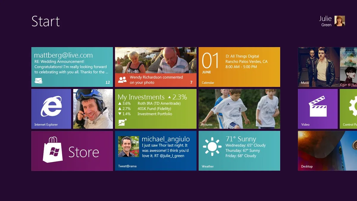
Microsoft unveiled its new design publicly in May 2011, announcing that this new UI would be part of the "next-generation" of Windows. At the time, Microsoft didn't have an official name for it. This was the first time the public saw this new design, and reactions were mixed. This was the first time Microsoft had confirmed that the Start screen would be replacing the Start menu outright.
A few things had changed between the time since the conceptual stages and initial development work, and the demo that was being showcased on stage. The Start screen had advanced quite a bit in design; being cleaned up and featuring a far more simplistic and fluid design that more closely mimicked that of the Windows Phone Start screen. There were still only two tile sizes, but the larger tile now spanned across two smaller tiles instead of three.
The live element of the tiles had also changed. The smaller tile sizes now also included "live" info, and the larger tile size had been changed so that the entire tile was live. The Start screen's background had also been simplified, replacing the underwater art design with a purple gradient that better showcased Microsoft's new design language.
Bigger changes came in the form of the swipe-in menu, which still didn't have a name. The menu had yet again changed, now featuring just five options instead of six and a darker design. The layout of the options was also different, with the Start button now in the middle of the menu rather than at the top. Microsoft decided to drop the dedicated app switcher button in favor of using a gesture-based app switching module. Users could now swipe in from the left of the screen to switch between apps.
The build of Windows that Microsoft used to demo the new Start screen looked incredibly polished. Many praised Microsoft for the beautiful design it had adopted for its new immersive experience, but many were still rather skeptical of the upcoming changes to Windows. The media were unsure if putting a touch-first UI onto a platform that's in-use mostly with mice and keyboards was going to sit well with users.
Windows 8 Previews (2011 and 2012)
In September 2011, Microsoft released the first public preview build of Windows 8 for developers, which encouraged said developers to start building their own immersive apps that would soon be available in a dedicated Windows Store launching alongside Windows 8. The build released to the public was a little further along than the experience shown off earlier in the year.
In the Developer Preview, Microsoft had changed the background of Start to a green color, while also adding a square-pattern that gave the Start screen a minor parallax effect when swiping in the Start screen. Outside of being able to move around and resize tiles, the Start screen wasn't customizable. Multiple tiles could be selected at once by swiping down on them.
The Start screen itself was limited to up to five rows of tiles in a group. Regardless of screen size, five was the maximum. This caused some odd spacing issues when using a large display, making the Start experience feel empty at the top and bottom of the display.
Another interesting addition was that the swipe-in menu now had an official name: the Charms Bar. The Charms Bar hadn't changed at all since it was officially unveiled, but users did notice that there was a separate Charms Bar design for mice and keyboard users. Instead of using the actual bar design, mice users could move their cursor into the bottom left of the screen to bring up a smaller menu that made more sense for mice users.
In the Windows 8 Consumer Preview released in January 2012, the Start screen had come along further. Now almost feature-complete, users could customize the Start screen in more detail. There were several color options to choose from, in addition to a few new background patterns. Microsoft had also removed the infamous Start button from the taskbar on the desktop, replacing it with a hidden "thumbnail" of the Start screen that would show up if you place your cursor in the bottom left of the screen.
Microsoft also removed the dedicated mouse version of the Charms Bar. Mice users now used the same UI to access the Charms Bar that touch users did, but instead of swiping in from the right, mice users simply placed their cursor in the bottom or top right corners of the screen. At this point, it was clear that Microsoft was leveraging corner and edge-based gestures in Windows 8.
Other noteworthy changes included a brand new Windows logo found in the Charms Bar, featuring a more squared, simplistic appearance keeping in line with the new Windows 8 design. There was also a new app opening animation, which connected the app tile to the actual animation, making the app opening experience feel like one fluid gesture.
In May 2012, Microsoft released the third and final preview build of Windows 8 to the public, known as the Release Preview (opens in new tab). This build was more or less identical to the RTM of Windows 8, albeit with a few minor UI changes. The Start screen now showcased up to six rows of tiles instead of five, reducing the wasted space issue on larger displays.
There were also more Start screen customization options, including more colors and background patterns. Microsoft had also updated the Windows Aero theme on the desktop, giving it a more "Metro" like appearance while still maintaining the blurred transparency effect.
Windows 8 RTM (August 2012)
Microsoft made a few changes to the design of the Windows desktop in the Windows 8 RTM. The Aero and window transparency had been gutted, replaced with a simplistic, flatter, opaque window border and non-blurred taskbar. This was the last piece of the Metro/Modern UI puzzle, aligning both the desktop environment and Start screen environment with a similar design language.
The problem was that the Start screen or "Immersive Shell" felt entirely separate from the desktop environment, which is actually what Microsoft wanted. In Microsoft's ideal world, users would just remain in the new immersive experience, only accessing the desktop to use a legacy program or access the Windows Explorer.
Users ended up feeling confused when being thrown between the desktop and immersive experiences, along with the hidden features and functions that were only accessible when placing your cursor in a corner or swiping in from one of the edges. The desktop didn't acknowledge the new immersive experience, and the immersive experience didn't acknowledge the desktop. It quickly became apparent that users were not enjoying the disjointed Windows 8 experience.
Windows 8.1 (August 2013)
A year later, Microsoft released a major update to Windows 8 for free. The update was called Windows 8.1 and was essentially an entirely new version of Windows, released in a much shorter time frame. It improved upon a number of the Windows 8 immersive experience behaviors and attempted to integrate the Start screen experience with the desktop more closely.
Microsoft finally understood that expecting users to remain fully in the immersive experience was unrealistic, with most users still treating the Start screen as a Start menu. So to better this experience, Microsoft made a few small but important changes that better positioned the Start screen for what it was.
In Windows 8.1, Microsoft re-added the Start button to the taskbar, making it easier for users to switch between the Start screen and desktop environment. It also added an option that allowed users to boot into the desktop by default, rather than into the Start screen. This was a big change, as it meant Microsoft was no longer expecting users to remain in the immersive shell to do everything.
On the Start screen itself, Microsoft added two new Live tile sizes: an even larger one and an even smaller one. There were now a total of four tile sizes. Microsoft also added a new background option that used your desktop wallpaper.
Microsoft changed how touch users selected multiple tiles on Start. Instead of swiping down, users now could now tap and hold on a tile to get the same result, similar to how other touch-based OSes do it. Mice users now had a dedicated context menu when right-clicking in Start, too, which made more sense for that input method.
The biggest change was the addition of a dedicated Apps List, which up until Windows 8.1 wasn't really a thing. Windows 8.0 had an Apps List, but it was only accessible via the Search charm. In Windows 8.1, Microsoft even allowed users to set the Apps List as default when pressing the Start button.
Windows 8.1 Update 1 (2014)
In 2014, Microsoft released a minor update to Windows 8.1 that further improved upon the behaviors of the immersive Start experience and the desktop, bringing more desktop functions into the new immersive shell. For example, the taskbar was now accessible from within any immersive app by moving your cursor to the bottom of the display, and the taskbar now showed open immersive apps alongside legacy desktop apps. Immersive apps now also had a title bar that would show up if you moved your cursor to the top of the display. This gave the user an easy way of minimizing or closing an immersive app if they didn't have a device with a touchscreen.
The Windows 8.1 Update in 2014 was the penultimate version of Windows 8 that found a happy medium between the new immersive shell and the old legacy desktop. Users using Windows 8.1 Update were not thrown between two different experiences, because Microsoft had better integrated the old with the new. The taskbar was now universally accessible again, as mice users would expect. Touch users were not encumbered with old legacy UI's if they didn't want to be, as users were still able to remain entirely within the immersive shell if they wished.
Windows Central Newsletter
Get the best of Windows Central in your inbox, every day!
Zac Bowden is a Senior Editor at Windows Central. Bringing you exclusive coverage into the world of Windows on PCs, tablets, phones, and more. Also an avid collector of rare Microsoft prototype devices! Keep in touch on Twitter: @zacbowden.
-
I don't know about you guys but right now I miss Windows 8.1 and sometimes I even miss Windows Phone 8.1, both for their fluidity and animations that I really liked. I was an early adopter of Windows 10 and sometimes I regret it - I just don't get it why would anti-malware executable take up 30% of my CPU while I am playing a legit purchased game on Steam or while I am browsing Edge. Sorry Microsoft, but you need to try harder to convince me not to buy a Mac when I'll go to university.
-
Not missing Windows 8.1 on my laptop one bit, but certainly missing Windows 8.1 on tablets. Also missing WP8.1's legacy on phones.
Some idiot thought they can mess up entire wokflows on mouse-based devices because Microsoft felt thretened by iPhones. And now, we have tiles in the start menu instead of actual useful UI like the one on Windows 7, still paying for the mistake Microsoft made on the desktop. Here is the deal: Metro was perfect for touch, the classic Windows desktop is perfect for mouse and keyboard. Trying to get WP's design to a desktop PC was the most idiotic thing a "designer" could do. -
I honestly didn't use the start screen that much on desktop PC, however, the charm bar was something I really liked and something I miss in Windows 10.
-
Yeah, I really miss 8.1 and Phone 8.1. I had a non-touchscreen laptop during the Windows 8.1 days and I really liked the changes and found them easy to adapt to. Windows 10 is feeling a bit blah right now.
-
That's an Intel issue, not a Windows one. That means that ALL machines that use Intel processors. ALL Macs use Intel Processors. The slowdown will affect them too.
-
He's talking about another thing. When you open the task manager, you can often see that the anti-malware excuse is using quite a bit of CPU. It's kinda annoying when it happens
-
That aspect ratio is awful. So glad Surface are 3:2 now.
-
I HATE any screen that isn't 16:9
-
You might study the ancients on architecture. 3x2 has been refered to as the "Golden Rectangle" and is viewed by most to be a ideal proportion for buildings, rooms, chests, etc. Deviate from this "Golden Rectangle" and one finds buildings too tall and narrow, or the ceiling too low for the size of room, or a room feeling like a hallway vs a gathering space. I find it a pleasing space for a display as well. I believe our natural field of vision also approximates 3x2 landscape. Portrait mode is for people with eyes stacked on top of each other. A compromise made for phones to be able to use them one handed.
-
They also didn't have movies or video screens. I've had nothing to do with the other.
-
Agreed. If there's one thing I've always hated about my trusty Surface Pro 2 it's the aspect ratio. It makes it near impossible to use in Portrait Mode which isn't an issue on models after it
-
And the reason I never udpated to Windows 10, is because of the Windows 8 Start Screen. It's by far the best thing about Windows. Long live Window 8.X. Plus the Modern IE, the absolute best.
-
You do know that you can change the start menu in W10 into a start screen right? I have it that way on my W10 work computer and my personal Surface Pro 4.
-
I own 5 computers. 2 running Windows 8.1 (my pride and joy) 3 running Windows 10. The 3 running Windows 10 are set up in Tablet mode for me. Tablet mode in Window 10 does not come even close to Windows 8.1 tablet mode. But I appreciate the information.
-
I don't think he's talking about tablet mode necessarily. You can have a full start screen in desktop mode too. I find this the perfect combo for mouse and keyboard.
You probably knew this but just wanted to add -
do you know something I don't? The "Start Screen" in Windows 10 acts nothing like Windows 8. In Win 10 it scrolls up and down, Win 8 horizontal. And the BIG difference, the Start Screen in Windows 8 will stay open on one screen while you work on another. In Windows 10, the moment you click on anything in another screen, the start screen disappears. I keep an old workstation with Windows 8 for that reason. Prefer it to Windows 10.
-
Loved windows 8, windows 10 is a flop for me everything seemed so much easier in 8 even without the start button lol
-
And then there is this. How is Windows 10 "harder" compared to 8? I mean what logical path can someone find for a Windows user to feel like a jagged, clue-less UI where you have to guess everything, not be able to drag a file from an app to the desktop or vice versa...how is that just "easier" compared to 10? These are the statistican anomalies you have to just ignore when designing for people.
-
Easier how? First time using Windows 8, I spent 15 minutes to figure out how to go to desktop straight from start screen, another 15 minutes to get back to the start screen, and another half and hour to find the charm bar and turn off my PC. Granted, I never read any user manual or reviews on how to use Windows 8, but it shouldn't be that hard. I've used Windows 98, XP, Vista, and 7, each one drastically change the UI but never the user experience.
-
You used all those other versions of Windows which means you should have a knack for technology. Strange that it took you fifteen minutes to find the desktop.
-
And the hidden gestures for navigating (which were panned then but are somehow magical now on iPhone X ) were brilliantly thought out. The multitasking gesture was so natural and intuitive. Probably the best gesture since pinch to zoom.
-
Exactly.
-
I absolutely loathed Windows 8 on the desktop and the Surface Pro. HOWEVER, I still reckon it was the best UI for tablets only AND for the Xbox (instead of that piece of sh*t UI we are force fed today on it). Unfortunately, Microsoft doesn't know the meaning of the word "balance" and their stubborness to make all look the same ends up delivering good experiences on some devices (desktop and laptop) bad experiences on others (tablets and consoles).
-
The world had become dumber as devices became smart.
This is why android (Windows 3.1 program manager) icons are preferred over something progressive -
Squares around icons are progressive?
-
No, grids of icons are progressive.
-
How is the Start Screen not a grid of icons? It is the same thing. Limited function widgets certainly weren't innovative.
-
Its not the same thing.
The difference is like browsing a website without images and media.
The difference between bulletin boards and internet.
The difference between Windows and MS-DOS -
There are few kew points why Windows 8 flopped: 1) The initial developer release did not have an wizard or out of box tutorial that demoed what gestures or "mouse zones" did what so users were left to figure out how to interact with the O/S, hence the backlash. I had a migraine just from interacting with the O/S... as you had to envision you had a larger screen than you physically had to touch these zones. For instance to get the start screen icon to show up, I had to pretend i had a 50" screen and drag the mouse to the bottom left hand corner to where it would be on a 50" screen. My TV is next to a light switch, to open the charms bar I had to drag my mouse to where the light switch is situated on the wall. The other alternative was to shrink my screen down to what it look like on a 20" screen and have massive wasted screen space. 2) To reboot, shut down, log off you had to go in to settings!... settings out of places... 3) The removal of mouse centric charms bar... was a major mistake 4) There familiar context menus for desktop / mouse and keyboard users was not available from the get go. 5) Users could not close applications easily, as there was no X to close store application and they always opened full screen. You had to drag down the from the top of the screen and down... imagine doing that on with a 40" display.... 6) Multitasking with store apps was a nightmare, you could only have set sizes and on a 40" inch display they were pain in the backside to work with. With touch however, Windows 8 was just plain awesome and intuititive after you learned what gestures did what. However the caveat is that it worked well with smaller screens not larger displays.
-
5) that close app gesture is very playful.
Dragging the window down doesn't close it.
The app remains suspended but weirdly it cannot run or get notification. I still have 8.1 Media Center on my TV and every so often i do the gesture drag thing ...
Wait a second pull to the sides, wait for the app window to do a back flip and finally app is closed.
Very impressive when you do it infront of guests waiting for the TV to play something. I wouldn't have it any other way. -
2) To reboot, shut down, log off you had to go in to settings!... settings out of places... Not really. You could just right click on the Windows icon in the bottom left corner or press winkey+x, but I obviously agree with you that the lack of tutorial was real and many people didn't know about it right away.
-
Not really. You could just right click on the Windows icon in the bottom left corner or press winkey+x
I believe you're thinking Windows 8.1. 8 didn't have a button to right click as far as I remember. -
It didn't have a button, but you could still right-click there to get the menu
-
It is laughable that people "said" they had issues rebooting, shutting down, or logging off. If you go to the Start Sreen in the upper right it had the "power" sign and the Users logo or name in which they could sign off or do all those things mentioned. I don't believe these users ever used Windows 8.1. If they did that's the first thing you see one logged on. I call bullpuckey!
-
It wasn't there in Windows 8 and iirc, it wasn't in 8.1 from the start, but came with an update (I might be wrong)
-
I had Windows 7, after using a few preview builds of 8, I made a conscious decision NEVER to upgrade to it. And I never did, upgrading to Windows 10 when it was released - which, despite many problems in it's early incarnations, seemed to get the right balance between Windows 7 and 8 functionality
-
Man I miss the charms bar. Tablet mode and Touchme Gesture Studio get me part of the way to a Windows 8 experience...but the charms bar...R.I.P.
-
Maximizing the use of thumb swipes was one of the beauties behind Windows 8. Most people did not spend enough time with it to understand this. When resting hands on the desk beside a laptop or holding a large tablet, the thumbs are the digits most freely available. I dock my task bar on the right and set it to auto hide. This gives me a much more powerful charms bar. A slight curl in of the thumb, or swipe up from the bottom of the screen, reveals the task bar just like the charms bar. A swipe in, brings in the action center. A tap, and both of them recede. Since Windows 10 uses vertical vs horizontal scrolling, this also eliminates the visual task bar clutter from the bottom of the screen.
-
And absolutely useless on a desktop PC. Which is why Win 8 failed, it was a touch OS for non touch systems
-
That was the major flaw though. If Microsoft decided - rationally - to not force touch elements on devices that didn't have touch...everything would have worked out perfect.
-
Definitely best touch UX so far.
If this is followed by the evolution of the Start Menu in Windows 10, I guess Zac will follow up with what's to come in Andromeda and CShell ;) -
Nope, not missing Windows 8/8.1 one bit, be it for desktop or touch interface: I LOVE how I now have access to the taskbar all the time in Tablet Mode whether I'm using a Win32 or a UWP app, so much faster to switch between apps that way (and no, I'm not bothered by the screen estate taken by it).
-
The Start Screen would have been fine if it was actually useful. Users would have learned to love it. The Start Menu wasn't liked at first either, but it was useful and it grew on people. Live Tiles are useless, especially on a PC. They needed to be interactive at launch and have more functions. Random info and no way to act on it was frustrating. The first few times I saw something interesting on a Live Tile, I was unable to easily find it. Happened regularly with Facebook posts and news articles. Very frustrating and removed any chance I would pay attention to them in the future. I can't be the only one with this issue, years later Microsoft addressed it with chaseable tiles. Why couldn't I start and stop music, access a bookmarked website, initiate a reply to an email, or turn on Bluetooth/WiFi from a Live Tile? The complete lack of function in Live Tiles doomed the Start Screen. Once you consider the terrible Windows 8 apps and their full screen nature, that operating system had no chance. Windows 10 is what Windows 8 should have been even though they still haven't fixed Live Tiles. It is now only a matter of time before they kill them.
-
I think Windows 8 was good on touch screen laptop and tablet. but on pc oh my God absolutely terrible I can still hear my girlfriend complaining haha
-
If they launched 8 as 8.1 there wouldn't have been the initial backlash and Windows 8's reputation wouldn't have been tarnished beyond repair... It was just to different all at once, people couldn't handle it, it was to much. If they'd made just a few different choices, Windows PC dominance could have translated in to some mobile succes. Especially in the early days of Windows 8, when Androids power wasn't as cemented in the mobile OS market as it is today. Ah how things might have been ;)
-
Windows 8.1 start menu is the best! I love it on my tablet. I wish Microsoft would give us options for tablet mode. Choose scroll direction, choose swipe between apps method.
-
Windows 10 still doesn't work as well for touch or mouse use as did Windows 8 in many ways. For machines without a dedicated windows button on screen, including current Surface devices, the charms bar was a better way to bring up the start screen than trying to tap on the tiny Windows logo on the task bar. The notification center in Windows 10 would still be well-served with a big Windows button at the top. The full-screen Windows 8 start screen has always been better for organizing and quickly launching apps than the WIndows 7 start menu, but even in full-screen mode, the Windows 10 version lacks some features: * Windows 8 "show more tiles" would lock the scaling of the start screen to be lower than for the rest of the the desktop, so you really could see more tiles. Under Windows 10, it just allows for 4 medium tiles in a column. It reduces the dead space, but doesn't really allow for more tiles in the same way. * The Windows 8 layout algorithm (2 medium tile widths per column, wrap around to more columns once screen height is reached) allowed for a more consistent ordering of tiles when changing between landscape and portrait modes. The Windows 10 way (arbitrary layout within a group) makes things a mess if you ever switch orientation. * Windows 8 allowed syncing of start screen between devices. If you had the same apps installed on multiple machines, they would appear in the same places. Windoes 8 had some really good features that improved both touccscreen and mouse & keyboard usage. Too bad that the haters who never actually tried it won out and we lost a lot of good ideas. Windows 10 is decent, and has made some actual improvements over 8 in some areas, but some good things were lost as well.
-
i would say Windows 8 failed becouse of to less touch screen in the market, is a dam good OS if you have touch screen but most of the computers still yet today is missing touch screen and W8 was not as good for keyboard and mouse using stuff.
-
Touchscreen just isn't the optimal input for a desktop PC experience. It is nice as a supplement but too inaccurate to be the premier input method.
-
Still using 8.1 for desktop. W10 is garbage.
-
In recent months, I saw something a bit weird, several months ago I use my Surface RT to examine the Marketplace, it showed up a message, saying MS was closing Marketplace for Windows 8.1 RT, so I thought that was it, maybe MS did officially abandon this RT environment. But some months later as I turned my Surface RT back on, an entered Marketplace, I notice it was back online for Windows 8.1 RT, I could still download apps. So did MS actually end their support on Windows RT already?
-
Great work on this summary of Windows 8's life cycle, Zac! I did not know half of this :) I remembering not liking Windows 8's Start screen back when I was previewing it, but then I got used to it, and did not understand why everyone else did not give it a try. Then Windows 10 came, I got used to that, and then I hated Windows 8 and today I really enjoy using Windows 10s Start Menu. I am still not a fan of the Full Screen mode, though. I have almost daily encounters with Windows 8 Start Screen. Too little info and actions to take on too much space without interaction. Everything is hidded, and you have to know how to get it. That is my personal reason for not liking Windows 8's Start screen. Windows 10's Start MENU is much more actionable, plus the action center.
-
Funny how habits can change fast sometimes. Now I use Start in full screen mode, because it has such nice animation to it ^_^
-
A mix between Win8 start screen and W10M home screen/W10 tablet mode for the next Always On Connected PCs would be the ideal interface when using the services in "smartphone" mode.
-
I prefer Windows 10 in desktop mode but I prefer windows 8 in tablet mode. I always found Windows 8 was brilliant as a tablet, it felt very intuitive and natural with its layout, gestures and charms; they don’t feel quite the same in Windows 10.
-
I certainly miss the polished UI feel of Windows 8. Windows 10 is getting there, but it's interesting how long it has taken. Windows 8 had very, very odd UI quircks that took getting used to, but at least they looked like someone had to approve the final design before launching the OS.
-
Windows 8 was a great OS, especially on a windows tablet device. I could understand the shock of a new interface where touch and pen came first and the desktop second. The structure for me, was fine, and little issue in my workflow. The major issue I had with windows 8 was the 8.1 update where windows search was overhauled. Before search was instant and fluid and had a wonderful full screen dashboard and pane with the search results I neded and nicely indexed files on the micro-sd card too on a surface pro device. But after 8.1. windows 8.1 search results were toned down hard. The results and indexed return results for files were far less relevantly presented. Only apps and major files came back, but really never the files I needed, compared to the situation before 8.1. Also the fragmentation of bing search was a big shame. After 8.1 web presearches outside the US were toned down, making search more simplified to the indexed data of local storage. In 8.0 I could actually get bing search results that I could click and IE 11 would then autosearch and deliver results. An immersive universal search experience. That was great while it lasted.
In windows 10 I have seen search become less indexed and more filtered. But it still requires an extra step in the end-user interface experience. For me windows 8.0 search felt more universal, than the current search experience. It's more fragmented, less smart. Unfortunately Cortana doesn't help, because it is not supported in all markets, so it has a limited usecase.