Windows 10's Cortana gets a splash of color for the weather
All the latest news, reviews, and guides for Windows and Xbox diehards.
You are now subscribed
Your newsletter sign-up was successful
Join the club
Get full access to premium articles, exclusive features and a growing list of member rewards.
An issue in trying to make your user interface minimal and clean is sometimes you can go too far. In the past, Microsoft has been accused of making their Windows Phone OS boring with 'wasted space' and only dark and light themes.
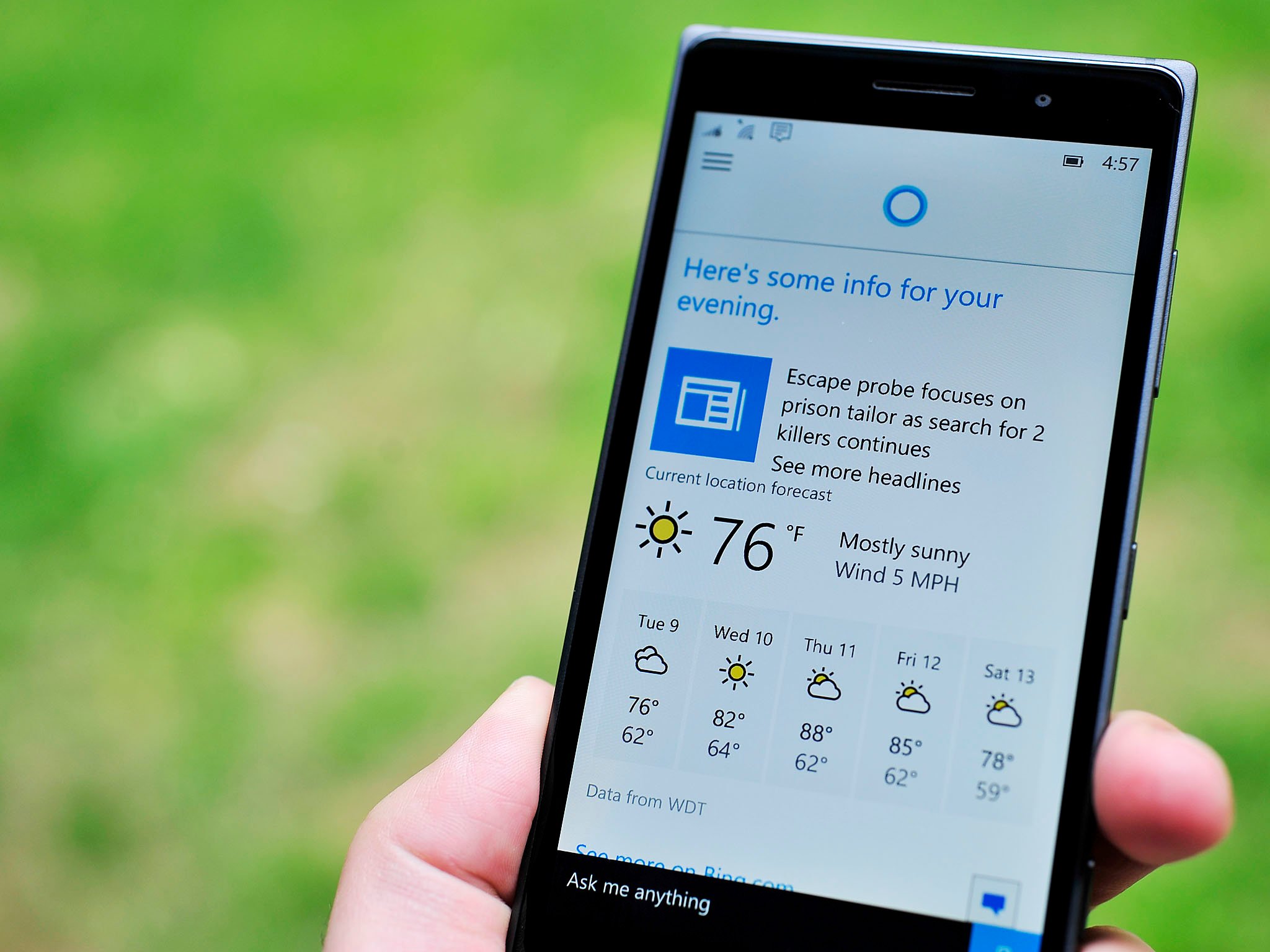
One of our readers recently noticed that in Windows 10 and Windows 10 Mobile the weather in Cortana is a little brighter. Specifically, a splash of color has been added to the forecast to add a little pizzaz.
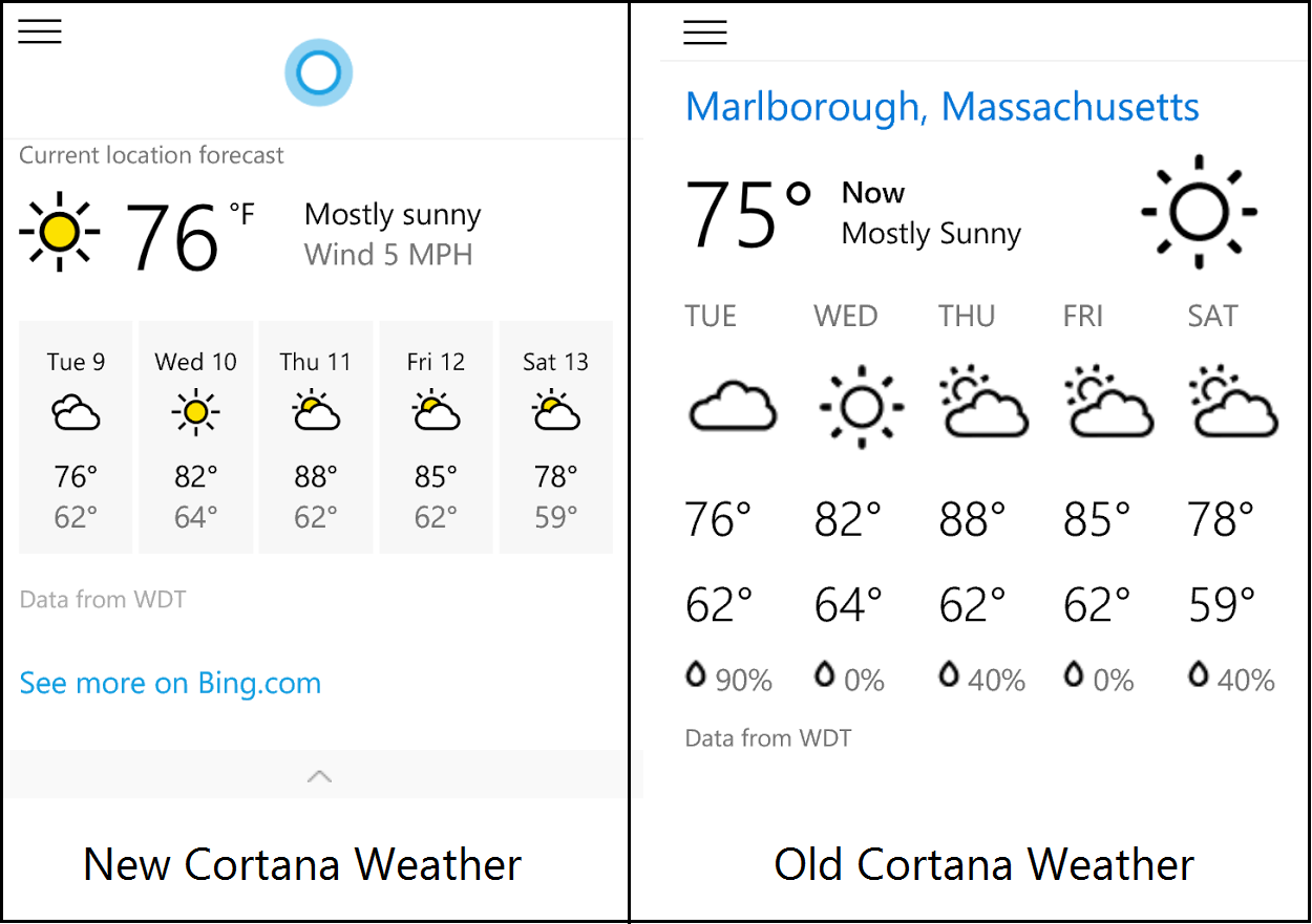
As observed in the above screenshots you can see the new weather layout versus the older, monochrome one on the right. Although this is a small change adding some color back into the text-driven and chrome-defying OS is sometimes a good thing and we like the new look.
Article continues below 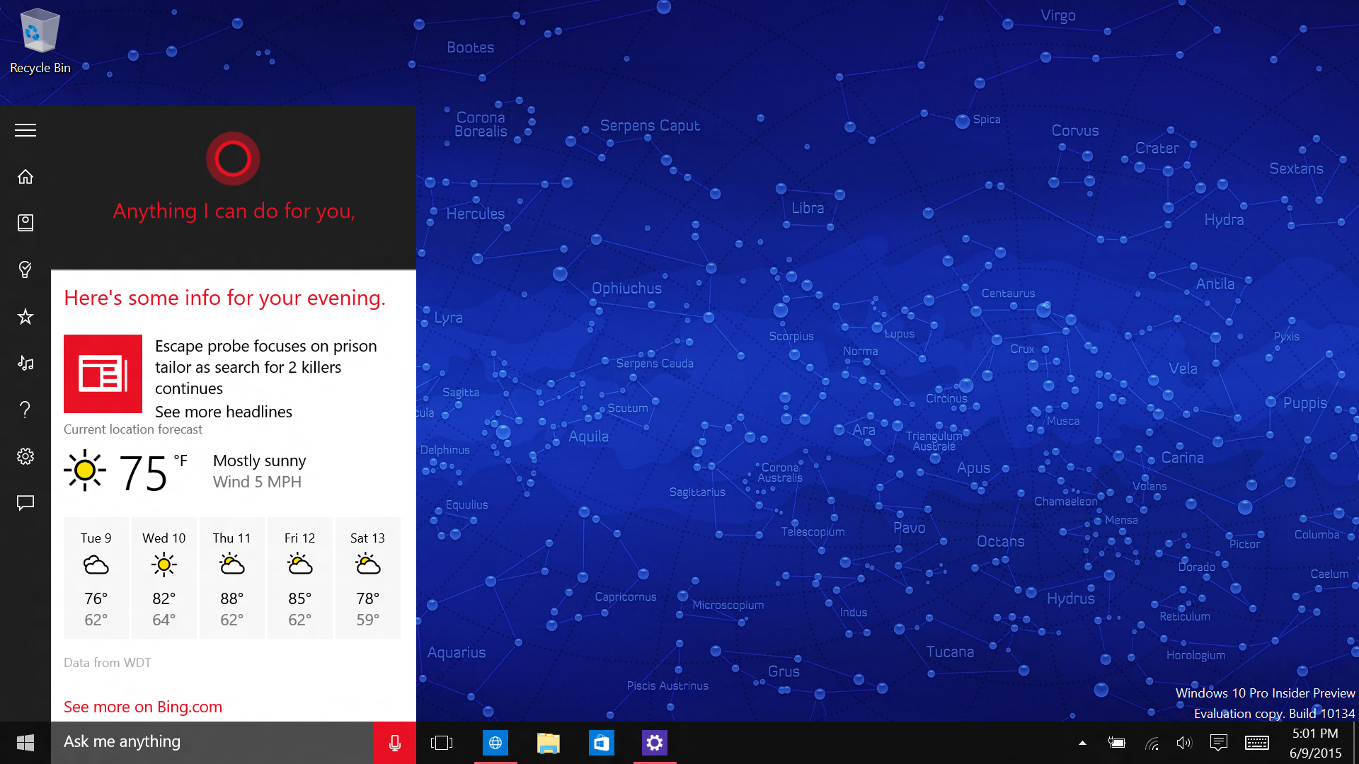
The new icons are present on both Windows 10 Mobile and Windows 10 preview builds.
Do you like the new look? Should Microsoft add more color to some parts of the OS, and if so, where? Sound off in comments!
Thanks, Mohamed W., for the tip!
All the latest news, reviews, and guides for Windows and Xbox diehards.

Daniel Rubino is the Editor-in-Chief of Windows Central. He is also the head reviewer, podcast co-host, and lead analyst. He has been covering Microsoft since 2007, when this site was called WMExperts (and later Windows Phone Central). His interests include Windows, laptops, next-gen computing, and wearable tech. He has reviewed laptops for over 10 years and is particularly fond of Qualcomm processors, new form factors, and thin-and-light PCs. Before all this tech stuff, he worked on a Ph.D. in linguistics studying brain and syntax, performed polysomnographs in NYC, and was a motion-picture operator for 17 years.
 Join The Club


