3 things Microsoft needs to fix in the new Xbox One dashboard

While the Fluent Design System is supposed to bring stylish translucent panels and fluid animations, its implementation across Windows 10 devices is a far cry from the concept videos the company has shown, but that's OK – these things take time.

The Xbox's first jaunt with Fluent Design offers a glimpse at a sexier future for the dashboard, and while changes are on the way, I thought I'd outline some of the things I think Microsoft should take a look at for refinement.

1. The home screen

This probably comes as no surprise if you've been reading the feedback across the internet, but the new home screen needs quite a bit of work.

The new home screen needs quite a bit of work.

In my initial impressions video above, I talked about how the abundance and placement of "suggested" content and ads were annoying, sitting in-line and on-par with your actual content and dashboard functionality. Xbox platform corporate vice president Mike Ybarra recently told us that the four blocks next to "Resume" are algorithmic, and some of the features aren't functional in the current build.

I have noticed them surfacing interesting content, such as letting me know when my friends are playing multiplayer games, or if they're streaming on Mixer. They also show current installation progress.

Since we know more fixes are on the way for those blocks, I'd like to address the design of the home screen itself. The top banner with its chunky white text, low-res background images, and the ugly gray divider block beneath make the home screen look like an unfinished website template. Huge amounts of wasted space offer no real discernible benefits and could be far better implemented. The previous home screen simply looked a lot better.

The previous version of the dashboard also had a lot more features, giving you quick access to Game Hubs and other information. Additionally, the gray block hides any custom backgrounds you might have set up. The previous dash had transparency based on your accent color and looked a lot more consistent.

Hopefully Microsoft will develop and fine-tune the home screen, particularly since it's the first thing you see every time you turn on your console.
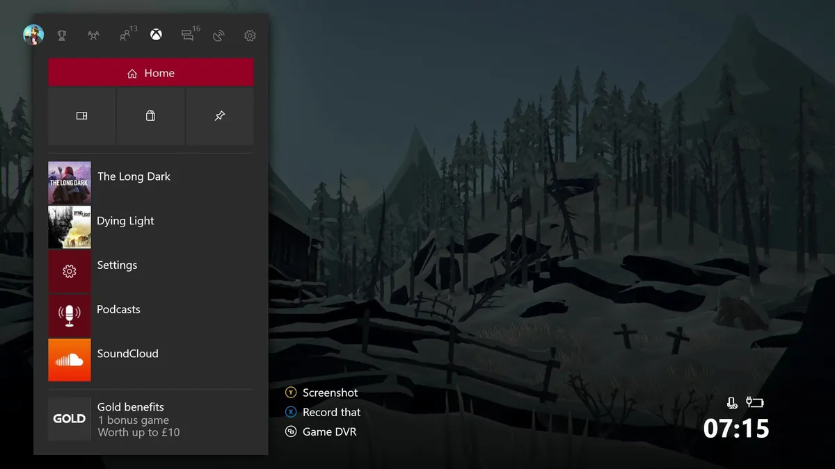
2. Fluent Guide

The new Guide features a horizontal format, changed from vertical. Additionally, it takes on a new sectioned configuration, where features that previously had their own pages have been split out. Some have complained that this leads to more steps to access certain information, but the mentality is that it should take fewer steps in certain situations. For example, the Communication tab no longer shows your messages straight away, it has you jump through a second Blade menu first. On the flip side, though, there's now a quick access link for creating new messages or accessing messages that come directly from Xbox Live.

We can only assume Microsoft has done this so that it can add more features to these sections in the future, rather than cluttering up existing lists. On the current dashboard, Clubs appear in the same list as your friends, for example, which can make the list more cumbersome to navigate than simply splitting them out into separate Blades, as seen in the new Guide.

Overall, I think the new Guide is a great step in the right direction. The fact it's no longer pinned to the left of the screen is reminiscent of the old Xbox 360 Guide, and it feels a little speedier. The only change I'd make to the new Guide is the addition of Fluent Design translucency. This element in motion with an acrylic translucent texture would look really awesome and would fully showcase the design ethos behind Fluent Design, adding depth to the different elements on-screen.

3. Content blocks

Another big change in this dashboard is the addition of what Microsoft calls "Content Blocks," which are customizable sections that rest underneath the main home screen. As of writing, you can pin games and individual people on your friends list. But Microsoft has big plans to add more features to Content Blocks in the coming months.

Whether or not we'll see them in the near-term, I think Content Blocks could prove an incredibly powerful feature for Xbox One in the future. Ybarra mentioned the idea (not the plan) to have an app like Twitter as a Content Block, allowing you to see trending content and recent tweets. Here are a few scenarios I'd like to see:

  • Website favorites as Content Blocks, from Microsoft Edge.
  • Full support for the Universal Windows Platform (UWP), allowing apps to be pinned.
  • Allow developers to inject data from their pinned apps into Content Blocks, similarly to how Live tiles work on Windows 10.
  • Apps like Netflix, YouTube, and Groove would make great Content Blocks, showing rich information on your subscriptions and suggested content based on your interests.
  • Bring more social media apps to Xbox, such as full-blown Twitter, allowing you to keep up to date at a glance.

There's huge potential for Content Blocks, but it remains to be seen whether Microsoft can get developers on board.

Your thoughts and feedback

Clearly, Microsoft isn't finished with this update wave, and I suspect that the next few Insider Alpha Ring builds we receive will work to address some of the feedback leveraged at Microsoft across sites like Reddit, NeoGAF, and the wider social media conversation.

Overall, even in its early state, I like the new dashboard. It feels a lot faster and more fluid, given the elimination of splash screens, and the new features like mass game transfer between storage devices, the Content Blocks, and the new full-screen Community tab are welcome benefits. Of course, there are things like new Avatars on the horizon, too.

It's far too early to pass any form of final judgment over the new dashboard, which is the whole point of Microsoft putting it out there to gather feedback. But what do you think of the new dashboard so far? What would you change? Hit the comments and let us know.

More: Everything new in the Xbox Fluent Design update

Jez Corden
Co-Managing Editor

Jez Corden a Managing Editor at Windows Central, focusing primarily on all things Xbox and gaming. Jez is known for breaking exclusive news and analysis as relates to the Microsoft ecosystem while being powered by caffeine. Follow on Twitter @JezCorden and listen to his Xbox Two podcast, all about, you guessed it, Xbox!

26 Comments
  • Have to say that I am not real impressed so far with this update. All of my pinned games on the home screen are greyed out and cannot be started. I have to go to the installed games area and start games.
  • " The previous home screen simply looked a lot better. " No, it did not.
  • The current one is extremely ugly.
  • Well, everything is subjective.  I still prefer the original dashboard and Kinect usage.  There's no universe where I think ANYTHING Microsoft has done to the Xbox is worth crap.  But that's my subjective opinion.  I actually find a FEW aspects of the latest alpha to be an improvement over current production versions.  Then again, that's also like me saying I dislike cauliflower less than beets.
  • So you like the grey block and the huge white text banner that takes up tons of space pointlessly?
  • That weird gray block is bad design. You go from background, ugly grey divider and than background again. I hope they fix that. Also the guide could benefit from some transparency or that ugly gray could be the background instead.
  • The Xbox interface is a piece of poo. Simplify simplify simplify. The only thing just as poorly designed is tablet mode in W10 and that's an insult to tablet mode. Does the Xbox team use PS4? It's super simple and for the most part I can see everything I need to use on one screen. It takes so much work to get to things on Xbox far too often. And the ads oh the ads the ads the ads the ads everywhere! I paid 300 for ads? Is this Amazon? Enough with the ads. So basically Xbox interface is a dumpster 🔥.
  • I hate the PS4 OS. It looks like a beta product in 2017. No polish at all. 
  • PS4 dashboard is oversimplified and ugly - too many things glowing and the background music and animations...oh, lord, it looks like something straight from the 90's. So tacky.
  • I still think the one annouced at E3 2015(http://i.imgur.com/lebIQWq.jpg) was incredible. I think a "mashup" between this one and fluent design would bring an amazing dashboard. 
  • Navigation should be Home>Community>Games>TV & Movies>Music>Store. All apps should be laid out in the perspective pages categorically. The store should have a small section on each page based on the pages category. Community and Mixer could actually be placed as a sub group on the home page. Fire every single person involved in creating the OS structure.They're just not good at what they do. They just don't care and the OS structure reflects it. It is an abomination and I would be embarrassed if it were my work.The OS is fine, it just really needs some layout work and organization so desperately bad.
  • "the abundance and placement of "suggested" content and ads were annoying, sitting in-line and on-par with your actual content" - I say the same thing about Windows Central all the time :D
  • hey if you paid us $9.99 per month with $250 upfront cost to use the site I'm sure we could reduce the ads and still pay the bills
  • It looks like they were going for a style/performance over substance approach but it doesn't look nice enough to negate all of the pains in the ass it's caused.  It may help performance a bit by not having everything open by default (for instance, now you have to click into the party window to even see who is in your party or send invites, etc.) but it's not functional.  Is it this hard for them to EVER just get it right?
  • Does anybody remember the days when your interface was a stop, play and eject button, and all you needed to worry about was putting the cassett tape in the right way round and then waiting 10 minutes for frogger to load.
  • Why are they called Content Blocks and not Live Tiles?
  • I don't know, maybe they don't update information on the fly?
  • I think Jez said that developers can push info to them...such as Twitter.  Which to me, sounds EXACTLY like a Live Tile.
  • My understanding is that the entire section is a "content block" that can be customized while each tile is essentially what could/may be referred to as a "live tile".  Either way, who cares?
  • You're right.  Consistency is not important across an OS that is supposed to be unified.
  • I personally find algorithmic / adaptive menus to be extremely annoying. The lack of consistency confuses me. Frankly, I would prefer 3-4 simple pages. 1. Games. First and foremost, because it's the main reason I bought an XBOX. Just big high res tiles that are cached, no waiting to load images. No gimmicky content blocks, just game icons that I can easily select so I can play them.
    2. Store. Make it easy to find and buy stuff. But keep the ads off all the other pages.
    3. Community / Xbox Live stuff. Friends, groups, etc.
    4. Settings. Includes access to quick settings that you can pin yourself. No adaptive things that aren't static. I just want it to be simple so I can get to where I want to go quickly and easily.
  • The XBONE interface is not intuitive at all.  While I'm a Boomer and think so, my son who is a Millenial also thinks that it is very difficult to figure out how to navigate.  It looks like they have done UI/UX from a pure asthetic point of view and did not look at Human Factors or Industrial Design factors at all.  Completely confusing!
  • Totally agree with you! This new dashboard is clearly less "productive" than the previous one.
  • I agree with everything you say, but I have a few doubts that they can pull off transluctency on the blades without losing a few ms on the standard xbox one. If they have to choose, I would prefer speed over effects in the menu.
  • Bring back the Xbox 360 blades but make it super hi-res and improved fuctionality.
  • the new Community section looks good tho, probably the only preferable change for me :D. A snappier Guide is welcome, but I agree on that it shouldnt take more steps to get to things. They might have done this to avoid unnecessary loading, but making the underlying code async should do?