Dear Microsoft: Windows 10's dark theme is a mess
Windows 10's dark theme isn't as bad as it once was, but it's still a mess.
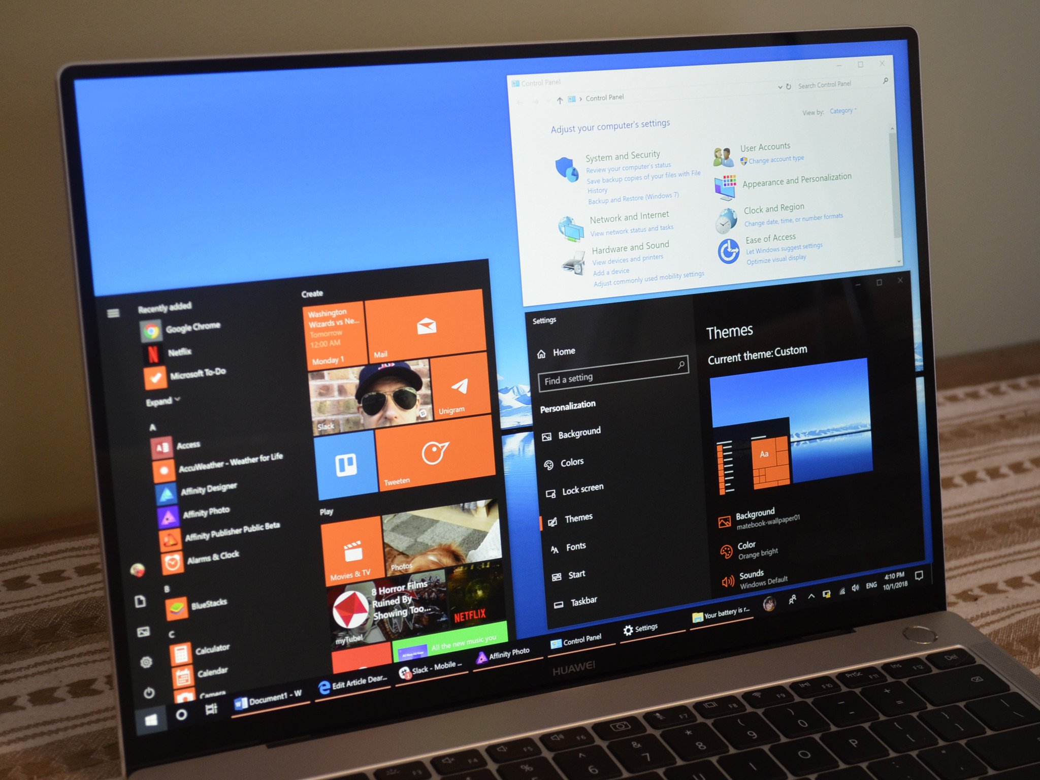
Microsoft has pushed dark mode onto many of its first-party applications and aspects of the user interface. But Windows 10 looks poor when compared to the wonderful new dark mode available on macOS Mojave. I'm here to shed some light on what's going wrong with Microsoft's dark mode.
Fifty Shades of Darkness
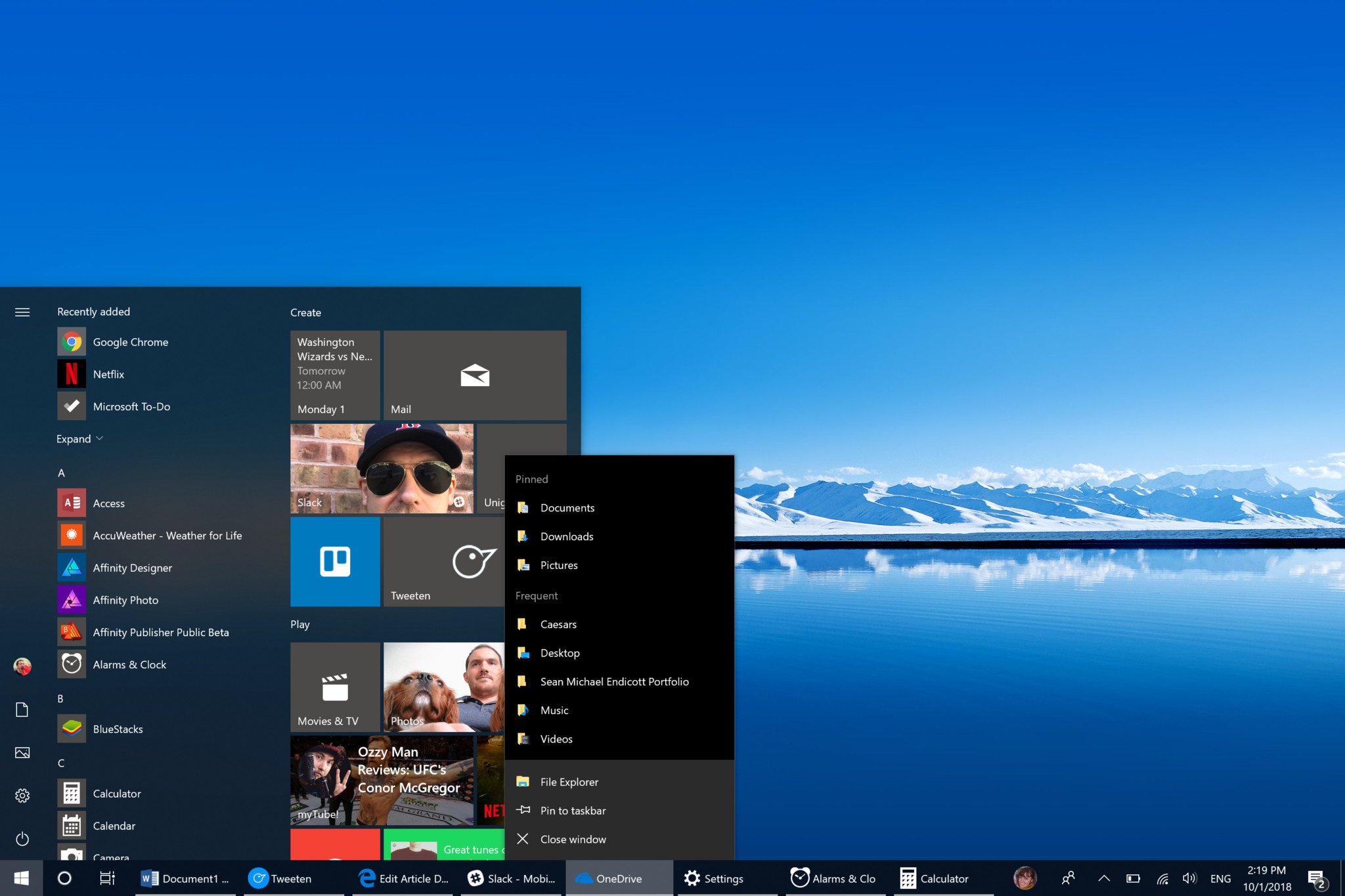
Windows 10's biggest issue when it comes to its dark mode isn't what is dark, it's what isn't dark and when dark elements don't match up. Some context menus are white while others are black. Some apps use transparency behind text while other elements don't. Clicking around Windows 10 shows a number of design ideas being used. Some of these work in isolation such as using dark grey or pure black but using a mixture of them throughout the operating system look sloppy.
There are also large parts of the operating system that lack dark modes entirely. The Task Manager, Control Panel, some context menus, and the File Explorer are all blindingly white. File Explorer has a dark mode on the way but that alone could justify an article breaking down inconsistencies and issues.


Microsoft needs to iron out these inconsistencies and extend dark mode throughout the entire operating system. I realize that this can't be done overnight, but another operating system managed to bring in a far-reaching and attractive dark mode recently.
Grass is darker on the other side
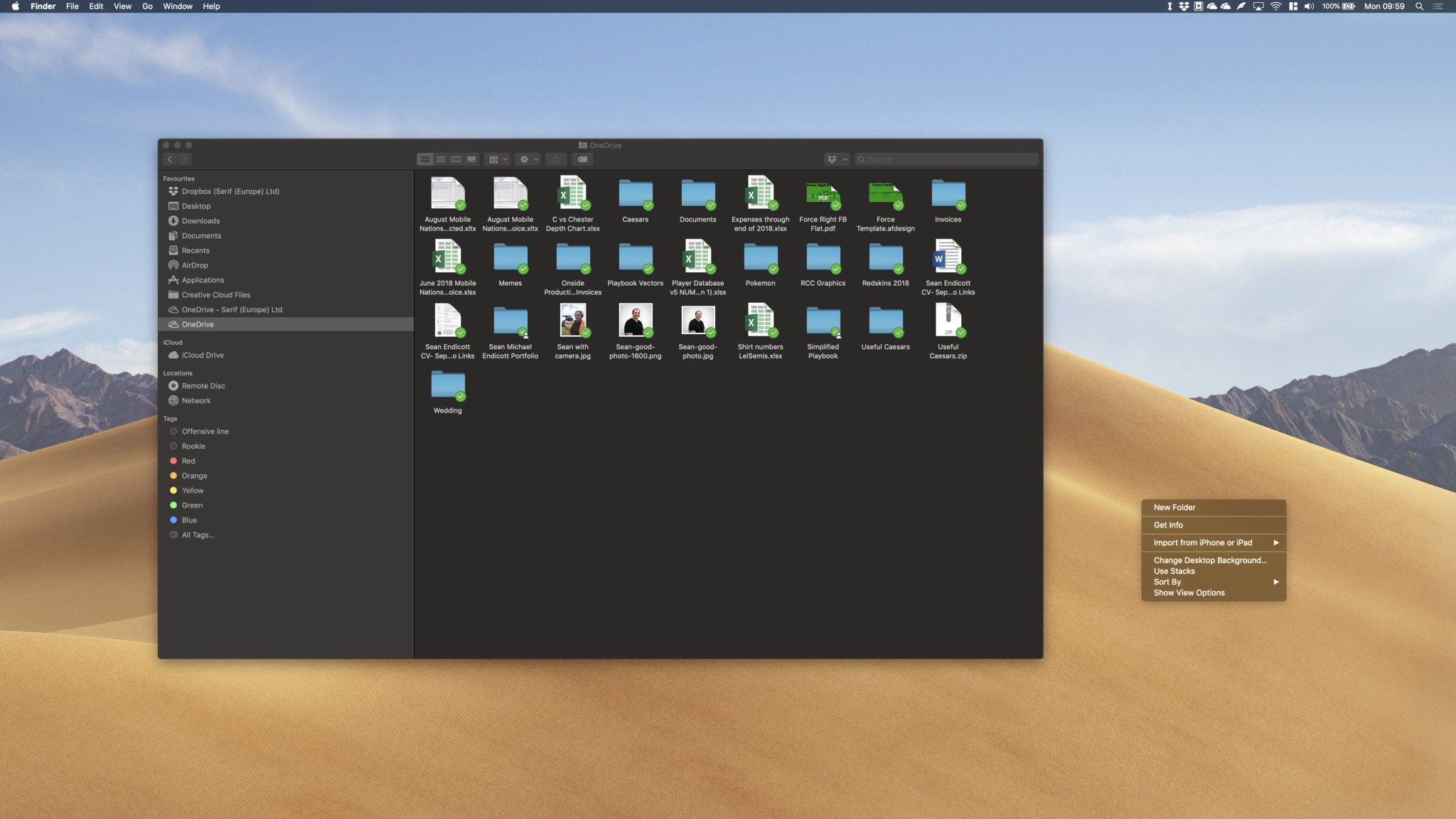
Windows 10's dark mode has had issues for years. The reason that its inconsistency is getting so much attention now is because Apple's latest update to macOS looks gorgeous. Apple did what Microsoft has failed to do, make a consistent and attractive dark theme that extends throughout the OS. The dichotomy between the two operating system's dark modes makes it even more apparent that Microsoft has fallen behind.

While I've tried to give leeway to Microsoft in the past, it's reached a point that is unacceptable when it comes to dark mode. Yes, they have made significant improvements over the last few years. The dark mode that shipped with Windows 10 originally was much worse than the latest version. But Apple has shown that you can make this change swiftly while also covering a wide range of menus, settings, UI elements, and applications.
The Insider team wrote an entire puff piece on dark File Explorer https://t.co/HuZfq0jBPh
But here's the reality folks. pic.twitter.com/7S6RgTv3R1The Insider team wrote an entire puff piece on dark File Explorer https://t.co/HuZfq0jBPh
But here's the reality folks. pic.twitter.com/7S6RgTv3R1— Rafael Rivera (@WithinRafael) August 8, 2018August 8, 2018
Microsoft MVP Rafael Rivara has an excellent thread breaking down some issues related to dark theme. I reiterate his sentiments. The reality is that Microsoft hasn't shipped a completed dark mode to Windows 10. I'll add further that this is made worse by the fact that Microsoft's largest competitor has shipped a dark mode that is so beautiful it feels like I'm playing with a tech demo, and I mean that in the best way possible.
All the latest news, reviews, and guides for Windows and Xbox diehards.
Overall thoughts
Windows 10's dark mode has been filled with inconsistencies and white elements for years, but the recent rollout of Mojave's dark mode makes Windows 10's faults much more visible. Apple has shown that an operating system can implement a system-wide dark mode beautifully and effectively on their first try.
Microsoft needs to catch up when it comes to dark mode, because when it's implemented correctly in Windows 10 it looks great. While some elements will likely get proper dark modes when they are overhauled into a more modern design, Microsoft needs to fix their issues with darkness now, and then work on a complete overhaul over time.

Sean Endicott is a news writer and apps editor for Windows Central with 11+ years of experience. A Nottingham Trent journalism graduate, Sean has covered the industry’s arc from the Lumia era to the launch of Windows 11 and generative AI. Having started at Thrifter, he uses his expertise in price tracking to help readers find genuine hardware value.
Beyond tech news, Sean is a UK sports media pioneer. In 2017, he became one of the first to stream via smartphone and is an expert in AP Capture systems. A tech-forward coach, he was named 2024 BAFA Youth Coach of the Year. He is focused on using technology—from AI to Clipchamp—to gain a practical edge.

 Windows Central Insider


