The Windows 11 Start menu sucks
The Windows 11 Start menu is bad, and Microsoft should feel bad.
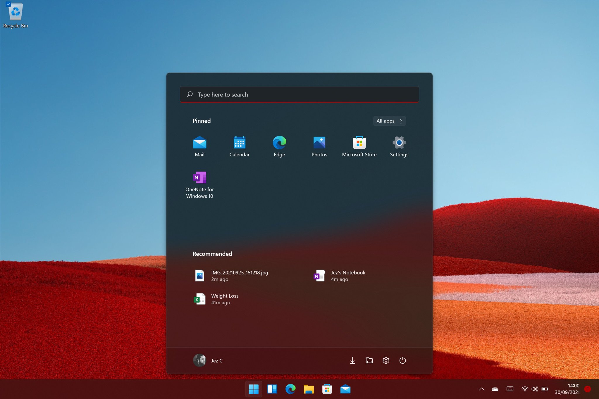
One contention that rides around every single time Microsoft updates Windows is the Start menu. Windows 8 notoriously bombed in market share due to the radical system upheaval, with the Start menu as a focal point for criticism (among various other things).
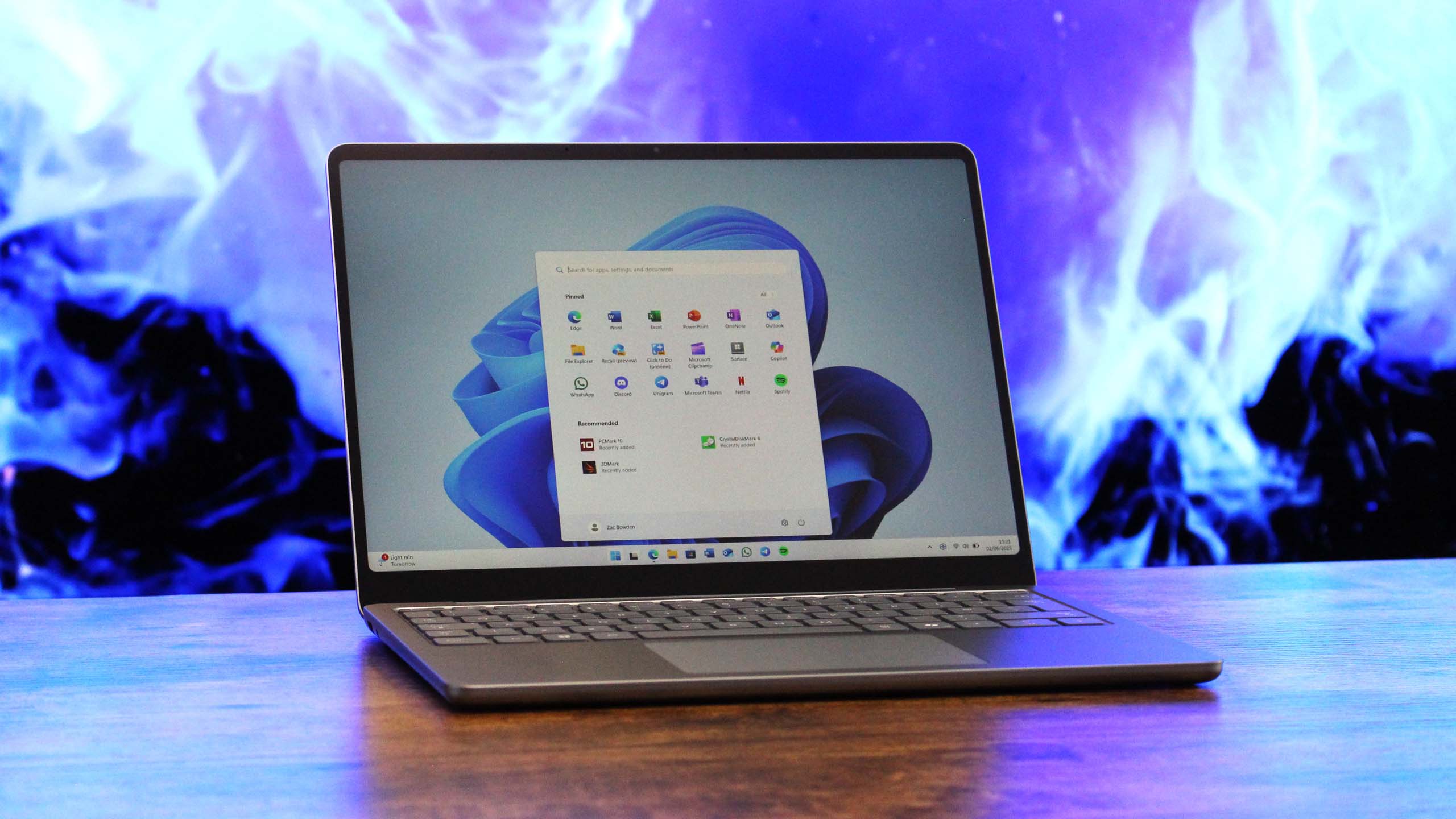
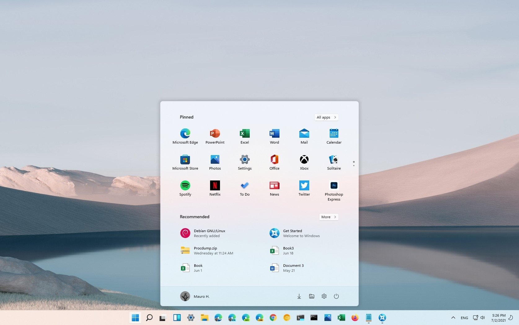
The Windows 11 Start menu is notably less radical. It falls back on the tried and tested docked menu, which doesn't take up all of your screen. It doesn't flood your cognition with dancing widgets either, previously known as Live Tiles (RIP their gentle souls). It's simple and elegant, putting your most-wanted apps right at the top, with recommended files beneath. Sounds cool right? Well, maybe, at first glance.
I recently purchased a second-hand Surface Pro X as a backup PC, specifically for running Windows Insider Builds and testing touch and Windows Ink features. And while I realize that I'm very late to the party here (so late, in fact, that Windows 11 literally launches next week), I already have some thoughts about the experience. And not all of them are good thoughts.
Article continues belowThe Windows 11 Start menu sucks
The Windows 11 Start menu is quite literally the starting point of any new PC, giving you quick access to the rest of your PC's functionality. Since the days of Windows XP, Microsoft has been needlessly and oft radically altering how it works, forcing users to re-learn every time its basic features and functionality. Windows 11 doesn't quite go that far. In fact, in a lot of ways, it's far easier to use than previous incarnations, particularly for new users. However, for those of us who have grown accustomed to using Windows in a certain way, the new Start menu feels like a leap backward.
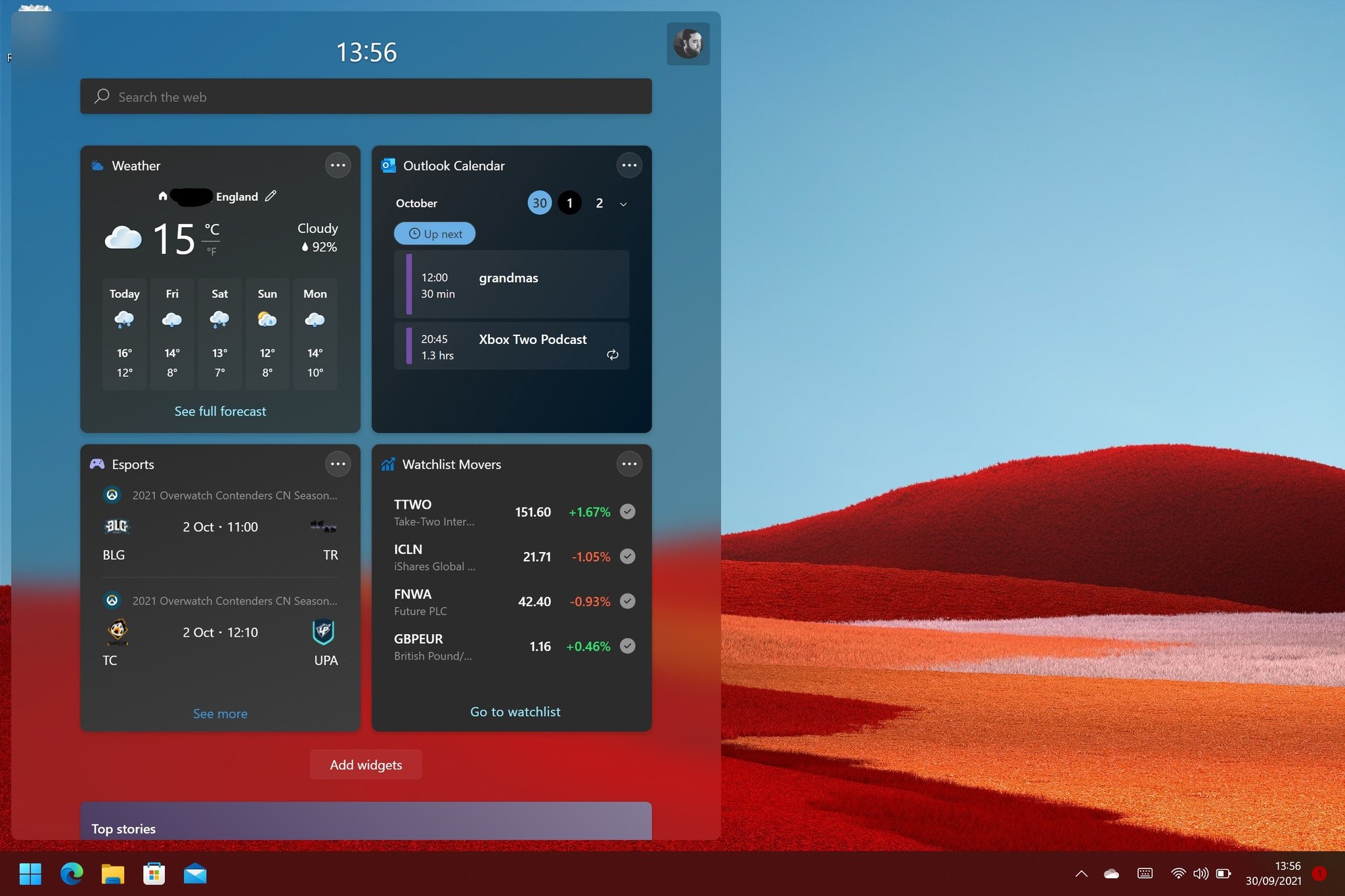
I won't wade too heavily into the debate about Live Tiles. I know many Windows Central readers love them. I used to as well. Or at least, their potential. Microsoft and app developers both didn't really leverage them to a meaningful degree. These days, I only really use the Calendar Tile and the Mail Tile, for at-a-glance reminders of what my productivity day is going to entail. The new Widgets panel offsets some of the loss there, but by putting it in a separate section, it basically ensures that I won't use or see it as often as I could've done if I could just pin Widgets to the Start menu.
I do like the new Widgets panel, and I think the potential for features is quite good up there. But considering the vast amount of wasted space in the Start menu, I can't help but wonder why we don't have the option to simply put Widgets in there instead.
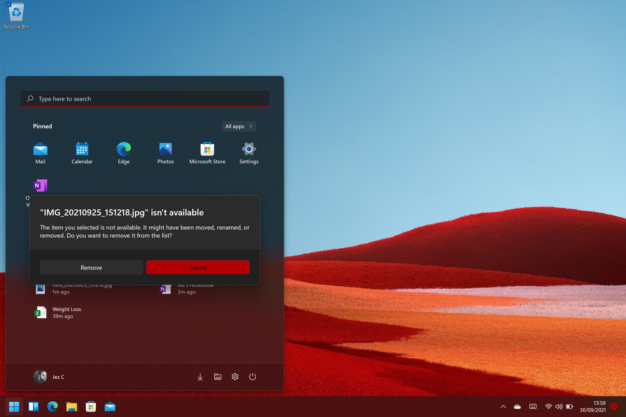
It's sort of my biggest complaint about the Start menu, ultimately. This new one is so lacking in customization features to the point of frustration. You can't resize it in any way, shape, or form. You can't remove the Recommended Files list. You can turn it off, but it leaves a nasty gap with an annoying reminder telling you that you've turned off Recommended Files, like a vestigial limb you can't remove. The Recommended Files list, if you leave it on, for me just surfaces years-old documents and other random crap from my file storage that I don't really want to see surfaced right there in my Start menu. Managing those files is a chore, too, forcing me to right click and "dismiss" every time it surfaces a file I couldn't care less about.
All the latest news, reviews, and guides for Windows and Xbox diehards.
It also doesn't really feel fit for purpose. What use is it, showing me a file that I've since removed or deleted? Why isn't the Recommended List intelligent enough to know if a file is still available? What if you surface a sensitive, personal document that I don't want guests who might be using my PC to see right there, front and center?
If you can't make it work for me, if you can't give me control over it, just let me bloody well turn it off, without punishing me with a passive-aggressive message and a pile of wasted Start menu space. It's straight-up bad design.
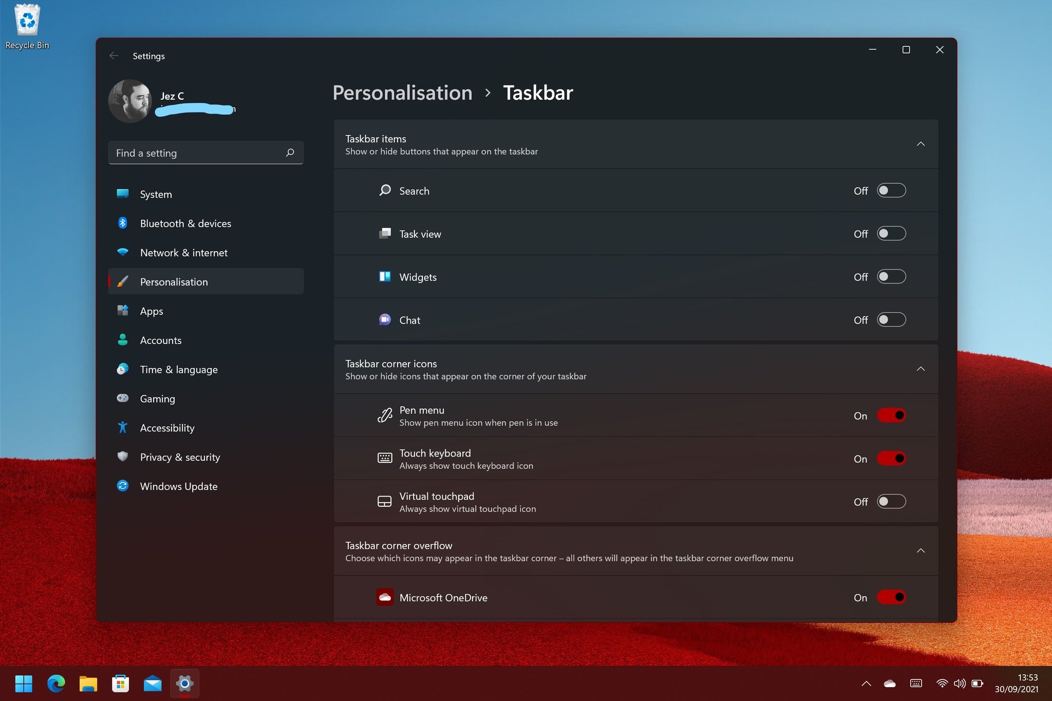
Furthermore, why is it centered? At least you can move it by trawling through the settings, but man, I can't for the life of me understand the logic here. Is it just because macOS has a centered dock? You're asking users to aim the mouse to click on it now, whereas before you could simply drag the mouse all the way into the corner without thinking about it, to open the Start menu. I generally use the Windows key and just search in the Start menu when I want to open things anyway, but the "change for the sake of change" aspect here simply irks me.
Oversimplification
As much as I dislike the term "power users," there's naturally a delta between people who know and use Windows inside out and backward and more casual users, who don't spend too much time on their computer. Figuring out where to set design priorities can be tough in some instances, especially when it comes to removing features, but far too often it feels like companies go too far in the other direction when trying to strike balance.
In a past life, I was an IT guy for a chain of private high schools in the U.K., and know all too well that literally nobody customized their Windows 8 or Windows 10 Start menus. The default crapware Live Tiles that OEMs would install on their laptops remained for years, until I forced a specific basic Start menu layout via Group Policy (which was needlessly complex to do in its own right, compared to managed Chromebooks).
Microsoft clearly knows that nobody wants to configure, shape, and resize Live Tiles, while also researching which apps even provide a baseline level of functionality in that area. But removing ALL Start menu customization is not, and never the alternative. Even Windows 95's Start menu let you resize it at least.
The Start of a long journey
If you can't make it work for me, if you can't give me control over it, just let me bloody well turn it off.
Windows 10 was famously supposed to be the last version of Windows, but I think most of us realized that was never going to be the case. Technology moves forward. Style sensibilities evolve. Needs and wants trend and change with the times.
I do love Windows 11 for the most part. The more consistent UI is a massive step in the right direction — Windows 11 is gorgeous. The new features in system apps are welcome to see, too. Renewed investment and interest in Windows is also exciting, as Microsoft picks up companies like Clipchamp to start resolving weak parts of its OS. And hey, those new Surface devices look like they'll complement the OS nicely as well.
I thoroughly expect Microsoft will react to feedback about the Start menu's features — or lack thereof — in future system updates. I just feel like we've been here before, at the precipice of RTM, with underdeveloped features. And considering the Start menu is the first thing you see when you sit at your desk in the morning, it's more than a little annoying.

Jez Corden is the Executive Editor at Windows Central, focusing primarily on all things Xbox and gaming. Jez is known for breaking exclusive news and analysis as relates to the Microsoft ecosystem — while being powered by tea. Follow on X.com/JezCorden and tune in to the XB2 Podcast, all about, you guessed it, Xbox!

 Windows Central Insider


