Office icons updated with modernized design, rolling out to all platforms in coming months

Outlook and Edge on iOS
Outlook and Edge on iOS (Image credit: Windows Central)

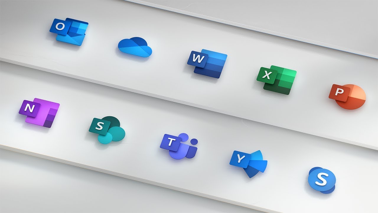
Microsoft today announced it is giving a facelift to its Office icons, bringing them into the modern era as Office continues to transform into a more collaborative suite. The new icons for Office 365 have been designed to embrace the history of Office while giving them a "bolder, lighter and friendlier" look.

Office icons updated with modernized design, rolling out in coming months

Office icons (Image credit: Microsoft)

In announcing the new icons, Microsoft gave a little background on how it approached the design process:

We wanted a visual language that emotionally resonates across generations, works across platforms and devices, and echoes the kinetic nature of productivity today.Our design solution was to decouple the letter and the symbol in the icons, essentially creating two panels (one for the letter and one for the symbol) that we can pair or separate. This allows us to maintain familiarity while still emphasizing simplicity inside the app.

Each icon, Microsoft explains, now focuses more on the content produced by each app, rather than a document outline for Word and a spreadsheet outline for Excel, for example. The icons have also switched up the letter-to-symbol ration, giving two-thirds of the space to the symbol and one-third to the letter. This shift was made to "[speak] more to people's creations," Microsoft says.

The new icons are set to roll out across all platforms in the coming months. You'll start seeing them on mobile and the web first, with other platforms to follow.

News of the updated icons also comes as Microsoft has pushed out a minor update to its Office Mobile apps on Windows 10, bringing a new radial color picker that was first spotted in testing in September.

Dan Thorp-Lancaster

Dan Thorp-Lancaster is the former Editor-in-Chief of Windows Central. He began working with Windows Central, Android Central, and iMore as a news writer in 2014 and is obsessed with tech of all sorts. You can follow Dan on Twitter @DthorpL and Instagram @heyitsdtl

21 Comments
  • Pay attention to the video at 0:40 onwards!
  • new icons everywhere.. mail, calculator, News, file explorer
  • I don't have high hopes for icon changes. It's a concept video, to make the video look good. They surely can't use the current icons in the video, since it's an ugly mess.
  • At least the icons got color and not some ugly wire frame one.
  • I'm doubting that windows will even get new icons anytime soon. It's a render cgi concept video to promote new office icons. These "new" icons might just be made for this video and may not be coming to windows.
  • Jon Friedman has confirmed that they're working on all icons: https://medium.com/@designjon/hey-matt-stay-tuned-this-is-the-beginning-...
  • Stop being so negative. It will come.
  • and so will I
  • Good to see they actually focused on the start menu for abit. I'm curious about the end of the video is that graph paper or a graphene tablet?
  • I don't know... I liked the flatter look but I I'm open to these. I usually like when things get a new look so they'll probably grow on me.
  • I like this new look and I think I like it more but I am fine with the current look too.
  • They're not bad, but the Outlook one could be simplified a bit.
  • "Modernized design". Retro is more like it. They're going back to that ugly candyland approach of much older Windows versions. And it looks horrible.
  • to me they look like they're made for Android, i liked most of the previous ones (2007, 10, 13)
  • Months to rollout icons?
    That's ridiculous, no wonder they haven't been updated in 5 years.
  • In the video, we can see a few other icons soon to be updated too. 🙂
  • I really like a lot of these icons. If I was going to complain though, I think the sleeve on the mail icon looks out of place, the Outlook icon could be a little more simplified, and the OneDrive icon having an "X" to separate color seems unappealing. The OneDrive icon could just use the two shades of blue with the a separating curve to outline the different clouds.
  • Right without the letters as queues i would not have been able to identify what those icons where supposed to be. Also simpler and more powerful is mutually exclusive goals.
  • Icons may seem like a small thing, but it's the little things that often matter most. And these new icons scream... productivity.
  • Wow, the deckchairs really looked good in that new arrangement, until they all slid to one side! And, what's that catchy tune the band is playing?
  • Hmmm … I initially had the same idea.
    On second thought, I think the icons are OK, maybe even nice, but just not very important to me. The Video is like MS running around yelling "Eureka!" My reaction is "duh ..."
    Office is pretty mature; we are more likely to see refinments like these icons, than major new functionality or usability. There is a significant group of consumers that highly value the aesthetics of apps. As long as the new form does not lessen functionality I approve. Also, I have to think that these icons are not a huge effort that significantly cannibalizes Office development. The analogy fails in that Office is not an impending disaster. BTW - that tune is "Nearer my God to Thee."