OneDrive for Android gets fresh coat of paint, ditches hamburger menu

OneDrive on Android
OneDrive on Android (Image credit: Windows Central)

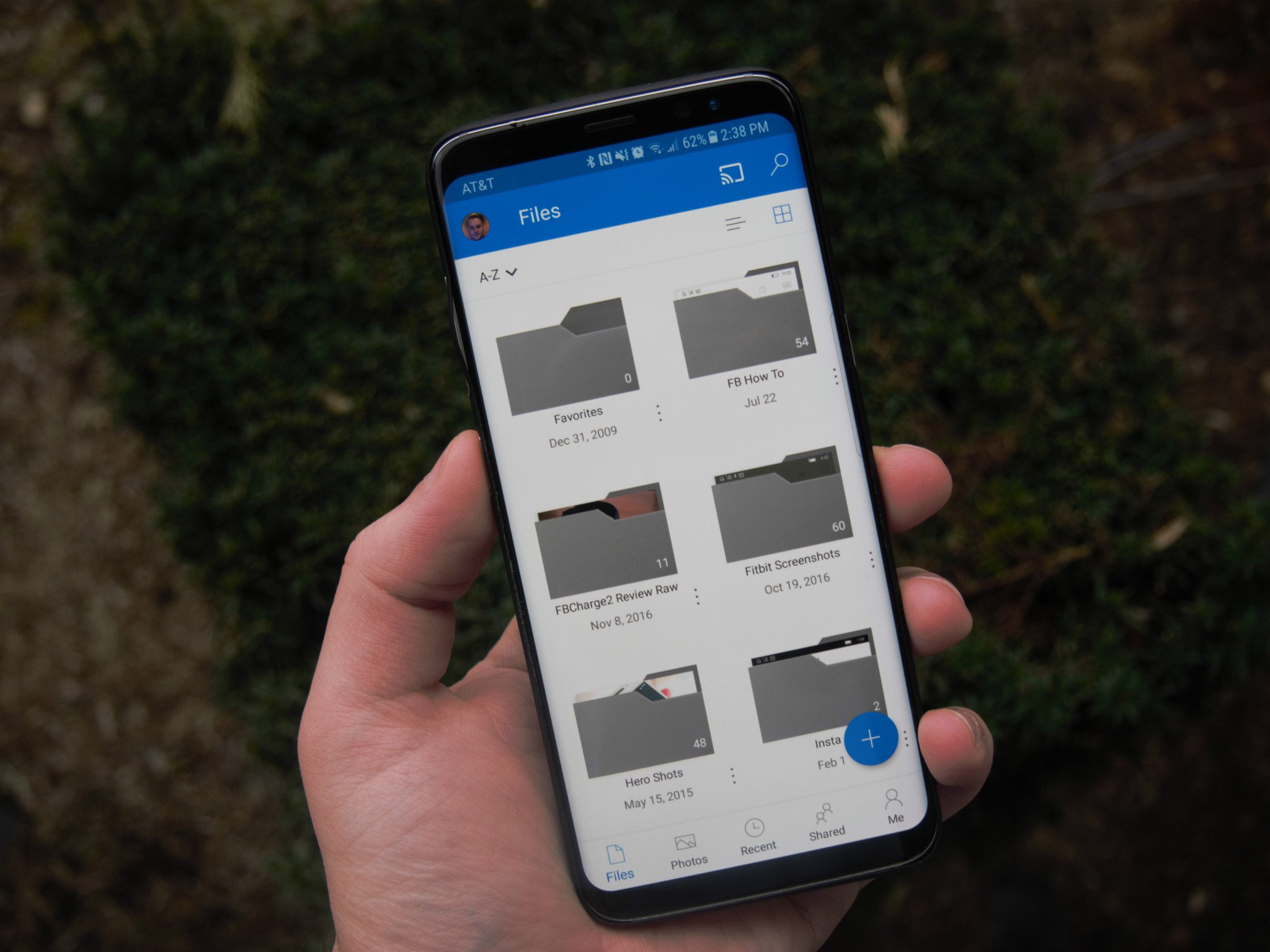
An update to Microsoft's OneDrive app for Android is rolling out, bringing along a fresh coat of paint. While the app still touts OneDrive's signature blue-and-white color scheme, Microsoft has changed up how you navigate your files by ditching the hamburger menu.

In place of the hamburger menu, you can now get around OneDrive using a set of category tabs at the bottom of the screen. The app defaults to a view of your files, but the tabbed navigation bar allows you to switch to Photos, Recent, and Shared sections as well. A new "Me" section is also available, acting as a location to see your OneDrive plan, how much storage you're using, app settings, and more. Here's a look at the full, official release notes for this update:

  • A brand new look and feel! We've updated the look of the app to help you be more productive
  • Get access to your Shared, Recent, and Sites content faster than ever with our new tab bar navigation
  • Check up on Notifications, your Offline content and Account info in the all new Me view

Though it doesn't represent a major overhaul, the update does make OneDrive look a touch more modern and potentially simpler to navigate. If OneDrive is one of your cloud storage apps of choice, you can grab the new look by updating from the Google Play Store now.

See at Google Play (opens in new tab)

Dan Thorp-Lancaster

Dan Thorp-Lancaster is the former Editor-in-Chief of Windows Central. He began working with Windows Central, Android Central, and iMore as a news writer in 2014 and is obsessed with tech of all sorts. You can follow Dan on Twitter @DthorpL and Instagram @heyitsdtl

35 Comments
  • It looks way better to me now. I like the "peek" of a picture in folders along with being able to see when something was uploaded without opening it.
  • They are removing the Microsoft hamburger woot! Just messing!
  • Why don't you delete this article and post it on android central . Cheers.
  • It's here so when you get your Android phone you'll know what to do with it.
  • What? But there was no mention of a catapult?
  • They already posted it on AC
  • Because it's Microsoft news.
  • I wasn't aware the site is named Microsoft Central now. Maybe I should be complaining about the lack of coverage of Windows Server 2016, Azure enterprise services, and MS SQL?  
  • Shut. Up.
  • It does need to change the name to Microsoft Central. It started out as Windows Phone Central, it was then changed to Windows Central, but the stated goals of the site now state that the focus of coverage is on all things Microsoft.
  • As someone who has very little interest in Android generally, I don't see much reason to go to Android Central. However, as someone who used OneDrive on Android, as an extension to my Windows experience, it is quite relevant for it to me feature on this site. Also, as others mentioned, it was also reported on Android Central.
  • Umm...it's a Microsoft product
  • OneDrive still is a Microsoft product. Don't like the article? Don't read it. #kthxbye
  • Wait a minute...
  • Yay for buttons being back where they belong to.
  • My first thought. The swap to the hamburger was boneheaded. They were on the way out when they swapped to it. MS is forever playing catch up when they try to follow other people's trends. They should stick to being trend SETTERS.
  • Good to know. The latest update to my 950xl is causing it to freeze regularly. I'm starting to look at Android phones. Sadness
  • OnePlus 5/5T. You wont regret it.
  • Join the club, loving the speed I have with my HTC U11 just wish it was the U11 plus that was announced 3 months after my purchase.
  • You mean they are making their apps look like Windows Phone again?
  • Yup
  • When can we access more than one personal account?
  • Wait, what? The hamburger menu's were put upon us in the early days of Windows Mobile 10... (which didn't go over too well to Windows Phone fans, and now the apps on Android are now removing these crappy menu icons to go with the more suitable tabs? The point to the hamburger was it was supposed to be better as Android and iOS use it, but WP fans objected for the most part because we had a good system in place. Sometimes I just don't get Microsoft, especially in the mobile messfest they have made. Almost like they purposefully sabotaged their own product.
  • No, nothing purposeful here. Just horribly placed intentions and shortsightedness. There are some visionaries working at Microsoft, and then there are those who lack imagination and end up behind the curve.
  • Maybe not purposeful, but it couldn't have been any worse if they were deliberately sabotaging it.
  • Exactly my point!!
  • But wasn't hamburger menus the future, weren't we doing it to look more like them?
  • Can we ditch the hamburguer menu in the Windows Central app already?
  • I like hamburger menus because it's a UI standard that applies on all operating systems. o 3 o
    Whatever, I guess now instead of simply pressing the button at the top left or sliding the menu out, I now have to curl up my fingers down at the bottom of the screen where it's partially being covered by my hand.
  • Not feelin' it Everything is small now, too much negative space compared to previous version which makes viewing photos sucky. I like some of the new share options though but I'd rather have the old view ... At least the the content itself
  • This looks a lot like the interface on iOS. Helping friends with it was annoying, because I was used to the Android one, but I guess it's fine now that I understand it.
  • Curious about something. Is there any easy way to scroll to a certain date in the photos part of this app? When I go look at my photos and I'm flicking up on the screen to scroll through them, a scroll bar never shows up on the right for me to "grab", and there doesn't seem to be a way to simply jump to a year, or a month to look for pics. Makes using the photos part very hard when you have 1,000's of photos.
  • Not a bad makeover. Although having set 'folder' images, especially for music artists, the fact that the gray folder icon now almost completely blocks the view inside said folder is an unfortunate redesign.
  • I wish they'd allow saving to the SD card.
  • Is anyone else unable to get a home screen shortcut to a specific folder to work on android? When I create a widget shortcut on my Pixel XL homescreen to open a specific folder, instead it opens to the files screen. This worked as expected until this update and it still hasn't been fixed.