Pogue Hates Windows Mobile, Does It Need a UI Overhaul?
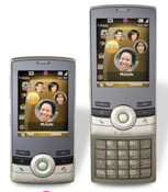
So David Pogue put up a review of the T-Mobile Shadow (Video First Look of the Shadow here) - I'm jealous because the Shadow is the device I'm itching to try out for real once the Smartphone Round Robin is over. He gives the hardware and the specs very high praise, but spends the bulk of his review railing against Windows Mobile.
Frankly, Windows Mobile 6 is a mess. Common features require an infinitude of taps and clicks, and the ones you need most are buried in menus. Apparently the Windows Mobile 6 team learned absolutely nothing from Windows Mobile 1, 2, 3, 4 and 5.
Read: Looks Good, Feels Good, but Wait... - New York Times
I have a few thoughts on this (including a Zuney zany idea!)- read on after the break.
Fair 'nough, I suppose, that Pogue is frustrated by extra dialogs, menus, and wait times. CrackBerry Kevin and iPhone Mike expressed similar complaints in their Round Robin posts. A lot of that is, as Pogue says, the manufacturer “punting” their responsibility to tweak Windows Mobile a bit to match the hardware. But a lot of it is stuff that I might be blind to - I pop up menus to do things and it doesn't often bother me because I have the shortcuts built into my “lizard brain.”
What I mean is that Windows Mobile works for me in large part because I 'grok' it. I encourage other power users to try to 'grok' it too so they can access the incredible functionality squirreled away inside Windows Mobile. With non-power-users, though, I often find myself just suggesting they get something simpler, which is a real downer.
We mentioned that Microsoft is playing around a bit with the interface with the Shadow, and may be playing around with the interface in general for the (unlikely) rumored Windows Mobile 6.1 update. Should they be playing around more?
I'm sure there would be a lot of support for a complete User Interface overhaul of Windows Mobile. In fact, I'd say most people keeping an eye on this space are expecting just such an overhaul from Photon / Windows Mobile 7.
In an IM conversation with our very own Merlyn3D, I had a surprising thought. The Zune isn't doing all that well in the market of MP3 players (and that's not too surprising), but what if Microsoft doesn't care? What if they're using the Zune to build up their “interface chops” and using what few buyers they've gained as secret beta testers? We know that we won't see a “Zune Phone”, but we also know that the Zune and Windows Mobile share the CE Platform underpinnings.
So how about it? If we want to know how Microsoft is going to simplify the User Interface of Windows Mobile in Photon, do we need to look no further than the Zune?
Windows Central Newsletter
Get the best of Windows Central in your inbox, every day!
-
Pogue is simply an idiot. When they mean simplify they mean less options. Options are good, stupid.
Surur -
No, it does not.
"Frankly, Windows Mobile 6 is a mess. Common features require an infinitude of taps and clicks, and the ones you need most are buried in menus. Apparently the Windows Mobile 6 team learned absolutely nothing from Windows Mobile 1, 2, 3, 4 and 5."
If you don't understand that it is time for MS to re-evaluate the way people interact with their data and phones devices, then I guess perhaps "you just don't get it.". -
Of course it needs an overhaul. Not the OS, just the UI.
It's so obvious even MS knows it, as I stated this morning here:
Hate to toot Apple's horn, but since the iPhone was announced then released it has become a mad dash to the UI finish line. This is a very big time in mobile land!
HTC has released the touch, with its new touch interface. Now MS is rushing PHOTON to the table- so fast that it might keep the Windows Mobile 6 name. And check out the NEW devices coming out. Palm Treo 500v. It has another interface layer on top of wm to improve usability. The Sammy i780 has it too. Rumor is that it was a vodafone request, but I wouldn't be surprised if it was MS as well.
I really shouldn't give Apple too much credit though. Everyone knew for a long time that WM was great, but very clunky to use. If it wasn't Palm OS would have died a long time ago. Microsoft was already working on this, I guess Apple just made them speed it up a little. -
Gold, I know you are Windows Mobile fatigued after "7 years". Why don't you just take your iPhone and wait for Father Jobs to give you cut and paste.
Surur -
Pogue is simply an idiot. When they mean simplify they mean less options. Options are good, stupid.
Surur
That's pretty harsh.....I wouldn't say that. Actually....I like Pogue's reviews despite the zani-ness or cheesy-ness. His ideas on products tend to be in line with my own. The fact is that I think you're looking through Windows Mobile through expert eyes. If you were anyone else looking for a platform, you might realize that the one real part of windows mobile that utterly sucks (compared to everything else out there) is the UI. It's saving grace is the functionality it can bring to a device.
David Pogue seems to know this as he tries to look at a device through "generic consumer" eyes. He's not aiming for you or me, but rather the people who are not WM experts, or pros, and would be utterly confused at how to operate a WM6 phone out of the box. Why do you think PalmOS, despite its age and limitations, is still a somewhat viable platform for devices today?
Now someone like you or me might be used to it. It's easy to hit start, then a letter for an app in that menu, or know that you have to go into settings then memory to kill an app. None of that negates the fact that the UI on windows mobile seems to be an evolution over years of one original terrible UI. Why do you think something like Spb's Mobile Shell can actually sell?
And yes, options are good...but you can get similar configurability and options on a PalmOS device with a fundamentally better UI. That means that it's definitely possible, but MS has never been great at UI's. Plus, regular users aren't as concerned with options, they just want to know that they can learn to use the phone.
Anyway, my point is that Pogue can sometimes get things wrong, but I haven't seen that happen often. In this regard, though, he's right, and I wouldn't recommend WM devices to those who I didn't think could handle maneuvering around the UI. I would typically recommend them to a Palm device, or now the iPhone. -
More options are good? Sounds like you've been tweaking your registry a bit too much...
-
Using the iPhone isn't really simple. Yes, you can use an activated phone to do some quick web lookups pretty easily. Activating it though? Making calls and sending texts still require quite a few clicks. Finding a contact to send an email or text to is ridiculous! There was a great comparison of clicks needed to do common tasks recently...
-
The phone different editor said this well.It makes me sad, but copying feature phone UIs might actually be a smart move for now. Feature phone UIs, though tortured, are what 90% of North American mobile phone users are familiar with (insert your own obligatory 90% Windows users joke here). Everyone is familiar with feature phone user interfaces. There are bunches of indistinguishable icons, plenty of carrier-branded apps that interfere visually with platform apps, buried settings, and plenty of themes to choose from.
WM Standard is very similar to my daughter's Razr. Guess what - the Razr has a spinning hour glass, and delete is also not the first option when you receive a text message, and unlike WM Standard you cant open an app in the app list by pressing the corresponding number key on the key pad.
In fact its very similar to most phones. These complaints are getting tiring, and just seems to be complaining for the sake of complaining. He did not even say a single bit about the Neo interface.
Surur -
I agree with Pogue on almost all points. I had the same exact thought about MS learning from the mistakes of prior releases.
I was so excited when I first got to play with WM6, then I used it and walked away weeping. -
At the risk of enduring Surur's wrath ;-) I have to also side a bit here with Pogue. The funny thing about Pogue's comments is how consistent they are with all new comers to WM, especially from Palm OS.
I'm fine with WM and the screens and even the wait cursor are all things you adjust to after a week or two, it's not a huge deal--until you use something different or better.
But the UI is clunky. The Standard edition "Start menu" is absolutely horrible, which is why I think the MS/Voda menu system looks real nice. But there are too many clicks to do some simple tasks. What I think Surur means though is that there are also 9000 + 1 ways to change that and make it much easier. You can customize to high heaven. OTOH, not everyone wants to do that. A friend who is in IT just picked up the Mogul on my recommendation (why would someone in IT not want such a device?). But as he mentions, he's spending a lot more time playing with it, customizing it and tweaking it than he had planned (he's coming from a flip phone) and he's not sure if he's okay with that. I can't say I blame him. WM devices can be a hobby (hello ppcgeeks!) but not everyone wants that in a smartphone.
Most average flip phone users that check out my WM Pro phones all feel they are too overwhelming (and these are people all under 28 + computer savvy). Of course the devices really aren't, but it's the look that throws people off.
Designing a UI is certainly not easy and I agree that the iPhone method is not the way either (rows of icons). I hope MS does something nice with Photon, but I won't hold my breath, but at least the 3rd parties are making $$ off of these overlooked issues.
Things like Neo and HTC's plugins are nice, but they are truly superficial--pretty wrapping over an clunky UI. It just kind of sucks to have to run another layer on top of the OS to make it more usable or consumer friendly. It's the same reason I generally hate skinning programs. It certainly helps though, but the real solution is to take those types of UIs and go further and deeper, overhauling the entire system.
The trade off though is this: WM is still the most powerful mobile OS around and will be for awhile. If you actually need what it can do, then these issues are not that important. Analogous to how real computer nerds prefer command line over fluffy GUIs. -
I agree with Pogue on almost all points. I had the same exact thought about MS learning from the mistakes of prior releases.
I was so excited when I first got to play with WM6, then I used it and walked away weeping.
Another iPhone owner....
Surur -
But most average flip phone users that check out my WM Pro phones all feel they are too overwhelming (and these are people all under 28). Of course the devices really aren't, but it's the look that throws people off.
Except the Shadow is a WM Standard phone, and no more complex than a Razr.
Here's he's nonsense about the UI. He does not mention the new interface ONCE. Its all a litany of nitpicking.But then you turn the thing on.
Unfortunately, after they did such a great job designing the hardware, T-Mobile?s chief executive and his ex-Apple designer punted on the software. They equipped this phone with Microsoft?s Windows Mobile 6. As it turns out, that decision is just as much an impediment to the Shadow?s greatness as AT&T exclusivity is to the iPhone.
Frankly, Windows Mobile 6 is a mess. Common features require an infinitude of taps and clicks, and the ones you need most are buried in menus. Apparently the Windows Mobile 6 team learned absolutely nothing from Windows Mobile 1, 2, 3, 4 and 5.
And lest you think I don?t have Microsoft?s best interests at heart, here?s a list of helpful suggestions. At no charge.
First of all, a cellphone should not display a ?wait? cursor. Ever. And definitely not almost every time you change screens, as on the Shadow.
If your Web browser can?t play Flash videos, it should just say so. It should not say, ?Make sure the path and file name are correct and that all the required libraries are available.? (Insert your own joke here about double-checking the local public library?s operating hours.)
When you?re finished looking at a text message, you should not have to open a menu to find the Delete command. When you?re on a phone call, you should not have to open a menu to find the Speakerphone command. When you take a picture, you should not have to open a menu to find Send and Delete.
A cellphone should not have a Task Manager. You should never have to worry about quitting programs because you?ve used up too much memory.
A cellphone should auto-format phone numbers with parentheses and hyphens when you enter them in the address book. When the cursor is in a number box, like ZIP code, the keyboard should automatically start typing numbers. The owner should not have to press the alternate-symbols key.
If the phone has a navigation wheel, the big, clickable center button should always mean ?O.K.? Always. It should never do nothing, even when there?s an O.K. label over one of the tiny softkeys.
When you?re assigning a contact to one of the five ?My Faves? slots, a T-Mobile calling plan that gives you unlimited calls to your five favorite numbers, three confirmation screens is two too many.
If it takes four presses on the More button just to see everything in the Start menu ? and you provide no direct way to get to the first page from the last ? you need to redesign.
A locking feature, which prevents the buttons from being pushed accidentally in a purse or pocket, is nice. But it should be optional. And one button press should suffice to unlock it; two in sequence is just annoying.
Now, there are certainly advantages to having Microsoft inside your phone. For example, this phone can open and edit (but not create) Microsoft Office documents. And it uses ActiveSync on a Windows PC, meaning that your phone is always up to date with your Outlook calendar and address book.
But over all, it?s a shame that such bloated, baffling software runs a phone whose hardware is so close to perfect. (The only hardware disappointment is that scroll wheel, which is balky and slow to respond. T-Mobile agrees, and has a fix planned for the next batch.)
So T-Mobile?s news release, it turns out, was half right. The Shadow does maintain ?all the powerful calling, messaging and picture sharing capabilities people crave.? Unfortunately, it doesn?t ?significantly reduce the complexity often associated with many feature-rich devices.? -
Except the Shadow is a WM Standard phone, and no more complex than a Razr.
Here's he's nonsense about the UI. He does not mention the new interface ONCE. Its all a litany of nitpicking.
lol, he's really got you fired up, eh?
True, the Moto Q was an easier sell to people as it's more "phone-ish" and I think Standard makes a good intro device. Just wish it were touchscreen to make it even easier.
I don't know why he didn't mention Neo. Maybe he didn't care for it or he thought it was not enough. But some of his complaints, like the wait cursor, delete, filling in numbers, memory management, etc. won't be affected by discussing Neo. -
But some of his complaints, like the wait cursor, delete, filling in numbers, memory management, etc. won't be affected by discussing Neo.
... and those things are also the same as in a Razr. For the target market (Razr users) its not even worth discussing.
Surur -
... and those things are also the same as in a Razr. For the target market (Razr users) its not even worth discussing.
Surur
True.
But I could also say that those are still bad or annoying. Just because the Razr does those things I'm not sure WM should too. I think they are legitimate complaints and things that a lot of WM uses would be happy to get ditch.
If you asked people: would you like WM fast enough so that you don't see a wait cursor? I think most would say hell yeah. The problem today is to solve that problem it is usually done via hardware = faster CPU = less battery and that is not a fun trade off either. (then again, the Shadow is using a 201mhz processor--that is pretty slow).
So just because other devices have poor UIs or clunky functionality does not really give WM a pass here. -
So just because other devices have poor UIs or clunky functionality does not really give WM a pass here.
Except I still have to hear of Pogue's crusade against the Razr. Also, unless you get loads of text spam, using one of your precious softkeys for delete is just madness. When you are viewing a text in WM standard the default is Reply and Menu.On the Razr its also Reply, Menu and Back (WM Std has a fixed Back key). These seems pretty sensible defaults for both devices. In fact most people prefer to keep their text messages. Did Pogue even complain that in the iPhone you could not delete single text messages, but had to delete the whole conversation? Or that the SMS mailbox was very small? Yet he complains about this little nitpick?
Formatting numbers with brackets? This is just a bizarre complaint. Who cares about brackets? I did not hear a groundswell of demand for this. Is this another piece of iPhone eye candy which is now suddenly essential for any phone that wants to be called a smartphone?
He takes offense to the device even having a task manager. Thats just crazy. The phone has 128 MB RAM, its virtually guaranteed users will never run out of memory. Yet he rants about it.
Pogue never has anything good to day about WM. This is just another example.
Edit (actually googling around, he hates the Razr's software. Maybe thats his problem. Did not stop more than 50 million people buying and using the phones every day, did it?)
Surur -
Here Mat Miller from the ZDNet blog does a point by point rebuttal of Pogue's criticism. Pity so many less people will read it.http://blogs.zdnet.com/mobile-gadgeteer/?p=679
Surur -
Another iPhone owner....
Surur
Of course. I've tried dozens and dozens of smartphones. Heck, I write for a technology blog where I talk about them. When I find a WM device better than the iPhone I'll move to it. If the Google platform is better I'll move to that. Symbian, same thing. Don't assume for one moment that because I use the iPhone platform that:
a) I don't use it for business. In fact I went with the iPhone so I could streamline my e-mail and business (I get well over 500 valid e-mail messages every workday, so I need an e-mail workflow that's very powerful and as much as the WM zealots claim that WM e-mail is better than the iPhone, with the exception of deleting they are dead wrong IMO.)
b) That I have never used WM devices. Here's an old photo of just my Treo collection alone: http://www.flickr.com/photos/benjaminhigginbotham/449650256/ and that's not even up to date (I'll try and get a newer one and post that, it's much cooler now). I have a similar HTC collection as well as RIM and Nokia collection. The Treos are out because we're doing a video profile on them, but given enough time I can dig up all my old devices (and probably their original boxes too). Oh man, now I want to find them all, what an awesome picture that would make. Could be a blog post with no text, just the picture.
So yeah, I've used WM6 and 5... Oh hell I remember when I had the Philips Nino (and there was a smaller one too... Not the Nino but a... something). been there done that, isn't all it's cracked up to be.
I'm not against MS or WM, I just don't think it's a good product today when compared to the rest of the marketplace. It's not awful, but it's also not the best. All MS has to do to sway me is create a more compelling product. I'm easy. Build it better and I'll buy it. The device to beat right now is the iPhone. Simple. -
Of course. I've tried dozens and dozens of smartphones. Heck, I write for a technology blog where I talk about them. When I find a WM device better than the iPhone I'll move to it. If the Google platform is better I'll move to that. Symbian, same thing. Don't assume for one moment that because I use the iPhone platform that:
a) I don't use it for business. In fact I went with the iPhone so I could streamline my e-mail and business (I get well over 500 valid e-mail messages every workday, so I need an e-mail workflow that's very powerful and as much as the WM zealots claim that WM e-mail is better than the iPhone, with the exception of deleting they are dead wrong IMO.)
b) That I have never used WM devices. Here's an old photo of just my Treo collection alone: http://www.flickr.com/photos/benjaminhigginbotham/449650256/ and that's not even up to date (I'll try and get a newer one and post that, it's much cooler now). I have a similar HTC collection as well as RIM and Nokia collection. The Treos are out because we're doing a video profile on them, but given enough time I can dig up all my old devices (and probably their original boxes too). Oh man, now I want to find them all, what an awesome picture that would make. Could be a blog post with no text, just the picture.
So yeah, I've used WM6 and 5... Oh hell I remember when I had the Philips Nino (and there was a smaller one too... Not the Nino but a... something). been there done that, isn't all it's cracked up to be.
I'm not against MS or WM, I just don't think it's a good product today when compared to the rest of the marketplace. It's not awful, but it's also not the best. All MS has to do to sway me is create a more compelling product. I'm easy. Build it better and I'll buy it. The device to beat right now is the iPhone. Simple.
Another iPhone owner....
Surur -
Another iPhone owner....
Surur
You better believe it! And lovin' every minute of it. WM just didn't cut it, so yeah, another WM user that jumped ship.
By the way, updated my Flickr feed with more Treo collection photos. It's too big, I'll need to get a better place to stage these, but it's cool looking nonetheless. My favorite: The Handspring Visor with the Springboard phone. THAT'S going back a ways! - http://www.flickr.com/photos/benjaminhigginbotham -
You better believe it! And lovin' every minute of it. WM just didn't cut it, so yeah, another WM user that jumped ship
And to be sure there will be more where that came from once the 3rd party apps start coming down the pike. Throw 3g into a second gen iPhone and we all might be using one (myself included)! -
Here Mat Miller from the ZDNet blog does a point by point rebuttal of Pogue's criticism. Pity so many less people will read it.http://blogs.zdnet.com/mobile-gadgeteer/?p=679
Surur
I'm not sure where this thread has ended up, but are saying that WM does NOT need an overhaul? Even Microsoft disagrees with you if that's the case.
I am an iPhone owner (which you might already know) and a WM user also. If the iPhone had MMS, Slingbox, and 3G I would say I love it, but thats not the case so for now I "really like it a lot" LOL -
I'm not sure where this thread has ended up, but are saying that WM does NOT need an overhaul? Even Microsoft disagrees with you if that's the case.
I am an iPhone owner (which you might already know) and a WM user also. If the iPhone had MMS, Slingbox, and 3G I would say I love it, but thats not the case so for now I "really like it a lot" LOL
Sorry, I cant argue with people who value style over substance. Isn't that how most of America's politicians get elected?
Surur -
Sorry, I cant argue with people who value style over substance. Isn't that how most of America's politicians get elected?
Surur
LOL It sure is!
Saying "I like the iPhone UI better" is not saying "I like the iPhone better," although they usually do coincide w/each other. Matter of fact, this thread has nothing to do with the iPhone, really.
"WM is too clunky" has been stated for YEARS, and originated when compared to Palm OS. Predominantly when the 700w came out, because it had a lot of Treo 650 migrants at the time.
The only difference now is that Palm OS was always inferior to WM, but when Apple lays out its SDK then its almost an even playing field. -
Sorry, I cant argue with people who value style over substance.
Wow, now that's a well thought out and insightful statement. (Shakes head). -
Wow, now that's a well thought out and insightful statement. (Shakes head).
Surur -
Surur
You choose to reply to THAT instead of my thoughtful, insightful, delightful, and downright factual post!!!
So much for substance over style.... :D :D -
I chose to add him to my ignore list. Your thoughtful reply obviously stands all by itself.
Surur -
I moved to WM long ago because it provided the functionality and features I needed to meet the demands of my job. And I received a lot of slack from many in the TreoCentral community because I dumped Palm for.....oh my...:eek: ..the enemy......the ugly, tap intensive, mandatory stylus driven, bloated Windows Mobile.
Now after several years with WM, with lots of exposure to other OS on a regular basis, I still do feel that it is the most powerful OS option currently available. It gives the most freedom of customizing and tweaking (and I will agree that many of these tweaks should not have to be made to begin with). It has a large selection of 3rd party software that probably now trumps any other OS....this claim is just shooting from the hip, I do not really know for sure. It is probably the most feature rich and powerful OS on the market now. But all of this does not mean it is the easiest or the most friendly to use. A factor that cannot be under estimated in the deciding process from an average consumer.
I recoginize, the most useful programs I use and recommend to any WM user deals mostly with UI and making it easier and faster to do what you need to. I look forward to any Touch or iPhone style interface for the most common tasks that would cover nearly 100% of what an average user would do with a phone and about 85 of what even a power user does most of the time. And if the interface is scalable and highly customizable then it could be configured to cover just about anything any level of user will need 99% of the time. And then still offer all the tools under the hood for those who want to look under it and do that much more.
I love the fact that the iPhone is here and offers a nice level of competition in both sales and perception. I think it is great that MS now has just under a year to sweat out the potential of the Google phone. I think it is great that BB still has a strong hold on the professional level of customers. This all adds up to needed advancements in features, power, interface, easy of use, and sex appeal or die in the new dynamics of this continually changing market.
WM certainly needs a major facelift for MS to even think they might have a shot at the non-professional customer who does not know how (or care about how to) use the power under the hood of WM. That iPhone level customer will be wooed every time by the slick polish of a good interface with no second thought of what features or power that maybe compromised. -
It is probably the most feature rich and powerful OS on the market now. But all of this does not mean it is the easiest or the most friendly to use. A factor that cannot be under estimated in the deciding process from an average consumer.
Well said. However, feature-rich and power means nothing if things like alarms don't fire reliably and consistently. Alarms haven't worked reliably since the advent of WM2003. And speaking of reliable, WM still suffers from being unreliable at times you need it most. Last night was a perfect example. While driving a phone call came in and my Treo 750 just locked up and I needed to do a soft reset.
I guarantee you there's not one Windows mobile owner that hasn't experienced this frustration with their device at some point or another. I know too many people who have shared thier "horror" stories with me.
You guys should listen to the latest Mobility Today podcast. My friends Dave and Steve talk about this subject at length with even David Ciccone boycotting WM until changes are made. I am just sorry I could make the podcast at the time they recorded it. -
Well said. However, feature-rich and power means nothing if things like alarms don't fire reliably and consistently. Alarms haven't worked reliably since the advent of WM2003. And speaking of reliable, WM still suffers from being unreliable at times you need it most. Last night was a perfect example. While driving a phone call came in and my Treo 750 just locked up and I needed to do a soft reset. I have a LONG laundry list of what we need to see in WM next major release. My list for Palm OS is just as long, if not longer. My list for BB is significant as well. Most can be fixed or added with 3rd party apps or tweaks in all cases. Alarms is a good case in point. I am sure this issue is on everyone's must fix for next release list. At the same time it is often times totally depending on the individual model of phone, but you usually find a thread for most phones that will resolve this issue most of the time. I guarantee you there's not one Windows mobile owner that hasn't experienced this frustration with their device at some point or another. I know too many people who have shared thier "horror" stories with me. The same could be said for Palm OS as well. My Treo with Palm OS would lock up more than my WM6 does.
Lock ups are not unique to or solely a WM OS issue. In fact over the last two major OS upgrades it has done nothing but has been reduced. Look at the difference between WM02/03 & WM06. It is no way perfect. It is not fully resolved. But it has drastically improved. To be completely honest, with a clean install of WM it very rarely locks up (the same with Palm). A VAST majority of the time the culprit has to with 3rd party apps or a specific glitch or design flaw with a specific model of phone. This is a point that is becoming less of a concern with each new major upgrade in the OS. In fact I have a a large amount of 3rd party apps and major tweaks on my Sprint Mogul with WM6 and after something like 3 months, I have only had two lock ups.
Heck I even experience lock ups with "regular" cell phones as well. Twice in the last month my Fusic just locked up and I had to pop out the battery to start it again. Again showing this is industry wide mobile issue and not a WM unique event.boycotting WM until changes are madeThis is the great thing about a free market. I wonder what their perfect Mobile OS is that is currently available right now that they are using instead? But of course perfection is realitive to one's wants, preferences, and personal & professional needs.
Unfortunately remaining efficient while meeting the demands of my job I have to use the WM because it does the best job at meeting those demands. But as I have said over and over in the past, I have no loyality to WM in any way. If Palm came out with a new updated OS (okay everyone stop laughing) that met my needs better than WM, then I would be waiting outside the Sprint store before they opened to buy it the first day it was released. -
This thread is supposedly about whether WM needs a UI update to make it friendlier to new users. I would say being new user friendly is a good goal, but it would be a shame to do this at the expense of the power of the devices. Obviously the easiest UI for a phone would be to only have one button and no screen, but the side effect would be that it could only call one person and not do anything else.http://ww1.prweb.com/prfiles/2004/12/28/192469/04513a.jpg
Surur -
I would say being new user friendly is a good goal, but it would be a shame to do this at the expense of the power of the devices. That is exactly my point that I fully agree with. Have a good layout that accesses 95% of what must users do on a daily basis while providing accessibility to all the power the OS has to offer for those that need it.
-
That is exactly my point that I fully agree with. Have a good layout that accesses 95% of what must users do on a daily basis while providing accessibility to all the power the OS has to offer for those that need it.
The current supposed champion of user-friendliness has nearly no power at all. I'm not sure you can have your cake and eat it too.
Surur -
I fully agree, that is why I am looking forward for a WM device with the user-friendliness that I feel that is quickly becoming an expectation or standard rather than a feature, without loosing the power that attracts so many power users.
-
I absolutely agree with Pogue. The windows interface was designed for a large screen and a mouse. Cell phones have neither. EVERYTHING on a winmob device takes more work to get to. Multi-tasking is great, but the interface sucks. Unfortunately, MS's idea of an interface upgrade is adding even more confusion. More capabilities is great, but not if they make common, everyday activities harder to use.
On my palm OS device, I can go weeks (months if I don't play any games) without pulling the stylus out of the device. Not possible on Winmob.
Winmob needs a total interface redo, so that common tasks are as easy to accessk, one handed and stylus free, as on a Palm OS device, while the less common tasks are hidden from view behind a menu or tab. Ideally, each user should be able to customize what those common tasks are.So David Pogue put up a review of the T-Mobile Shadow (Video First Look of the Shadow here) - I'm jealous because the Shadow is the device I'm itching to try out for real once the Smartphone Round Robin is over. He gives the hardware and the specs very high praise, but spends the bulk of his review railing against Windows Mobile.
Read: Looks Good, Feels Good, but Wait... - New York Times
I have a few thoughts on this (including a Zuney **zany** idea!)- read on after the break.
Read more at http://www.wmexperts.com/articles/editorials/pogue_hates_windows_mobile_doe.html -
Except the Shadow is a WM Standard phone, and no more complex than a Razr.
Here's he's nonsense about the UI. He does not mention the new interface ONCE. Its all a litany of nitpicking.
What you call nitpicking I call dead-on. One or two of these things might not be a big deal, but the sum-total of WinMob is that everything is more complicated than it needs to be. Can you adapt and get used to all the clicking and tapping? Sure you can. But why should you need to, when it's all so unnecessary?
Microsoft has no CLUE as to how to design a good, small-device interface. (Frankly, I'm not sure they have much of a clue when it comes to large device interfaces either, but that's a different story.) -
... and those things are also the same as in a Razr. For the target market (Razr users) its not even worth discussing.
Surur
I don't recall anyone claiming a Razor was the epitome of user interfaces. When the only praise you can give one bad interface is to say it's no worse than another bad interface, that's faint praise indeed. -
Another iPhone owner....
Surur
Another stupid comment. When one can't refute the argument, just attack the person making it, right? -
Meyerweb,
I agree wholeheartedly with most of your comments. However your assessment of the one handedness is incorrect. The Treo 750 is a model of one handed use. In the 10 months I have owned the device, I kid you not that I can count on two hands the number of times I used my stylus. Some of those time I was actually tired of using the d-pad and such too! Couple the Treo's one handed ability with some strategic (and useful) apps like Pocket Plus and SBSH's Pocketbreeze and you have yourself a one handed device that matches any Palm device. -
I absolutely agree with Pogue. The windows interface was designed for a large screen and a mouse. Cell phones have neither. EVERYTHING on a winmob device takes more work to get to. Multi-tasking is great, but the interface sucks. Unfortunately, MS's idea of an interface upgrade is adding even more confusion. More capabilities is great, but not if they make common, everyday activities harder to use.
On my palm OS device, I can go weeks (months if I don't play any games) without pulling the stylus out of the device. Not possible on Winmob.
Winmob needs a total interface redo, so that common tasks are as easy to accessk, one handed and stylus free, as on a Palm OS device, while the less common tasks are hidden from view behind a menu or tab. Ideally, each user should be able to customize what those common tasks are.
Can you actually give examples of these complex inaccessible common tasks? And are you forgetting that WM Standard does not even have a touch screen?
Surur -
Can you actually give examples of these complex inaccessible common tasks? And are you forgetting that WM Standard does not even have a touch screen?
Surur
There is only one and that was fixed in AKU 2.5+ (i.e. way before WM6) and that was switching folders in your inbox.
Other than that, I have no idea what he is talking about :rolleyes:. He sounds like a WM-crank from 2004--next we'll hear how WM crashes 'all the time' and the 'thousands of bugs'. Even in Palm OS, sometimes busting out the stylus is preferential since having to hit the Menu key, then 3 clicks over and 4 clicks down to get to one menu option is not nearly as fast as the 3 taps on a stylus. Same with hit a weblink: if you have 20 links on 1 page, you can either side-scroll through all the way down to get to say, #19 or you can just click #19 with a stylus.
The solution for WM in the future is this: when you setup the device for the 1st time, offer a two formats: one for consumer, one for business users. Then offer a basic and advanced after those.
That way you hide a lot of stuff for people who don't need it, yet maintain all the function for those that do. :thumbsup: -
The solution for WM in the future is this: when you setup the device for the 1st time, offer a two formats: one for consumer, one for business users. Then offer a basic and advanced after those.
That way you hide a lot of stuff for people who don't need it, yet maintain all the function for those that do. :thumbsup:
Agreed, but I think MS thought the did this by offering a WM Standard and WM Professional version.
HTC has done some work to make WM Pro more accessible, and the HTC Home today plug-in is a good example. With the plug-in you have access to commonly used, hard to reach settings like alarms, ring tones and profiles, but it did this without having to re-write the whole GUI.
Surur -
I dont normally drag my kids into forum arguments, but as the issue is the intuitiveness and ease of use of WM, I decided to see for myself how bad it really is. My daughter is 10 years old, and has a passing familiarity with WM devices (the 10 lying around the house has helped with this) but her main phone is a pink Razr.
I gave her my Kaiser and asked to do a few tasks. First I asked her to make a phone call. She opened the dialer by pressing the phone button, hit the contacts soft key, had some trouble by accidentally entering a record, but eventually figured out the OK key went backward. She intuitively understood the box on top was a search box. She entered the location by sliding open the keyboard (I asked her to phone home), typed in home, opened up the contact, selected the number and pressed the phone key. Task accomplished. Now I would have done it with many less steps, but she was never really lost or needed any help.
Next I asked her to send a text message. She initially fiddled around with the menus, but when I told her that on this phone you select the person first, and then the action, she was rapidly able to open up the contact app again, use the search box as before to find the contact, select it, select text message, press the soft key and was transferred to the SMS app, where she entered the subject, text with the keyboard, and pressed the send button. Task accomplished.
Next I asked her to do a google search. I had removed IE from my start menu, and it was interesting that she never went looking for it under the programs menu. I then told her I has a button set to IE (on my Vario it has the uninformative web and walk logo). She pressed it, it opened up in the address bar. She typed in www.google.com easily with the keyboard, easily going from portrait to landscape, and was searching google. (She can type much faster than my on the Kaiser keyboard BTW, probably partly because her fingers are smaller, but mainly because they do touch typing in school these days).
Next I asked her to change the ring tone, which she was able to do easily using the HTC Home plug-in, although it was not immediately clear to her that the area where it names the current ring tone was also the area where you tapped to change it, but she discovered this after a short period of tapping around. Next I asked her to play a song, which she was again easily able to do, as the HTC Home app has a plug-in which opens the music app. She was easily able to navigate the HTC Audio Manager and find a Weird Al song to play.
Then I asked her to take a picture. It took her a second to realize the only way to access this function was to press the camera hardware button, but as soon as she realized this she was up and going. Then I asked to to take a picture and e-mail it, and she was again easily able to do this, as she recognized the e-mail icon that appeared as a choice after you take a picture. The only issue was the screen which popped up asking her which of the 3 email accounts on the device to use to send the picture. She was able to enter the email address, subject, text and press the send key without any confusion.
I had run out of hoops for her to jump through, but it was clear to me the the UI is usable.
Now what was also clear was the iPhone like app/task based UI would have been simpler, and that people expect only one layer of apps, vs entering sub-menus, like Start>Programs etc. However the flip side of that is anyone who spends some time going beyond superficial use would be much more efficient with the current UI (plus some enhancements of course, like the aforementioned HTC Home).
Also clear is that the built-in apps can be improved a lot, such as Media Player, Picture viewer and Internet Explorer, but these have nothing to do with the UI itself.
If we look at this post from Macrumours we can see the competition does not have it completely right also.What surprises is me is that I can easily see myself recommending the iPhone to less tech savy people (i.e. retired parents) because it is so clear and simple, as well as the people who love gadgets.
Not really.. try handing the phone to someone who's not used one and get them to send a text. I did this yesterday.
1. He pressed 'SMS' - do far so good.
2. Screen comes up blank. He looks confused, hands phone back to me. I know that the text screen takes 10-15 seconds to come up fully but for a new user it's confusing. Hand it back to him.
3. He still doesn't know what to do. 'New message' icon is *not* clear.. it needs to be bigger and more obvious. I had to point it out to him.
4. Message comes up but *keypad is in alphabetic mode* (BUG I think - it makes no sense.. should be the phone keypad). By this time he's really frustrated and gives up.
Maybe I picked the worst app... I'm fairly convinced the SMS app was released to a deadline so is half finished anyway. OTOH I wouldn't even consider giving such a phone to my mother for example. http://forums.macrumors.com/showpost.php?p=4477095&postcount=8
Anyway, I dont know about grannies, but all I can say is that WM is safe to give to motivated and intelligent 10 year olds.
Surur -
[list]
[*]...when I told her that on this phone you select the person first, and then the action...
[*]...I then told her I has a button set to IE...
[/list]
I dunno, those 2 sound like usability failures to me. You'll not hear me say that the iPhone is perfect, but there *are* youtube videos of babies flicking and tapping across the UI.
WM is powerful but arcane, it has a strong learning curve and is often unfriendly with stock settings, buried menus, and it's pretty stylus-intensive. (and, as it ships, pretty finger hostile as well). Hardware integrators shouldn't have to spend time on the UI and bundling, it's not what they're good at. It's what Microsoft is supposed to be good at, and that's why I look forward to photon. -
[list]
[*]...when I told her that on this phone you select the person first, and then the action...
[*]...I then told her I has a button set to IE...
[/list]
No doubt WM is not designed to be learned but to be used. As demonstrated, the learning curve it not that steep for common actions however.
Surur -
There is an old saying which goes "Better be thought a fool than open your mouth and confirm it."
David Pogue has long been slamming Windows Mobile devices to the New York Times readership, but in his recent review of the T-Mobile Shadow he laid it on so thickly that his bias was completely exposed. This resulted in a minor backlash from other sites that have reviewed the device more favorably, notably Matt Miller's site at the ZDNET Blog. In his 18 item point by point refutation he showed exactly how sloppy Pogue's review was. This kind of rebuttal post is not unusual. What was unusual was David Pogue actually showing up in the ZDNET comments section trying to reinforce his case - and failing pathetically and publicly e.g.4.1. Why pick on the unlock process - 11/09/07
I agree with you Steve. Even the iPhone has a two part process to unlock it (button press and finger slide) so why should the Shadow or Windows Mobile 6 be held to a different standard? I personally want two button integrity and I am sure the people that I have called at 5 in the morning while I am getting ready for work now appreciate the lack of calls now too.Reply4.1.1. iPhone - 11/09/07
I DON'T hold the iPhone to s different standard. I find ITS 2-step unlock process excessive, too. And I criticized it in my review, exactly the same way. (Actually, it's even worse--it takes up to SIX STEPS to make a phone call, starting from sleep mode...) --Pogue
Originally posted by David Pogue Reply4.2. button presses - 11/09/07
What all of this boils down to is this: Some people don't care about extra steps. Windows Mobile people, like Windows people, have never cared about elegance or simplicity or streamlining of steps--and that is a TOTALLY LEGITIMATE stance. You get more excited about the length of the feature list--and no question, Microsoft's feature list is always longest--and this, too, is a totally legitimate opinion. But as a reviewer for non-technical people, I don't think you're in the majority. I will take elegance and simplicity over feature-list length every time! Some theater critics may love Sondheim, some food critics may love Daniel Bouloud--me, I love simplicity and elegance, whether it comes from Google or RIM or, yes, even Microsoft. As for your note about the 2-button press unlock: Remember, we're talking about a phone that, when its slider is closed in your pocket, has NO BUTTONS EXPOSED AT ALL. (OK, volume, but that's not going to make a phone call in your pocket if it gets struck by a pen or a dime.) So yes--2 button presses is excessive! --PogueReply4.2.1. The Call button is exposed... - 11/09/07
and pressing in on this will call the last caller you talked to on your phone. The directional pad is exposed too so if the Send button was pressed and the directional pad rubbed up against something you could call anyone in your most recently called list inadvertently. I still think the Shadow does bring simplicity and "fun" to Windows Mobile. I can do most everything right from the new Neo Home screen thanks to the plug-ins. As a mobile geek I would love to customize these even more, but think your standard consumer will be just fine hanging just within the Home screen.Reply4.2.2. NO BUTTONS EXPOSED AT ALL - 11/12/07
We're talking about the T-Mobile Shadow, right? You see that there are 6 buttons, a D-pad, and scroll wheel on the front, two buttons on the right side, and volume control buttons on the left side; all accessible while the slider is closed. Initially I had shut off the locking feature on my Shadow (it is optional), but then I decided to re-enable that feature when it started playing Windows Media music while I was in a movie theater. Furthermore, unlocking can be a one-step process on the Shadow; just open the slider! Also, any phone that can multi-task should have a task manager. How else would you be able to tell what applications are currently running?
Its a vain hope that Pogue loses a little bit of credibility from this exchange, as its clear his reviews are patently biased and not based on any real examination of the hardware and software. However I hope he stays a bit longer and exposes his ignorance even more for the rest of us to see. It should be clear to anyone who is considering a smartphone not to take Pogue's reviews seriously.
Surur -
Give him credit for slummin' it in the tech blogs, though, eh? ;)
-
Give him credit for slummin' it in the tech blogs, though, eh? ;)
He must have gotten lost trying to book tickets for the theater.
Surur -
... It is probably the most feature rich and powerful OS on the market now. But all of this does not mean it is the easiest or the most friendly to use. A factor that cannot be under estimated in the deciding process from an average consumer. ...
I love the fact that the iPhone is here and offers a nice level of competition in both sales and perception. I think it is great that MS now has just under a year to sweat out the potential of the Google phone. I think it is great that BB still has a strong hold on the professional level of customers. This all adds up to needed advancements in features, power, interface, easy of use, and sex appeal or die in the new dynamics of this continually changing market. ...
Horses for courses! People have varied tastes, some like buttons to press, some like to touch, some like it [SIZE="1">small[/SIZE], some [SIZE="4">large[/SIZE], that's why the market is full of variety right now and we would be the poorer technologically speaking if there was no competition.
Don't you love the intermingling of all these ideas? That's what makes systems develop, people want more all the time but sometimes people get sidetracked by voyerism!
:censored: [COLOR="Red">[SIZE="1">To me, the iPhone is just for voyeurism. Like..."roll over and show how pretty your butt* is" "roll over again and show...."[/SIZE][/COLOR] :censored:
I am just fed up already of cubes turning, just another gimmick to make my head spin. I want to have info at my fingertips! I wanna press buttons and, as a press them, the OS filters through all my data and give it back to me in a list where I can choose what to do with it. The power of deciding what to do should be up to the user (those users that can decide, that is - for those incapable of deciding, just give them candy).
And I am just a little woman...
Don't take life too seriously!:D
Cheers,*[SIZE="1">[COLOR="Red">Main Entry: butt
Function: noun
Etymology: Middle English; probably akin to Middle English buttok buttock, Low German butt blunt
Date: 15th century
1: buttocks ?often used as a euphemism for *** in idiomatic expressions [/COLOR] [/SIZE] -
Surur wrote: "Sorry, I cant argue with people who value style over substance."
You seem to have confused 'Style' with 'Design.' Style is a property of how something looks. Design is a property of how well something functions as a whole.
Most Microsoft products are unnecessarily complex in relation to the number of features provided. This is usually due to lack of design. Pouge has simply pointed out the that WM suffers from the same problem and could be improved by better design. -
"Also, any phone that can multi-task should have a task manager. How else would you be able to tell what applications are currently running?"
You shouldn't need to worry about which apps are currently running. The OS and applications themselves should transparently manage this for you. If they do not, you have an architectural design problem.
The fact that you see a task manager as a feature is an symptom of one of the underlying issues that has yet to be resolved in previous versions of Windows Mobile. -
You shouldn't need to worry about which apps are currently running. The OS and applications themselves should transparently manage this for you. If they do not, you have an architectural design problem.
If you read the MS WM Team Blog that is exactly what they say.
WM works like this: apps run in the background and when you go to re-launch them, they come up instantly. The system does monitor program memory in the sense that if it reaches a certain low-memory threshold, it will close out programs (based on a priority system).
Task managers are mostly nice to switch between open programs when you are working between them, which is why many people like a pop-up task manger that is easily accessible. No different than using the MS "Start Bar" to click the tabs for programs. Using this method I can switch between 2 or 3 apps with just a tap or two, as opposed to re-launching the Start menu and finding the app again. The MRU list also aids in this action.
I'm not saying it's necessarily the ideal system but I think people sometimes make too much hay out of it. In theory, your device should have enough RAM to not cause any concern, but some devices are shipped with a low amount of usable RAM and this does cause issues, like only being able to run 4 programs in the background as opposed to say 15, with no slow downs.
To put it another way, I'm not yet aware of a necessarily better system for multi-tasking and quick app switching on a mobile device. It's not an easy problem to solve when you have no mouse and limited screen real estate. Something like the iPhone one-button-Home key does not feel very efficient either, but it is hardly complicated. That's what happens when you skirt the issue previously raised when addressing app-switching, but that is hardly an ideal solution either.. Palm OS avoids it by not being technically possible. I'm not really sure about BB and Symbian, but I don't see their UIs as being radically different. -
"Also, any phone that can multi-task should have a task manager. How else would you be able to tell what applications are currently running?"
You shouldn't need to worry about which apps are currently running. The OS and applications themselves should transparently manage this for you. If they do not, you have an architectural design problem.
The fact that you see a task manager as a feature is an symptom of one of the underlying issues that has yet to be resolved in previous versions of Windows Mobile.
On the iPhone, due to the lack of a task manager, people have to force quit apps, and have to regularly reboot their phone, else safari starts acting up. Because none of the innards of the phone gets exposed people are literally in the dark.
Surur -
This is a problem caused by Safari related to the 1.2.1 update, not the lack of a task manager. Before the update, I went months without rebooting. Since 1.2.1 update in October, I've rebooted my iPhone maybe once a week at most. This is under heavy use of Google reader in safari on a daily basis.
Again, users shouldn't have to micromanage their phones memory or which applications are running. It's a symptom of a bigger problem. The operating system and application architecture should do it for them. -
Malatesta wrote: "Task managers are mostly nice to switch between open programs when you are working between them, which is why many people like a pop-up task manger that is easily accessible. No different than using the MS "Start Bar" to click the tabs for programs."
While I agree it's a difficult problem, simply using the same desktop UI on a phone isn't the answer. While it might be familiar, it simply doesn't fit the form factor and the way people really interact with phones.
New UI designs are needed to solve these problems and WM has yet to make the jump to the next level. -
Again, users shouldn't have to micromanage their phones memory or which applications are running. It's a symptom of a bigger problem. The operating system and application architecture should do it for them.
I'm not convinced people "need" to micromanage the phone memory on WM devices.
Here's what I think though: psychologically, people like knowing they have tons and tons of memory and that it is freed up as much as possible, despite no positive returns. They also like closing apps when not in use, like on a desktop.
Even I do it...closing out my apps via my app switcher, just because I figure if I'm done with it, why keep running it? Even though I know it doesn't make a difference--I have never seen a low memory error on a 700wx and I've never gone below 20mb of free RAM.
Another example: it was leaked that supposedly the upcoming 800w has an astounding 256mb of RAM and people were thrilled, though as I pointed out I don't see a use for that much memory (and in fact it drains power), but like "thinner is better", "more memory" is better.
Still, I have yet to see a better solution. The iPhone avoids it altogether by acting like PalmOS. But how would *you* enable multi-tasking and app switching on the iPhone? I'm all ears...ps and yes, I generally agree that WM could use a more friendly UI. My ideal device is combining WM and Palm OS, somehow...
But honestly, using WM is not nearly as tired and tedious as many make it out to be. -
On my palm OS device, I can go weeks (months if I don't play any games) without pulling the stylus out of the device. Not possible on Winmob.
Winmob needs a total interface redo, so that common tasks are as easy to accessk, one handed and stylus free, as on a Palm OS device, while the less common tasks are hidden from view behind a menu or tab. Ideally, each user should be able to customize what those common tasks are.
Generally speaking, I too would have to disagree, while still recognizing valid points as well...especially since much of these type of arguments are based on personal preferences, likes, bias, and level of experience with any given OS in question along with available 3rd party apps solutions currently available.
I would disagree because even with WM03, I was able to use my PPC-6600 without a stylus for several weeks while I was fighting to have my phone replaced due to a cracked screen on a 2 day old phone without using my insurance. I just wrote the next part of the WM Guide for WMExperts focused solely on increasing the one handed usability of any WM phone, when they publish it, breeze through it...it might help.
As for Palm, I found myself taping just as much or more with Zlauncher to launch a program than I do on my WM phone. -
Malatesta wrote: "Here's what I think though: psychologically, people like knowing they have tons and tons of memory and that it is freed up as much as possible, despite no positive returns. They also like closing apps when not in use, like on a desktop."
Which people are you referring to? You, software engineers or end users?
The last thing I want to worry about is which apps are running and using a task manager to free up memory so I can take or make a call. You shouldn't have to become smarter to use a smart phone.
For those who want to see the internals of their device, an optional application can be installed. But making the user dependent on the task manager just so their phone doesn't lock up isn't the solution - it's a band-aid.
Since mobile devices have limited resources, smaller displays, etc., the OS and application architecture should be specifically designed to work within these constraints. The current desktop metaphor simply isn't a good fit on mobile devices.
Malatesta wrote: "The iPhone avoids it altogether by acting like PalmOS. But how would *you* enable multi-tasking and app switching on the iPhone? I'm all ears..."
I'm not sure how you've come to the conclusion that the iPhone doesn't multitask. Mail can be fetching and sending new messages while Safari is downloading a webpage in the background and I'm reading another. I've even installed Unix server applications, such as the Apache webserver, on my iPhone and served web pages over Wi-Fi while talking on the phone.
The iPhone doesn't explicitly indicate which apps are running because it's not necessary to do so. You can switch between applications by tapping it's icon in Springboard.
In other words, the lack of a task manager doesn't mean a device is less advanced. In fact, I'd say it is more advanced because it manages the complexity for you. -
Malatesta wrote: "The iPhone avoids it altogether by acting like PalmOS. But how would *you* enable multi-tasking and app switching on the iPhone? I'm all ears..."
I'm not sure how you've come to the conclusion that the iPhone doesn't multitask. Mail can be fetching and sending new messages while Safari is downloading a webpage in the background and I'm reading another. I've even installed Unix server applications, such as the Apache webserver, on my iPhone and served web pages over Wi-Fi while talking on the phone.
The iPhone doesn't explicitly indicate which apps are running because it's not necessary to do so. You can switch between applications by tapping it's icon in Springboard.
In other words, the lack of a task manager doesn't mean a device is less advanced. In fact, I'd say it is more advanced because it manages the complexity for you.
Hey, how about criticizing when some-one gets it right. Task managers are optional on all OS's, given enough memory, but the iPhone is the only one who robs you of access to this feature. This is unfortunately, because even the iPhone does not get it right, and does run out of resources. Apps crash, people have problems playing music and surfing the web at the same time, the device becomes unstable, and the only option is rebooting.
You can pretend everything is great in cloud cookooland, and you dont need whats the hallmark of every multi-tasking OS since Adam and Eve, or you can enjoy having your phone be an appliance for which the solution to every problem is just, you know, rebooting.
Surur -
Surur wrote: "This is unfortunately, because even the iPhone does not get it right, and does run out of resources. Apps crash, people have problems playing music and surfing the web at the same time, the device becomes unstable, and the only option is rebooting."
Surur, you're creating a false dichotomy in which the only choices are add a task manger or reboot. Clearly, these are not the only options available. Instead of spending time and money adding a task manager to the iPhone, Apple should bring Safari back to pre 1.2.1 levels of stability and resource usage. Even with Safari's problems, I'd guess that I reboot my iPhone less than most other mobile devices.
Surur wrote: "You can pretend everything is great in cloud cookooland, and you dont need whats the hallmark of every multi-tasking OS since Adam and Eve, or you can enjoy having your phone be an appliance for which the solution to every problem is just, you know, rebooting."
No device or OS is perfect, but shipping with a task manager by default sends a message to users that says, "we expect you to micromanage your phone." and tells developers "It's OK if your applications misbehave or do a poor job of managing memory." This is the wrong message to send on a mobile device. Mobile operating systems and applications should be held to a higher standard than those on the desktop.
And Pouge was pointing directly to your Adam and Eve comment when he said, "Apparently the Windows Mobile 6 team learned absolutely nothing from Windows Mobile 1, 2, 3, 4 and 5." Using the desktop model on a mobile device wasn't a good fit then, and it's still not a good fit today. -
You do know, now with 3rd party apps, the situation is only going to get worse. I prefer planning for reality vs some esoteric ideal.
Surur -
Which people are you referring to? You, software engineers or end users?
The last thing I want to worry about is which apps are running and using a task manager to free up memory so I can take or make a call. You shouldn't have to become smarter to use a smart phone.
For those who want to see the internals of their device, an optional application can be installed. But making the user dependent on the task manager just so their phone doesn't lock up isn't the solution - it's a band-aid.
I was referring to end users.
This statement about worrying about running apps to make a phone call--I've never had it happen, have you? Like I said, WM is designed so that when you run low on memory, the system will automatically close programs to free up resources. When it closes apps, it is based on a priority system meaning features like the phone app, email and core services never get shut down. In other words, the system does manage resources w/o user input.
On devices with tons of RAM, like the 700wx and Touch, there is no "worrying" about memory. I just don't see how people are "dependent" on the Task manager--it's buried within Settings --> System. It's not exactly easy to get to or in your face, but rather there as an option. (Although the Treo makes it easy by holding down one of the Win key--even then, all it is is a list of running apps--it's not like solving a problem in calculus nor is it "required").
I'm not sure how you've come to the conclusion that the iPhone doesn't multitask. Mail can be fetching and sending new messages while Safari is downloading a webpage in the background and I'm reading another. I've even installed Unix server applications, such as the Apache webserver, on my iPhone and served web pages over Wi-Fi while talking on the phone.
The iPhone doesn't explicitly indicate which apps are running because it's not necessary to do so. You can switch between applications by tapping it's icon in Springboard.
In other words, the lack of a task manager doesn't mean a device is less advanced. In fact, I'd say it is more advanced because it manages the complexity for you.
So it works exactly like Palm, a 5 year old OS, where I can have my email, IM, Skype, Weather updates and pTunes all work in the "background". If I want to go back to those apps, I either go to the Launcher screen or switch to the app with the dedicated key or shortcut key (something which again is avoided with the one-button system on the iPhone).
I'd bring up the need for task switching like in WM when copying/pasting from various programs (Web to Excel to an Email for instance), but obviously this task is beyond the iPhone's capabilities, so why raise it.
I suppose when your Springboard now has 2 to 3 pages of loaded programs, it will become more and more tedious to "switch" between programs, especially with no dedicated quick keys. Once again, as long as we move beyond basic functions, I don't think the iPhone can compete in task switching and multi-tasking like WM devices can (or even Palm OS devices to a lesser extent). -
Once again, as long as we move beyond basic functions, I don't think the iPhone can compete in task switching and multi-tasking like WM devices can (or even Palm OS devices to a lesser extent).
It actually occurs to be that it would be nice to put a task bar on (like in wisbar and on the windows desktop) to taskswitch even quicker. Let me see if I can track down a free plug-in that does the job.
Surur -
It actually occurs to be that it would be nice to put a task bar on (like in wisbar and on the windows desktop) to taskswitch even quicker. Let me see if I can track down a free plug-in that does the job.
SururMagic Button does the trick:
(see near the top)Picturehttp://tinyurl.com/2rppeo
ps yes, your off the ignore list, I'm a forgiving type :p -
Magic Button does the trick:
(see near the top)Picturehttp://tinyurl.com/2rppeo
Thx. I had forgotten about this app.ps yes, your off the ignore list, I'm a forgiving type :p
:D
Surur -
Malatesta wrote: "So it works exactly like Palm, a 5 year old OS, where I can have my email, IM, Skype, Weather updates and pTunes all work in the "background".
No, it's quite different.
As of Palm OS 6, which was the first version to support a limited form of multitasking, applications are split into groups of smaller sub-applications that work together to perform a single task. This is a form of cooperative multitasking as only one UI sub-app can remain running at once. Developing Palm OS applications is more complex since they must be split into multiple discrete sub-applications that work together, yet can be run independently when required.
The iPhone is running a mobile version of Mac OS X, which supports true preemptive multitasking at the OS level. This means the kernel interrupts each application, giving each of them a slice of the total CPU time based on their priority. This is based on same kernel and preemptive multitasking model found on Mac OS X, which is similar to Windows NT.
This is in contrast to Windows Mobile 6, which is based on Windows CE 5.0, not NT. While Windows CE does support true multitasking, it is currently limited to a maximum of 32 processes and a 32MB virtual address space. -
Surur wrote: "You do know, now with 3rd party apps, the situation is only going to get worse. I prefer planning for reality vs some esoteric ideal."
You seem to be confusing a quick way of switching between tasks and a task manager. These two functions are not joined at the hip.
The current iPhone UI is optimized for running a limited number of apps.
While third-parties have modified Springboard to scroll down using your finger, which works pretty well, my guess is Apple has already created solution which doesn't require a task manager. However, this is purely speculation. We won't know the details until official third-party application support is added to the iPhone approximately than two months from now. -
Surur wrote: "You do know, now with 3rd party apps, the situation is only going to get worse. I prefer planning for reality vs some esoteric ideal."
You seem to be confusing a quick way of switching between tasks and a task manager. These two functions are not joined at the hip.
I am talking about the ability to kill misbehaving software instead of needing to reboot. With 3rd party software system stability has already decreased, and this will only get worse.
Surur -
Surur wrote: "I am talking about the ability to kill misbehaving software instead of needing to reboot. With 3rd party software system stability has already decreased, and this will only get worse."
Again, you're creating a false dichotomy: Either add a task manager or reboot. Just because your OS and applications are unstable, doesn't mean the iPhone must be as well.
While the exact details are currently unknown, Apple has indicated that applications will require digital signatures before they can be run. It's also likely that Apple third-party applications will be only be publicly available from the iTunes store and only those which meet a series of quality control tests before they will be made available online. Again, it appears that Apple will be holding the iPhone OS and applications to a higher standard than those on the desktop.
In addition, the current version of the iPhone OS allows you to end the current application by pressing and holding the front button for more than six seconds. This is a much simpler and more intuitive solution than a separate task manager application. -
While the exact details are currently unknown, Apple has indicated that applications will require digital signatures before they can be run. It's also likely that Apple third-party applications will be only be publicly available from the iTunes store and only those which meet a series of quality control tests before they will be made available online. Again, it appears that Apple will be holding the iPhone OS and applications to a higher standard than those on the desktop.
a) Its impossible for Apple to prove whether a program will hang or not. This is a scientific fact.In addition, the current version of the iPhone OS allows you to end the current application by pressing and holding the front button for more than six seconds. This is a much simpler and more intuitive solution than a separate task manager application.
b) On new HTC devices, pressing and holding on the X button also closes an app, which is more intuitive than pressing and holding the menu button.
I may as well complain about superfluous software such as the stocks app on the iPhone. Just because you dont like the task manager does not mean you have to use it. At least it doesn't take up valuable space on the launcher screen.
Surur -
No, it's quite different.
As of Palm OS 6, which was the first version to support a limited form of multitasking, applications are split into groups of smaller sub-applications that work together to perform a single task. .....
When I said they work the same, I was speaking about the end-user experience and UI, not about the kernel architecture or ease of use in programming, which is completely unrelated.
When I use an iPhone and want to launch a program, I go to springboard and hit the icon. When I'm done, I hit the home key and go back to springboard to launch my next app. Back and forth.
That's the same behavior is Palm OS. Except for the difference of having dedicated hardkeys for quick access to apps and bypassing the homescreen (email, PIM, phone, home, plus the Op+ keys and up to 26 favorites). In addition, a lot of core programs like IM, email, pTunes, alarms, weather, etc. run in the background.
So while the underlying OS is much different and yes, OS X can theoretically do much more, the actual user expereince (including my own) and interaction within the two OSs is very similar. -
Isn't it hilarious that WM and POS has always been accused of having the phone component act as just another app, when the iPhone does not even have any phone answer and end keys, and is being praised for it? Bizarre in the extreme.
Surur -
Surur wrote: "a) Its impossible for Apple to prove whether a program will hang or not. This is a scientific fact."
So, you're suggesting that we simply throw up our hands and give up? Clearly, this an important philosophical difference between Apple and Microsoft.
While it's true that we cannot guarantee within 100% accuracy that a application will not hang, we can significantly reduce the chance and design systems that minimize the need for user interaction when they do. It should be the extreme rare exception, not the norm.
Surur wrote:"b) On new HTC devices, pressing and holding on the X button also closes an app, which is more intuitive than pressing and holding the menu button."
While it's great that HTC created a third-party utility that lets you work around a limitation in WM, mobile devices would be more intuitive to use if you didn't need a quit button at all.
Instead of creating a separate UI element, Apple reused the same button that takes you the home page to force quit an app. In fact, I found out about this feature by accident during one of the rare times i've had to force quit Safari. Holding down the button when the app locked up came naturally since it's the same button you take to get back to the home screen. You just hold it down instead of momentarily pressing it. In fact, I wouldn't be surprised if this idea came from watching what people do when they couldn't exit an application in usability testing.
In other words, it appears that Apple tapped in to the fact that, if a button doesn't initially do what you want, people have a natural tendency to continually press it until it does.
Surur wrote: "I may as well complain about superfluous software such as the stocks app on the iPhone"
Again, the design of the iPhone is specifically optimized for a limited number of applications. We'll have to wait and see how Apple updates the iPhone's UI in response to the presence of additional third-party apps. -
Isn't it hilarious that WM and POS has always been accused of having the phone component act as just another app, when the iPhone does not even have any phone answer and end keys, and is being praised for it? Bizarre in the extreme.
Surur
I mean, I guess in a free market it's nice to have options, including a 1-button device that is all touch, but I have to say--it's not really for me. Having dedicated keys is a huge help for common tasks.
I'm glad to see more WM Pro devices are including a dedicated key for email. I see email (Exchange) as the core of WM, so it makes sense to have a button for it. -
I would disagree because even with WM03, I was able to use my PPC-6600 without a stylus for several weeks while I was fighting to have my phone replaced due to a cracked screen on a 2 day old phone without using my insurance. I just wrote the next part of the WM Guide for WMExperts focused solely on increasing the one handed usability of any WM phone, when they publish it, breeze through it...it might help.
As for Palm, I found myself taping just as much or more with Zlauncher to launch a program than I do on my WM phone. Here it is:
[URL=http://www.wmexperts.com/articles/howto/how_to_use_your_wm_smartphone.html] Part III: Use your WM Smartphone One-Handed[/URL] -
I mean, I guess in a free market it's nice to have options, including a 1-button device that is all touch, but I have to say--it's not really for me. Having dedicated keys is a huge help for common tasks.
I'm glad to see more WM Pro devices are including a dedicated key for email. I see email (Exchange) as the core of WM, so it makes sense to have a button for it. I agree the more programmable hardware buttons available the faster and easier a phone is to use.