Microsoft reveals brief look at Windows 11's new modern File Explorer UI
File Explorer has replaced its aging Ribbon UI with a new Fluent Design one.

What you need to know
- Microsoft has shown off a new File Explorer UI on Windows 11.
- It replaces the old Ribbon interface with a modern Fluent Design one.
- The UI is simplified with less text and more icons.
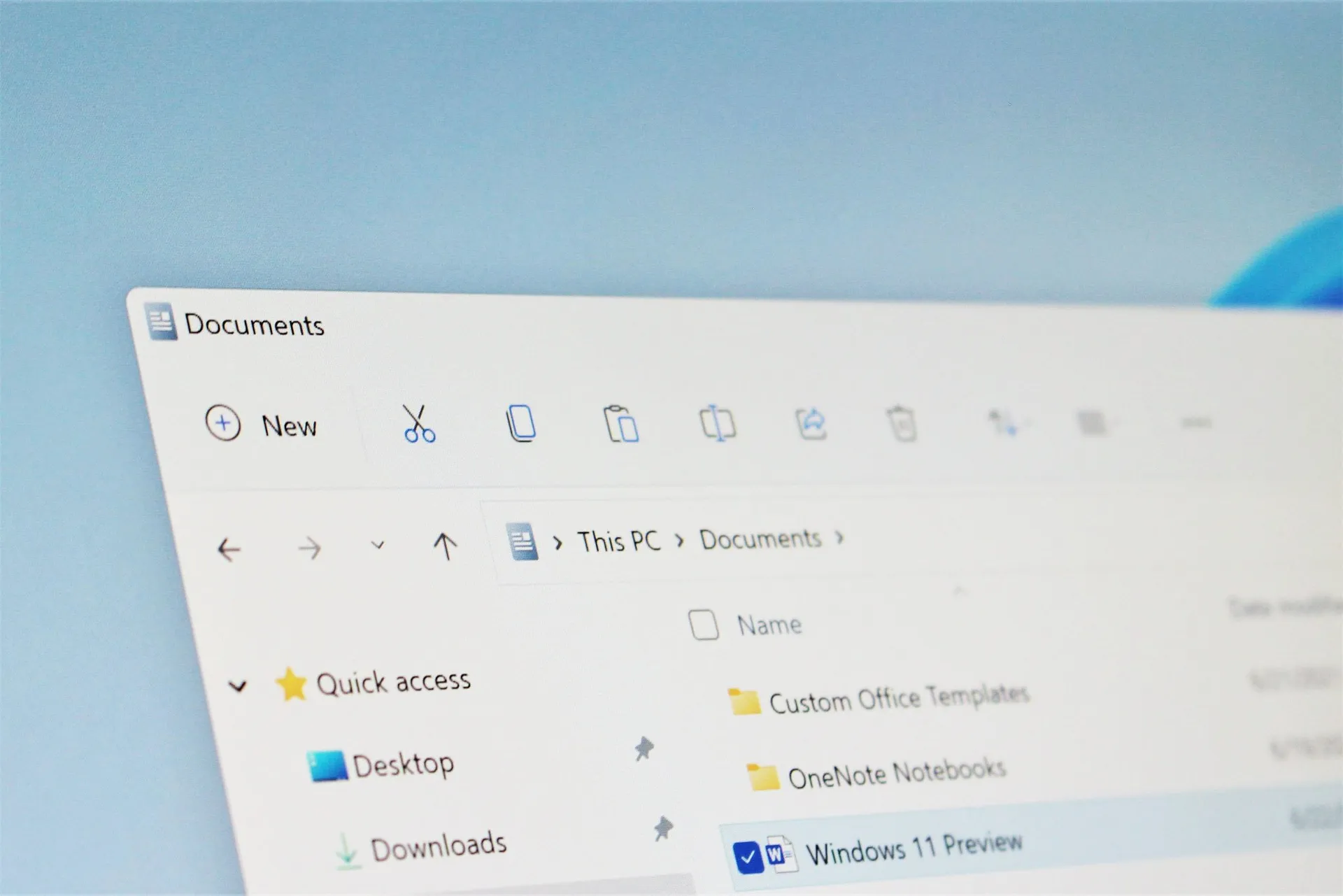
Microsoft has revealed a brief-look at a modern interface for the legacy File Explorer app that will be shipping as part of Windows 11 this fall. The new File Explorer appears to be the old one with a modern UI on top, and it looks fantastic.
The new UI looks to be based on WinUI, and features a clean and simplistic interface along the top of the explorer. Gone is the dated Ribbon UI interface that was introduced with Windows 8, and replacing it is a modern header with minimal buttons. It's a much cleaner looking interface, and perhaps less daunting to the average user too.
Annoyingly, the brief look really doesn't focus on the File Explorer itself, so we can only pull from a few frames.
On the left is a "New Item" button that likely provides quick access to creating a new folder or file. Alongside that are a bunch of icons that appear to resemble common tasks such as rename, copy, paste, delete, and share. Microsoft appears to be relying heavily on imagery instead of text with this new design.
The new File Explorer also includes modern context menus, which look much cleaner and less cluttered than the old context menus, although that isn't shown in the video. We'll have more to share about the new File Explorer design once Microsoft releases a preview build, sometime next week.
In the meantime, what are your thoughts on what we've seen of the new File Explorer UI so far? Let us know in the comments, and be sure to check out the rest of our Windows 11 coverage too.
Windows Central Newsletter
Get the best of Windows Central in your inbox, every day!
Zac Bowden is a Senior Editor at Windows Central. Bringing you exclusive coverage into the world of Windows on PCs, tablets, phones, and more. Also an avid collector of rare Microsoft prototype devices! Keep in touch on Twitter: @zacbowden.
-
It looks really good I wonder how you look on a smartphone.
Can't wait to hear the latest about Windows 11 X and mobile coming soon -
for mobile check out Android 11 and Android 12.
-
Zero chance they will have a mobile version. That ship sailed in 2011.
-
Please, Help Me! TPM 2.0 is activated and secure boot is also enabled but
the PC Health Check Software is showing that my PC is
not compatible with Windows 11 -
This seems to be the experience most people are having. I think that system is not currently working.
-
This tool might help you find out what exactly is preventing it from showing up as compatible: https://github.com/rcmaehl/WhyNotWin11/
-
is the picture used in the article recreated by windows central staff? i don't see it in the video
-
Ok.... well they should be applauded for poking the bear. Little underwhelming but baby steps for those who complain about "muscle memory".
-
Needs more tabs.
-
I'm totally underwhelmed by this. How is it that a near $2 trillion company cannot just rewrite this thing? The third party Files uwp in the Windows Store is far more modern looking. It lacks features (although also has some awesome ones) but then it's just a bunch of devs working on it when they feel like it. This by comparison just feels like lipstick on a pig. I'm just hoping that they make significant progress before launch to improve it.
-
Err no, this looks awesome. Excellent design, touch friendly, keeping existing features and adding few useful things. The UWP app just feels like a UWP app and that's not a good thing. And you cannot just rewrite something easy, this isn't a web development. There's a good reason why rework of legacy Windows parts such as the Control panel is a slow process.
-
Well, the look is always going to be subjective, I don't think it looks bad but it's hardly anything special. They've removed the ribbon and replaced it with icons, they've rounded the corners and spaced things out a bit but other than that, this is essentially still the same File Explorer we had in Windows Vista. That's a long time to rewrite this for any company, let alone Microsoft.
-
Wow, this is so underwhelming. It really is lipstick on a pig like someone else mentioned in the comments. They need to really rebuild it like all of the great designs out there. We’ve been waiting for something for years and this still looks outdated and lacking in features like tabs. This is the first thing about the release that I’ve complained about too.
-
Apple hasn't done much to Finder either. The reason is because these are system-level components that are still used in software a decade old or more.
-
We aren’t talking about Finder. Finder work and looks great. Unlike explorer which sucks and lack many features that are basic like tabs.
-
Finder is garbage compared to W10 File Explorer, one of the best file management apps on any OS. The W11 File Explorer looks to be several steps backwards.
-
I like it. Come on Microsoft also remove Control Panel.
-
As long as they replace it with a shell that has the same or more functionality. I don't want Windows to end up like Mac OS in that anything complex you need to do you have to open terminal. Making first changes is not the problem with a terminal, its months and years later and no visibility at what has been changed.
-
Nobody knows how to downgrade the functionality of a working product like Microsoft.
-
The only thing they could do with File Explorer that they haven't done before is to offer a multi-pane format. Whether it's called modern or classic or just old, every version looks basically the same--a display of files by name (the essential feature of a file) and a toolbar and/or menu to perform some function on or with one or more files. Theming the UI is just more of the same. Looks like the 3rd party dual-pane file manager aftermarket is safe for now... still.
-
One of the most important bits in File Explorer is shifting between view types, hopefully that is at least as easy as with the ribbon. I would personally like to see more view options such as a view that showed the size of folders at a glance, or one that can have assigned preview images for albums or videos. I also always wanted native automation tools in File Explorer for mass renaming files or folders, but perhaps that is against their new simplicity ethos.
-
If it doesn't include dual pane, file sync and FTP, then I'll just stick with Directory Opus.
-
Just as long as we still get ms paint and note pad
-
So, still no tabs?
Looks nice though. -
JMHO but this is just decreasing functionality for the sake of touch. Its the same mistakes MS made with W8x in that they focused so much on touch and tablet and forgot that the vast majority of people use Windows with a mouse and keyboard, on servers and workstations, etc. THERE IS NOTHING BROKEN ABOUT FILE EXPLORER! And that seems to be the problem with the UX changes with W11 in that, again, MS is just screwing around with things that are not broken. They throw the baby out with the bathwater. W8x had a great touch UX with charges and even Metro IE was very nice touch wise. But because they ripped out desktop UX the backlash was so bad they the ripped out almost all of the great touch UX of 8 to return a more 7 interface. Now they are doing the same with 10. There are thinks broken with 10 that need fixing, the UX really wasn't the problem.