A closer look at File Explorer's new dark mode in Windows 10
File Explorer has finally been updated with a brand new dark mode in the upcoming Windows 10 feature update. Let's take a closer look.
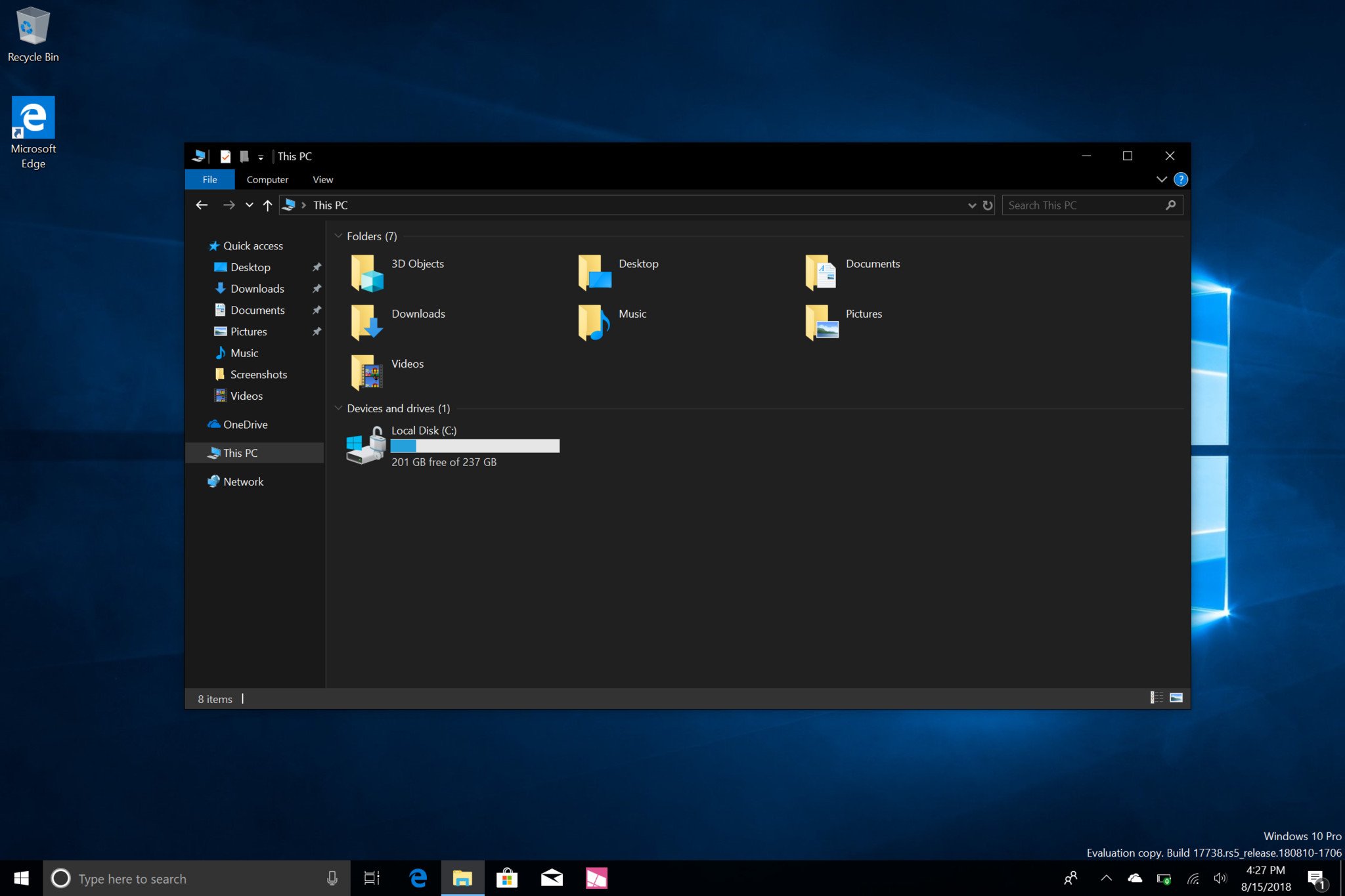
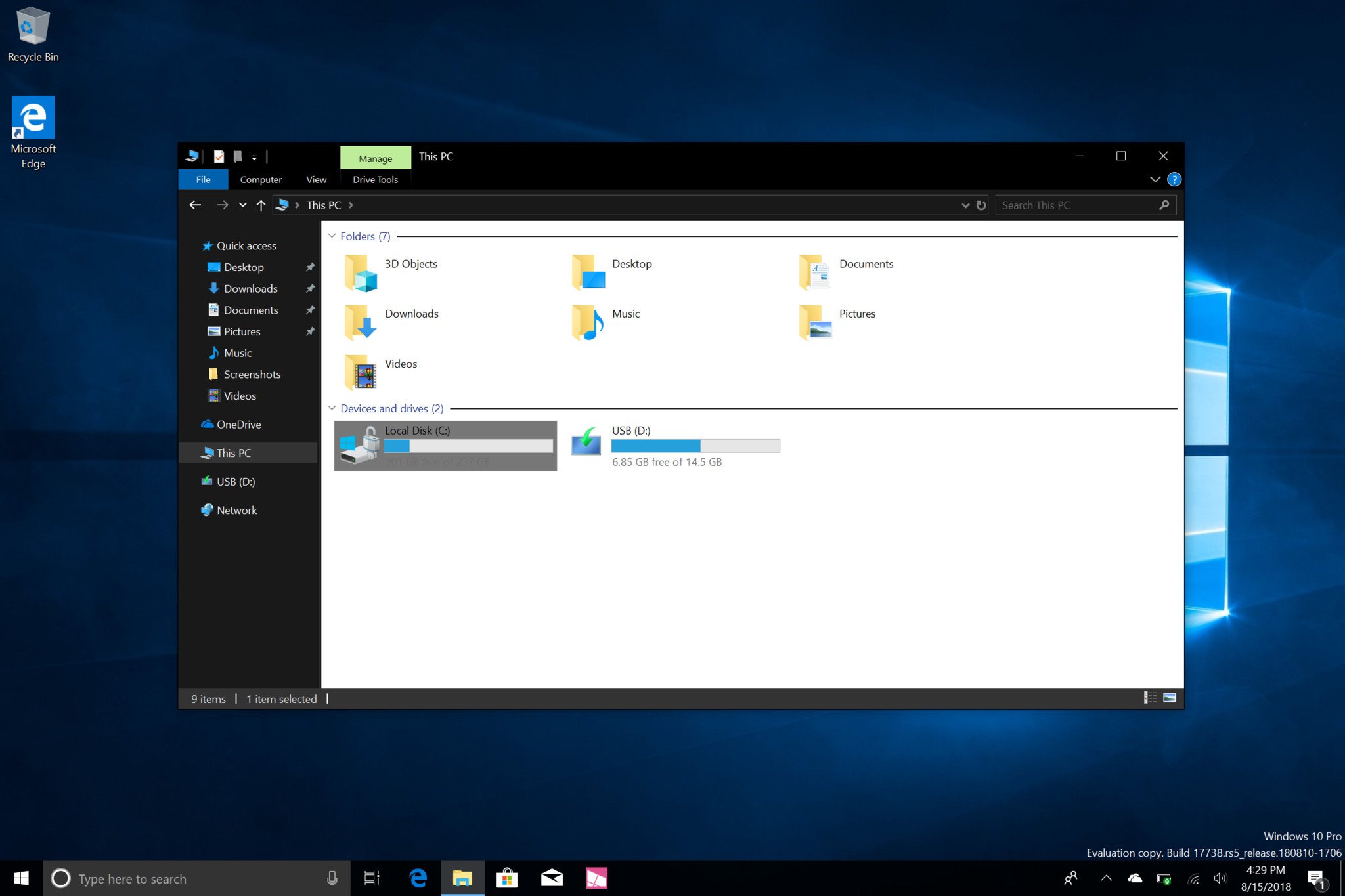
Microsoft is debuting a brand new dark theme for File Explorer with its upcoming Windows 10 feature update, codenamed Redstone 5 and scheduled for release in October. It's not often that you see File Explorer receive any new features or changes, the last notable one was when Microsoft added the Ribbon UI to it back in 2012{.nofollow}. So the introduction of a new dark theme for File Explorer is a pretty big deal — let's take a closer look and see how it is.
Just like most apps on Windows 10, enabling the dark theme for File Explorer is done through the system-wide dark mode toggle within the Settings app on Windows 10. Once enabled, File Explorer seamlessly switches into dark mode, which blackens out the title bar and tabs, and gives the rest of the UI a dark gray tone, which is super easy on the eyes.
Even the context menus within the File Explorer and on the desktop have received dark mode treatment, which makes these legacy context menus appear more consistent alongside the modern context menus found in UWP apps when dark mode is enabled. It's pretty awesome and is something I've been asking for since Windows 10 first launched back in 2015.
It's not all good news
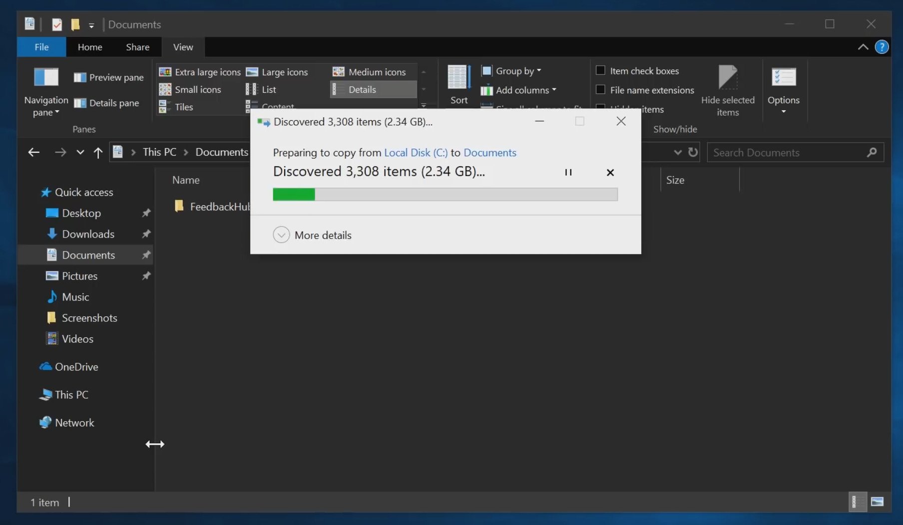
On the surface, dark mode within File Explorer is really cool. It looks good and functions well. However, when you start to dig a little deeper, things aren't so peachy. For example, other than the File Explorer itself, none of the popups or related dialogs have been themed to match the dark mode. That means when you copy and paste or view the properties of a file, you're thrown back into a UI that's blindingly white in nature.
I've also noticed a few bugs when dark mode is enabled, sometimes it doesn't fully enable in the File Explorer when opening it up, leaving for some elements remaining white while the rest of it is dark. There's also a minor UI issue going back from legacy Control Panel to File Explorer, which will see white flashes when switching between folders and sidebar dividers remain white instead of switching back to dark.
And then there are other Explorer windows such as the legacy Control Panel itself, which appear to be half themed with some UI elements featuring dark mode and others not. I know Microsoft is slowly phasing out the Control Panel and related legacy Explorer windows, but they aren't gone yet. So it's important they at least look finished.
Of course, there's still several weeks of development time left before this update is finalized, so these issues could still be ironed out before then. However, Microsoft has announced that its dark mode in File Explorer is pretty much done at this point, so expecting any considerable changes to how it behaves across different windows is likely not going to happen for this release.
Other than those small issues, the dark mode in File Explorer looks excellent, and is exactly what I've been hoping for within Windows 10. When you aren't surfaced with a white popup dialog, the dark mode UI looks and feels complete, and it's great to see Microsoft focusing on at least trying to make its light/dark modes consistent across apps, even if they are legacy.
Windows Central Newsletter
Get the best of Windows Central in your inbox, every day!
Zac Bowden is a Senior Editor at Windows Central. Bringing you exclusive coverage into the world of Windows on PCs, tablets, phones, and more. Also an avid collector of rare Microsoft prototype devices! Keep in touch on Twitter: @zacbowden.
-
One thing that I loved about Windows 8/7/Vista, etc is that despite of all the flaws it had, the OS by design never felt incomplete.
-
Well all of those were released in one go and done.
not continuously be refined/ changed Overtime. -
We've been hearing this excuse since Windows 10 first launched, I honestly don't think it holds water any more. Microsoft no longer has the luxury of thinking of Windows 10 as a free update, it's something people are now paying for and as such consumers have a right to expect a certain level of quality. Microsoft doesn't sell Windows 10 as a beta, or something in early access. There's no good excuse at this stage for updates to introduce additional bugs rather than fixing the ones that are present. I don't know about you, but when I updated to Windows 10 and purchased Windows 10 devices I did not do so with the understanding that Microsoft was changing from a test-and-release model to a release-and-fix one.
-
"Evolving process" is a PR term for Perpetual Alpha™
-
IMO, Vista was the best looking OS Microsoft ever put out.
-
Microsoft are pathetic compared to Apple and all available metrics say so.
-
Apple only has to design for the current MacBook and iMac computers (so 4 models in total).
.
Microsoft on the other hand, has to design for all laptops and desktops made since 2011 which is closer to 5+ million models. They need to make sure the changes work for everyone which is why they are super slow.
.
Yes, I including so many insiders hate the slow process but there really isn't much of a choice we have. -
I don't see the connection between having so many configurations and inconsistent ui
-
Windows 10 is a constantly evolving OS and most of those changes are based on USER FEEDBACK. They can't change everything overnight and you can't expect insider builds to be complete and bug free. Even something as simple as changing the color on dialog window (like copy/paste) requires thousands and thousands of hours of bug testing on nearly infinite combinations of hardware configs and programs installed on the PC. Windows is by far the most complex OS on the market and it's literally the only OS that supports millions of legacy and new devices and almost all of them are simple plug and play. Apple by contrast has it easy and even with that said there is still tons of things that aren't plug and play like they are in Windows.
-
Well, maybe they shouldn't have opted for a constantly evolving OS then if it's too hard for them.
-
So many apologists here. Microsoft must be laughing at you people being so gullible.
-
They need a platform that feels stable in user experience, not something that feels like Apple’s Public Beta releases. I see they revamped the Microsoft Store UI YET AGAIN. The way they’re doing this is incredibly sloppy. Windows 10 is feeling less and less like production software. A 1 year release cycle for major updates would have been good enough. Yes, you don’t get “new stuff” all the time, but at least you don’t feel like you’re constantly relearning basic aspects of computer operation due to the number changes they’re making to the user interface of various components on a rolling basis. Consistency is a good thing. It trumps “new things excitement”.
-
Uh, what? Hardware has nothing to do with UI changes. There's absolutely no excuse for Microsoft's software design to be so far behind Apple's.
-
I partly agree with that. I've got a Macbook, OSX isn't perfect either. Stuff goes weird, Bluetooth devices sometimes don't connect automatically.
(look at timecapsule, cracking macbook whote cases and many other hardware recalls they've had to do. ) But, there is no excuse for why Control Panel isn't dead, and all settings functions aren't in the settings app. MS also really hamper themselves by backward compatibility.
Think of all the regression testing they do, so .Net, .Net Core, Win32, various runtimes and libraries all make legacy software from decades ago continue to work.
MS pride themselves on this, but I do long for a new Windows, and clean room design where they put all their best people into a clean slate/ green field Windows.
Look how well they did with Windows Phone and moving from CE to One Core.
They do have the skills. They just seem to still be so lost in their own internal politics.
One Microsoft still hasn't quite taken hold in Redmond. Its a shame, as they do have the people in there to rule the computing world, and make some game changing products - sadly we might never see that. -
Microsoft's software is not behind Apple in any way. You Apple sheep need to stop sniffing your own farts and telling yourself it smells great.
-
As a hackintosh user, Mac Os looks nice from 1024x600 to 1440x900 and 1920x1080 screens, it looks gorgeus compared to Windows UX, even Fluent design looks very cheap compared from Material design.
-
MacOS scales better and the desktop UI design better accommodates lower resolution screens, IMO. I had a MacBook Air and the fact that it’s screen was low res never bothered me. I’ve seen older MBPs with 768p screens and macOS looked considerably better at that resolution than Windows does. The entire design language respects your screen real estate much better. Microsoft’s current design language wastes a lot of white space trying to look mobile on a desktop screen. I find it unusable on anything below 1080p, and you have to use that awful %-based scaling on HiDPI displays. This is something that just works without the fiddling on macOS.
-
Well, except for that metric about how many people use Windows versus how many people use Mac OS. And that is the exact reason things go slowly in Windows world. Think back to the apparent near death experience tech bloggers and many users had with the "radical" changes wrought by Windows 8.
-
What do you mean, MacOS is quite outdated :?
-
YES. it is. MacOS is like using windows 3.1. It's garbage. Like most things apple, lots of fluff not much substance.
-
It's funny how Microsoft copy almost every MacOS feature then, since the birth of both OSes.
-
But is consistent!!!!!
-
Which metrics are you referring to?
Microsoft has a much larger market share in almost all of the market spaces they compete in:
Consumer OS market
Enterprise OS market
Web browser market (they both suck at it, but IE and edge are still better than safari)
Productivity Software market Microsoft is the backbone of the corporate world, and their leadership in the Cloud development and computing market will make them vastly more valuable than Apple in the long term. Apple basically has the iPhone and iPad... And they are behind Samsung in the mobile market. The only reason they're worth so much is because they charge an insane amount of money for their products. -
"Which metrics are you referring to?" - Profit, Market Cap, Brand Value, Quality, Customer Satisfaction, Marketshare in every category they compete (high quality/pricey stuff and not chinese sh*t for the masses).
all these markets that you counted are occupied by Apple in the high quality segment. Apple just don't make sh*t budget products.
Microsoft has no leadership in Cloud (and pretty much anything). Amazon is the leader BY LOT. Apple makes more money having only iPhone and iPad than the entire Samsung corporation... -
' ' '
-
LOL! Says the Apple shill. As an iPhone X owner, Apple are boring and stale.
-
That’s why you got the X, right? Your work certainly isn’t paying the premium for that SKU. You don’t own an iPhone. You just say you do to try to lie some credibility into your fanboy reactions.
-
It should be dark black...not dark grey
-
Nah, needs to be light black I think.
-
Batman approves. 👍🏼
-
I wish a full fledged Windows 10 on UWP. Windows 10 Mobile on tablets could have looked better with more improvements and features. And also ready to compete with iPad and mobile OSes.
-
thank you zac
-
Wish you could tie dark mode to nighttime hours, like with Night Light. I wouldn't want to use dark mode all the time, but would probably use it at night if it was automatic. The Twitter app (at least on Android) does that, and it's nice.
-
That would be a very nice feature Tarkus13
-
So go on the feedback site and suggest it. That's how almost all the changes to Win10 since launch have come to happen. Someone suggests something and people vote on whether they would like it. That aside you don't know that won't be an option....this is an early insider build and they often change significantly before release
-
You could write a program to switch dark mode on when you press a button or even when night shift is turned on.
-
File Explorer's dark theme will be great ... Once it's uwp (touch friendly) and fluent design.
-
It looks like a dark mode for the aesthetics, not a dark mode for power saving on an OLED screen. I guess it's OK since Windows now days do not need to save power for OLED screens as there is no windows on phones with OLED and OLED on laptops is more or less non-existent. Sad. Still nice looking.
-
MS killed OLED savings with dark mode when they hurriedly tried to erase Windows (Phone) 8 from existence.
-
What about OLED monitors or all the people with a PC in the living room and a 4k OLED TV...like myself. If things go as they should OLED should become the standard. The image quality is far superior to even the best LCD and refresh rates on the monitor side are getting pretty close to parity. We finally have a standard that can produce proper colors, true black and true white. Only thing holding it back now is price which drops with time.
-
"All the people?" Not many people use their PCs on a television, in the grand scheme of things... Also, most people have LCD TVs. In addition to that, the disparity between quality in the LCD panel market is much smaller than OLED. You can get a great LCD display for much cheaper than an OLED display. Most people do not have OLED televisions. I'd argue that for many people, the amount of television they watch barely justifies spending money on a television at all - much less an OLED panel with 4K resolution. Many don't even yet have access to internet speeds that allow them to easily stream 4K without buffering or interruptions when someone else uses an internet connected device. Don't project your own personal situation and grievance onto the entire market, as if it's normal. It isn't.
-
I HATE this file explorer.
I LOVED the UWP one. -
Metro Commander Pro. Its all you need ;)
-
Microsoft should just buy files and folders, make it stable, and be done with it. I love that app, but it's flakiness makes it a no go when I need something done and done now!
-
I made a post about this on Reddit. https://www.reddit.com/r/Windows10/comments/92xeht/problems_with_windows...
-
So funny. WindowsCentral always painting the stuff better than it is... Even bad news are good news here. This Dark Mode is terrible. It is unfinished, embarrassing and there have been quite some rants about it on Twitter by quite some Windows Insiders. Microsoft representatives have responded by being "offended" because they get told how unfinished this work looks. And to be honest, there is nothing good about Dark Mode as it is now. The whole idea is to be light on the eyes, but you will have to visit a doctor when you open a menu or something and it shines brighter than the sun (especially, when it's dark and your eyes are accustomed to the dark). It is useless like this.
-
I agree. And the black is ugly. All they did was remove the white/color. LOL
-
Typical article of sugar coating poop. What do you expect from these people. This Zac kid should go out more to Twitter and reddit forums for the reality check.
-
Twitter and Reddit are full of idiots, and the same people that go there are the people who come here... So why should he go anywhere? You're here, right?! This is a fan site. They spin a lot of things. But I think you people have a very lopsided idea of how important your opinions are in the grand scheme of things.
-
I understand File Explorer, Control Panel and MMCs have many functions, so it takes time to implement. Howerver, MS Office team finished Dark theme on MS Office a long time ago.
-
Eww. Haha! I have the Surface studio, but good grief MS needs to step it up. The icons are hideous and looks outdated. I am not just saying this because I prefer other OS.
-
They'll get there with it...eventually. At the moment it still needs a lot of work. Something about those bright yellow folders in a dark theme just looks so wrong. It's a little like the Outlook.com dark mode, where it's dark, until you read or write a message. It's jarring. Frankly the fluent design File Explorer concept done by MS themselves a couple years ago looked so good compared the current dated look of explorer.
-
Who wants to bet that when rs5 releases they pull dark mode cuz "it's not ready" I hope not. But skinners on deviant art have been able to modify explorer in weeks. Microsoft has been at this for who know how long. I mean I know they are doing more than just changing elements in the UI. Still dialogs and junk that are all white and not modern/fluent need to just go away. How there isn't an interpretation layer from old dialogue box to new fluent dialogue box just kinda baffles me.
-
There's a lot of work to do yet.
-
Yep. Just looks the original one turned black. Needs more fluent design and to get rid of those yellow folders.
-
They need a night blue mode, as seen on Twitter.
-
Once they make File Explorer a serious UWP app (not the hidden one with basic functionality) I'll give them kudos. If they are serious with their platform, they should make all their apps UWP, especially such an essential app as File Explorer
-
UWP doesn’t have the API coverage for this. That’s why Edge isn’t even a full UWP app. They should have done UWP for Mobile and put more development into WPF on desktop. UWP and the rotting desktop ecosystem on Windows is a reason to consider Apple, not leave it. The way Apple are executing this is far superior to what Microsoft has done. It will totally work for them, and it will totally help them sell more Macs and iPads.
-
I am missing some basic functionality in the file explorer folder/directory tree structure (and equally in the Outlook folder structure): the option to change the font color of the folder names. That way you could visually give groups of folder names or sub-directory names the same font color. This would enable you to choose directly the right group of folders / sub directories that belong together (as an example).
-
I guess if you actually CARE about a "dark mode", that will be great. It's not something anyone in our household has ever wanted. We just leave it the default.
-
I really love that theme...
Dark grey ftw ! it's much easier on the eyes than pure black.
But IMO now that the file explorer is done, other ms apps with dark themes should also switch to that consistent dark grey, and MS should also add dark mode to the whole system (i.e. dialogs, etc.) -
OMG I cant wait...!!!