Video Interview with Windows 8.2 Concept Designer Jay Machalani
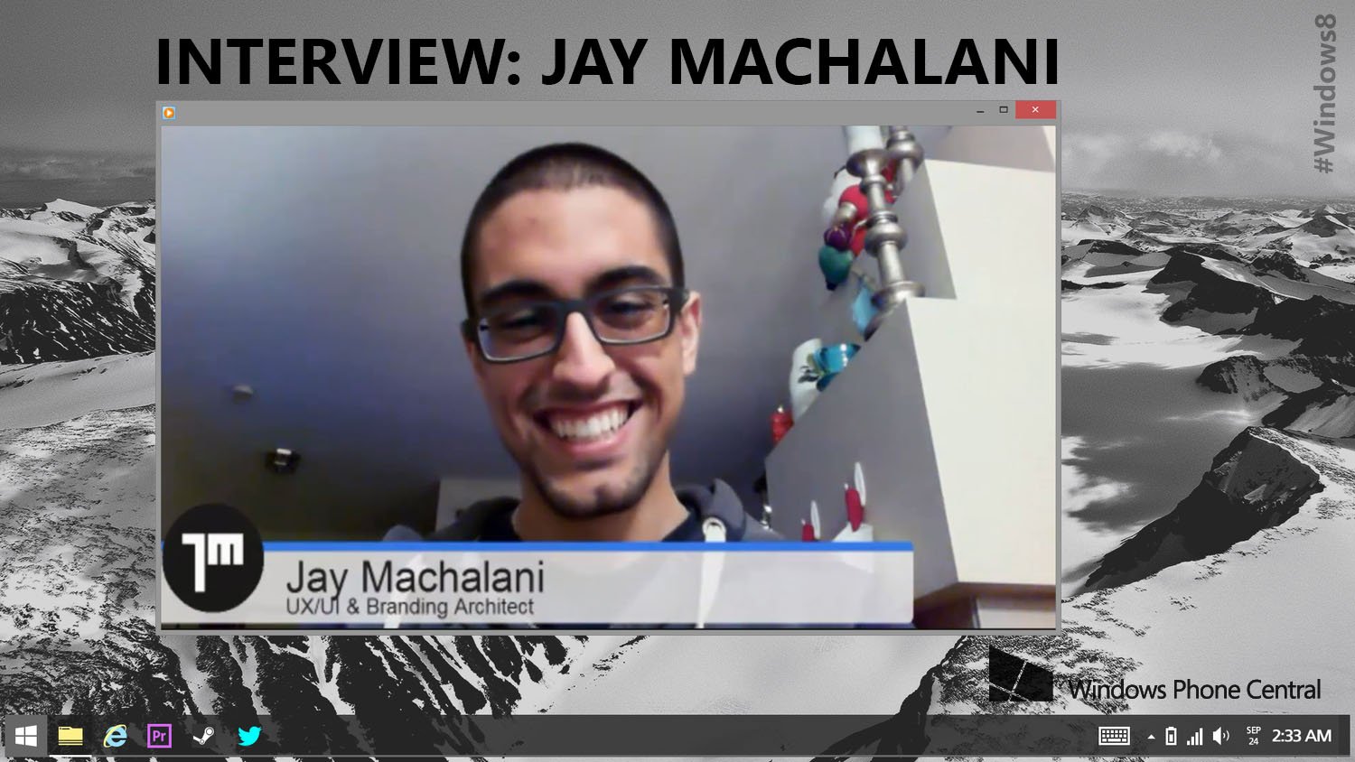
Last week we reported on Jay s Windows 8.2 concept design. Many Windows fans around the world looked upon the concept animation and screenshots with awe, at a design that could not help to amaze. This week, we decided to have a virtual sit down with Jay and discuss his motivations for designing the concept as well as the impact it might have on Microsoft’s future designs going forward.
Jay primarily uses a Surface Pro as his main Windows 8 machine and feels that “the idea of windows 8 is amazing”, but that there is a problem with “the way both environments [desktop and modern UI] are managed”. The research itself was entitled, Fixing Windows 8, and as Jay explains, he simply “took what Microsoft wanted Windows 8 to be… and made it polished.”
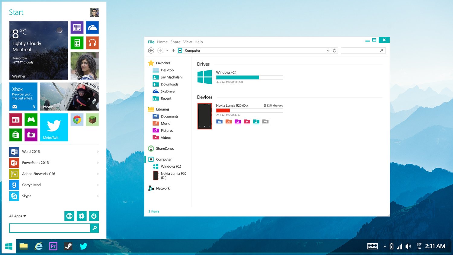
The system focuses on the idea that you are, at times, “stuck with metro elements when you don’t want them.” The biggest issue, as Jay points out, is that “when you want to use one app, you are stuck in its environment”.
Many concept projects are in the works by designers around the world, so why did Jay’s project capture such attention? We believe it is the stunning work presented, but Jay explains to use that he believes his idea caught fire because he “brought solutions backed with research”.
For those of you hoping that Microsoft might be paying attention – they are. Jay will be taking a trip to Microsoft’s headquarters in Seattle at the beginning of January; he states that the company is well “aware that they need to fix Windows 8”. In a discussion the young designer had with one of Microsoft’s designers, Albert Shum, he stated that Microsoft is “working on integrating the desktop more”.
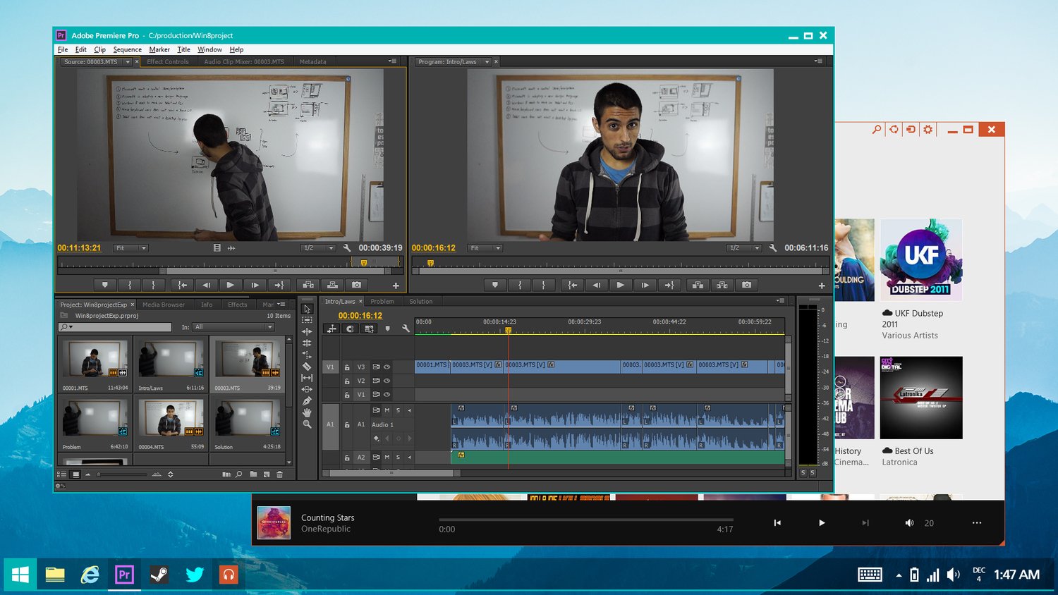
The research that Jay Machalani brought forward focuses on closing the gap between the desktop environment and Windows 8’s new modern UI; he made a point to note how the Desktop “feels like another metro app” and that in true productive environments, you simply need more control over the customization of your working environment.
Jay’s design itself is an idea of Windows 8 where applications, whether they are desktop legacy or Modern UI, can run in either environment. The Windows 8.2 concept doesn’t force the user to choose which environment he wants to work in, but rather incorporates both for the best experience.
In the 8.2 concept, a user simply holds down the Windows button on their device to switch between the desktop or the metro interface, but retains the ability to use both applications; this way, a user is not choosing what apps they would like to use, but instead how they will be interacting with their PC.
In the end, Jay says that the Windows 8.2 concept was just one of the many projects he works on as he loves designing, and it just happened to “really explode”. We will be meeting up Jay later in January 2014 to see how he is getting on with Microsoft and what new information he may be able to share.
Make sure to watch the above interview, it is twenty minutes and a great way to pass some time. Jay is an energetic designer whose passion truly shows in the video. You can also check him out on his website by clicking here.
What do you think of Jay s design – would you like to see his concept become the future for Windows 8.2?
Get the Windows Central Newsletter
All the latest news, reviews, and guides for Windows and Xbox diehards.
-
I was far from impressed by it. The only innovation was making the start menu not a direct copy of the the classic start menu.
-
+920
-
I guess he did combine Windows 8 and 7 in a pretty cool way tho...
-
I don't think you looked far into it. Also we're talking about windows 8.2 not a fully redisigned windows 9...
-
I dunno, his idea of windowing metro apps and full screening desktop programs is a prime example of simple but effective. Its a eurika moment. Sure you could say Ms should have thought of it, but no one invented the wheel until it was invented. Sometimes it takes a fresh pair of eyes to see what you missed.
-
This is already possible. Google for more information :)
-
Or bing?
-
Are you saying you would rather keep the interface in Windows 8.1?
We don't Google here. We BING IT. -
You may use whatever search you like, most will give you the information. Furthermore the start menu on the desktop resembles Start8s "Modern" menu far too much for my liking.
-
Let's not have this argument again. Bing sucks if you're not in the US. Google still reigns supreme in the search engine wars
-
Bing > Settings > United States.
-
Yes, but then I get results for US companies. Totally useless.
-
Out. NOW. BING FOR THE WIN! :)
-
I'm not finding anything and have never ever heard of anybody making software that allows dekstop apps to be run like Metro apps while completely killing the desktop. THAT is a huge eureka moment.
-
^^^^ This
-
I think the current WIN 8 interface is fine as it is now.
Some apps are designed for Metro/touch, and some are just Desktop/mouse apps, and that's fine (for now at least). There are just a couple of apps that needs to be addressed by MS. The main issue is that the Metro version of the app needs to communicate with its Desktop cibling. Heck it should be one app, that changes skin based on where you are, or if it's impossible for it to be one app, then at least the Metro version should be able to communicate with the the Desktop version (and vice versa) when switching from one environment to the other! (ie Open tabs, favorites...) On a side note, one thing I really miss in Win 7 is transparency.. why did MS drop transparency!? -
Transperancy was dropped because 2GB RAM minimum hardware requirements would not be achieved. Dropping Aero actually made Windows 8 appear to be faster than Windows 7&Vista. When you disable Aero on 7&Vista, perfomance is comparable to Windows 8.x.
-
Are you saying you would rather keep the interface in Windows 8.1?
-
Yes.
-
Yes
-
I like how it is now
-
You missed his point! He specifically states that he doesn't want to bring innovations with this! He is just trying to fix the things that are wrong by using ideas that already exist in the OS and In Microsoft's vision! He did a magnificent job.
-
Not impressed either, looks like a messy mix of both worlds. Without the best of both.
-
Agreed
-
That dudes idea is horrible. I like the interface they have now
-
I don't think you have thought about what it is that he is doing and done to improve the simplicity.
-
I don't think you can accurately judge whether or not another person has thought it through. Just because you like it and we don't, doesn't mean we are somehow missing the point here. I don't care for his changes either and much prefer the interface as it is. I don't have any issues using it on any of my devices, from tablets to desktops, touch or otherwise.
-
But apparently many people do. I for one would consider buying 8 for my company if I could set it to default to the desktop way of interaction through GP.
-
Agreed, not intuitive, I'd rather hit the start button and get to the start screen. This is just duplicating some of the tiles.
-
I don't think you have thought about what it is that he is doing and done to improve the simplicity. Not it is not because there are probably 5 apps that one will need quick access too. Why do I need to switch always to a never ending screen of apps? It is a good idea. I like it. stop hating.
-
1) Repeating yourself hardly demonstrates your point. 2) Just because many people seem to be of the opinion that is at best mediocre or that it simply sucks, does not mesn they are "hating" on it. Personally, I consider it to be a sloppy hybrid that shoves Windows 7 and 8 into a clumsy and inefficient mess that will suck system resources Microsoft has gone to great length to free. Congratulations - you like it. Many (including me) do not like it and are glad it is just a concept from a person so arrogant as to say they are fixing Windows. It will never see the light of df day unless they choose to go the Start8 route and build an add on. End of story....
-
I don't want to offend you, but the comments on WPCentral get more and more "fanboyish" just like Appel fanboys do: "Oh MS does it the best way, don't you criticise the way things are done by MS, even if they suck, or are at least inconvenient."
-
Messy is what it is right now. The desktop jumps to modern and modern jumps to desktop... That's a mess! He separated both worlds. No more confusion.
-
Indeed, the current UI really stinks if your using a touch pad or a mouse but its great for touch. Most people don't have touch screen aios or laptops. Imo only in the past several months (give or take 6 to 8 months) touch screen has started to become more mainstream. Also If I have a 40 inch monitor I don't one damn app (i.e search) taking up the whole screen! its pointless and blindingly annoying - sure I can snap it or resize it later but annoying none the less. Least they could do is give an option to start up 25% snapped, 50% snapped, 75% snapped, 100% and Custom + plus an option to remember for a specific or all apps. The only thing I wouldn't mind taking full screen on startup is when I am watching a movie or tv show on netflix or playing games.
-
It's better than most ideas People share in the comments. As much as I love windows 8, as it is IS the famous messy mix of both worlds. This a not-so-elegant but cool enough solution.
If everyone here is so unimpressable, I can't see why there aren't as many amazing concepts as the number of WPCentral users. If you think your ideas are better, put them out on the ground. -
+1 i think he made a great way to integrate both metro and desktop together. People will never be happy, it is way easier for them to hate than adapt or invent something
-
People can have their say. Your almost saying if you cant do it better, then don't comment..
-
I did not actually said that people can't have their say, but I apologize for looking a bit too rude on what I was trying to say.
-
Seriously though the comments here that are mostly rubbishing this guy. Not sure where you guys are coming from? as a previous poster commented some of the WPC commenters are boarding on juvenile, the same people that bring nothing to the table except criticising.
-
Just cause he changed it a little bit doesn't mean its improved. I think he made it worse cause the interface is already good
-
Is that throwing it on the ground? "Don't trust the system, man."
-
You're an idiot, no one is saying they have better ideas, they're saying that they don't like his...
-
I don't think you have thought about what it is that he is doing and done to improve the simplicity.
You're an idiot. How about that. -
Here's a groundbreaking idea to consider - leave it as it is because for many of us its absolutely fine? =/ I trust Microsoft's vision far more than the concepts of this guy.
I'll give him credit though, he somehow managed to turn the start menu into something the general public will actually hate more than the Start Screen. That's quite an achievement! -
Well, since they called up him, Microsoft Vision might be closer to this guy's one than you think?
-
Certain parts of his concept may be, at least. I can't see all of it making the cut though.
-
SnatchedIT, respect mate -- this is the smartest comment I've read on here so far. End of the day, the guy must be doing something right, like you said Microsoft called him up. Furthermore, there is a thin line between arrogance and confidence -- I think this guy is young and oozing with confidence, not arrogance like some are trying to imply. One day I think he will make it the top. As long as he keeps his feet on the ground, and doesn't let all this kind of interest go to his head.
-
Love, love, love templates!
-
I make the most of what I have and find ways to do everything I could on w7. The issue is change and here we go again
-
I use 7 at work an XP at home. What does 8 not do, that 7 does? I only ask because a new PC is one of my must haves, and I don't know which to go for. At the moment, I am in the 7 camp.
-
8 does everything 7 does, and more. You just interact with it a little differently.
-
There is so much windows 8 adds. I'll tell you why I like it. First off it starts up on my windows 7 computer alot faster. Then my computer would sometimes freeze up and I couldn't tell why and with the new task manager, I found out that my disk was management was the problem. Windows 8 also has its own ISO mount and zip file. I am personally not a fan of the start menu on desktop but with ideas like this, I have confidence the ui will get fixed to be both mouse mouse and touch friendly at the same time. Anyways hopes this helps you make the switch.
-
Thanks for the comments guys. Hopefully I will have one soon.
-
Also you'd be better of getting an AIO or touch screen, if you want to use on a desktop pc best learn the short cut keys :) http://windows.microsoft.com/en-gb/windows-8/keyboard-shortcuts .Having run all previews, even rtm on vmware and 8.1 a 40 inch tv + desktop I can tell you it is not so mouse friendly for desktop users with large screens. It's fine if you want to live in metro but living with both requires a period of adjustment. As getting start8 or anything of the ilk just defeats the purpose.
-
Haters gonna hate, but his design is flawless. If Microsoft announced this today as the next iteration of windows 8, I would wet my pants with excitement.
-
+1.
-
+920
-
+1520
-
+2520
-
+2520
-
+8XT
-
Lovers gonna love no matter how bad an idea sounds
-
U tried
-
Lolwut
-
+822
-
Seriously though the comments here that are mostly rubbishing this guy. Not sure where you guys are coming from? as a previous poster commented some of the WPC commenters are boarding on juvenile, the same people that bring nothing to the table except criticising. Personally i think this guy has it, i think he has great ideas, love the new start icons on the desktop the way it should have been.
-
I was so excited when I saw the live tile since I thought GTA had finally come out
-
I love the colourful file explorer icons and use of the highlight colour
It makes so much sense -
Another Indian in Microsoft
-
What does his race have to do with anything? Besides, I believe Machalani is a Lebanese name.
-
*nationality
It doesn't change the fact that hapishyguy's comment is retarded though -
Yes it is. He is Lebanese!!
-
Lol at this article, I guess it's a slow news weekend
-
Huh?
-
Yeah some of the articles are a little questionable. Not the editorial its self, just what its about
-
-
I don't think you have thought about what it is that he is doing and done to improve the simplicity.
lol... Just remember Michael over half of the population has below average intelligence. -
Not really impressed. I agree it's important to keep Desktop and Metro separated. Firmly separated.
As for its proposal though, I hate the "Start Menu of Tiles". I, unlike Michael, am a strong defender of the return of the Start Menus on desktop. They should have never left. However I think the menus must fit the desktop design. And the tiles and the entire metro design doesn't fit the desktop mode. So, even if they don't wish to copy W7's Start Menus design, they should opt for something else. For example, have the menus in black with the texts in white like the charms bar. -
MS has a new design language with metro. Keeping the desktop out of its aesthetic style isn't convenient for them, nor for the costumers, who probably would like to see a consistent environment. MS can't advertise the so called "One experience" when my windows device ships with two juxtaposed to one another.
-
Then they should have made the desktop design more "modern". Desktop isn't going anywhere. The Metro design, however...
It's not possible to make PC's part of the "One experience". Because 99.8% of the programs used on a PC open on desktop. PC users haven't bought into the Metro design. Because, on a PC, it's a useless design language. Which is why they must, to me, firmly separate Metro from Desktop, specially for PC users.
Spamming users with tiles on the Desktop is just stupid. Why insist on the tiles when the user is already on desktop AND the app will open on desktop anyway? So, put the Menus back. Design them in accordance with W8 desktop design (which if you notice, is different from the W7 design). But stop trying to make tiles happen on a PC. They won't. Tiles are useful on touchscreen and mobile devices. Nowhere else. And even on devices...they need to be customizable. Forcing colours upon people won't make them keener on the tiles. -
Agreed!
-
Being able to pin live tiles to the start screen is genius. I don't know how you can be opposed to having live tiles and have a WP. Anyway, he makes it very clear that you can pin whatever you want to the start screen, including not pinning any live tiles....so your argument is basically completely invalid and trifling.
-
Pinning live tiles... Never lol better have 30 shortcut icons on the desktop screen (win7)
-
It's not my fault you can't read, is it?
I stated clearly I want desktop and Metro firmly separated for PCs. Those who want Live Tiles and the Start Screen can have them. But those who don't want that on a PC - because on a PC the Start Screen is useless (since all the programms you open take you back to desktop anyway) - can have the same experience they had on W7 but with the improvements of W8 with regards to security, booting up etc.
Also...not pin live tiles to the Start Screen? What's the use of that? That is just stupid.
Pin Live Tiles to the desktop would probably be a much better idea. Though it would clutter the space. Regarding your "I don't know how you can be opposed to having live tiles and have a WP"...yeah...I have a WP because it's what's running on Nokia. Period. If you're a regular here, you should know that by now ;) -
The tiles take you back to desktop? Hows that any different to the traditional start menu? Its essentially already a full screen start menu. People seriously need to move on
-
On desktop you have your shortcuts, you click them, the windows open and that's it. You can minimize, open another, have a bunch of them open simultaneously. All of that without interrupting the work flow or ever leaving the same space.
On the Start Screen, however, that only works the same way with Apps that are specifically Metro-designed. Otherwise you're living in a place that keeps throwing you to a completely different environment. People don't need to "move on" just because you like it. The facts are simple: the implementation of the touch-design Tiles Menu was poorly made. The vast majority of PC and laptop users - where 95% of Windows users are - don't like the Start Screen with tiles etc just to be constantly throwned back to Desktop. It's pointless to have it. I, for example, was open to have my PC with the tiles. Now I have it booting up directly to desktop. Why? Because I NEVER used anything on the Start Screen. All the programs I use an need (including Microsoft's Office and Windows Media Player) are on desktop. I boot up and shut down the PC without going once to the Start Screen. Once. Like me, many. The only thing that's lacking is the Start Button Menus for easier access. There's no point trying to impose minoritarian tastes on people. It's fanatics about the Start Menu that have to move on and accept that the majority wants to have Desktop and Metro completely separated. Period. Microsoft will be bringing back the Start Menus and separate the Metro UI, whether you like it or not. Because the majority demands it. Just like they brought back the Start Button and the boot to desktop, albeit the screams and cries of a small minority of fans. -
While you have valid points. Put yourself in the windows division. They want to move to mobile devices and they have a large desktop non touch screen devices. But it costs way too much to build separate OS and manage the whole life cycle to get it on devices. What we have today is a compromise to meet these but it is not the completed vision.
-
can we please move on from the start menu! On win7, I never used it unless to power off the pc. going through start->program-microsoft office->word .... shortcuts it is. With metro, I can group all my shortcuts into nice groups of tiles. 1 second needed to press windows button to see them, doesn't really "interrupt my workflow" lol 95% of people just don't like changes... I remember when Linux Ubuntu went "metro" with Unity a lot of tears from everyone :D , 3-4years later, it is more popular than ever with even more optimization. "Microsoft will be bringing back the Start Menus and separate the Metro UI, whether you like it or not."
They will integrate even close together, just like winRT is fusing with WP8. For coding purposes, it will make everything much easier. Their vision, i hope, is to try something like ubuntu on a phone is doing it, when connected to a LED screen, it become a full blown os. btw is your pc made by nokia? -
I agree with all of your points. W8 is amazing on a touch tablet or tablet, but it feels like two completely disparate systems wedged together on the desktop. It IS better on 8.1, but it still needs a lot of work. For general ease of use and "getting things done", especially at work, I prefer W7. That is still the best OS that MS has put out so far.
-
Some people just don't realise what a mish mash w8 really is since they probably live in metro and probably just use sleep mode as opposed to switching off. Speaking of powering off who ever thought burying the power off button in settings was so freaking smart! /sarcasm. Also some people don't realise all those millions of applications that are used day to day may not have a metro equivalent or be redesigned for metro.
-
disagree, I use my start screen on a PC as just that, a start screen. all my desktop programs are more efficiently organized and accessible with the press of a button than they ever were crammed into a little start menu.
-
I don't think you have thought about what it is that he is doing and done to improve the simplicity.
I totally disagree. I love the snapping feature and wish it could be done with both sides. I agree it would be nice to have desktop apps fullscreen and RT apps allowed in the desktop area. -
I like it, then again I don't have any problems with w8.1 :P
-
I really like the "Start" menu following the WinPhone metaphor: a tight space for a personal arrangement of tiles without the free for all the Win 8 start desktop is. As for the traditional/classic desktop....I wonder why can't it follow along like a Parallels Win 7 machine on a Mac running in coalesce mode.
-
I'm really impressed that MS has got in touch - at least they're not being complacant, if slow. But then it must be hard to turn a behemoth like MS. Good luck!
-
Looks good; but like the Dev said before anything is approved it must be tested and assured that it works everywhere. It is just a Concept at the time. It will take alot more effort to put into practice. But what the hell MS should give him alot of money for his thoughts.
-
Or Simply hire him, I think MS do need a fresh pair of eyes so to speak and they are probably aware of that.
People who are living in metro enviroment won't pick up the little things Jay Machalani has done because it works fine for them. I personally love the start menu in his design, so much freedom, I probably would have the smallest start menu ever for my personal login. But the amount of applications I need for work... forget about minimalism lol. -
The best thing he said was most of what he is saying already exists (with a few exceptions). There are few things are not possible in Windows 8.1 today technically because of the seperation between WinRT and Win32 API. Solutions like ModernMix bring some of what he is saying to life. He said in the interview having some of his concepts integrated directly in Windows was the main message. I like his passion. :-)
-
Man. So many haters here.
-
Indeed ahaha
-
Gee, so anyone who simply doesn't like something is summarily a "hater"? #Wrong
-
If they bother posting just so they could put something negative about someone's idea... and offer nothing constructive, then yes.
-
Then you are simply a fool. I doubt very seriously there are things in your life that you simply do not like, and there are no "constructive criticisms" you can make--you simply don't like them. It's perfectly reasonable that some people may actually like Windows 8.1 closer to what it is now than what this guy imagines it could be. I, for example, do not like the old Start menu and I find it ridiculous that people still need it. I also no longer care for the old Desktop itself. I DO believe the live tiles have not been leveraged with the true power and potential they could and should have. I firmly believe, rather than going BACKWARD, that Microsoft should concentrate on expanding the capability of the live tiles to do the most common things that people keep a stupid amount of dumb windows on their screens. MOST of them are not actually used....they're just open. I am admin over 300 users and I can count on one hand the number of users that are actively using more than two windows at a time...and they are usually spread across two monitors. All the rest are hidden behind the active ones or minimized. That's just ridiculous. Live tiles should be the replacement. So, no, there's nothing about what this guy his suggesting that I care for.
-
I just think hating without giving a reason why is a useless post. I think like you that tiles could used in a greater way! We need opinion like yours that could at least help these designer create a way that would boost your productivity. Microsoft is surely watching website like this to get review about designs, so comments like "meh", "hate it ... " wont send them in a direction that would give us a great Window 8.2
-
And if you have nothing constructive to add, but feel that you need yo comment with a "meh" anyways, then you're being a hater.
-
ScubaDog, just because people don't use it doesn't mean the functionality doesn't have to be included. It is all about options and flexibility, right now W8 misses that by a long shot for desktop users. If MS went your way and they will quickly become stagnant and irrelevant, just like saying MS should have stayed with the windows 7 design language is silly and illogical considering the world right now is moving towards touch and gestures as opposed to point and click. Mobile devices right now have so much processing power, which a decade or two ago may not have been imaginable thus stuff of fiction.
-
You make something and introduce it to the world you're not just going to get praise. There's nothing really special about this concept.
-
There's a difference between constructive criticism and hating. The former is good. The latter isnt.
-
I think this is a great concept. I want it for my surface lol
-
I think it's great. Making "windowed" Modern UI apps would further boost the ecosystem because of all those people who never venture out of the desktop. I'd also love to be able to access my open desktop apps from the left swipe menu on my DV8P.
-
Meh.
-
Why is this still news?
-
yeah! he synched the background wallpaper!!
-
Montreal Represent!
-
I like my Windows more seamless, not separated.
-
+8.1
-
You have options, you either stay in either or you have the functionality of both. I don't think some of you have actually read his entire research post and watched his videos??.
-
Nope. It's tl;dr.
But I'm certainly sure he picked the wrong concept video to represent his idea. -
Nah.
-
So is this supposed to influence Microsoft or what? I find the whole idea if these "concepts" and the hype they generate quite pointless as they never go anywhere. Unless you intend to market a product based on these designs what's the point?
-
They both have crappy webcams.
-
This guy really impressed me, some ideas are simply "wow". MS should seat down with him ;)
-
Total meh. Wasn't impressed at all. I like Windows how it is, I'm not stuck in 1999 with the Start menu and desktop.
-
I understand why MS created Win 8. And most should if they know anything about anything. Apple did it and its making them filthy rich (like they weren't already? Lol). The difference is that OSX does what this concept does essentially. So yeah, I think MS may do this. Who knows. Remember... Everything is always BETA. Whether labeled or not. Nothing is ever FINAL. Were the BETA testers. Get used to being disappointed. Amen
-
I like the current start screen best on touch enabled and tablets,,,with desktop on other side..
-
Looks good to me!
-
Nice+, Look my suggesion also for windows 8.2 http://sdrv.ms/1cpZ9B9 http://sdrv.ms/1cgdRJ8 http://sdrv.ms/19Hw29Y
-
That would be nice to have, metro apps on desktop ;) and the category view, combined with the start menu in this W8.2 concept would be pretty sleek.
-
The small start menu, much like the start button, is pointless.
-
Nice...
-
Such a shame no one remembers Windows 8 "Zune". It is a great concept.
-
I do agree that when I am in desktop, I want to open many windows with apps at the same time...and not move to metro....i should be able to open my apps in desktop....this kid does have good points...for sure
-
QT
-
Nice interview. Enjoyable to listen to. Jay Machalani has an interesting point when it appartently comes to the facts of research results. I guess more options is a direction one could take. It was my feeling that the destkop was not metro enough. I do not feel windows 8 was a rush. I do however think that windows 8 is confusing for the end user because there are still two modes of interaction asked by the OS to the end user. I think desktop user would want to use the mouse and keyboard shortcuts in both envrionments and others with touchscreens quite the opposite. I think there lies the issue for which microsoft has to work on a fix. There are already many options for mouse and keyboard uses for both environments. It's just that touch support seems to have stopped in the desktop all together. I think it is the right way to go that the desktop should be designd more as an app. If I want to do file management I always go to the desktop. Touch in my experience is a fast way of management of filing, copying, pasting. Its all doable with fingerswipes and drag and drops. But the desktop environment has kept its small buttons and texts for that. That's where the experience and productivity gets lost. I think productivity can be maintained by also adding a modern UI experience to the desktop environment. I think Jay is showing a first glimpse in the right direction. If it's all about options I would then also encourage productivity design for use in touch based interaction. Why apps like calendar and email and onenote only in the modern UI and no word, powerpoint and excel? I understand from a business perspective that the desktop would still make sense as the best environment. It still could be, but from day one since public beta release, I always felt the productivity experience for the general end user missed consistency of the modern UI experience mergergerd with the desktop. The desktop is fine, but they need to get rid of the windows 7 design and integrate the modern UI fully. It's all about the touch experience, thus bigger buttons and letters.
-
How about allowing me to put live tiles on the desktop no need for the start screen if the I could put desktop apps next to live tiles on my desktop... ???
-
Microsoft´s design with Chrome /pre/installed.
-
If you want google Chrome, start petitioning Google. They don't even want to make desktop chrome touch compatible or give it dynamic scaling. It's still basically made for Windows 7. Its not Microsofts fault you're being scroogled.
-
Thought his ideas were a bit rubbish to be honest. The only good bit was metro apps on desktop, but I wouldn't really credit him with that idea. People have been talking about it since the pre release of 8 and its always seemed like the long term plan.
-
People have been able to run apps in windows on the desktop since Windows 8 launched with StarDock's ModernMix. http://www.stardock.com/products/modernmix/ Perhaps that functionality should have been baked in, but I can see how leaving that out helped force OEMs to get off their rumps and start building touch screen machines.
-
Exactly.
-
You don't like it, then you design something that you think is worthy. Give the man props for doing something and not just putting down everyone else's ideas. Besides I think he likes turtles.
-
Windows 8.1 is best design ever.. If they put start menu back they should redesign it ... Something colorful or you can open windows apps on desktop. But i dont like the start menu of windows 8.2 concept.
-
Am I the only one that thinks this is straight up terrible? I'd dump windows as my preferred OS if the start menu came back. Leave it in 1995 where it belongs.
-
Having the start button is already a devolution...
-
A very clean fix and the idea of slightly changing the size of things / removing the top bar (minimize, size and X) gives a far more predictable user interface. It gives dedicated machines a dedicated way of using them. Good solutions are simple! Whilst on the matter of improving Windows (Phone). Windows Phone also has GREAT basics included which are not used to their full extend by faults courtesy of Microsoft. Take the messaging hub! Essentially every messaging/chat app is the same and Microsofts hub pretty much nails all functionality. Why not include and API for developers so that they only need to cover their server-side code and the MS Messaging hub takes care of the rest? Anyone in favor: http://windowsphone.uservoice.com/forums/101801-feature-suggestions/suggestions/2283656-universal-messaging-hub-with-3rd-party-support
-
His ideas were OK, but. They go against the core of the philosophy behind Windows 8.
In W8, the Desktop is a subset of the Tile/Modern UI system, it runs as an app inside it. That's why we don't see Tile apps on the desktop - it would "loop into itself". What he is doing is taking the Tile UI into the Desktop. Why? There is no good reason to do this if you follow the core design philosophy of W8 (something he says is important to do). Also, a big part of the design of W8 is to entice users away from the desktop, and into the MS Store and Modern UI, in order to sell more hardware and software. Creating a desktop experience that makes it less likely that a user takes advantage of the touch UI goes counter to that. For the Mouse & Keyboard users, there is already third party software to replicate the old Start menu. Why go against two of the core development rules that I mentioned above in order to placate the small portion of users that need a hybrid Tile/Desktop Start menu? Make it a third party offering, and leave it at that. His other ideas were of the same ilk, if I remember correctly - mix the Tile UI within Desktop. If Microsoft does that, they would go against everything they set out to do with W8. Maybe they will, but I think it would be a mistake. There is much room for improvement in Windows 8, but almost all of that is about flashing out the Modern UI part. I can't think of a whole lot of point in making the Desktop portion more touch friendly. -
I personally think his comments do make sense, since in both worlds,mouse/keyboard and touch, you have to face gestures or very precise clicking from the other. This does not make sense. Obliging you to go into the touch world is OK to get it off the ground, but that is why he took the desktop environment (most current devices do not have any touchscreens, so making that whole world a subset is ridiculous) and gave it a touch of the old start menu blended with the new tiles and such. You get metro where it's useful. The other way around, he took the desktop apps and granted them some more gestures to be usable in the touch environment (e.g. scaling up the default Windows elements like the _ [] X bar or replacing them by gestures and the splitscreen bar). Plus if they wanted to enforce the whole touch/metro interface, why the heck didn't they create a usable file explorer app. His comments and changes are relatively simple, as he stated himself and that's why it would be relatively simple to implement too, and create a far more predictable way of working and navigating around the OS. And if only the apps that are desktop+metro would have a way of knowing they have to switch with a long winkey press, the whole experience would be complete and brilliant. Also, Microsoft seems to be willing to take his ideas/principles into account if I'm reading the articles correctly, so I'm very curious what the results of their talks will be!
-
You make several good points, especially about the file explorer. It should have been a priority to have one in the Modern UI as well. Also, things like the network connectivity interface contradict the philosophy I mentioned above - it's a Modern UI popup running within the Desktop section, and it makes zero sense to have it there, and is very clumsy to use. But to me, many aspects of this guy's design only reinforces the problem, it doesn't solve them. The solution to the problem with the Desktop is not found by bringing more things over from the Modern UI, IMO. It's to refine the Tile system. I would think most of what Jay is talking about regarding that is stuff that Microsoft has thought of and either rejected or is in the pipeline.
-
I'd like modern UI better,it's designed for tablet.How can I touch on desktop?
-
""""Jay points out, is that “when you want to use one app, you are stuck in its environment”."""" Mr Jay, the two environments need to be separate.
Think of the desktop as literally your office desk and the metro UI as the magazine section in the front of the office.
The two cannot be in the same place.
Cocktail Flow and Facebook should never be on the desktop, these are for downtime. Desktop is for productive Autodesk programs. Part of the responsibility of a designer is to give people what you think they want and not what they request.
Microsoft knows this very well and credit to them for being stubborn on it. From an development point of view, running a metro app side by side next to a desktop application exceeds the 2gig threshold for minimum Windows 8 system requirements. It was one of the reasons why aero was dropped as the hardware would simply be too expensive to push out tablets with 6gb ram. -
If you go to Mr. Jay's website you can see that in his concept that the user will be able to switch between the Metro environment and the desktop environment
Let's say that you chose a Metro environment, and you opened the Facebook app. The result is that it will go fullscreen. And when you close it, you have to go to the top of the app and slide it down. It's a good way to close an app, but only for tablet users. For PC users, they really want a quicker way On the other hand, when you choose the desktop environment, and you opened the Facebook app. The result is that it will not go fullscreen, but rather in a "windowed" mode, you can resize it's length and width, minimize, and maximize. To close the app, of course, is to tap or click the X button at the corner. Which will satisfy PC users So from taking your example, let's say the Facebook app was a magazine, since it is best with a Metro environment, you can easily take it from the Magazine section to your own office while having to use it the same thing, your just in a different place.
Let's say that the Calculator app is a table, and it is present in both places cause they both have the same thing with different features. The table in the office has papers, files, computers, and notes. While the one in the Magazine section has of course, magazines. What Mr Jay said about "when you want to use one app, you are stuck in its environment" was that it may not be a negative thing, but it is a true problem. Now I see the reason why Microsoft had to make a Metro version for the Calculator