Poll – Do you like the new OneDrive design for Windows Phone?
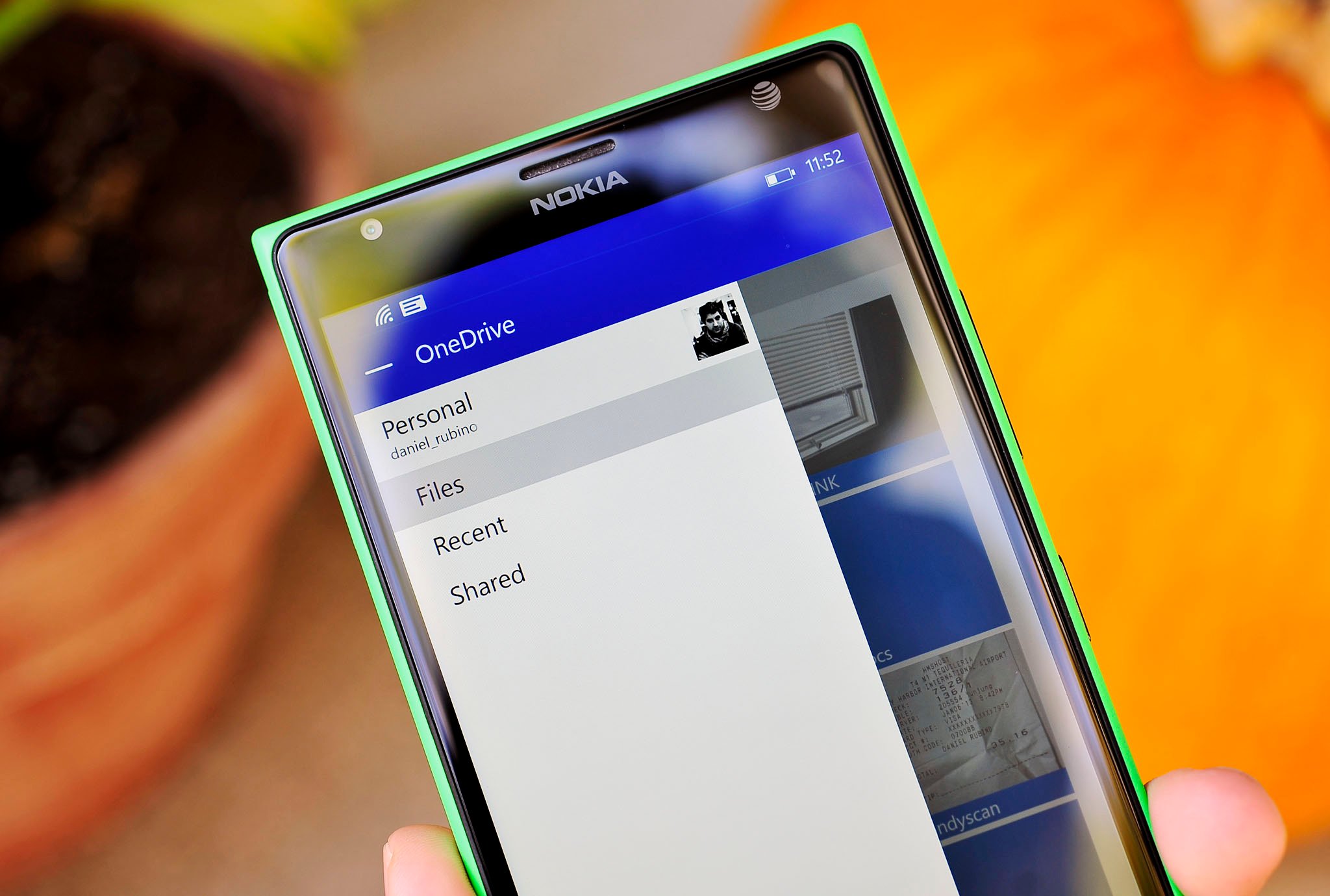
Late last night, a rather significant update went out for the OneDrive app for Windows Phone. With the app refresh came some highly requested features like support for OneDrive for Business. However, there was also a rather large UI change too, stirring some controversy amongst loyal Windows Phone fans.

Changes in app design are always a mixed bag. UI design is an art and like art, there are champions and critics for choices and layout. Some are rational others are pragmatic, and many are just subjective opinions.
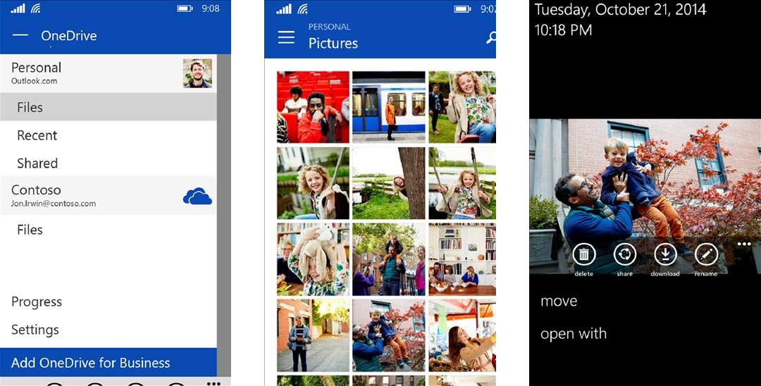
Perhaps the most controversial design choice is the addition of the so-called 'hamburger button', something that even Windows Central uses on the website. These triple-line buttons are more common these days across UI design to designate menus, although they are relatively new to Windows Phone.

Putting aside ideological adherence to undefined 'Metro' principals, what do you think of the new design? Do you find it easier to access different parts of OneDrive and does the app make sense when you first look at it? Alternatively, does the new design stir confusion and revulsion at the idea that OneDrive is looking similar to Android and iOS?

Take the poll below and let us know your thoughts in comments! If you are on mobile, simply head to m.windowscentral.com to take the poll through your web browser.

Daniel Rubino
Editor-in-chief

Daniel Rubino is the Editor-in-chief of Windows Central, head reviewer, podcast co-host, and analyst. He has been covering Microsoft since 2007 when this site was called WMExperts (and later Windows Phone Central). His interests include Windows, laptops, next-gen computing, and for some reason, watches. Before all this tech stuff, he worked on a Ph.D. in linguistics, watched people sleep (for medical purposes!), and ran the projectors at movie theaters because it was fun.

312 Comments
  • Personally, I rather like the new design. Although I think the barren Modern look is good for some things, it is a concept that is also fluid that needs to change with the times. This does not mean surrendering core aspects, like adding drop-shadows, but I think merging of popular design choices is a logical and smart thing to do. Regardless, I know there are some people who want Windows Phone to have a completely unique design, which I understand, but I do not think this app degrades that in any way. After all, the majority of the OS is still very Modern/Microsoft.
  • Seems fa... Facebook like
  • Daniel, it's not about whether the app looks like another OS, nor about how UI design is like 'art'. In fact, usability is quantifiable.  The main problem of the mixed use of Hamburger button and Pivot tabs is that the hand gestures conflict with each other, i.e. both requires the same left/right swiping to activate. Also, the Hamburger button is way out of reach for the right thumb, when one is using the phone with one hand. Gizmodo has an article today, which explains this much better than I can. http://gizmodo.com/were-designing-apps-wrong-for-huge-smartphones-1651751412 Microsoft needs to hire better designers that follow its own guidelines properly, and also has the experience to design apps that increase usability, but not lessen it, when they add new features.
  • What a crap and ugly android port! F u c k. of! I will back the modernUI with big headers! So guys, look here and vote: https://windowsphone.uservoice.com/forums/101801-feature-suggestions/suggestions/6623043-stick-to-modern-don-t-copy-android
  • The real problem is the phones with huge screens. I can comfortably reach the whole screen of my Lumia 820 with my thumb. The 4.3" screen is the perfect sweet spot.
  • This is not some common app. Nay, this be one of THEEEE apps. OneDrive is clearly being positioned for greatness, and now it's been found wandering the kingdom, drunk and staggering. This is not how an app should behave. We know because there is a royal declaration regarding how apps should look and conduct themselves. This is not simply about avoiding the casting of shadows or reflections. If the King wants to make provision for slovenly behavior and the supplanting noble traditions, let us hear his well considered decree, and we shall judge against that. Else, constancy!
  • I think this is a great step forward. The pivot still works and the titlebar is small enough for me to be able to see more files on screen at once. There are a few issues though that I would love to be fixed. The images that replaced the titles at the top of the pivot menus are quite small and do not have enough padding-top and padding-bottom. Other than that, and a few performance issues, I like it.
  • It's not obvious but you don't have to click on them, you simply swipe left or right.    
  • There is a mock-up that shows a normal pivot that uses the same vertical space as the new layout.
  • It is much better and seems more responsive. I like that I can have business and personal account on there, I wish they would do the same for PC. One drive business is lacking compared to personal..
  • It does not feel unique or Windows Phone. It's not a beautiful experience and has an ugly grey bar on the right. It looks like an app designed by a teenager that has functions worth having but no design skills were used. Seriously needs a designer to add some style.
  • I think it's too Android-like UI. It should be Modern-App UI  
  • I agree it is not pretty, but we also needed some function, so hopefully form comes after. I think it is pretty easy to navigate, I'm sure there are ways to improve it, but I think it is a step in the right direction.
  • I feel the same way.
  • The changes to the UI in this are changes for changes sake, there was nothing wrong with the UI the way it was and if anything it's more confusing and harder to use. Every WP user knows that to access settings in other apps it's, tap the three dots, select settings. With this UI change they moved settings out of the place that's consistent with other apps on the system and into the slide out panel accessed by using the hamburger button in the top right. Why, it was perfectly fine where it was. That hamburger button in the top right is fine for operating one handed on the 530 but what about on the giant screen of the 1520. Why did they move search, again that button was fine on the app bar. We now have a horrible grey bar with three icons instead of text based pivots, why as it wasn't needed. Still Microsoft have to make Android users feel comfortable just in case hell freezes over and people spontaneously ditch Android for Windows Phone, even if it upsets their long term WP users. That's OK as long term users would never ditch WP... would they!!?!
  • I agree, the previous UI isn't really bad and it just works. Now it looks so inconsistent with other Microsoft built-in apps. I don't think Microsoft really need to make Windows UI to be too familiar for Android users, heck Android is actually starting to have different and finally beautiful UI with their Android Lollipop, why Windows is trying to do backwards?? Metro UI as we know hailed and often praised as one of the innovative and best UI existed, it even got some awards because of it and now they're trying to deviate from it completely. They can evolve the Metro UI while retaining its DNA, current approach seems totally different that it doesn't resemble to Metro as we know it.
  • It's possible they're changing it to be more consistent with future changes leading up to Win10? I like it. But I think there are still to many UI elements/controls at the top of the display.
  • And if they want more users, they have to think about more than just the Microsoft Faithful who already have Windows Phones.
  • How would someone switch between personal and business using the old method?  Pivot still exists in some form it just looks different,  swiping left and right still works.
  • The pivot doesn't really work, it's odd having the icons and then a separate title that represents the icons, when the same thing is achieved in less vertical space with a typical pivot.
    I don't mind the concept of the hamburger button at all, but I do think the placement here is poor, tough for users of large screen phones to reach with one thumb!
  • @neo158 @jay agree
  • I feel the 'repeated' title was just to use the space created by the presence of the hamburger and search buttons...
  • I have a 1520 and find the app much less usable design wise but some of the features make up for it. I expect the menu to be at the top of a web page, but native apps have the flexibility to be designed with thumb usage in mind. The way IE was overhauled and put the interface at the bottom. Other than that I want the option when taking a picture to place it in Business or Personal.
  • Jay nailed it. It's not dogma to dislike the hamburger, it's just bad UX. The placement just doesn't work on 5"+ phones. This is an issue on Android and now Windows is introducing the issue. IOS recognized the issue when they went to a bigger form factor and created that reach mode to address it. Another issue with this design is that there are at least 4(!!!) different menu styles. The hamburger, the pivot, the app bar, and the 3 dot menu at the bottom. This is stupid. So stupid. Further complicating things, there are now two pivot styles, one with icons and words everywhere else. This thing is a total UI/UX mess.
  • The hamburger is uneccessary since there is an app bar menu. More importantly, there is a hamburger menu and a 'patty' menu when the buns disappear!?
  • Sorry to hijack but little touch-up: http://i.imgur.com/8qyiCb9.png I find the grey bar USELESS & UGLY!
  • Thanks for this comment Dan! It only needs some slight polish as Jay noted, but it's ridiculous to describe the design as 'crap' as some have said. For me I don't really like the look of the hamburger although I really like its functionality, maybe MS can come up with a new look for that hamburger button?? :-)
  • Big hamburger.
  • It's ugly Dan and you can say that modern design doesn't lend itself to certain functionality, but that doesn't mean MS should use an Android design UI. This app looks just like an Android app and imo it looks like a lazy design. I mean give me a break.
    So should we expect more Windows phone apps to look this way? I'm going to keep posing this question because no one has given me a good answer. If more apps start looking like this why stay on windows phone? This look is so similar to Android, what's the difference? Are we still banking on seamless integration between PC and mobile devices? So that's why we should stay? I'm here for the design. Change it, alter it, evolve it; don't slap a hamburger menu and an ugly search icon on top with two different colored ugly bars....
    All of Microsoft's services currently work better on the other platforms too. I will give them the nod to performance, they improved that dramatically.
  • 8.1 did that quite a bit: most of the design changes were for the worse and lost what made Windows Phone so interesting. The hideous new store is a good example of that. This is what happens when business people make - or influence - design decisicions. ("Windows Phone is getting killed by Android! Make it look more like Android!")
  • I think they only say that about the quality of apps, they want the functionality that Droids get.
  • Functionality can be added without the addition of ugly))
  • Are you kidding? Haha, the store looks a lot better than it did in 8.0.
  • Dude! It looks like the front of a Koreatown mini mall: Busy with signs and hideous. But whatever. Everybody likes what they like. And that's fine. It's just a phone:))
  • I think when polls like this are posted WCentral staff shouldnt post their opinions, mainly because there are many who will just blindly agree with whatever you guys say and it will skew the results. Not saying your opinions arent valid but it has huge potential to affect the overall outcome. Maybe after the poll is closed and you run a follow-up story you can state your preferences.
  • You must have also saw that apparently over 60% like this new design and were like..... Wtf! Because that's exactly what I did. This sucks honestly. I love OneDrive but this app is hideous, it will pain me everytime I use it. Seriously, if you like this design, you'll love Android. This is what all of their apps look like. I'm not being facetious.
  • Agreed!  It's like the new Music Hub.  It atrocious (IMO).  It's simply horrible.  But when you have sites like these with influence say it's ok and they understand what Microsoft is doing, then we will continue to get these type of updates.  It's like Microsoft is throwing in the towel with every iteration simply stating if we can't beat them, then join them.  :/
  • I don't know if you realize we're talking about design, but the design of the Xbox Music fits Windows Phone a lot more than the design of the old Music + Videos hub did in 8.0.  Xbox Music just screams "Windows Phone" when you see it.
  • And that's exactly what I'm talking about.  Design equates to functionality.  When the design changes and that changes functionality from what was better to worst then to me that an issue. It's not always how things look.  But with that said, as I sit here with my 7.5 WP device and my 8.1 WP device and I go into the music hub 7.5 beats it hands down for me.  You may not agree and that's alright but that's how I see.  Thx!
  • Glad I'm not the only one who likes it.
  • I like the new design too.  What I like about the android version is that it allows you to set a password to go into the program.  Here you just open it up and anyone can gain access.  I think for Windows phone they should go a step further and allow password protecting folders. 
  • I like it
  • Agreed!
  • You have three icons near the top, that link to the same thing as the three links in the slide out menu. You have two menus, one slide out, one at the bottom. You basically have three horizontal menus in general. You have left aligned icons at the top and centered at the bottom. You have more android UI / material design elements than Windows.  How can you like it from any standpoint?
  • I was mostly indifferent about the changes, but all the discussion has forced me to heavily analyse the new UI... and now I strongly agree with it.  The 'hamburger' is the most efficient method for switching between Personal and Business accounts, and having it available no matter where you are within the app is pretty great.  It feels like its designed specifically for people with person and business accounts, which may be why it doesn't resonate as well with the average consumer. As a result of this, sticking the Progress and Settings options in the side panel kinda makes sense (quick access, no matter where you are)... personally I'd stick the Recycling Bin in there too, and leave folder specific options in the three-dot menu. The only thing that I think constitutes a bad design choice is the change to the pivot.  The icons are pretty useless... I honestly don't know why they tacked them on and didn't just use a regular pivot with smaller text.  Maybe some OS specific issue?
  • Hi Roun, I wonder can we have a pic of the hamburger menu with that Personal - Business picker?
    I'm one of these against the hamburger menu but I don't have a business either, it makes sense in the app the way you say.
  • It took me a few minutes, but I like it a lot better than the old one.
  • One feature missing, returrning to parent folder. I have to start from the topmost parent, really? Come on, how could they miss that? Edit: Figured it out--hit the back button. For some reason, with the new UI the back button didn't seem like the right action.
  • Every App that requires me to alter my habits just in order to use it, gets rated 1 star by me. And this design changed things drastically. Settings is not where it used to be. Hamburger buttons requires me to use 2 fingers which is unacceptable. That gray strip beneath the pivot text and icons is horrendous. I hate it.
  • So.... things should never change? You people are rediculous.
  • Thats not what I did say. Don't put words into my mouth. I am all for change but this change is for the worse. First off, Microsoft heavily suggests to every dev that his/her app should kind of look and behave like a native first party app, so people dont get confused. Now they are breaking their own rules and require me change my habits on how to use this app, and this app only. Thats not how things work.
  • "Every App that requires me to alter my habits just in order to use it, gets rated 1 star by me." That sounds like you don't accept change. Face it, designs and things are going to change over time.
  • I can imagine an approach developers might take... To provide a skin setting to make the UI behave more like classic WP, Android or iPhone, thereby pleasing everyone as it were. Indeed, you might see Telerik and the like providing their controls that can be customized this way. As a dev myself, I realize how much extra work this would be and in any case would not favor it myself, but as more of the artifacts creep on from other OS's it certainly becomes a possibility.
  • It looks like OneNote (MUI) on my Surface 2. The thing is that the phone is in portrait mode, so we can't see both the "menu" tab and the main view (on the right). So I'm happy as Windows RT and WP are starting to converge for common apps.   The only issue is: my fingers are more or less always on the bottom of the screen. All WP menus are there (ellipsis, etc.) So it's no longer possible to surf Onedrive with just one hand, as the menu button is now in the upper right corner.   Also, the grey tabs in the main view would look better if centered but I guess this will come.  
  • Also this will be eventually a universal app once windows 10 retails, so a lot of the new design makes sense.
  • Great design. Everyone should LOVE it
  • Why should everyone love it, if I wanted to run Android style apps then I would use an Android device.
  • I do love it!!!
  • Good thing there is a thing called choice.
  • Yes, but as what makes this design ecosystem unique disappear, so goes meaningful choice as well.
  • The thinking is just that many of us are suggesting people may choose Android if they like the look. We chose WP, and Microsoft chose to publish UI guidelines and follow them for most apps, and so have most of the apps on the platform. This is not a third-party app where we would likely accept Android or iOS -ness. This feels like MS dropping the ball.
  • android style
  • Great design, wish there should be sign out option
  • the one drive for business settings within the app has a sign out, not sure about the normal one drive settings.
  • i am not sure but there is an automatique sign in this app , no need for signout option 
  • I like it but where is my settings, like actual settings.
  • Thats a good example of poor design, shouldnt have to hunt for previously available features.
  • In the bottom of the hamburger menu... It's right there, very easy to find.
  • Buried in the hamburger menu, where it absolutely should not be
  • Agreed Jay. Good to know you're not going to convert the Windows Central app to that format... Right? ;)
  • If we have need for a secondary menu and hamburger it will be clear which options belong in that menu
  • True. That's a good point.
  • Ill take the poll and let you kn_ow
  • Not for 8.0?
  • Microsoft stopped updating the 8.0 client some time ago and it's a good choice.   Why aren't you on WP8.1 again?
  • His lazy carrier probably didn't approve release of 8.1 for his device.
  • I do not like it at all and this only adds a nail into a half closed coffin (if that made any sense). MS has totally butchered the "original" windows phone experience.
    I think this design is a "prelude" to windows 10 for phones.
  • I can't see an update and it looks the same
  • New design is better than the old one
  • No. No it is not.
  • Metro/Modern UI needs to continue evolving. At this rate, to me the UI seems stale, and hasn't changed much.
  • Evolving, yes. Looking like Android? No. Material UI copies the big bold font and colours of WP, and WP is now copying unoriginal Android design? At this pace EVERYTHING will look the same and that's just not... unique. This update is a mess and needs to go away.
  • Looking like Android? What? You never heard of UIs adopting different functions? The Hamburger UI is not common to Android. I would invite you to take a look at the web and you'd realize your comment is out of touch. Android has adopted the "..." used heavily by Windows Phone. This allows users to easily identify its function across the board. Let me repeat that in a simpler way, UI doesn't give a sh*t about your fanboyish feelings.
  • will change next year with windows 10 rollout.
  • Why is it better, at least qualify that statement with some evidence?
  • I have not received the update yet. I went to the Store, selected onedrive and noticed that there is no pdate ready. Is this is update only for the developer preview?
  • Open Store settings and check for updates manually.
  • Are you using WP8.1, if not then thank god you won't have to put up with this butt ugly UI.
  • It's only available to WP8.1 users. Not available to WP7 or 8.0.
  • Yep ... It's indeed much better & faster too
  • New design is verryy bad I like the last design metro one
  • Is amazing
  • I don't like it. One reason why I fell for WP the first time I held a device in my hand, was that metro design that was so refreshing.
  • It's a good move by OneDrive team I like it but I need a sign out please add it in the next update
  • New design is better than the old one but not the best..
  • I like new design very much.More ui changes in WP apps are always welcome.But still waiting for godamm denimmmmm:)
  • What is business account in one drive?????
  • All the paid accounts I think.
  • Nope. Paid is different. OneDrive for business is for SharePoint and company hosted files.
  • One of the ways you will have a "OneDrive for Business" is if you subscribe to Office 365. :)
  • Office 365 has OneDrive for Business.  Similer but very different than OneDrive. Nice that there is now one place to go for both though.  OneDrive For Business was only accessible from the Office app on WinP.,
  • This is your sharepoint 2013 sites of your enterprise. You can sync the library using onedrive for business app.
  • would be the one drive associated with your business office 365 subsciption.
  • This is gorgeous ! Best design. I've ever seen
  • You forgot to add the /s at the end.
  • Please have my lol
  • No I didnt forget , remember that people aren't the same ;)
  • Might as well buy an Android smartphone now
    Which I might next year (maybe)
    If MS changes my mind
    Been a long time WP fan
    Hell WP(7) was my first smartphone
  • Have fun lagging your ass off.
  • Lol thanks but it I'm just ranting here I just don't want WP to go bye bye or radically change into something else
  • Please, the phones coming out for Android for the past two years have been amazing phones. This lagdroid stuff is garbage. If you're using a super dirt cheap phone then yeah Android probably isn't running great. However, Moto G/E are awesome and all other mid to high end phones lag just as much as Windows phones.
  • WP7? Some of us have used the Windows mobile platform since the PDA days when you had to dock your mobile device with a win 98 PC to download offline WebPages if your wanted to look at them on the go.
  • Same here, it was also a time when apps on Microsoft's mobile platform had consistency as well.
  • There was such a time? :?   I had a Windows Mobile 5 device once, not touch. Didn't know to do anything on it.
  • So, You might as well go Android, because one app looks vaguely Android-esque? Right... 
  • Hubs have gone too, which were unique, and now apps are looking way too Android like. The point being made about choosing between an Android or Windows phone, now that Microsoft has better apps on other OS, is why choose WP? I don't like Google and its services and don't like the bland iPhone OS, so choose WP. But others who like Android or IPhone, why would they move to WP?
  • I agree having two phones. , if. I were you I will get a nexus 5 or a Moto X device , at least better than galaxy or any other manufacturers
  • Awesome
  • indifferent for me
  • I hate that windows phone feels more like the other os. The tiles have been made redundant due to the action center. And we are losing the unique design aspects of windows phone. It just feels less....interesting. The new update looks nice if not something uninspired
  • You notice how many more people are buying Windows now? That means the old way didn't work for the masses so it had to change to stay alive. I love the new WP.
  • Yeah but this new changes also gonna make users like me switch back to other os ...because if we can have the REAL OS why should I go for LOOK LIKE OS...mean its better to have android then having android like os....
  • Tiles are not redundant. When properly optimised, they will work the same way system apps tiles work, synced with action center
  • That's not possible for third party devs
  • I don't think notification centre has removed the usefulness of live tiles, but has complimented them nicely. For example, the MSN News app will give a notification for "Breaking News", but also gives updates of less significant news items on the tile. Notification centre is good for the things that you really can't afford to / don't want to miss, like emails and text messages.
  • Totally agree. Both have their uses and lives tiles are still Metro and unique.
  • I think it works just fine, maybe even better then the last ui
  • microsoft, get immediately rid of the hamburger menu. it's terrible. both ui and ux wise. lots of information about that, too, from apple ux designers. it's not metro, it's not platform-consistent, and it's not very usable. terrible choice. following a fad that should already be dead.
  • + icon
  • Totally agree with this!!!
  • Agree!!
  • Agree, its a mess, inconsistent and ugly. Plus, does not use accent colours.....
  • I really don't.
  • Don't like it one bit. Its cluttered and confused and it has way too many elements. They borrowed too heavily from "generic android app". Less is almost always more. And its really slow and clunky!
  • It's not so good. The previous design was better.
  • No. It's Android-style, and what's worse is that it is pretty much completely unnecessary, at least at this point. The functionality of the sidebar mirrors the panorama and the normal WP-style menu.
  • Completely agree. Aside from the ability to switch between business and personal accounts, the left side bar mostly just replicates the pivot items. In what world does this make sense?
  • I like it..
  • Awesome really really nice this new UI
  • Superb
  • Honestly the old design felt very slugggish and hard to get around, (don't hate) it does seem faster and easier.
  • Yeah but it seems like they removed/broke pinning a folder to start screen? WTF? Did they hide it somewhere that I'm not aware of?
  • Long-press on a folder > tap on '...' > pin
  • Yes superb!
  • Can't say I love it but I have no reason to hate it either. As long as the navigation isn't confusing.
  • Yes :-)
  • This design shows that this update is connected with windows phone 10
  • What!!! How would you know that as NOTHING has been mentioned about Windows 10 for phones!!!
  • Actually Windows 10 for phones has been mentioned. Windows 10 is designed to be a unified operating system for all windows devices. Phones, tablets, laptops, desktops, embedded, etc... All running Windows 10.  
  • Love it
  • Seems faster
  • The Business OneDrive support is a way cooler feature than the UI which is pretty good.
  • Agree with you Daniel.  
  • No net.. Haven't updated it.. :P
  • I had to go back and use it again... Seems faster no huge differences . In my opinion it's ok and its hard to argue with FREE.
  • No.
  • Featured it great I love it
  • no offence, but those who don't like changes, please stop hating. even android and ios have changes in design by the time. we must embrace changes, not hating it.
  • When it's changes that add something to the functionality or to fix issues then yes, however this is change for changes sake as the previous UI was consistent with the rest of the system. No, I won't stop complaining, and yes I do take offence. Don't ever tell me what I can and cannot do!!!!!
  • It's now a mess, inconsistent and ugly. Why not complain?
  • This
  • There are two ways to switch between views, that's redundant.
  • I can't see available storage. I can't add business account. I can't see GB plans.....
  • yes you can
  • The upper-left hamburger icon is not easy for one handed mode. Other than that, its good.
  • Yea.
  • Much better and easier navigation. Now Here Drive needs a major overhaul .
  • Oh i love it!
  • Bit by bit, WP is just becoming a clone of ios and android, a reflection of Microsoft's utter incompetence and failure to make this platform succeed.
  • Don't taze me bruh!!!
  • It's a welcomed change. Still feels like the Metro design. Just because it has the "hamburger" menu buttons on the side doesn't make it Android-esque. Some people are really overdramatic about miniscule details such as this.
  • Hmm, where's settings now then? Here's a hint, it's not under the three dots like EVERY OTHER BUILT IN APP ON WP!!!!
  • It's not metro design, its a mess!
  • It's faster now, the UI is meh! But it is definitely faster, the old version would take ages to show you the thumbnails, but this is faster. Oh and now we see more on one screen too
  • Design is great, more user friendly than the prev version!
    Overall it's easier to use!
  • Not a huge fan yet, but I don't use the app on my phone very often, so i'll give it some time to grow on me. Could you view files other people had shared with you before this update? That's one thing I want them to add to the Windows version, ability to browse those files that others have shared with me.
  • It's still ugly with that top bar, and the Android side menu style is so... Android
  • Awesome Update....
  • Personally ...... I dont think the new design is confusing.... But I hate it to the core .. I dont hate the hamburger button... But the huge blue bar makes it look way too androidy..
  • Exactly
  • +1020
  • Here is my re-design: http://i.imgur.com/8qyiCb9.png
  • Redesign? You took away the ability to swipe to different content and you removed info like file size and upload date... I also like simplicity but you're just going overboard IMO.
  • Was in a rush :P. Meant touch-up/ fix Edit: I did not remove the info size/ upload date. You can view your files in 2 ways xD
  • I know you didn't COMPLETELY remove it from the app but you did remove it from that screenshot, which I don't agree with. And what difference does it make to me whether you redesigned it or fixed it? Lol
  • I thought it was bad but I used ot later while uploading pics and o liked very much it feels faster
  • With the new UI, I don't really see a decrease of emphasis in content (in fact more emphasis is now given) and as long as it gives me the info/content that I need as a user then I dont see this as a problem. Now a personal problem that I have is the "hamburger button". A control I'm not a big fan of because it requires me to stretch my fingers across the screen. I use a Lumia 920 and I really like using my phone one-handed. The "hamburger button" just doesn't compliment all screen sizes. 
  • Its fast but looks more like android !!
  • Good approach. Appreciated for introducing navigation panel like facebook. It should not be like old fashioned drive look. More improvisation can be done on top it. Introducing color folders and all can be added in future updates. So such type of steps always makes us feel good about Windows. Hoping for password protected facility to be added.
  • I love it!!
  • I definitely prefer this over the old design.
  • I'm loving it!
  • I'd like to see tile evolution, not just flat, but 3d, a sort of roll cube, like a dice with some info on every face
  • Not that bad...but what makes me sad is the removal of login & logout option of the app which gone in the last update..it is a very much needed thing security is first priority...in this update also one more feature gone now u cannot check ur storage u have...it's too bad...big thumbs down Microsoft...
  • The design may be better than previous one, but one of the main aspect of succesfull designs is constancy ! I am not against evolutions but users need to know the way the OS and the apps are working, the UI and interactions should be consistent in all over the OS and apps, don't look at the geeks, they will learn how to use an app but for normal users its going to be hard each time they face a new UI and a new way to interact with app. The hamburger menu is not the main problem, the main problem is the UI and interactions are not consistent and they are changing each time and its not good for all users.
  • Agree!
  • Not that bad, but I prefer the old. Why the hell don't they update the windows version? That one need a update urgent! No functionality at all!
  • It's awesome!! Smoother and feels ease to use... Better than the previous
  • Yes... I do
  • It sucks. The app "starting screen" shows a black bar on top of my Lumia 930, clearly they haven't done much testing with 1080p devices (on 720p it looks fine). It also shows a top border on the app itself. The Settings moving from the bottom bar to the hamburger menu, I don't like it but it's understandable. People coming from Android will easily find it there.(err... not sure how many people are leaving Android and getting WP but anyways...)
  • 6.9 out of 10. I'd prefer a more modern-like design.
  • Still. Can't. Select. Destination. Folder. To. Move. File. WTF?
  • Why dont they update office and one note they really need to renew
  • who cares, it works. the only people complaining are the ones that probably doesn't use much OneDrive and complain about a stupid design like if this removed functionality, in fact, it works a little better.
  • I don't lik... Windowsphone have some unique nature and design of an application. But this app update look like Android and ios version.I don't lik this design.
  • i'd rather be hated for who i am than loved for who i'm not
  • Like The New OneDrive.
  • Yes I like it. Yes its more like android but I would like to keep the flow of what was initially started with windows phone metro UI. Im all for change when it comes to windows phone. Just update our apps just as much as the competitor's and im fine. Again yes I like the change it has more functionality.
  • I think the key question is does an app use provided developer components to construct the UI?  Clearly the hamburger menu is not a standard UI construct and is foreign.  If this is the way Microsoft want apps to go... i.e. away from the bottom menus and to popup menus that look like iOS, then they need to add these components to their design rules and component library.  If not, then they shouldn't use them.
  • I always choose function over style.
    In-app metro UI can die off completely as far as I care, as long as it's replaced with a more functional UI.
    Microsoft's metro/modern UI is flawed, main thing is the ridiculously large segoe text that doesn't even fit on the screen.
  • Honestly, I can't truly test apps because I'm using the Developer Preview and my phone is frustratingly slow, resume-y, and often times freezes. The "design" looks awesome, but for me it's less about looks and more about functionality and speed. L928
  • I would also like it to adapt to our accent color rather than just the native one drive blue..
  • Yes definitely yes
  • Didn't updated yet.
  • |: Who care about Microsoft designs |: Microsoft is too slow ):
  • Yup.. Like it very much.
  • I like how it looks on my 8.1 Icon....................
  • I like the design. It does not look bad and is more functional imo.
  • No
  • Yes
  • somewhat yeah but not all of it its not perfect on a side note they should give us the next version of modern UI on windows 10 for phones
  • Seems facebooky & the hamburger seems like a waste when there's the ever friendly & easily accessible ellipses for all things not readily displayed & then there's this bugging grey area on a nice blue & white screen.
    While the addition of business account is nice, the UI is not as nice as expected
  • Facebook wanted it's app to look similar across all the platforms. Now that MS is providing apps of it's services for all three platforms, I guess they made the same decision as Facebook. I understand wanting to keep the branding and look similar across all, but WP was unique.
  • Exactly, the changes to the Facebook app were needed for consistency but with the OneDrive app every single one of the UI changes are just for the sake of it.
  • Yeah, I like it. Looks quite similar to Android Lollipops Material Design, which I'm a big fan of. 
  • May I ask then why don't you use Android?
  • Then why use the Mod-terial design, just get an Android device and run Lollipop on it.
  • I agree that the Modern UI should evolve. I embrace change. You know, the Facebook app isn't 100% respecting the original guidelines, but it looks and feels great. I like some of the changes in the updated OneDrive app. As long as I can still flick left and right to move between pages, I don't mind the icons on top instead of text. But the hamburger button has to go away. It's just ugly, and it completely ruins the UX. I don't mind it because it's copying Android, I mind it because I don't like it on Android so I don't want it on Windows Phone. Put the things in the hamburger menu back in the app bar options. Everything else is great. And yeah, it must suck for larger screen phones...
  • Only Microsoft can think of a UI which doesn't have select all option when it comes to deletion
  • Ya it is cool and simple UI. Similar to facebook
  • Sorry I don't like it, extra clicks needed, on a 1520 the gray bar is as big as some peoples screens, why put the settings where they have.   They should always design in choice, do you want to open the app on the files page etc.   Bob
  • I personally like the old Metro UI  That is what Windows Phone is all about right?! Microsoft needs to fire those who are attempting to change the Metro UI, and focus on the consistency whether it's Windows Phone, Tablet, or desk top. I WILL NOT update my OneDrive, because i find the new UI is HORRIBLE! Microsoft, you are starting to loose hard core Windows Phone fanboys if you keep implenting Android UI intro Windows Metro UI.   If I want these design, I will get a stupid android phone!  STOP!!!
  • Oh yes
  • Is there not a way to have this as a black background vs. white?  And I like it, however, the design is very Android influenced, and that I could do without!
  • Am I missing it, or is there still no pin support for this on Windows phone? Like there is in the android and apple versions of the app.
  • I think its fine, though I gonna miss the original Metro UI, which what it gives me the first good impression to Windows Phone and Zune. They really need to refine this new OneDrive UI, its still too close to Android UI and I find some UI elements aren't align, scale and spaced well, not pixel perfect. The Hamburger icon is bad, they should at least copy from Coratana hamburger icon. The navigation pivot icons isn't spaced very well. There is a weird white space under the navigation pivot which makes the content cutoff when scrolling, its bad.  I still find the overall UI is rushed, but nevertheless it was ok in my opinion. If they're going for overall different UI for Modern/Metro as a next step, they should really collaborate with real designers. Metro UI was too good to be replaced by this.
    Functionality, this app is better than the old one so only the UI is something need fix here.
  • When Windows Central will allow us to vote on polls in the app? Android already has it.
  • No way to even go up to the parent directory?
  • I don't use it, thanks
    Don't like to put my data info other houses(servers)..
  • Not too much
  • It follows OneNote design..
  • As long as it's functional, I DON'T CARE
  • Seems faster and stuff.
  • I love it. But I want the feature to log out
  • I agree that if you have a 4 inch phone it is harder to touch the right spot! I have a Nokia 1520 so it is not a issue. They may want to give the option to offer larger icons or menu panel's to make it easier to touch the right spot!
  • I'm not gonna read through all the comments so this may already be said. But bad move. Hate the hamburger. But what's worse either that or the grey navigation bar is redundant as both navigate folks files, recent and shared, and there's nothing more I hate than redundant menus.
  • The design is stupid. So we now have three lines on the top. And what do they mean...? There's a menu there!
    Fine.
    And then we have three dots on the bottom. What do they mean...? There's a menu there!
    Try explaining this to someone non -technical.
    Weren't we laughing at the stupid design of IOS and Android apps, that had important buttons in top. We smiled and told them how clever Windows Phone is because everything is within reach of your thumb.... Apparently even that advantage is gone now... Tell me again... Why should people choose Windows Phone over other phones? They all look the same in the apps. What's next? Removal of the live tiles? :-(
  • Agree completely.
     
  • Really the only complaint i have is the placement of settings. 
  • Am loving the new UI
  • Functionality, better. Responsiveness, better. UI design, notably worse.
    I expect many of the people giving positive votes are doing so because, overall, it's a better app. But with a consistent, cleaner UI, it would be even better.
    Creating a small improvement does not excuse missing out on the big improvement it could, and should have been.
  • I ditched my dropbox account when they wouldn't make an app for windows phone, glad I use onedrive, works great on my L920!
  • I like hamburgers, I like buttons... just don't like when they are combined, especially not in WP. :p The UI is fine, I guess, but it doesn't feel like WP. I like the Metro/"modern UI" style, and it's disappointing to see Microsoft not adhere to it. Did they just take the iOS version and reused it?
  • Personally, I hate this desgin, the UI of the older version was okay. I'm not a fan of this hamburger thing. All this stuff they put into the hamburger button could have been in the BottomAppBar as an MenuItem. And instead of putting these little symbols in the Pivot, text would have been better. I mean, on the Facebook app, for example, it's rather okay, but on the OneDrive App it doesn't fit at all.
  • The new design feels a little more laggy to me.
  • Old one was quite better!
  • It's 10 times more useful but it looks 10 times worse.
  • they need to forget about making UI changes and concentrate on making Microsoft third party apps more fluid.   There is not 1 single Microsoft app that scrolls with fluidity other than the system apps.   I just can't uderstand why they don't prioritize this.  It destroys the "WP is smooth" myth that I used to believe.
  • I like the design when priority is given for switching between business account and personal account. I'm not able to view the polling page from the app on my L730.
  • I'm very upset and disapointed in the new design. I feel like MS is slowly introducing more and more Android like UI into WP and also stripping away some of the beauty and uniqueness of the Metro design. They should stick with the core principles of the UI and not just make changes for changes sake. WP has the best mobile UI look, MS should be promoting this in their app designs not tearing it down.
  • Same good and nice fix on pictures upload thanks Microsoft
  • I do, was surprised when I logged in on my 1520 and noticed it
  • Need to downgrade asap
  • I dont mind it, except where the settings and progress are located. Why cant they be in the app menu with some of the other features? Just doesn't seem to follow their own design rules...
  • Everything new gives a better experience. So obviously its good. But you have to change it with respect to time. And give more features. Don't dump updates. Thats life of any app.
  • I would not call it "new design".  And it is not "embracing". They simply dropped WP design branch for this app and gave us half-ass ported (with features missing) andriod version. Try to find a difference with this https://play.google.com/store/apps/details?id=com.microsoft.skydrive&hl=en
  • It's good to see that they're integrating OneDrive for Business as well. About the new design I think it's different for each user. But for now, I really like it. It's more refined, more slick. I would love to see my available storage on OneDrive for Business, but you can't have it all. Expecting updates.
  • I love it
  • I can't sign in to school account thus can't take advantage of business account. UI wise it's different but makes sense for OneDrive.
  • Dropping major design language features as typography is severe mistake. Now we have tiny icons as in Android. The whole app looks confusing. The clear structure, which is a major advantage of Windows Phone, is gone. Functions are everywhere (top and botttom appbar).  There is no need to have the app looking the same in all OS. I wished I could go back to the previous version. Please Microsoft do not make the OS a cheap clone of Android.
  • I like the UI....as things are not with big fonts anymore and good to view in my 1520...but placement of things is a problem when i try to use it by one hand...especially search button on top right...
  • It's a matter of personal preference.  I like it a lot.  As far as being androidy  I wouldnt know I've never had an android device.  That could change at some point I've played with my sons S3 but it broke and now he has a 1020.  I'm thinking about trying the Note 4 at some point.
  • Love it.
  • Heck yes I do. :-)
  • https://windowsphone.uservoice.com/forums/101801-feature-suggestions/suggestions/6623043-stick-to-modern-don-t-copy-android?page=3&per_page=20 Comments there say what i think about this sh..ty move.
  • The new design is horrible.  I think the same idiots responsible for Windows 10 have puked on OneDrive as well.  Microsoft is quickly turning me off.
  • I don't use OneDrive... Yet...
  • I like it, it matches the windows UI
  • NO! Those tiny icons are not following Metro/ Modern Design. Bring back the old one!
  • It looks great and very alluring
  • Well damn, and there was Leo last week on Windows Weekly saying the Hamburger Button was so 2013, and slowly being phazed out. Perhaps they should have gone with the Dots option they used in Outlook.com last week. My problem with MS design is a lack of true consistency, even across their own Apps and Services. It's like sometimes even they're not sure which direction they should go in.  
  • there is NOTHING in this update that required such a brutal design language change. as others have said, the new layout just does not fit the overall Windows Phone / Metro design   this is not about liking/disliking the new layout. it just loks strange on the platform.
  • I like it, it looks great, and has more harmony with 8.1, the older version was way too 8.0.
  • Change is nice
  • Re: yogi003,
    Change for only purpose of change is a waste of effort (money = paid hours) and I disagree about change (implying always) being good. Not true.
  • like!
  • I like it! Very easy to use. I am a leftie and I often get annoyed at menu options being stuck on the right. Having said that, its clear I am a minority on this (left-handedness) so why can't there be a left/right handed option like some apps have?
  • Holy cow it looks like Android. I could start a whole thread on why I hate Android, but while the new design isn't "bad", I think it lends too much to Google. If people get Windows Phones and see that they are too much like Android, they won't see the point to switch. Google Play has so many more apps, and more people support it as a platform. So why get a Windows Phone? It's UNIQUE. It offers what iPhone and Android are too busy battling over that they ignore. Same thing with the Zune or Xbox, if they were too much like the competition, there's literally no point in getting one. Microsoft, the new design is definitely slick and comes with some new features that I like, but the new visual design was extremely anti-metro and almost made me nauseous. However, this is all personal opinion, so you may like whatever you want.
  • Oh yeah, and there's a hamburger button. Enough said.
  • It doesn't affect HOW I use OneDrive, so I have no complaints really. I do think having Recent and Shared under the hamburger menu is redundant since you easily swipe to the right, and I do wonder why the hamburger menu couldn't just be a swipe to the left instead of a button... But again, overall it didn't hinder my usual experience, so whatever. I do believe not letting the user know you can just swipe to the right because the Metro header design is gone is a mistake though. Its the whole point of Metro design, no?
  • Yes!
  • I don't see the benefit from the 'hamburger' menu. This change is another step towards inconsistency, which MS consequently communicates these days. I got the feeling, too many people can make crucial decisions in this company*. No, I don't like it, and btw I don't care, if it is 'too android like'...   * Viele Köche verderben den Brei (german saying) Too many cooks spoil the broth
  • Ofcourse it's awesome
  • Updated last night but still looks the same. Must be an 8.1 thing.
  • I much preferred the old UI. Also that grey bar that people mention, unfortunately that is a Sideeffect of the SDK and not the Developers fault. For whatever reason the SystemTray does not sit flush with the page grid which results in that crappy line between the two. I have seen the same issue when making apps, it's just aone of the crappy visual flaws of a sucky SDK unfortunately :/
  • I don't get the hate. Windows Phone isn't without its problems, and saying something is bad because it's like Android isn't an argument; it's fanboyism. I love WP 8.1 because it's taking the best of what other operating systems offer and blending it into a different experience that emphasizes flow control over app-centricity. Enhancing the OneDrive app with these menus was exactly what was needed. Navigation is rapid and straightforward, and almost everything is two taps away. I'd love to see this design pattern applied to OneNote; right now you have to touch a tiny text label just to backtrack, which is clumsy.
  • They should have placed the account info after the shared menu and settings, progress, about on the ellipses, thin this app they will also make available on iOS and android to have familiarity on all devices.
  • I love it. I think it is a great improvement.
  • On Windows Weekly, Leo Laporte (huge Android and Apple fan) says that the Android people are moving away from the hamburger menu design. It's so "last year"! Geez, Microsoft, get a grip on yourself.
  • "ideological adherence to undefined 'Metro' principals" doesn't bother me at all.  In fact, i see it as a way to lure ios and android user to windows.  familiarity is the key.  familiarity is why the action center drops down from the top and not from the side or from the bottom like so many recommended.  if the apps are there and they act and look familiar then the switch is a bit more tolerable.  And, is this what we want? We want OUR platform to grow and the only way it can do this is by making it easier for people to switch without a jarrinng experience that is unfamiliar.
  • I wish i did not update. It's ugly.
  • No. It's awful looking. I came to Windows Phone for the metro design. Frankly, if I wanted Android, I would have gone with Google's mobile OS. If Microsoft can't add features to their own apps without changing their UI, then they have thrown in the towel.
  • The Modern UI needs not to be barren and we've seen that implemented such apps like Skype and the MSN apps to name a few.  If we are going for "popular" design choices versus the design principles of Metro (Modern UI) then why would we waste our resources on Windows Phone when personally I think iOS has a lot more to offer.  I think one ofthe core problems with Microsoft and its developers is this inconsistency of the design of apps.  Take for example, Spotify.  I love Spotify but the app looks and feels like you're on iOS.  Personally, I love this Spotify for Windows Phone and Windows 8 concept by Fábio Alves. The new design of OneDrive is not bad but it's not what we're expecting as most of us have switched to Windows Phone because of its unique design and experience.  If this continues, it would not be a surpirse that people will be leaving the platform for a far more mature and consistent experience.  
  • Very nice redesign, with consistent features for both OneDrive Personal and Business. As for the design, it's certainly usable, but I'd prefer maintaining a consistent Windows app style.
    .
    More importantly however, I'd like to see functionality updates. For example, an app password or pin in addition to account credentials for an extra level of protection on mobile devices. Plus integration with Office Mobile (add new Word doc, OneNote notebook, etc), and with local storage (merging the Microsoft Files app).
    .
    Overall nice job Microsoft! Keep the updates coming!
  • I dont like that the 'hamburger' menu comes in from the side rather than down from the button. They need to learn from webos/google-material design that actions/animations/transitions should make sense. Their animation is divorced from the button. It shows poor thought put into it.
  • It looks like an android app.
    I never liked this hamburger menus on the left side, I remember when they came to google apps (play store...) and I didn't like it. I actually forget that menu is there sometimes. Anyhow, unless this is new WP guideline (they didn't announce anything, did they?), it looks more like it followed android guides instead of WP.
  • It's too much Android like
  • New interface seems to work fine an it looks fresh. That's always good for an app.
  • I liked the new UI.. It runs fast.. Loads up the images fast..
  • The UI has nothing to do with the load. They've improved load times, yes, but there's no reason they needed to put in an ugly, space-wasting, redundant hamburger button, or ditch metro design's textual pivot page titles for incomprehensible icons (while still wasting space with a textual translation of that icon above it!) and wasting further space with an out-of-place, hard-to-reach search icon up top which SHOULD be in the appbar down below. If we wanted poorly-designed UI, we could have Android. iOS and Android's half-assed nod to WP (by "flattening" some of the icons) misses the overall point of windows phone design language. Apparently, the developers at OneDrive also miss the point.
  • No précise opinion because my OneDrive app is force closing since a couple of month ago (Lumia625, App on the Device Storage, WP8.1 Update + Cyan) :)
  • I'd like to get the update, but for some reason I can't. Oh, wait. Is this JUST for 8.1? It read over on the Windows store page that it was for 8.0 as well.  Maybe that was a mistake and this is just for 8.1 and that is why I can't get this update becase I can't get 8.1 on my Icon because Verizon did not think it was ready for relase.