Windows Central readers aren't sold on Windows 11's look ... yet

Windows 11 Install
Windows 11 Install (Image credit: Daniel Rubino / Windows Central)

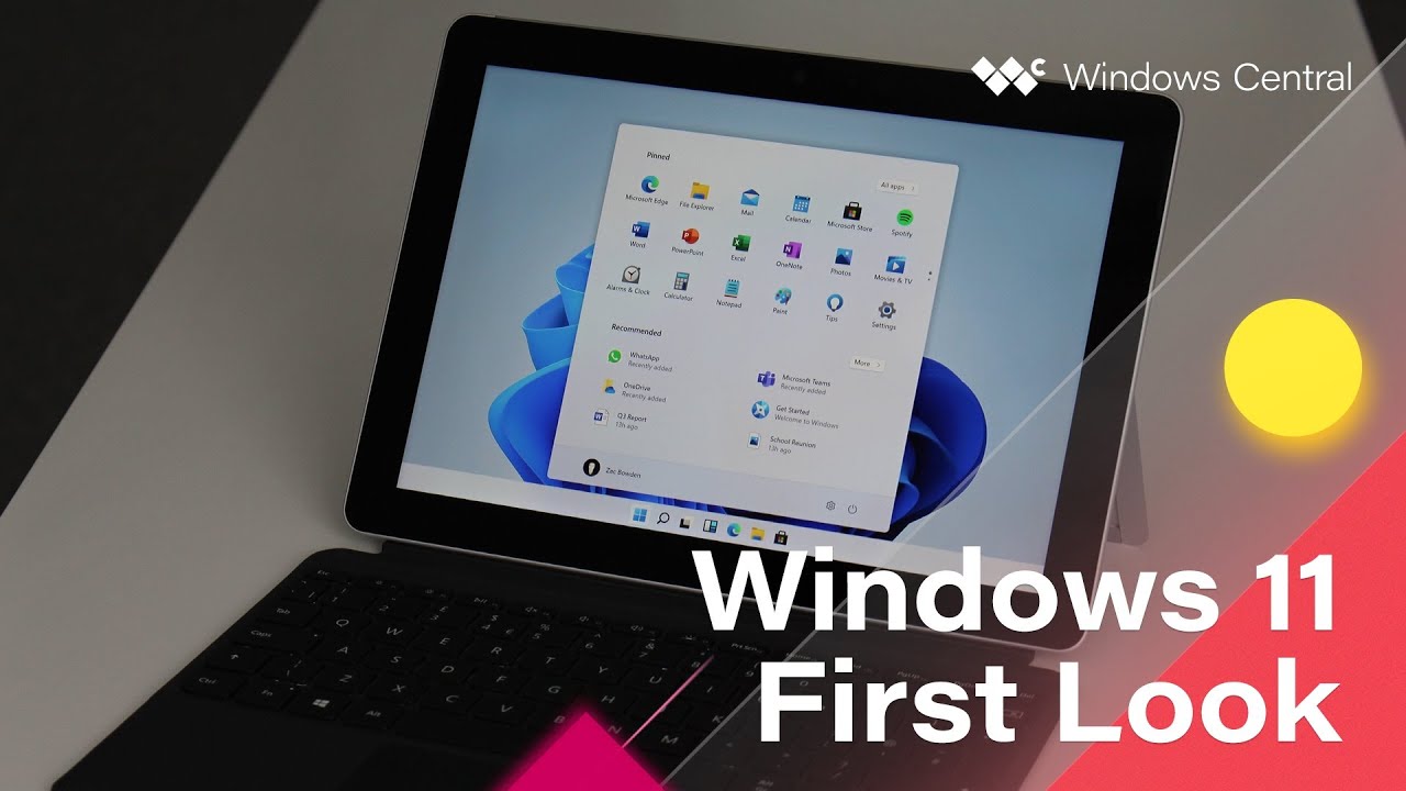
Windows 11 build 21966 leaked yesterday, providing us the first glimpse of Microsoft's upcoming operating system. The OS has a new Start menu, Taskbar, and several other UI features compared to Windows 10. While the leaked build doesn't show a finalized view of the operating system, it gives us enough of a glimpse for some early judgments and opinions.

At the time of writing, our poll asking you about the look of Windows 11 has just under 4,000 votes. Of those participating, over half say they need more time to judge it. That's understandable, considering that this isn't a final build, and Windows 11 could look different when it ships to the public.

The remaining voters lean more towards loving the look of Windows 11. Out of all voters, over 32% say that they love the look of the new operating system. Just 15% of total voters say they hate it.

Of those that hate the look of Windows 11 so far, the biggest complaint appears to be the centered Taskbar. Luckily, it appears that you'll have the option to move the Windows 11 taskbar to the left, which is where it's rested for decades. Despite the total vote leaning towards a positive view of the OS, the majority of comments we've seen are negative. It seems like those that dislike the look of Windows 11 are passionate about it.

If you'd like to check out the new operating system in action, make sure to check out our Windows 11 hands-on video. We also have a piece with screenshots and clips of different aspects of Windows 11. Since Windows 11 is fresh, we'll keep the poll open so you can continue to weigh in and share your thoughts.

Sean Endicott
News Writer and apps editor

Sean Endicott brings nearly a decade of experience covering Microsoft and Windows news to Windows Central. He joined our team in 2017 as an app reviewer and now heads up our day-to-day news coverage. If you have a news tip or an app to review, hit him up at sean.endicott@futurenet.com (opens in new tab).

71 Comments
  • Interesting how it skews too. On my Twitter poll (2K responses, so far), it looks like this: It looks great/promising: 42.2% Terrible: 11.1% I'll wait for June 24: 46.7% Of course, there is a lot more coming than has been shown in this leaked build e.g. new Store, some inbox apps, media controls, etc., so 1. waiting for the 24th and 2. Waiting to actually use it yourself is a wise choice.
  • I'm solidly in the looks great/promising camp. Yes, we should all be patient for the final release, but I'm already a fan of the new aesthetic/UX (e.g. already using TaskbarX to center my taskbar). Meanwhile, it's interesting how a distinct minority of readers who hate the look, scoff at the name change, etc. attract so much attention. Contrasting opinions can lead to engaging discussion––until it devolves to the point of nonsensical triviality and irrational mulishness.
  • there is no difference between W10 last insider and W11 except new start menu which not working on multiple screens. Everything else looks the same. Dark mode still miles behind apple- a lot of white 'things' from xp era
  • "there is no difference between W10 last insider and W11 except new start menu"
    False. New UI/UX (new Start menu, Action Center, centered) New animations New touch experience New icons New sounds No more Live Tiles Widget Panel Completely new Store New inbox apps New OOBE New Ink Workspace
  • New UI/UX (new Start menu, Action Center, centered)- just icons
    New animations- yes, minimize, maximize, start animation
    New touch experience- extra border
    New icons- not new vs W10 insider
    New sounds-
    No more Live Tiles- it is not feature
    Widget Panel- not new- still don't get what is the purpose of it
    Completely new Store- no
    New inbox apps- I use PWA
    New OOBE- nice name but what is it?
    New Ink Workspace- yes extra few buttons All of these are just small cosmetic things definitely not worth new Windows version.
  • So, even though the core UX of the Start menu, store, action center, Widge panel, etc. looks nothing like it has FOR THE LAST SIX YEARS is not worthy of a new versioning number? That's the most ridiculous thing I have ever heard. It's literally the reasons behind changing names from Windows Vista to 7 to 8 to 10 as that was the only change there too (cosmetic/UI). Sorry, I can't take your opinion seriously. It's logically inconsistent.
  • How difficult is to understand this? No new store, action center just got rounded edges- nothing else is new, Widget panel is not new (https://www.windowscentral.com/how-use-news-and-interests-taskbar-widget...) and there is no etc!!! Job for 5 programmers for 2-3 months- sorry they probably would polish it better.
  • How difficult is it for you to understand you haven't seen everything yet and that a leaked dev build from May is not what is shipping in October? Yes, there is a new Store experience coming. New media overlays, improved dark mode, new Mail app, etc. You need to stop acting like you know everything about Windows 11. I'm here to tell you YOU DON'T.
  • Yes, everything is coming. In the same way like dark mode is coming for over 2 years and somehow still didn't come. Wherever you click like properties etc is still white. Photos app swipe with touchpad is also coming for over 2 years unfortunately somehow cannot fully come. Ms makes billions but cannot sort basic things and an update wort nothing naming next version of Windows. On Linux etc it would be named a 'new theme'
  • "Yes, everything is coming. "
    This is your big brain contribution to a leaked OS from May that's not coming out until October? Fascinating. Now do every other OS e.g. when will macOS let you safely eject a USB stick in 2021 without a warning? When will WearOS not suck? When will Samsung make Bixby useful?
  • I must agree with Prfraczek,
    They totaly killed tablet mode (thats rly not feature), but they also added another UI (yes added, not changed) there are still ui things from Vista, windows 8 and 10. There are now fighting 4 UI languages. Look what MS did with Windows 8. They bring us (back in 2012) new fresh OS, which was really faster than 7, and it was soo much touch-friendly than Apple iOS system ever been. Now its totaly opposite. Apple made great responsive clean (With one UI language, not four) Tablet Os for their iPads. And microsoft cant do anything for 6 years…
    They just change icons every 2 years… but they cant finish anything. File-explorer still from Vista/7
    Tablet mode is gone (so no fullscreen apps without tons of bars), no tiles, no fullscreen startmenu, and things like Action centre is not interactive with touch. Its just opens and close.
    Volume bar is from W8 etc. Its like one big chaos which doesnt deserve new name.
  • "Its like one big chaos which doesnt deserve new name."
    Have you tried it?
  • davo_svk and prfraczek, some of your criticisms of PAST versions of Windows are valid, and so to the extent you're saying you're dubious MS will do it right this time, fair enough. Please recognize that most of your comments are not on the new version, which you've not seen yet, except in a few limited, very early screen shots and a very brief demo on preliminary UI changes. This is the first Windows release under Panos Panay, who is a stickler for design perfection. I am optimistic this will be very good, or at least a great start to the next major version of Windows.
  • Actually, I've been running W11 since yesterday- installed over Insider 21930 on XPS 9500. Yes, I wish this W11 will just go better but currently there is almost no difference between 21930 and W11. Same long unsorted bugs still persist. Don't get me wrong- I prefer Windows over other systems but it is quite frustrating if half of the dark mode is white or once your onedrive sync photos you cannot simply swipe between them and been forced to use 10 years old Picasa as default viewer or while run Explorer in dark mode you see white flash before. And then you see
  • Since when does an updated app mean you revise the Windows number? The apps can be updated independently
  • You obviously don't get it. Microsoft can issue a version bump based on several reasons. Some of it is UX changes and polishing of the OS (Think Vista to 7) Others are under the hood refinements or other small but significant enough changes, to warrant the version number. Microsoft has decided after nearly a decade with Windows 10, and part due to this pandemic, they saw the real need to Windows to be front and center again, and the Cosmetic changes, are just part of it. The OS is getting under the hood improvements, a new store is rumored to be coming that will be a significant enough change, and we do not know what else Windows 11 may be bringing to the table. There is also speculation what we are seeing in this leak almost a year ago and there may be bigger changes as Microsoft is semi hinting at. Judging an OS on a leaked (not even proper release from MSFT) and thinking you know what they are or are not doing. We are jumping to conclusions before we see and hear everything Microsoft has to show. Even then, some of what has been shown, some folks like it.
  • Windows 10 changed it's UI from "metro" to "fluid" without changing its name to windows 10.5 or 11 so not sure why that didn't deserve a name change but this does
  • These are the type of people that also complain when too many things change and the reason that legacy support has to keep bogging down Windows in general.
  • I have been pondering quite a bit about the new Windows and my opinion is that: 1) assuming there is not any significant technical innovation it makes little sense calling it Windows 11 unless for marketing reasons 2) the new UIX seems less powerful than Windows 10. In Windows 10 I have all my programs/app organized one screen, I can create folders containing similar programs. For example I have a folder which collects MSFT 365 programs. With Windows 11 it does not seem possible. It seems less productive
  • "it makes little sense calling it Windows 11 "
    The entire Start menu/taskbar/action center/store and design are all new. It doesn't even look like Windows 10?
  • That is true, but till now I can not see a real step up from Windows 10. I read today an article in Zdnet "Windows 11: Is Microsoft having its Spinal Tap moment?" which explains what I mean
  • I think you should reserve judgment until you try it? Just me.
  • You are right. Till now mine are just suppositions.
  • Apple does this constantly. Very rarely is there anything substantial between their MacOS builds yet they have huge grandiose events about it and people praise them. We don't even have the full announcement yet. We are going based on an internal preview build that doesn't even contain the full release version. Give them a chance to state their case before rendering a full judgement. It's likely that this was being made at the same time as 10X and will likely feature a lot of those improvements. People just love to bash Microsoft at every step.
  • Except that wih Macos 11 they moved to Arm and made a complete UIX overhaul
  • "a complete UIX overhaul"
    A complete overhaul is a bit dramatic. They certainly tweaked, upgraded, and refreshed a lot, but the overall look remains very similar to the previous release. I mean, they get to update sounds and that counts, but not for Microsoft? They can count Safari but Microsoft can't Edge? Sheets makes the list, but not a new Mail or Store experience?
  • If this "completely new UX" is worth calling a new version of Windows, people who make rainmeter skins are far better windows developers than people at Microsoft. They should have version Windows 100 by now. And, instead of removing features they add stuff too.
  • My feelings are mixed so it's "wait-and-see" for me as well. I like the changes to Windows InkSpace but am still waiting for them the improve Microsoft/N-trig inking tech to remove the wobble when drawing. It's been pretty stagnant for the last few years.
  • That is more of the under the hood thing, but yeah I hope they will improve it. N-Trig is good, I can make Arts of it just fine. But still needs more work, the jitter can be a problem if you draw on slower strokes, which can be a deal breaker.
  • so far i like what i see. hoping that more legacy apps have a proper dark mode. I especially LOVE the context menu when right clicking Start elements and hope it's implemented throughout the OS with project reunion
  • Personally, I like the slightly rounded edges of the windows. Seeing as how mobile tablets don't have sharp jagged edges for their glass and haven't for years, it only makes sense that the windows shift to look aesthetically similar to match. As far as the centering of the menu, well it's like you said: it can be shifted back towards the left if we so choose. Other than that, I'm inclined to like it. To say I "love it" is a bit far, but I certainly don't need to see more to decide whether I like it or not. Maybe you should have added a "I like it" answer.
  • will be interesting to see what is actually better about the OS and how it functions rather than just how it looks.
    is it more efficient and lets apps run faster on the same hardware? is it easier to program for? does it save battery?
  • Yeah, agree, that level of nitty-gritty stuff is unknown at this time. It's why I'm looking forward to the 24th.
  • "Windows 11" could be a false leak designed to throw people off the scent before June 24.
  • That is absolutely not the case.
  • Isn't it kind of weird for Satya to declare major changes to Windows if this is it?
  • "if this is it"
    You're commenting on what you have seen from a May internal dev build of an OS not due until October and without watching Microsoft's pitch on Windows 11, including what is coming/planned.
  • Totally agree...Wait til the 24th and hear the pitch, then decide.
  • Windows 11.
    Big sur but ugly and with less functionality(lack of menu bar)
  • Why are you comparing it with another OS ? In that case several Linux/Unix distros are better looking than both Windows and MacOS.
  • We want decent Tablet Mode. Not deleted entire tablet mode…. Please MS at least bring back gestures from W8.1 if you cant create something good new.
    Full screen apps, touch friendly gestures (no taps arent touch friendly), widgets/tiles. Its really sad (or fun?) that MS had great tablet environment, but they killed it, and an Apple, who had “DumbOs” in their tablets they have now great performing touchfriendly Tablet OS with very good gestures as W8.1 had. Whats the point of Surface pro and GO2 now? They are now totaly useless without mouse and keyboard..
  • @davo_svk watch Zac's hands on demo with the leaked version. There are touch improvements, many of them much needed too
  • They had to add some gestures when they removed tablet mode. It would be totaly unusable, if they wouldnt add those "new" gestures
  • It is a bit nicer than Windows 10 on my Surface Pro. Hopefully they keep updating an making it better.
  • @davo_svk, we won't know for certain until we see more, but from Zac's demo, it sure looks like they've finally fixed the need for a separate Tablet mode, by making the entire OS always touch-friendly. Tablet mode is a poor bifurcation of the OS, effectively an admission that they couldn't figure out how to have the design incorporate both needs at the same time, and a carryover from that disastrous failure of a design concept in Windows 8 -- 8 brought great stuff for touch, but by splitting desktop and Tablet, it destroyed Windows, probably even contributed to the negative view of Windows Phone's UI (because it looked like the "hated Windows 8"), and MS is still recovering from that on the UX design front. Assuming they don't screw it up on the execution, conceptually at least, merging these into a single mode should be a significant improvement for touch users, especially people like me who use touch and keyboard together a lot on the many touch laptops out there.
  • A how to guide for running Windows 11 on a virtual machine will help those who are on the fence or bashing it without any good reason. As there are free options such as Vmware Workstation Player (free for personal use), Virtual Box, Qemu, ProxMox etc.
  • Center taskbar will be the worst feature.
  • You can left align it.
  • There is an option to change it. Not really an issue.
  • I don't know about that 15% that hate it, but I'm psyched and I've been anything other than appreciative of Microsoft's efforts (or lack thereof) towards Windows UI for the last decade. While I never liked the technical ideas of 10X, the shell work they did along with their already in progress rollout of the new icons was a big improvement on 10.
  • Windows 10 is still not smooth as windows 7 they're thinking to step up with new UI. Maybe, that would be the reason people hate it.
  • I personally don't see the fuss over some of these things like rounded corners. My screen has sharp hard edges and when I snap a window to it... I would rather just have a nice 90 degree angle on my page. I use Bing for my wallpaper or I see most people use their own. I'm a power user that is looking for more efficient ways to use my computer. And from the little I've seen like the Windows Start screen being messed up, It feels less efficient (EFFICIENT being the key word). It may be more efficient in other places but... I hope what is leaked is something they had and scrapped like Windows X. And I've never had a laggy Windows PC since Windows 7, so having all that legacy stuff in the OS has never slowed me down and is much needed for the work I do. I don't care what the name is or the animations of opening and closing windows, irrelevant if it breaks things that already work great and replace it with things that takes extra steps to do the same thing I have now. Okay I'm done ranting, I'll go fishing until the real reveal, can't wait.
  • So far from what I've seen I don't see enough there to warrant a full new windows release. I hope they have some surprises in store but to date I think they could have just realeased it Windows 10 " add some catchy phrase.".
  • LOL. You can literally change a color or button in an app and increase the version/build number
  • Official version numbers are a marketing thing. It is hard to say that the number is not justified when it brings much more than Windows 7 gave over Vista. However it is legitimate to say that some feature pack updates in Win 10 lifetime weren't too far of this. If I had to describe what message they wanted to deliver it would be "Windows is not dead". Nothing more bold than that like "Windows has a great future". It leaves a fairly reassuring feeling that someone is working on it and that he thinks to some extent of the users. But not that they have some big ambition to grow and expand in any way. Maybe there'll be something like that in Windows 12, but at this point it doesn't look that way.
  • Hey Microsoft, Give us an EASIER option to keep the LIVE TILES without going in the Registery Edit and more like a toggle button in the settings!! Yes, many Windows users (including many old Windows Phones Fans) USE those tiles every day, many have made a long list of tiles that are pinned to their home screen. Without those LIVE TILES, the experience becomes almost similar to using a Chromebook. So Microsoft : Remember back in Windows 8, when you took off the START button?? YES IT WAS A MISTAKE! Taking away the options to have those LIVE TILES (or not) is also a Mistake to many Windows Fans.
  • The largest point of contention among the haters is the centered taskbar (which, as Daniel Rubino pointed out, is an option, not hard-coded in)? Seriously? Well, I'm glad it's something so important to use and functionality.
  • honestly some stubborn hardheads just really love to hear themselves complain lol. we live in a world of unprecendented technological advancement. accept change or get left behind.
  • I would not call people who look at this leak as "haters", me personally I just think it would be stupid to iterate from 10 to 11 is this is no more then some shell updates. Frankly I wanted CoreOS with a very simple framework that you can add modules to, to build out the Windows you need. Hell, take a queue from Surface Duo and make W11 a GUI riding on a Linux foundation. But just slapping a different (not better, just different) GUI on the same old Windows... that is pointless.
  • I just installed it, and purely from a cosmetic view, am loving it. It looks great, the animations are nice and super smooth, really nice new icons, shadow and translucency effects are great.... I could go on I'm totally surprised that I even like the centered task bar. Performance and stability seem good as I haven't experienced any issues either. Yes, at the moment there are plenty of parts of the OS that either look similar or exactly the same as Windows 10, but I have a feeling a lot will change and improve by the final release. I'd say that until you try it, keep an open mind, and wait for the final release
  • I'm loving all the content about Win11 here and on twitter! My opinion: New UI/UX (new Start menu, Action Center, centered)
    New animations
    New touch experience
    New icons
    New sounds
    No more Live Tiles
    Widget Panel
    ====================================
    => This could have been a theme, free, or a beta of a paid one. Hard to sell it like something else. Completely new Store
    New inbox apps
    New Ink Workspace
    =====================================
    => The apps Microsoft remembered to update before the lunch and to be forgotten after the lunch (pretty much like the current ones). New OOBE
    ==============
    => I bet most customers don't event know or care audit mode. 🤣 What is really important here and kudos to the team that finally did this: Resizing/Maximizing/Restoring windows is fixed and that deservers a new major version! 👏👏👏 (Releasing that for the current Windows 10 would be a dream) The next important thing is June 24th, I really want to hear the thinking and narrative behind for example centralizing the task bar by default because that could affect millions of users used to throw the mouse to the lower left corner and open the start menu. I am truly curios and exited to hear from the teams. And.. I know people love Windows but (about the rotation) "...almost iPad like..."?? 😵
  • After expending more time with the May build: 1. Maximizing window is not fixed (black rectangles appear for a brief time during the transition), is less obvious but looks like is something in the core of the OS that just can't handle animations. 👎
    2. Round corners are just "hacked" into the windows, that program crashed and all windows showed the real square design. 👎 Is Windows 10 insiders with extra programs for another start menu, simulate round corners, effects, icons and sounds. So far "Windows 10 is the last version of Windows" is still true.
  • I absolutely hate the chrome style launcher. I enjoyed having my tiles organized into meaningful groups. I will be looking for ways to revert Start.
  • Agreed if I wanted chrome j would get a chrome book. Nothing innovative about this.
  • I was one of the people who said not to change the name to Windows 11. Maybe change it just to Windows to perfect the evolution to Windows as a Service, but not to 11. However, after reading the anti-Windows 11 comments here, I've changed my mind. People against changing to Windows 11: most of your comments here have been so contrived and self-contradictory and absent facts or data that you have actually changed my mind just to disagree with you. I am now an eager supporter for the new Windows 11.
  • So is it strange the Windows icon is not in the centre when centre justified? The more icons you add the closer the Windows icon moves back to the left where it was. Seems it should be in the middle flanked with say system icons on the centre left and app icons on the centre right. Just sayin. PD
  • Ooohhh aaaahhh the start icons are centered what a huge innovation. This looks like Chrome and the way apps are handled seems just like a phone now. I'm unimpressed
  • I just think that after six years, Microsoft are interested in Windows again. It's like "we have this ting which 1.3 billion people use, and we should start acting like it's important".
  • I guess most of the complaints here are due to the fact that they decided to name it Windows 11 and not 10.
  • From what little I saw from LTT's June 17th video, Windows 11 looks like a total mess. An Operating System should cater to both ends of the spectrum - beginners and pro/enthusiast users - intuitively. While they made some good changes, as long as Microsoft clings onto compatibility, that won't happen. A lot of things feel... very unintuitive to say the least. That's compared to MacOS, not any previous version of Windows.
  • I'm loving what I'm seeing, but of course want to see more. Both are positive sentiments from me 😉