Here are the winning Pouch logos!
You’re all crazy talented, but only one design could win the logo redesign for Pouch. We picked 5 of our favorites a few days ago and let you all vote on which one you liked best. You’ve spoken and there’s a winner. Results below!

Community Winner: robotessa
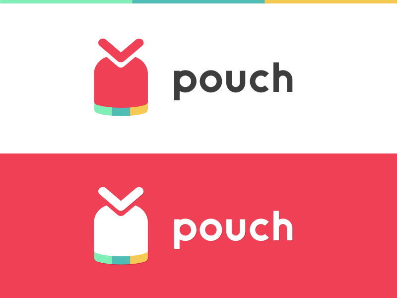
Pouch Logo Winner from Robotessa

Congrats to robotessa on winning the vote from the community in the poll from a few days ago. Your design was rock solid.

Joshua’s Winner: siopz92
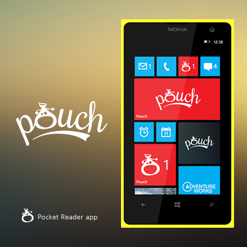
Pouch Logo Winner Josh

Big congrats to siopz92 for being the design that Joshua liked best! 

Like we said in the original post, we’d have a community vote, but Joshua would also have the ultimate say. We dig both apps and design is always subjective. Either way, both of you will be picking up a $15 gift card to the Windows Phone Store, $50 gift card to the Windows Phone Central Store and mad props. Be sure to check your private messages in the forums from a message from me with contact into.

Congrats to you two and thanks everyone for participating! 

Sam Sabri
44 Comments
  • Grats!!! Both logos look awesome, great job guys!!!
  • I liked the original logo
  • Those are both really nice... I think I prefer the simplicity of robotessa's design, but well done on both.
  • Congrats!!
  • I'm a pretty big fan of siopz92's design.)
  • Thank you! :)
  • I like siopz92 design, make me smile.
  • I'm glad you liked my icon design. :D
  • 2nd one is ugly, imo. Way too much going on.
  • I think it's the best one. It has flow to it and you know something is good if you have to keep looking at it to figure out what's going on.
  • me too.I feel its better than the other one.Never understood why it didn`t get more votes in the poll esp. cause it was my favourite .It makes me smile like someone mentioned above and the way its been designed looks much better than the first one.Possibly its because i am not a designer at all,dunno much about gradients and stuff.Anyways,great choice,Joshua.Way to go pouch :)
  • It looks good on double wide, what about on the other tile sizes?
  • Nice logo !
  • Great choice, loved it when I saw it
  • ehhhhh not a fan of the winner, unfortunately :\  but big fan of the community winner
  • My vote was siopz92. This was the only logo that tells what the app is.
  • +1
  • Thank you! :)
  • I like both.
  • Congrats ! How I feel jealous now. Haha
  • With the sweeping underline, the siopz92 one looks like it reads pough and the "o" looks like an engagement ring.
  • Holy hell. The fugliest logo of the four won...
  • The second one looks way better without the poo-brown background. I thought the robotessa was too stylised to be immediately recognisable as a pouch, and that salmon pink is horrid (I realise it was in the original logo).
  • The winning logo was my favorite, but they all had a chance and were unique in their own way.
  • Thank goodness! Can't wait to see it on my phone.
  • Wasn't a fan of the winning design at first, but the more I look at it, the sexier it gets. Works really well with the whole word.
  • The community one just reminded me too much of Google with the colors at the bottom of the pouch. Everytime I look at it I cringe thinking about that crap company.
  • I don`t really get whats that big about the community selected one,too minimalistic/flat for my liking.Doesn`t give me any idea what the app is about and it feels lifeless,
  • Fugly siopz!
  • The top one crushes the bottom one. The top one makes you think "pocket" especially with the "V" and the colors. The bottom one would never let anyone think "pocket". Poor choice by Joshua IMO.
  • So Joshua is a guy who has a different taste from most of the community, good luck with your app then. I wonder where you shop.
  • He probably didn't choose the community favourite because it is pretty likely to be a breach of Pocket's trademarlk (similar logo, same colours, similar name and font).  
  • Exactly, which meant that Joshua really only had 2 choices to choose from the 5 picked ones that didn't infringe on Pocket, which is pretty unfair to those who actually took the time and tried to make something that followed the rules. 
  • Joshua's choice was the best.
  • Pouch is useless...stop spamming it
  • But not useless for others, so stop complaining.
  • Its funny...the logo that was least popular with the community ended up being the one picked by Joshua :)
  • Hi, Windows Phone Central community! Many thanks to everyone who voted for me ^_^ My congratulations to the finalists and Joshua’s Winner siopz92, his logo is very cute *^_^*  
  • Thanks and congratulations to you being picked by WPC community :D. You did well. :)
  • Both look great, nice job!
  • I love siopz92's logo! It just screams "FUN"!!  
  • Thanks! :)
  • Good choice! :D
  • Congratulations everyone, I liked the chosen designs :)