3 things we just don't like about the Windows 10 Fall Creators Update
As with all Windows 10 updates, there are things we like, and things we like less. Here's a list of things we like less in the Windows 10 Fall Creators Update.
All the latest news, reviews, and guides for Windows and Xbox diehards.
You are now subscribed
Your newsletter sign-up was successful
Join the club
Get full access to premium articles, exclusive features and a growing list of member rewards.
The Windows 10 Fall Creators Update is expected to launch October 17, and while Microsoft is bringing lots of awesome new features and changes to the table with its latest release of Windows 10, there are a few things that I am personally not too pleased about. As we do with every Windows 10 update, here's my list of things I just don't like about the Fall Creators Update.
Design Inconsistencies
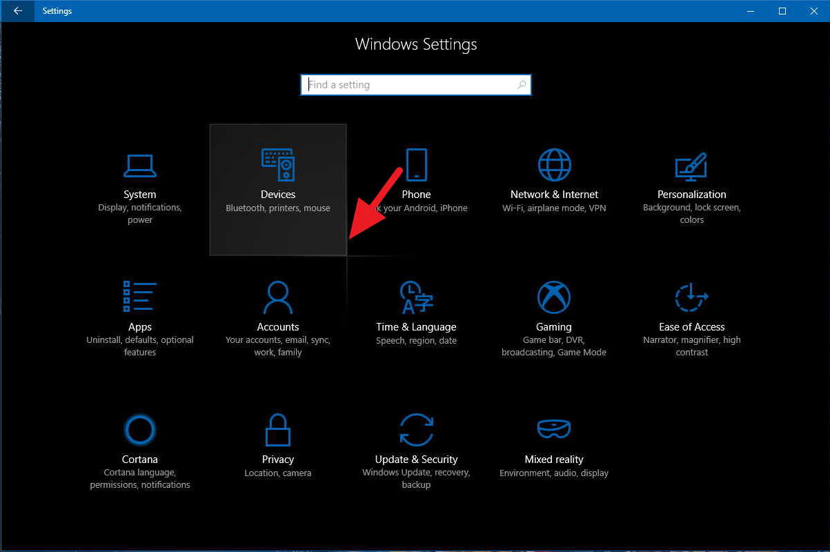
With the Fall Creators Update, Microsoft is starting to implement its new design language known as the "Fluent Design System." Microsoft says the implementation of Fluent Design is a journey, that will take several releases to complete. As a result of this, the design language in the Fall Creators Update is nothing short of inconsistent, more so than it has been in the past.
There's now a total of three design languages in the mix on Windows 10 right now; legacy (the classic pre-Windows 8 look), Modern Design Language 2, and Fluent Design. A lot of people won't mind this, and I assume most people won't even notice, but if you're someone like me who appreciates design and takes note of that, then the Fall Creators Update is going to be rough for you.
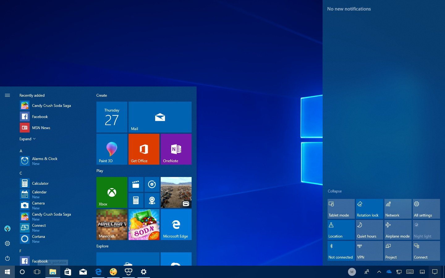
Article continues belowFor example, the new Fluent Design "reveal" effect is being implemented randomly throughout the Windows Shell. You can find it in My People, but only in some of the menus. You can find it in Edge, but only in some of the menus. You can find it in the Action Center, but only in the Quick Actions. You can find it in Settings, but only on the main Settings page.
The random, patchy implementation of reveal is the worst offender when it comes to inconsistent design in the Fall Creators Update. Acrylic is another contender albeit less offensive because it's a lot harder to notice, but it too has been randomly implemented. You can find Acrylic in Start and Action Center, but not in flyouts or the taskbar.
I personally would have preferred if Microsoft had just skipped implementing Fluent Design into the Windows Shell with the Fall Creators Update, and waited for it to all be ready in Redstone 4. Of course, Microsoft likely decided against this to keep new design changes gradual for users who do not like dramatic UI changes, but as someone who notices design; the Fall Creators Update is maddeningly inconsistent.
My People Implementation
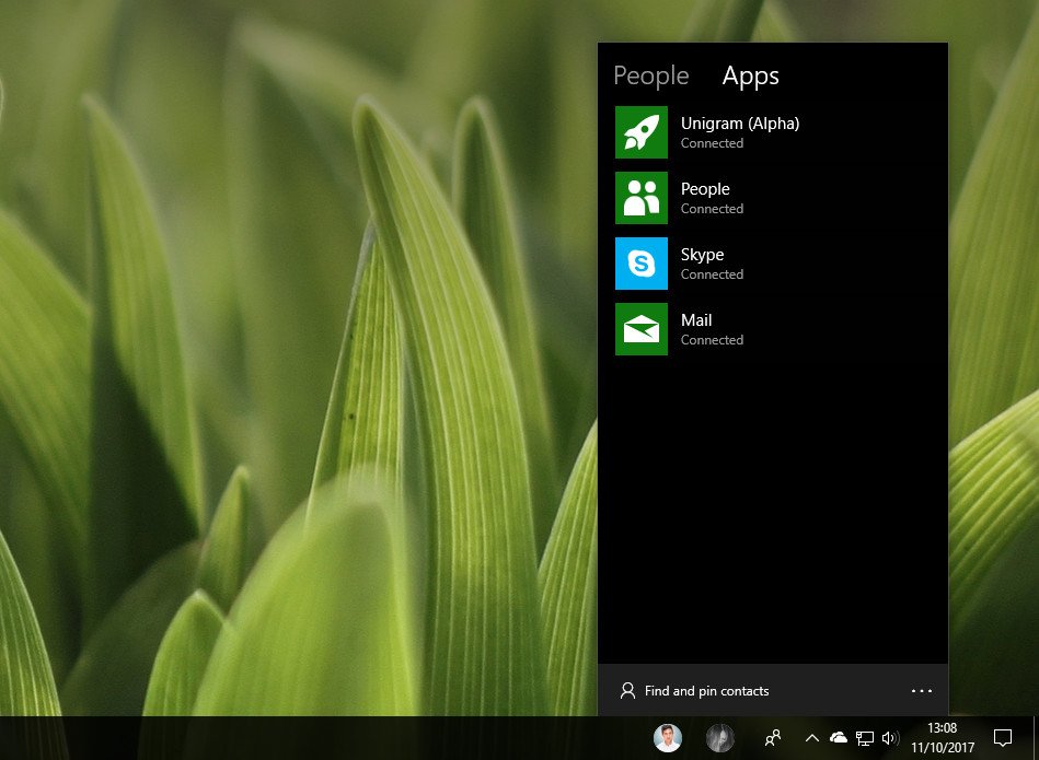
I really want to love My People, but the entire experience just feels unfinished at best. Let's start with its user-interface, which looks like it's still in alpha. The My People hub looks like a Windows Phone 8 app, with a pivot-style menu at the top that you can switch between and an ellipsis menu at the bottom with access to more options.
All the latest news, reviews, and guides for Windows and Xbox diehards.
Not only that, and this is less Microsoft's fault, but there just doesn't appear to be developer support for it yet. Now, I understand the Fall Creators Update isn't out yet, and maybe on October 17 lots and lots of developers will update their apps with support, but I'm highly doubting they will. My People has been available to developers for months in Insider builds, yet I've seen just a pair of third-party apps with support.
While the problem is partly due to a lack of app support, the other major issue is that even if there was hundreds of apps with support, it really needs to big apps to take advantage of it, like WhatsApp, Twitter, Facebook, and GroupMe. It's great if smaller, lesser known apps and developers take advantage of it; but unless the big guys do, no one is going to care.
And I really want people to care, I want My People to be a success for Microsoft. You don't know how badly I want one convenient hub where I can contact all my friends no matter which service they prefer. Hopefully My People will get the support it deserves from Microsoft and third parties over the next couple of releases.
Missing obvious options
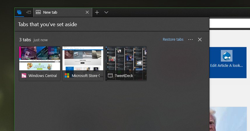
The Fall Creators Update is all around a pretty nice update, but it's still missing a selection of options that should have been in Windows 10 since day one. For example, I still can't select multiple tiles on Start to unpin, resize or move around. This is an option that was present and useful in Windows 8 and Windows 8.1, but removed with the debut of Windows 10.
It was removed because Microsoft rewrote the Start experience, including live tiles, with Windows 10, and just never got around to re-adding that functionality. Insiders have been requesting its return for years at this point, yet it's still not back. Other obvious options that just aren't here include the ability to turn off "Set tabs aside" in Edge.
Yes, I constantly accidently hit the set tabs aside feature, which throws all my tabs in to the side area. I then have to go in and restore that browsing session, requiring me to reload all the tabs I had open. It's so annoying, and as someone who doesn't use the set tabs aside feature at all, why can't I turn these buttons off?
I've also noticed that syncing settings across devices, such as wallpapers, passwords, and more, is really flaky in the Fall Creators Update. Microsoft may be working on a new system for the syncing stuff, but right now I find that more often than not, it doesn't work as reliably as it did before.
What things don't you like about the Fall Creators Update?
That's my list of mingling issues that I have with the Fall Creators Update. We want to know if you have any issues or problems too! Let us know in the comments.

 Windows Central Insider


