Outlook picks up bold, modern redesign on iPhone and iPad
The redesign adds a splash of color, more visual feedback, and other, smaller tweaks.

Microsoft today is giving Outlook for iOS the overhaul that it promised earlier this year. The redesign (opens in new tab) brings Outlook on iOS up to par with its Android counterpart on the design front, introducing a bold blue header, along with visual feedback for gestures and much more.
This update also makes Outlook for iOS one of the first apps to introduce Microsoft's redesigned Office icons.
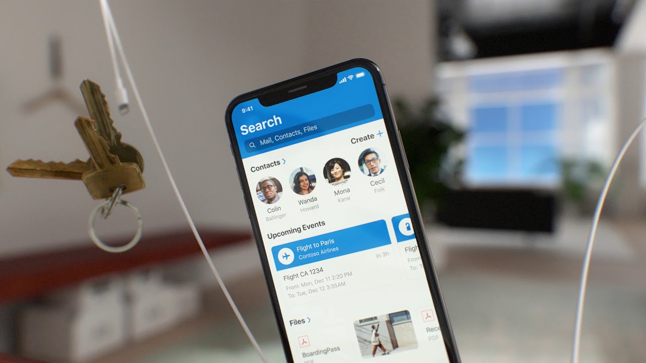
The most immediate change you'll notice when launching Outlook version 3.0 is the blue header that dominates the top of your inbox. Gone is the largely colorless interface of Outlook's previous incarnation, and in its place is a pop of color that "helps you easily find your way to Outlook while rapidly switching between monochromatic apps to quickly complete your task and get back to what matters," Microsoft says.
Additionally, Microsoft has introduced additional sensory feedback for when you use swipe gestures on emails from your inbox. "When you swipe right or left on an email, subtle changes in color, shape, and iconography unfold," Microsoft says. "The corners of the message transform from hard-edged to soft and round, metaphorically pulling that item away from the message list and sending it where you want it to go—with haptic feedback."
The calendar experience is also seeing a refresh. When scheduling a meeting, you can now slide your event around on the calendar to find a time that works for all attendees. You should also now be able to take action on events from Outlook, allowing you to do things such as check in to flights directly from the app.
The update will be rolling out to all iOS users over the coming weeks. And while Microsoft didn't make mention of it today, we've previously confirmed that a dark mode is in the works, so we should see movement on that front over the coming months as well.
See at App Store (opens in new tab)
Windows Central Newsletter
Get the best of Windows Central in your inbox, every day!
Dan Thorp-Lancaster is the former Editor-in-Chief of Windows Central. He began working with Windows Central, Android Central, and iMore as a news writer in 2014 and is obsessed with tech of all sorts. You can follow Dan on Twitter @DthorpL and Instagram @heyitsdtl.
-
It would be necessary that Microsoft brings Photos, Contacts and Calendar apps for Android.
I know that Outlook and OneDrive handle this, but the experience is bad. Separate apps would be a lot smarter. While maintaining the current integration with Outlook. Do you have information on the subject ? -
They will never do that. Outlook is for business and Office365-subscribers with added benefits for home users with free personal accounts. Photo's and music apps are consumer only, an area Microsoft does not invest in. And contact and calendar are part of Outlook. It is one of the strengths of the app. I use the stock apps for my personal stuff and all my work things (files, mail, contacts, calendar) are nicely gated in the Outlook app.
-
Regarding photos, what about it is bad? Are you talking about like viewing them through onedrive? I personally only use it to automatically back up my photos to onedrive which it does perfectly in the background. I just use the Google photos app to view photos. And to add onto the other comment, I also like that calendar, contacts, and email is in one place. I'm not sure how separating it would improve it? Or are you saying there should be separate devs for each part (calender, contacts, calendar)?
-
Download app called "Piktures" from play store. You will know google photos jist doesn't cut it. Piktures is the first app I came across almost at par with photos app in windows.
-
Cannot wait for the dark mode...
-
What version will get these changes? I recently got 3.1.0, but I don't see the blue header.
-
same here in India. Just upgraded to v 3.1.0, but can't see the new changes
-
i've got some of the changes like when you swipe on a message, the corners get rounded and the color change depending if you've set it to delete, archive or move to a folder. Perhaps the blue banner is one of those "a\b" features where some users get, but other users get something else?