Windows 10 People app has a fancy new icon that follows Fluent Design
The People app now has a new icon, and it has more people on it!

What you need to know
- The People app on Windows 10 has a new icon.
- The icon meets Microsoft's Fluent Design guidelines.
- Microsoft is rolling out new icons to all of its apps.
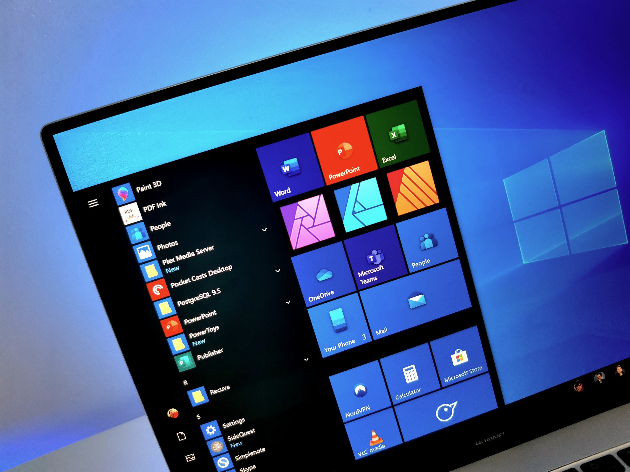
Yet another Microsoft app has a new icon. This time, it's the People app that's getting the Fluent Design treatment (via OnMSFT. The new icons previously rolled out to Insiders and is now generally available through the Microsoft Store. The new app follows the Fluent Design guidelines that Microsoft is using for all its apps.
The new People app icon has the same blue background that many of the refreshed app icons have. It also has people in three shades of blue. Those same shades are used in other app icons, including the Your Phone app. The People app icon also gained person, bringing the total to three people in the icon. The old icon had two people in it, which is almost a person icon at that point.
Microsoft continues to roll out new icons to apps as it marches towards a unified set of icons across all platforms and services.


To get the new icon, check for an update in the Microsoft Store. The People app is built into Windows 10 and can't be uninstalled, so it should already be on your system.
All the latest news, reviews, and guides for Windows and Xbox diehards.

Sean Endicott is a news writer and apps editor for Windows Central with 11+ years of experience. A Nottingham Trent journalism graduate, Sean has covered the industry’s arc from the Lumia era to the launch of Windows 11 and generative AI. Having started at Thrifter, he uses his expertise in price tracking to help readers find genuine hardware value.
Beyond tech news, Sean is a UK sports media pioneer. In 2017, he became one of the first to stream via smartphone and is an expert in AP Capture systems. A tech-forward coach, he was named 2024 BAFA Youth Coach of the Year. He is focused on using technology—from AI to Clipchamp—to gain a practical edge.

 Windows Central Insider


