What's in a color? The influence of Nokia on Microsoft design.
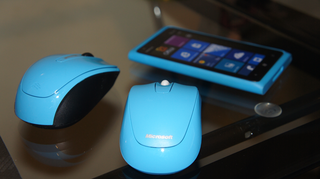
Microsoft all of a sudden loves cyan & magenta, we wonder why. Oh, right...
Throw this under just observations we’ve noticed in the last few months with some of Microsoft’s new hardware but it looks to us like they are adopting some of Nokia’s more bold design efforts.
The latest being the usage of cyan and magenta for some of their hardware, like the Microsoft Wireless Mobile Mouse 3500, which gained two new Nokia colors this week.


These colors look familiar
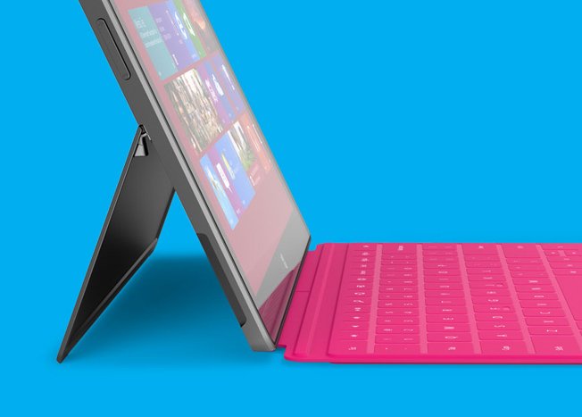
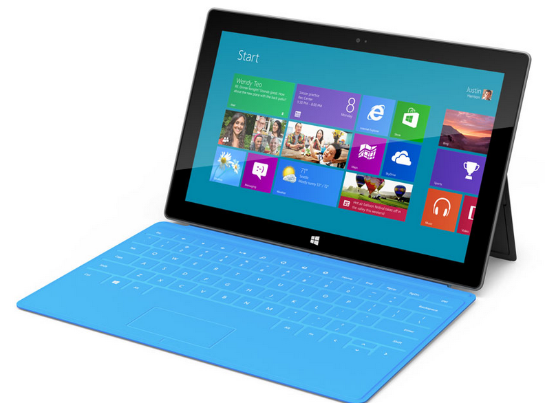
Whether it’s the Surface coming with a cyan or magenta cover/keyboard, the new mouse colors, Nokia’s Lumia line or the new color schemes in Windows 8, Microsoft seems to have ripped some of the design principles right of Nokia’s book.
Or perhaps this is part of that deeper partnership growing between the two companies? After all, they are swapping services with each other and working closely on that whole Windows Phone thing, so much so that both companies are doing a joint-press conference on September 5th. That’s a first for Windows Phone.
“Magenta is a provocative colour. Cyan is classic, and fresh.” -Tiina Aarras, Nokia
Those design principles are really nothing new, of course. Nokia discussed this at length on their Conversations blog in the past, describing the theory on colors. In an interview with Tiina Aarras, a design at Nokia, the following inspiration was presented for the Lumia line of colors:
All the latest news, reviews, and guides for Windows and Xbox diehards.
Returning to the idea of purity, Aarras was inspired by the CMYK colour group (Cyan-Magenta-Yellow-Black) which was invented as a primary colour group for printing when newspapers began to produce colour comic strips in the 1890s.“Those colours are pure, defined and exceptional. They’re distinctive modern design icons and people recognise them. Because these are primary colours they contrast with each other – put them together with a black glass screen, and they are ideal for producing a bold and confident approach.”
Much like Metro UI (or whatever it will be called), the focus on pure and simple colors is a brilliant and obvious design choice, one that Microsoft now seems to be embracing.
Cyan and more cyan.Yes, please!
Microsoft never received too much credit for some of their consumer hardware offerings, but their mice, webcams, keyboards and even devices like the Zune HD and yes, Kin, do push the boundaries on design with often great (but under-appreciated) results. Now with Nokia in the mix, they seem to be getting that extra edge to really have products that just “pop” when you look at them—why else is the Surface so fascinating if it weren’t for that design and those colors?
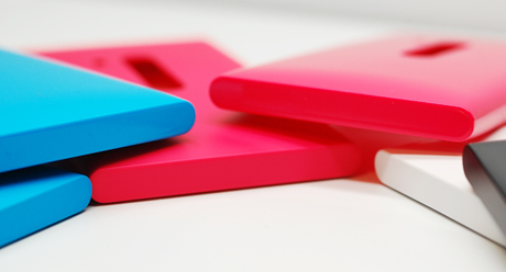
The joke in fashion is often that “black is the new black” but in this case, we’re going with cyan and magenta as being the “it” colors this year and next. Let’s watch what both Microsoft and Nokia do with colors and design over the next few months, as our bet is we’ll see even more overlap.
And we’re thrilled with that idea.

Daniel Rubino is the Editor-in-Chief of Windows Central. He is also the head reviewer, podcast co-host, and lead analyst. He has been covering Microsoft since 2007, when this site was called WMExperts (and later Windows Phone Central). His interests include Windows, laptops, next-gen computing, and wearable tech. He has reviewed laptops for over 10 years and is particularly fond of Qualcomm processors, new form factors, and thin-and-light PCs. Before all this tech stuff, he worked on a Ph.D. in linguistics studying brain and syntax, performed polysomnographs in NYC, and was a motion-picture operator for 17 years.

 Windows Central Insider


