New icons found in Windows 10 build 9901 point to updated modern design language
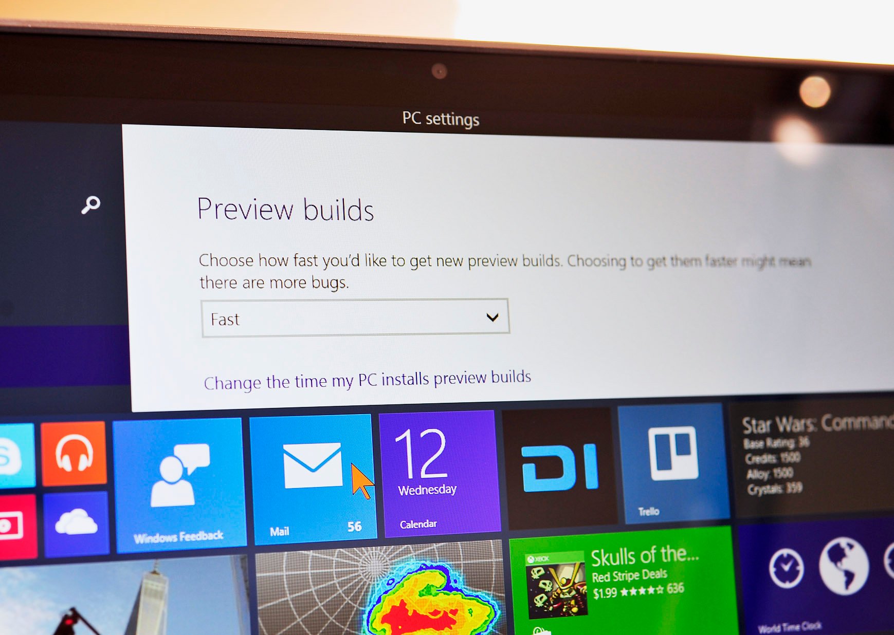
The digging continues on the Windows 10 build that leaked earlier this week, and this time it seems we're getting a peek at a new style of modern UI icons coming along for the ride.

The icons, which were leaked to Neowin, display markedly thinner lines and make less use of color filling. Furthermore, the icons were found in an asset called "MDL2" which, as Neowin notes, could stand for "modern design language 2."

Modern UI 2 Icons

These icons show up in the same build 9901 that leaked earlier this week and gave us a look at some new consumer features such as a redesigned Xbox app and Cortana integration. However, if you're eager to rush out and install this leaked build, be warned, as installing it will prevent future automatic updates.

Source: Neowin

Dan Thorp-Lancaster

Dan Thorp-Lancaster is the former Editor-in-Chief of Windows Central. He began working with Windows Central, Android Central, and iMore as a news writer in 2014 and is obsessed with tech of all sorts. You can follow Dan on Twitter @DthorpL and Instagram @heyitsdtl

89 Comments
  • That's a nifty little phone icon there! I wonder what that could be for?
  • Maybe something similar on the lines of Apple wherein receiving calls on your Windows based machine when you receive a call on your windows phone.
  • Guess Skype? Or like in Apples world with connected iPhone and iMac/iPad. (Someone calls you on your phone and you can answer with your tablet/computer device)
  • You mean Palm's world.  R.I.P WebOS  
  • Windows 10 will run on phones too, the icon is only for devices with calling capabilities, not for all devices (PCs).
  • I need a phone I can just dock and turn into a PC. Windows 10 is the answer.
  • Back in the day, I could plug my Nokia N8 into a tv via HDMI cable. With Bluetooth on for a mouse and a keyboard plugged into the USB-on-the-go port, BAM!  Instant PC. ;)
  • Shouldn't the phone icon be updated to, you know... a modern phone?
  • Sooo... A rectangle?
  • The phone icon is pretty much industry standard. A "modern" phone icon like a smartphone usually has other meanings like "mobile number" in a list of contact values. The floppy disk "save" icon is also dated but is a standard in UI design so it continues to get used because users are trained to what that icon implies.
  • I almost thought you found a W10 build for the Lumia icon.
  • As a good portion of laptops also allow WWAN could simply be that you can no make phone calls native in windows.  Nothing exciting really.
  • Windows always had phone icons. I'm not saying that there's not something new here, but from an iconography standpoint it's not earth shattering.
  • Not impressed until I see a new recycle bin icon on my desktop
  • Yes, they should have done that from the beginning.
  • Live tile recycle bin!
  • With the p0rn...
  • Ha ha!
  • SIM icons? Maybe we might see some Windows 10 tablets with SIM capabilities!
  • Maybe for skype..
  • there already are some windows 8.1 tablets with sim capabilities :)
  • These are icons that are available in Windows Phone, I'm guessing these are their redesigns.
  • Windows 10 will be available for phones devices, not only for PC or tablets. The system icons must cover all possible scenarios, but not all devices will show all icons.
  • Call forwarding icons.
  • They seem to be for phone.
  • Windows 10 is same on all devices
  • No, there are still going to be OS variants.
  • Nope... One kernal variable ui
  • No, same kernel. That's entire point of this shift. One OS, all devices.
  • WP8 already has the same NT kernal as Windows 8. The OS itself will be on all devices. A Windows 10 app will run on WP, Xbox, and Windows 10 without modification.
  • Yes, variants, but system icons will be the same.
  • Yea I dont see any Windows system icons here, which are the ones that need modernising.
  • They should at least make them an option and not remove the old ones. Posted via Windows Phone Central App
  • It seems usless to add options for each individual icon. I doubt anyone would care
  • I care. I think the old icons look cool and are great for cases in which you want to add a classic theme to your computer or wanna make a program with a classic theme to it. Posted via Windows Phone Central App
  • Being 2014, soon 2015 and soon running Windows 10 I don't think anyone should be making classic themes for programs. I was traumatized enough by bad program designs during Vista-7 years.
  • We already had the old ones for 8 years now ...
  • So? You've probably existed for over 8 years in your life. What? Now we get rid of you?
    Edit: I was referring to like Shell32.dll in Windows 10. I failed to realize this was Windows Phone 10.
    Posted via Windows Phone Central App
  • I think you are one the ones that was also really sad that Windows Vista, 7 and 8 didn't have Windows 2000 or XP icons by default.
  • What? Do you know what you said?
  • Wait, I was refering to like Shell32.dll in Windows 10. I failed to realize this was Windows Phone 10.
  • There will be no such thing as Windows Phone 10. Get your facts straight before you start lecturing others.
  • I know. I am trying to reference to the OS on the phone when it comes out. I don't wanna reference to the PC mode.
  • I kinda agree, lazy modern (like it is now) and beautiful aero themes should remain part of the OS. However there's software like StarDock Windows Blinds that pretty much allow you to theme Windows to your heart's desires...
  • Hey by the way guys, I sent you an email and u messaged Daniel about something I would like for you report on. If your not interested in doing so, please at least tell me that. Thanks
  • I read Icon and freaked out. I'm that desperate for any news on my phone getting cyan.
  • That's just sad man...
  • Sell your soul to satain. Maybe you get the update ;)
  • Nah not even he can get the update available to Icon owners :P
  • Sadly is true....+930
  • Ahh crap... My dad literally just bought one from Verizon on his upgrade. Lol sucks for him xD
  • It looks more likes iOS 7/8 icons.. :(
  • I agree, I want Windows not iOS/OS X or Android. They're more difficult to see too. I prefer the current ones, I don't understand why MS are trying to make Modern UI look more like iOS/OS X and Android when they have a perfectly beautiful and functional design language themselves - they were the ones that came out with a flatter look before Apple or Google! MS looks to be moving Modern UI in the direction of Apple and Google's design languages lately. :(
  • Too much exaggerated... -_-
  • I disagree. Apple and Google are the ones who moved their design language in the direction of MS's Modern UI, but refined it a bit. Now it's MS's turn to refine their design language into a better looking Modern UI. It's going to be a back and forth thing cause that's how competition works.  I'm all for the changes as it keeps the UI fresh, unlike Apple who kept iOS looking the same from version 1 to 6 and finally modernizing in iOS 7.
  • What? It looks like WP icons... Lol...
  • Battery icons are already in current build. And this looks like evolution to unified phone-tablet-PC interface. Nothing special.
  • That's what I was thinking. They're imbedding icons in the OS for whichever "device" Windows 10 is installed on.
  • Why "nothing special"? It is special, it is about windows.
  • I need batman icon!!
  • I Hope their design gets more aesthetic and more modern, flat not like the design of Windows Vista aero.
  • Windows Phone is as flat as it gets. :|
    Although you can rest assured that the design will stay minimal. The days of vivid textures are long gone. :)
    I just wish they introduce some substantial new elements instead of just some tiny tweaks. Google's Material Design is really beautiful and alive. Really want Microsoft to beat them again (so in the end, we win!)
  • Yeah. As much as I love Microsoft and own pretty much all of their products, they are pissing me off. I can get used to change but to be honest it seems like a downgrade. We go from fading and transparent objects now to squares that have a certain color. It should of been reverse and Windows 8 design should of come before 7. Or they could of allowed options. As much as I love my Windows phone, I still wish it had all the features of my Android. There are so many things falling behind and Windows Phone 8 to 8.1 was like they got some big mess and just threw it together. Like I keep getting "Resuming..." and there's serious issues with the lock screen. I don't like their approach on allowing apps to control my lock screen and how things like "Nokia Glance Background Beta" and that new Gestures Beta thing appear in my app list and not settings. It seems inconsistent and like I have to add pieces to the puzzle. Kind of like the double control panel in Windows 8.1. Why can't they just intergrate more features into the OS and make it solid?
  • Yeah! Redesign!
    Metro (and Windows+WP in general) is long due for a design change. WP has had pretty much the same design language since WP 7. (And yes, action centre and start screen background were welcome changes. But it's all starting to look a little monotonous.)
    Google's Material Design looks beautiful. Need something to beat it, or at least match it.
  • Google's design isnt that great...when i saw it introduced, i was like whoa...but then what was implemented looks crappy overall... even half the people over at android central are sceptical or already rejected it..i read their first article when screenshots were shown...
  • Booooooring!!!!.... Yaaawwnnn..
    .........
    I can't wait for Build 2015 so we can get the jucies...
  • These are WP icons!
  • Yep, I don't know why some people said it looks like iPhone...
  • I like that they still have an icon for the 3.5 inch floppy.
  • Like it a lot! looks a lot more elegant now! Especially with the blacks and greys that are making there way into the OS.
  • I read update and was hoping for an update to the BROKEN Facebook app! Can someone from WindowsCentral please check into this issue and provide some feedback to WP users? I've already tweeted Joe Belfiore. The “Most Recent” newsfeed is broken! Really hope a fix is coming SOON...
  • same problem here >.<
  • Haven't tried the preview yet. Anyone tried it on a Vivotab Smart?
  • Why is the "phone" icon still the old rotary-type phone? Do kids under 20 even know what that is?
  • "Why is the "save" icon still the old floppy disk? Do kids under 20 even know what that is?" You can use the same question for the save button haha
  • Do you know about universally known signals?
  • Why is search a magnifying glass? Has anybody used those in 20 years? It's a universal symbol
  • Why is the cut button a pair of scissors, below 20's use safety scissors as this is now politically correct lol had to do a slight funny troll!
  • Yes! This was one of my feedback points which I gave, to make all the design of the is like metro / modern design language Yes!
  • *OS
  • I already got it. It's really buggy for me, so I'm reverting back to 9879. But now I'm really looking forward to it.
  • I already hVE MOST OF THESE ICONS is it weird, i am having this awful problem on the preview where certain letters are missing
  • Eh i prefer the old icons, but what I really hope for is that they change all the desktop icons too and not just the few they have done so far, getting tired of the old glassy icons.
  • No biggie icons change
  • All these icons indicate one thing that's coming: Transparency
  • They need to replace wireless icon in windows with wifi icon. Current cellular icon makes no sense.
  • Are they removing the circle around most buttons? I would miss that nice little cue.
  • May be thats for phones only
  • FINALLY !!! microsoft show'd do a full redesign of windows! we have metro ui and the other ions like the calculator and control panel are old icons. doenst make sense !!! they show do a full redesign and make windows the same graphical language like apple do do !!!