How to create Microsoft Excel 2016 reports
While Excel is an optimal program to collect and organize your data, its information management features don't stop there. Here's how to better present your content.

All the latest news, reviews, and guides for Windows and Xbox diehards.
You are now subscribed
Your newsletter sign-up was successful
Join the club
Get full access to premium articles, exclusive features and a growing list of member rewards.

In Excel 2016, users will find that they have numerous ways of organizing and visualizing their records. Making use of these options will allow you to put tables and charts together to create reports worthy of praise.
- Basic chart and table creation
- How to create PivotTables
- How to create a Dashboard
- Timelines and Slicers
Basic chart and table creation
Before you can impress your team with an in-depth report, you need to learn how to generate charts, tables, and other visual elements. Here are a few types to get you started.
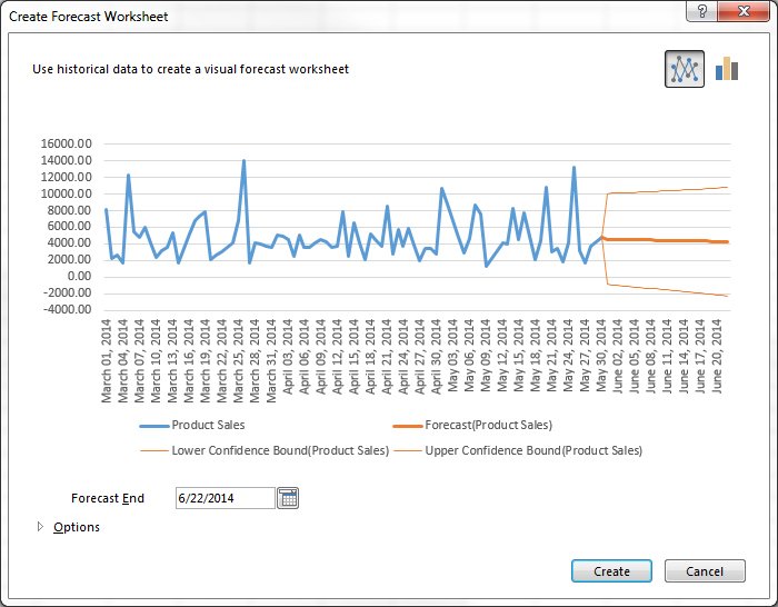
How to create a basic forecast report

- Load a workbook into Excel
- Select the top-left cell in the source data
- Click on Data tab in the navigation ribbon
- Click on Forecast Sheet under the Forecast section to display the Create Forecast Worksheet dialog box
- Choose between a line graph or bar graph
- Choose Forecast end date
- Click Options for customization
- Select Forecast start date
Forecast reports are useful for calculating projections for sales, growth or revenue.
Article continues belowHow to create hierarchal charts

- Select a cell inside of the data table
- Click on Insert in the ribbon
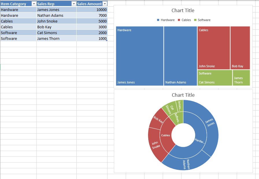
- Click Insert Hierarchy Chart under the Charts group
- Select between TreeMap or Sunburst chart
- Click on the + (plus) sign to add or remove chart elements such as title, data labels, and legend
- Click on the right arrow for each element to customize the appearance or behavior
The Charts group itself is an effective way to find the chart that best suits your data. In fact, Excel 2016 has a Recommended Charts option, which allows you to scroll through shortlisted charts or through all available charts.
How to create PivotTables

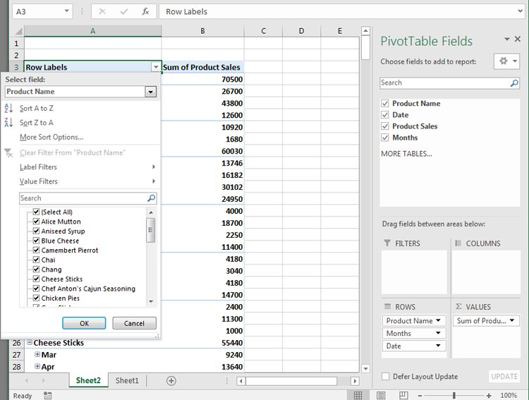
A PivotTables enable users to sort through and reorganize data in columns and rows in order to find the most effective view. It's especially useful when you are working with vast amounts of data.
How to create a recommended P{ivotTable
- Select a cell within the table range or source data
- Navigate to the Tables section in the Insert ribbon tab
- Select Recommended PivotTable
- Browse through the presented types of PivotTables
- Click on the PivotTable you want
- Click OK to generate
- Select Seasonality options
- Modify timeline and value ranges
- Select to fill any missing points by zeros or by interpolation
- Select criteria to aggregate duplicates by
- Select Create to finish
How to create your own PivotTable
- Click on a cell within the source data or table range
- Click on the Insert tab in the navigation ribbon
- Select PivotTable in the Tables section to generate the Create PivotTable dialog box
- Decide on the data source in the Choose the data that you want to analyze section, in case you don't want to use the selected source
- Select New or Existing Worksheet under the Choose where you want the PivotTable to be placed section
- Click Add this data to the Data Model to incorporate additional data sources in the PivotTable
- Click on fields to include in the report in the PivotTable Fields
- Click and drag fields to reside in either Filters, Columns, Rows, and Values
Once you have decided on the layout and contents of your PivotTable fields, you can use it as the foundation for other Pivot Tables.
How to create a Dashboard

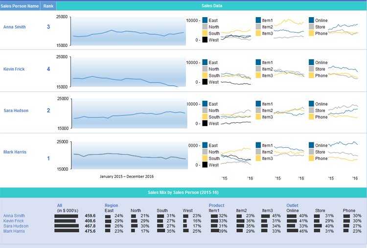
Once you have become comfortable enough to generate charts and tables using your provided data, it's time to begin piecing the story together in a dashboard. The Dashboard is your chance to showcase your data in an attractive, informative and insightful hub view. It provides a top-level view of the data, allowing your audience to quickly see data and trends in order to view results and make decisions. This reporting tool is highly adaptable and can be used to report a plethora of results regardless of your line of business.
All the latest news, reviews, and guides for Windows and Xbox diehards.
How to prepare your PivotTables for the Dashboard
- Select the original PivotTable that wish to use as your master or reference table
- Right-click on the selection
- Choose Copy
- Select another cell on your worksheet
- Right-click on the selected cell
- Choose Paste to duplicate
- Repeat steps No. 4 to No. 6 as needed
- Click on PivotTable Tools for each table
- Click Analyze
- Insert a name in the PivotTable Name box to identify the function of each table
How to generate PivotCharts from PivotTables
- Select the original PivotTable
- Click on PivotTable Tools
- Select Analyze
- Select PivotChart
- Choose the type of chart that you need
- Choose formatting options in the PivotChart Tools tab
- Click on Analyze under PivotChart Tools
- Enter a name in the Chart Name box
- Apply steps No. 1 to No. 8 as needed for all PivotTables in use
Timelines and Slicers
With your multiple PivotCharts and PivotTables created, you'll need to be able to find specific information that supports the details you wish to share in the dashboard. Slicers and Timelines provide a way to filter through the data with ease. Timelines allow you to filter by time to locate a specific period. Slicers are essentially click-to-filter options for PivotTables. Not only do they apply a filter, they also indicate the filter currently in use.
How to add a Slicer
- From a PivotTable click on PivotTable Tools
- Select Analyze
- Select Filter
- Select Insert Slicer
- Select the items to be used as slicers
- Click Ok
- Select a Slicer
- Click on Slicer Tools
- Select Options
- Select Report Connections
- Choose the PivotTables that connect to the chosen Slicer
How to add a Timeline
- Click on a PivotTable
- Select Analyze
- Select Filter
- Select Insert Timeline
- Click on the items to use in the Timeline
- Click on the Timeline
- Select Tools
- Select Options
- Select Report Connections
- Select PivotTables to link the Timeline to
With each resulting chart, you can choose to copy and paste it on your dashboard. You can then decide how the dashboard should appear, what will tell the best story for your report.
This results in a dynamic dashboard that allows recipients to look over your presented data while allowing them to sort through the data to give them customization options pertinent to them. If you are creating a Dashboard to be used on a regular basis, you only need to update the source data to recreate the report with new information.
Wrapping Up
There isn't one report to rule them all, but Excel has the tools to help you make the report you need. How often do you have to create reports in Excel? Which one are you most proud of? Let us know in the comments. And be sure to visit our Office 101 help hub for more related articles!
- Microsoft Office 101: Help, how-tos and tutorials

Ryan is a Former Contributor for Windows Central.
 Windows Central Insider


