Photos app for Windows 10 gets a new Project NEON overhaul
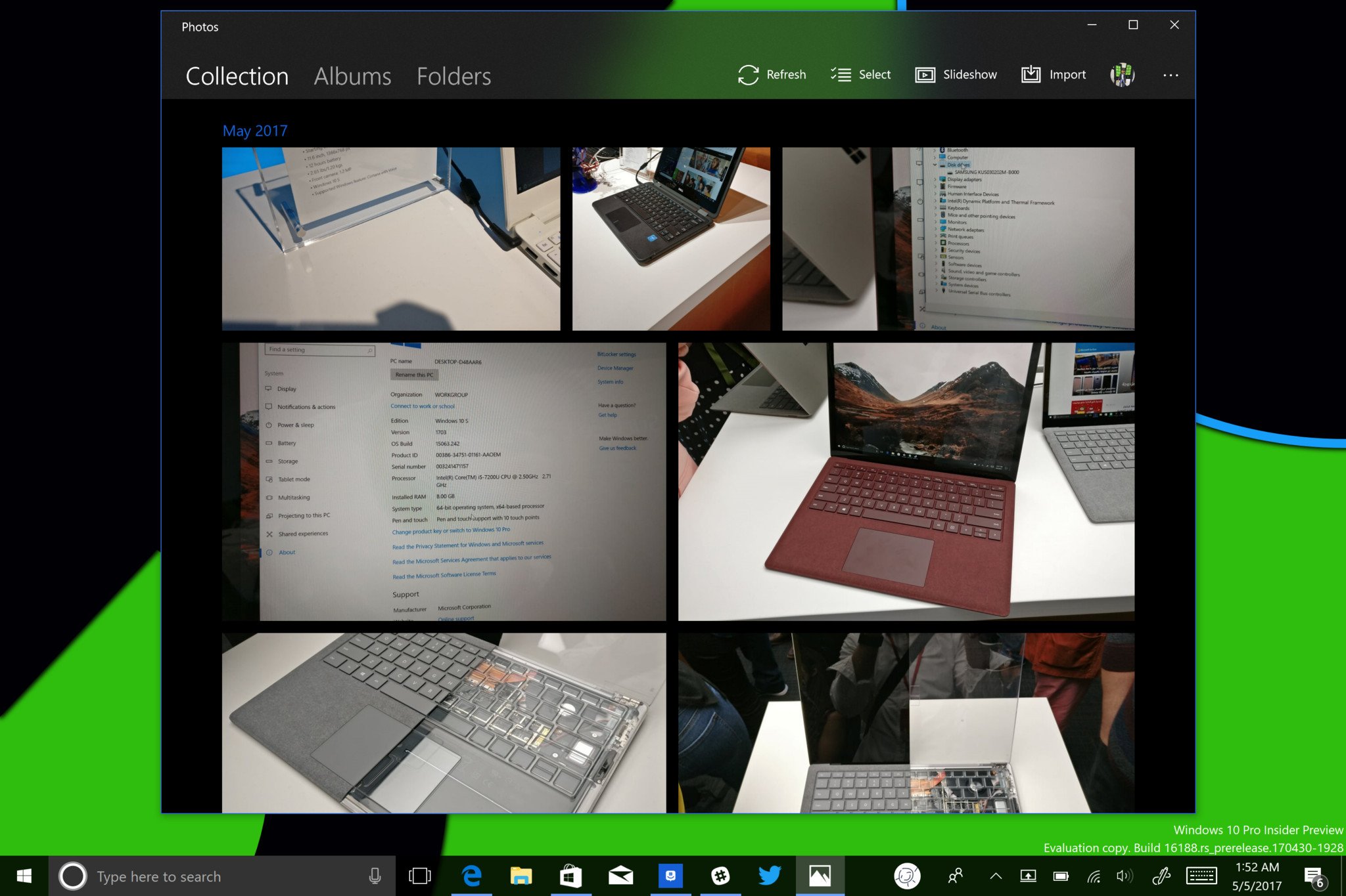
Project NEON, an ongoing effort to rework the design language of Microsoft's core apps, has been in the works for some time now. Although we're yet to see any official word on the changes, several recent updates have continued to change the styling of some Windows 10 apps. The rollout of the new design language now appears to be in full swing, with the Photos app getting its own translucent makeover.

The latest version of the Photos app, version 17.428.10010, introduces this overhaul to the application. Although no new functionality arrives in this update, the Photos app now joins a range of core Windows 10 applications sporting Microsoft's new design language. Now, Groove Music, Movies & TV, and the People app all offer this similar styling.

For now, this version of the Photos app appears to be slowly rolling out to Fast Ring PCs, following the recent release of build 16188. We're also yet to see any similar update for its Mobile counterpart. Stay tuned to Windows Central for future information on Project NEON app updates.

Windows 10 Redstone 3: Everything we know so far

Matt Brown

Matt Brown was formerly a Windows Central's Senior Editor, Xbox & PC, at Future. Following over seven years of professional consumer technology and gaming coverage, he’s focused on the world of Microsoft's gaming efforts. You can follow him on Twitter @mattjbrown.

47 Comments
  • For the start of RS3, it is very nice but I would expect it to get better till we reach the final, in terms of polishing of photos app.
  • I guess the translucency is just a great way to identify a product quickly as one that is written using Neon instead of old APIs and guidelines.
  • If you look closely you can also find other clues to identify the app target SDK:
    • The ComboBox control has animations when opening/closing the drop down - SDK 10240
    • The ScrollViewer doesn't reach the top of the margin and changes UI when the mouse hovers over the scroll bar - SDK 15063
    • UI elements blurred between different layers (inside the app window) - SDK greater than 14393
    And so on...
  • You are right, but I meant, this is good for marketing, noticeably making apps Neon. When you want your audience to spread word, making them have to look closely is not the way to go.
  • Yeah, I'm not sure that's a good idea though. I mean, users shouldn't "judge" an app by its target SDK. The only difference is the set of available APIs, there are no performance differences or anything else. It could just be that a given app doesn't need a more recent API and just uses an older SDK in order to reach a bigger audience.
    It doesn't necessarily mean that the app in question isn't regularly updated or is just "worse" than another app with a newer SDK :)
  • I think you live in an ideal world. :)
  • Why is that, what do you mean?
    I mean, you can see in the Store that there are apps targeting the SDK 10240 that are better than "more recent" apps, that's what I was thinking about when I said one shouldn't judge an app by its SDK without first trying it out.
  • You say "people shouldn't", well, they just do. This forum is full of people who say an SDK is not used, the world is coming to an end.
  • This is fine for PC, but for mobile we need more flair..... Like the 7.0-8.1 app.
  • Just a heads up on the error on the last paragrah "For now, this version of the People app"
  • This is why I should wake up before writing :P
  • idk why they left the background a solid color but it's a start
  • It won't be a good idea to make that background translucent, since it will just introduce visual distraction. The solid color especially the black (or even white) helps the thumbnails to be easier to be scanned with our eyes for browsing. Not every UI element has to be translucent just because they can. It will just makes things visually busy and messy when overdone.
  • It would work ok if they added shadows to the tiles there, bring it out into a more 3D feel.
  • If they do that, then every related UI element must have it for consistency. Thing is it will be still too busy visually, instead of focusing the actual content. There is no need for shadows really when the solid dark background already highlights the content. This is really an issue at the moment since they are now testing these translucent effects while the actual design language is still left unchange to make these things fit. For other people it looks okay, but design-wise these things need serious work to make the overall design and aesthetic cohesive. I really hope that Project NEON is more than just animation and blur effects here.
  • Productivity to also means no distraction, eye straining, fancy fair like stuf. What I miss from Microsoft for already quite a while is ui/ux consistency. Today even the "ok" and "cancel" will be found in reverse position. Not to talk about how the hamburger menu behaves; overlay or displacing. Where one can find the settings wheel. Control elements are not visible unless the user hovers over them. All so much for productivity and Neon is not improving that, does it?
  • I don't get it, why the excitement, so they added some transparency to People and Photo apps. But how about making those apps actually work and have some good features? Like not deleting contact pictures every couple of months and syncing between devices...
  • The mobile version has the ability to favourite photos. The desktop version doesn't. I thought these apps were universal.
  • Wrong! In mobile you can set local photos as favourites, on the pc you are probably seeing your OneDrive photos, therefore you won't be able to fav them the same happens on mobile... Try it and let me know
  • Just tried it.  And I don't have OneDrive set on my desktop Photo app.  On the folders tab, I only see 2 locations on my HDDs.  Can't favourite a local image on desktop.  On the other hand, I can favourite a local photo on mobile but not on OneDrive.
  • Oops missed for mobile..
  • Still wondering how well all these transparent and translucent features are gonna work on slightly older PC's. I can smell lag.
  • Wow 😂 C'mon that was a genuine concern. why the downvotes people
  • NASA can launch satellites faster than Microsoft can provide updates. Seriously, what are you guys doing in there?
  • Paint 3D get also neon look
  • Didn't you guys receive the Bing tab in the photos app? People all over the place are reporting on it, but there are no screenshots, and I don't have any fast ring devices now.
  • It's there. Matt was in sleep while writing this article..... 😉
  • Ya
  • Bing tab is A/B testing, not everyone has it. For instance, I have it in one version without NEON; in my NEON version I don't have it.
  • They need to fix things like the fact photos sometimes don't show up for hours in the app, before they worry about stuff like this.
  • Please god change your desktop background. What is that thing?
  • How do you know what God's desktop wallpaper is?
  • Mandatory "Enable Neon for all System-Wide Title Bars, especially Win32 ones" comment.
  • Let the inconsistency in Windows 10 continue! Meanwhile File Explorer cries in win95 in the corner
  • So they added this thing that noone asked for at first place, but 3 years later haven't fixed the stupid overlay bar with controls on top of photos, that hide the pic????
  • There's nothing to fix. Just tap/click on the photo and the overlay visibility is toggled.
  • I have personally asked for this in my Insider Feedback, so that's at least 1 human being you chose to ignore :)
  • Transparency everywhere was one reason I left Apple. It just slows things down and makes everything hard to read and distinguish. Makes for a very inconsistent, blobby interface.
  • Exact, and also against the visibility of the content. Yes, it can be disabled, but the point is to make a serious and useful design.
  • As long as they give on/off buttons and intensity sliders for people who don't want it, yes, please do extend transparency and the general AERO look to win32 apps. I want it everywhere. The closer to 7/Vista, the better.
  • One thing I've always seen as a step backwards was the incredibly dull, bland and downright boring GUI Windows 8 introduced. I LOVED the colorful GUI of Windows 7 and 8 completely ditched that. Aero glass looked soooo beautiful. Hope NEON brings this back with adjustable settings.
  • Great, now port it to Android for all of us displaced w10m users.
  • I do notice Photos on Phone has Stories instead of Albums? Anyone else notice this?
  • They did change the title to be Stories, but no new functionality has been implement yet. Hopefully that what they will do is to improve it like what Storyteller does and looks. The UI and features from Storyteller is really great (unfortunately it was slow). It was more than just a plain photo viewer with editing features. It makes photos and videos more interesting that makes it more fun and lively to use.
  • Is there a way to turn this junk off?
  • Is there any news about when MS will release this to the rest of the Fast Ring insiders? I'm still waiting for it and the rest of the new Project NEON apps.
  • Instead of changing transparency they should fix a very annoying bug, i.e. the NEXT/PREVIOUS buttons do not work when photo is viewed from another application, such as Total Commander. This is really drives me crazy.