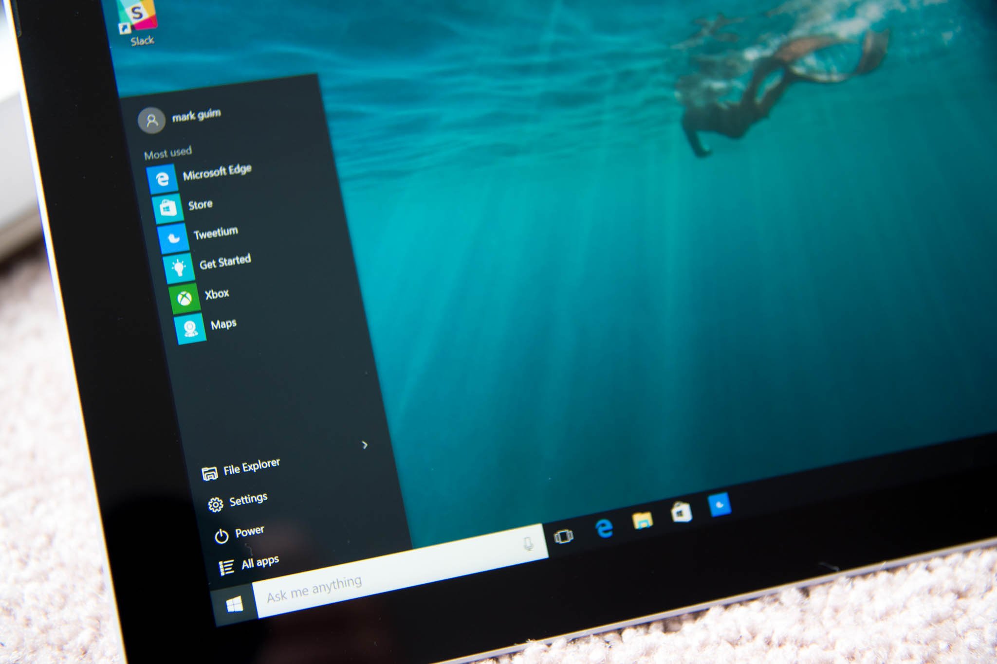
What's new in the Start Menu for Windows 10 Anniversary Update

The first anniversary update of Windows 10 packs a lot of new improvements and features. In this release, Microsoft is focused on making the operating system more secure. There is a big push for pen support with "Windows Ink", notifications get vastly improved, Microsoft Edge gets support for extensions, and the Start menu gets redesigned with enhancements for "efficiency and discoverability".

Ever since Microsoft removed the Start menu in favor of the Start screen, the way we access apps and settings have been an area of controversy for many users. However, on Windows 10, the classic Start menu style returned with a design that combines the Windows 7 Start menu with the Start screen introduced in Windows 8. And on the Anniversary Update, the menu gets new improvements, which according to Microsoft, aims to reduce clicking and scrolling.

In the new design that Microsoft introduces with the Windows 10 Anniversary Update improves the Start menu for the desktop and mobile devices.

The redesigned Start menu

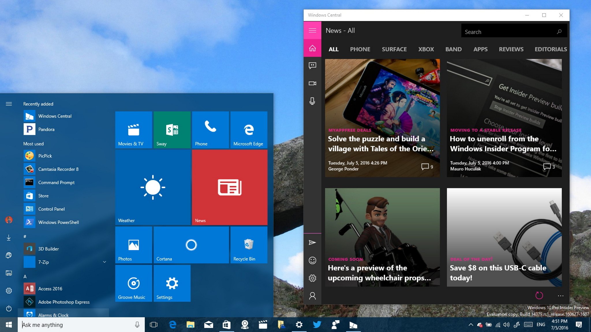
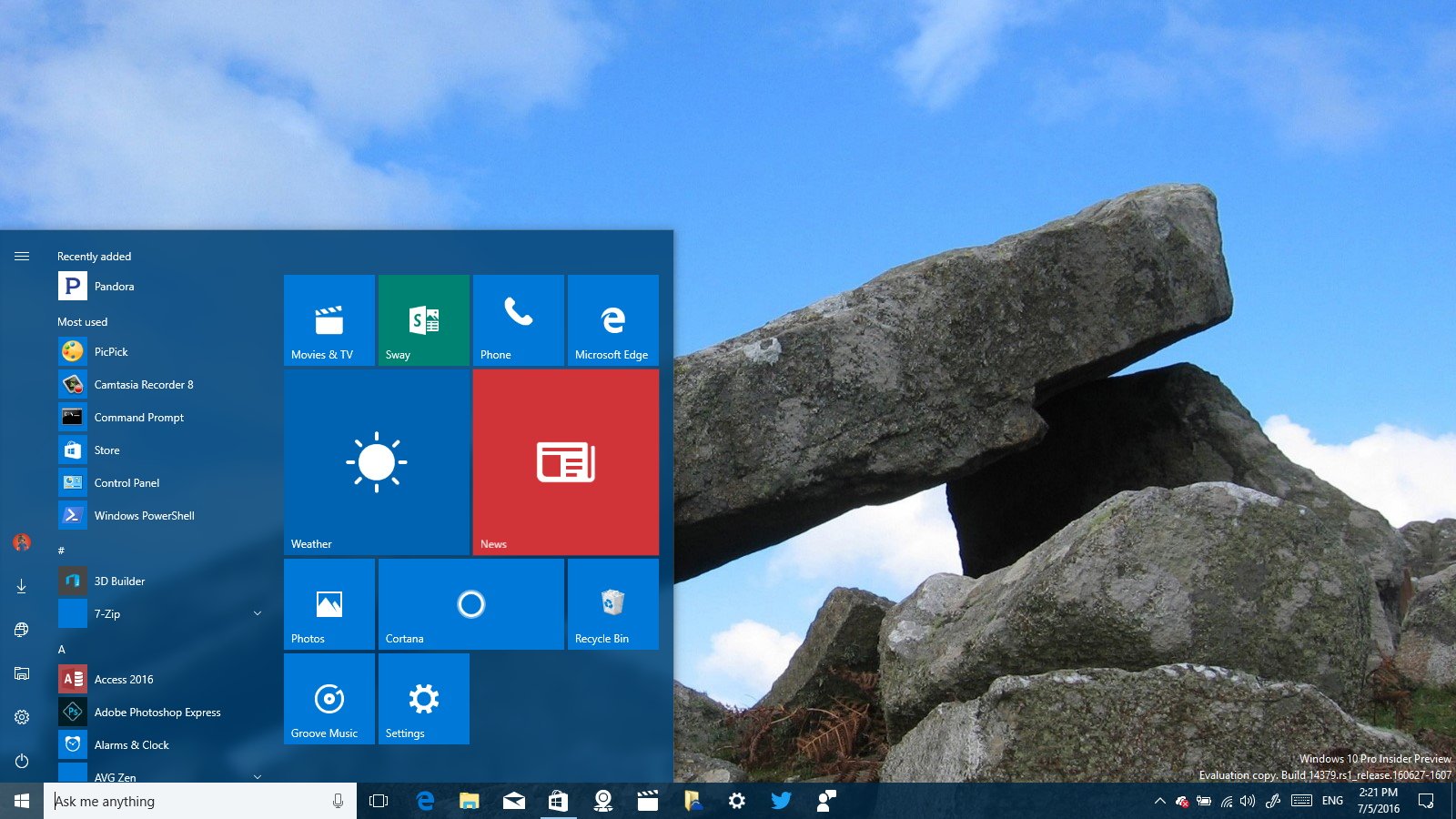
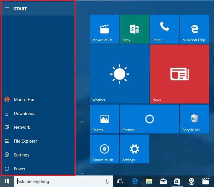
The new menu is being updated with the same modern design language we see with the Windows Store apps. The Start menu now features a navigation pane on the left with a hamburger button at the top-left corner, and the user profile menu button has been moved to the bottom, above the Power, Settings, and File Explorer buttons, which have also been relocated to this section.

New Start menu design (Windows 10 version 1607)

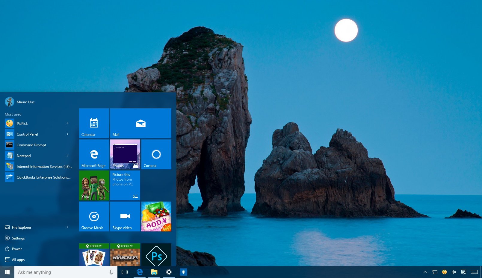
Old Start menu design (Windows 10 version 1511)

When you click the hamburger button, the left rail will expand revealing the labels for each item listed to have a better understanding of what each button does. Interesting enough, you'll also notice the "Start" label next to the hamburger button, a word that Microsoft hasn't show in the menu since Windows XP.

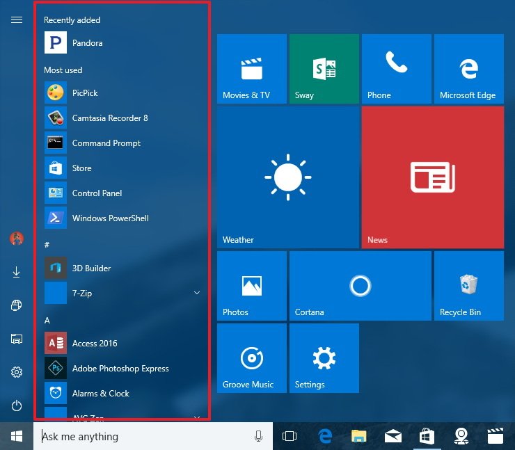
The new design also removes the "All apps" button to access your apps. Instead Windows 10 now shows a single view that includes the "Most used" and "All apps" items. Basically, you can now open Start, hover over the menu and scroll up and down to quickly find and launch the app you want to use.

Of course, you can always click the letter (or number sign) to jump immediately to the letter listing the app you want to open.

The "Recently added" group now appears at the very top of the new unified list, and apps you have recently installed from the Store will stay listed for seven days, instead of three. Finally, the scroll bars now hide as soon as you move the mouse away from that area, rather than staying visible for a long period of time.

The redesigned Start screen

The Anniversary Update also brings similar improvements to the Start screen, when you use the menu on tablet mode or full-screen mode.

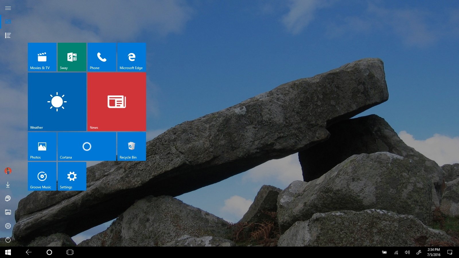
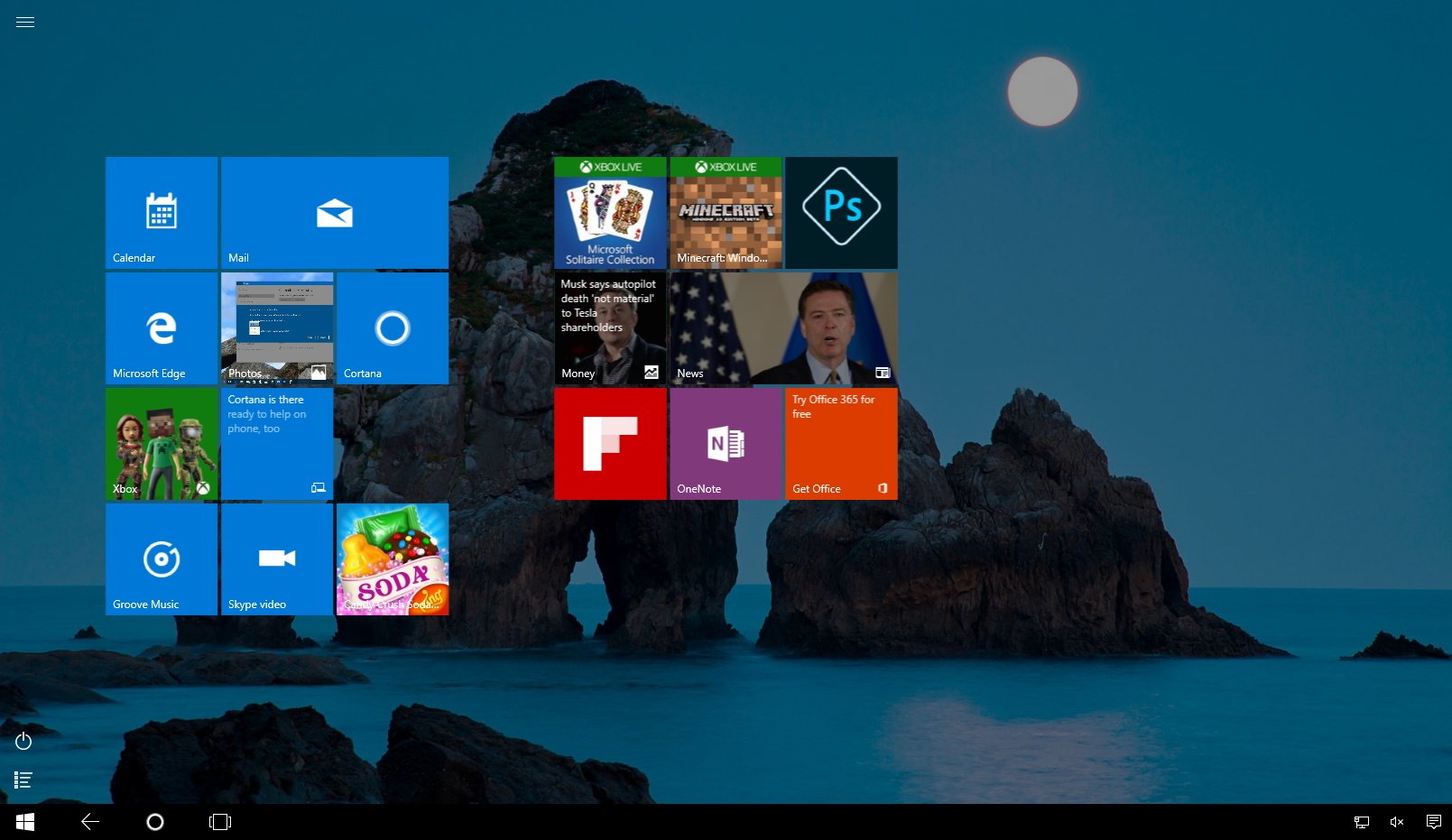
The new Start screen design continues to show the default Live Tile view, but it implements all the new changes found in the Start menu and a few more.

New Start screen (Windows 10 version 1607)

Old Start screen (Windows 10 version 1511)

When clicking or tapping the hamburger button, the left rail will expand similarly to the regular menu, but you'll notice that the tiles view won't get pushed to the right. Instead, the new rail will overlay on top of the tile view.
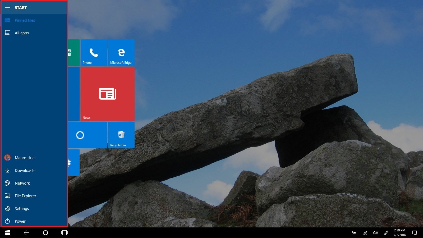
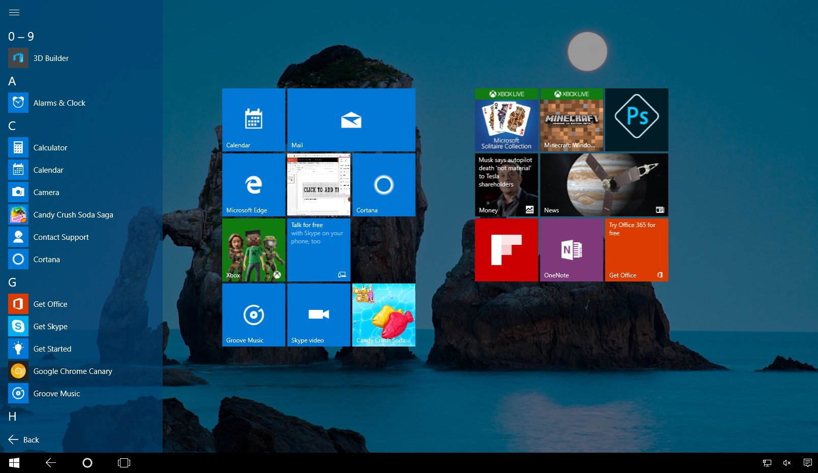
New Start screen (Windows 10 version 1607)

New Start screen (Windows 10 version 1607)

Old Start screen (Windows 10 version 1511)

Old Start screen (Windows 10 version 1511)

Unlike the regular menu, the Start screen also features two new buttons to switch between "Pinned tiles" and "All apps".
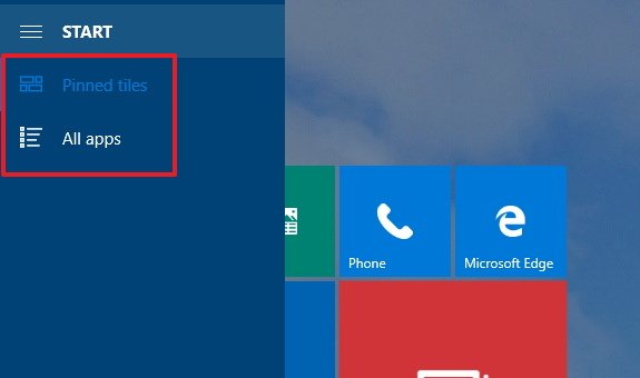
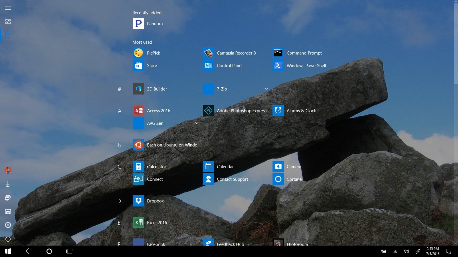
The most noticeable change on the Start screen is the "All apps" list. The new list follows the same design as the smaller menu, but is optimized for touch.

Previously, when you could access all your apps with a simple list from the left pane. Now, on the Windows 10 Anniversary Update, you can click or tap the "All apps" button to access the new view that takes the entire screen.

New Start screen All apps view (Windows 10 version 1607)

Old Start screen All apps view (Windows 10 version 1511)

The new "All apps" list implements a grid-like view that provides an efficient way to take advantage of the real estate of the Start screen on your touch-enabled device. The new list view is a balance between grouping as many apps as possible in one area, but without making the list too crowded to the point that it becomes too difficult to find the app you want.

The default view will show three columns of apps, but depending on your screen resolution, the list can be divided into more columns.

As part of the Start screen changes with the Anniversary Update, you can now take full advantage of the entire screen when using Windows Store apps by choosing the auto-hide the taskbar while in tablet mode. You can configure this new feature under Settings > System > Tablet Mode and turning on the Automatically hide the taskbar in tablet mode option. Once the feature is enabled, the taskbar will automatically hide when running apps, but you can always swipe from the bottom up or dragging the mouse to the bottom of the screen to bring it back.

Chaseable Live Tiles

On the Windows 10 Anniversary Update, Live Tiles remain with the same look and feel, but they are getting smarter. Remember when you opened the Start menu and, for example, the News app tile showed you the latest headlines, you clicked one of the titles, the app opened, but the article you saw is nowhere to be found?

To address this issue, Windows 10 introduces a new feature called "Chaseable Live Tiles" that let you click a story, picture, or another type of content on a Live Tile and open the app to that particular content, instead of just opening the app.

While Chaseable Live Tiles is part of the Windows 10 Anniversary Update, it's not something that works automatically with every app. It's up to developers to update their apps properly to support the new feature.

Wrapping things up

After radical changes were made to the Start menu with Windows 8, Microsoft brought back the familiar menu with Windows 10, and now the company is being careful what goes in new improvements. In the new update, new changes are being introduced, but retaining the same Start design that matches the modern design language throughout the operating system with a familiar user interface.

Do you like the new improvements in the Start menu? Let us know your thoughts in the comments below.

More Windows 10 resources

For more help articles, coverage, and answers on Windows 10, you can visit the following resources:

Mauro Huculak

Mauro Huculak is technical writer for WindowsCentral.com. His primary focus is to write comprehensive how-tos to help users get the most out of Windows 10 and its many related technologies. He has an IT background with professional certifications from Microsoft, Cisco, and CompTIA, and he's a recognized member of the Microsoft MVP community.

85 Comments
  • I don't have any of the insider builds of windows 10 on my pc or laptop currently as both as daily drivers for me, so i'm really excited at seeing the changes... I think its more productive and everything is just there.. cant wait for august 2nd
  • What ring are you insider of?
  • is it only me who cannot see two images?? one that of new start screen and old start screen O.o
  • Same here
  • No, those images are not shown on my end either. Must be a broken link or something.
  • Fixed. Thanks,
  • I can see both different images just fine on W10M TH2.
  • Mauro Huculak said they fixed it
  • "When you click the hamburger button, the left rail will expand revealing the labels for each item listed to have a better understanding of what each button does." Also known as "how it should be in the first place." This is one of the reasons people hate hamburger menus: they've replaced something previously clear and intuitive with incomprehensible icons and therefore an extra step of clicking just to get to what we should've had from the get-go. This is one of the biggest design flaws that Microsoft sadly adopted. Humans ditched heiroglyphics for words millenia ago for a reason. No, developers, I don't know what your stupid icons mean but I do know how to read. Give us the five extra pixels it takes to replace your stupid symbols with words.
  • As someone with dyslexia, It's much nicer to have single symbols for everything than words all over the screen. Symbols are a much better solution in my view, especially as they are universal in a lingual sense. Symbols and icons are the way forward.
  • I opt for both when possible. Especially if you can turn one or the other on/off in settings.
  • Symbols are a terrible solution. There is a reason you replied to me using words instead of icons. We ditched them millenia ago for a reason. Now we have hundreds of apps that all use their own inconsistent, incomprehensible icons, just as primordial humans all drew different heiroglyphics. Symbols are a way backwards and the current shift towards icons without text has resulted in a chaotic mess of inconsistency and frustration. Icons are only useful when space is at a premium (not the case on most devices, save for the tiniest of phones) and when they're universal and unambiguous, which is not the case because the grand majority of icons are not standard and clear. Rather, "Icons are notoriously ineffective as labels, being very difficult to interpret correctly without training or experience." Thus, when icons are used, they must always be accompanied by text because "text labels are necessary to communicate the meaning and reduce ambiguity." This is basic Design 101.
  • :P
  • I agree that it is bad if symbols are inconsistent. But, symbols are universal if developers use Segoe MDL2 Assets. It is very useful to save the space because users can easier focus to the content of apps, they don't need navigation controls all the time. Btw, picture tells thousand words.
  • At least a good picture. You may not instantly know that the light-blue S is Skype. But when you read it first time, second time you'll know.
  • Both symbols and text have their advantages, which is why a good OS uses both. Experienced users immediately recognize the symbol, whereas new users can read the description. It's been that way since the very first GUIs.
  • Clearly, @coip, you prefer your words. And so many of them. Perhaps graphical user interfaces are not the best solution for you, and you might want to consider moving back to something like the DOS operating system.
  • Playing it that way, huh? Why are you typing the comment then? Go ahead and respond with icons, otherwise you belong to the DOS age as well because obviously all text belongs to DOS only. There are design guidelines; there are clear discoverability issues that can be objectively addressed. @coip is right and now that the design language of Windows has become a mess with everyone turning their own ideas into icons and forcing their users to think the way they do, the text has become mandatory and no amount of attacks like this changes that fact.
  • I'm sure you've heard of emojis. People use those all the time, and they're growing in popularity.
  • I absolutely refuse to use an emoji
  • There is a symbol on toilets, not words...
  • Problem is that a lot of sysmbols aren't universal. Some symbols are easy to figure out. Other require trial and error. Many icons give you a description when you hover the mouse over them. However, if you are using a touchscreen you will not be able to access the descriptions. 
  • I think it's fine. Since you are able to hit the hamburger button, you will be able to know what the icons do. Finally, once you know the icons, you can hide the text to save screen space. Similar to the ... button in WP. Posted via the Windows Central App for Android
  • If at least the icons were more colorful and descriptive. White symbols on a colored background remind me of the early days of graphical user interfaces. Why have this amazing 32 bit color depth if you dial the visuals back to the days of Windows 1.0, Apple's System 1 and GEOS on the C-64.
  • And what are the new features for Windows 10 mobile?
  • Battery improvements. Bug fixes. /s
  • That's it. -.-
  • Redstone 2 will be focused on mobile... Right now focus was on desktop more...
  • Well, I really don't see any battery improvement in mine Lumia 730... 2 days in Windows 8.1, close to 1 day only in Windows 10
  • I had no change on the previews with Lumia 820. Since 3 month i'm on Lumia 950, and battery lifetime improved from 26 hours to average 31 (heavy usage).
  • It was made clear ages ago & sooo many times now, that W10M won't be getting anywhere near as many features as W10. It was made clear ages ago & sooo many times now, that W10M will have increased priority with the next major release (RS2), & beyond. As for your question, I'm not aware of any major changes to the SS of W10M, are you using Fast Insider RS1 builds, have you seen any?
  • When and through what official channel was "it made clear", as you claim?
  • Only one of the head honchos (TM) at BUILD, with his "infamous" statement that W10M isn't as much of a priority as W10 for much of this year (& then subsequent clarifications/qualifications by MS). http://forums.windowscentral.com/windows-10-mobile/418690-microsoft-wind... It's been affirmed heaps since, by write-ups at WC, sourcing people they've spoken to, we'll see it ramp-up again from ~Sep't. onwards, by ~Jan. it'll likely be at full steam. At no time have I been suggesting W10M won't be getting any features, my reference was only to the relative feature count. It's clear lots lot has gone into W10M, just markedly less than might otherwise.
  • Mobile had almost as many builds as PC released these months. While there weren't many new features, they worked on it as much as they did for PC
  • We'll get a different article for that.
  • I wish I could hide apps list back. Looks really ugly with first apps in my list.
    Also Jump list(if I apply this term correctly) with recently used items now are "hidden" under right click, but before we have nice right arrow. They removed it or I've missed some option to show it? Personally for me reworked apps list is huge drawback :(
  • Agreed
  • Wel they really made a mess of the menu structure ... The old menu was just perfect. I would like to know how to get back the originale "all apps" option . It is just a real mess how it is organized now.. It does not give extra value to the menu. Please give us the option to get the old style menu back....If you have a solution to this feel free to post in here. w'll be gratefull :)
  • No my friend. Same here
  • First WC has to remove the crap old start menu image from every article about W10 Start menu
  • Quick question. I am a W10 user, but just have not found the time to research... On win7, I can go to Start->Document->(list of all recent documents no matter what kind). Can I do that in Win10? If so, how? Lately I had to launch an app, THEN I can see recent documents and where they are stored....
  • Just open the File Explorer. Your last 20 documents are on the first window under Quick access.
  • Open Explorer, top left column "Quick Access".
  • Perhaps in a couple of years start screen and tablet experience will be as good as in Windows 8.1. A bit same with mobile considering performance, stability and useful features
  • I would like to have the option to hide the icons on the lower left so NOTHING is shown on the scxreen.
  • I still despise this start menu, the new All Apps view in full screen mode even more so. The 10240 RTM Start Menu was perfect. The only flaw was not enabling swipe ti view the All Apps list from the hamurger menu (similar to how it works for Groove Music on mobile).
  • Nah. For tablets it was a step back compared to W8.x. As for the Start itself, RS1 really looks like an improvements over the TH builds.
  • I hated it but now I like it more especially in full screen. I am a heavy duty power user and have over 300 apps and it takes forever to scroll through the list and now in full screen I see a whole bunch without scrolling as much. Posted via the Windows Central App for Android
  • Nice tweaks.
  • Microsoft needs to bring back Horizontal scroll for the full screen start menu. Why not make it an option to the vertical scroll. Horizontal scroll is much better for tablets.
  • I'd actually rather like to see multiple pages of Start tiles. If you introduce side scrolling, how do you handle it when the start menu is small? Do you scroll sideways then as well? I think that would be a little awkward. Instead you could have arrows or even icons or numbers at the bottom that would allow you to switch between different pages. Multiple rotating start screen pages is something they should add to W10M as well as well as Cortana as the first page when you scroll left and that last thing should work on tablets/desktop as well. That way Cortana and the start menu aren't two different things, Cortana becomes part of the start menu and can take up as much space as the start menu. While I'm at it, I'd like to see support for even bigger live tiles as well as the capability to make them even more functional. Say, for instance that I could have a live tile with a list of Wunderlist tasks and I could the click on one of those tasks and be taken to it or perhaps even mark it as complete, etc. This has to be done carefully, of course, to avoid cluttering up the interface. I'd also like to see the desktop itself be revamped so that you can have live tiles on the desktop. So that shortcut to the spreadsheet that you have on the desktop and open every day, perhaps it could be customized to show a little info from the spreadsheet itself, before you even open it.
  • This is what I need. I added many times to feedback. They are not listening to it.
  • Until you're able to resize/maximize at will the menu as you do with any app/program in Windows, I'll be permanently frustrated with the menu. And the tablet mode is completely useless, never use it on my 2 tablets. I really love Windows 10, but the start menu needs sorting.
  • You can resize it idk what you're talking about. Posted via the Windows Central App for Android
  • Post the video of this . And from yesterday,,, Zooming images make the whole screen on flickering even on Edge. Don't know why?
  • I dont like the new one.  
  • I miss the 2 column layout in Windows 7. Until they bring it back I will not be happy.
  • Please stay unhappy
  • I like the new redesigned start menu on Windows 10, but why don't they bring the hamburger menu to the Windows 10 Mobile in the all apps list. It would be easier to open settings, and I could faster access to the downloads folder. Maybe even adding power options, so it would be possible to turn off/restart the device without using hardware buttons.
  • I would actually kinda like that.
  • Havinga space for Hamburger icon at the top doesn't sound look good. Though we can have it as a left-side of the Start screen on W10M, on need for Hamburger. So right would be still all familiar All Apps while the left side would be these system shortcuts, recents, and Store recommendation (if enabled). Consistency is good, but it still needs to consider if certain layouts would actually be optimized for certain device or form-factor.
  • New All Apps view is only available to tablet mode? Or is it available in desktop mode wid fullscreen start screen too?
  • I know this is mostly about the start menu, but why does every article that mentions Edge have to talk about those stupid extensions?  Nobody's going to use those extensions if the browser itself is not ready for prime time.  Why don't they finish the basics first before focusing on extensions????  Having said that I'm still hopeful that this anniversary update will finally make Edge usable, although I'm extremely skeptical about it.
  • You're not kidding, I use Edge as my main browser but damnit if it doesn't freeze up on me all the time.  Also, lack of syncing my favorites is ******* me off, I do all that work deleting my favs I don't want and make new folders just to see it go back to the way it was before. 
  • Anyone used/still use Stardock's Start10 for W10? Just wondering if it's still useful/relevant considering the "improvements" coming up.
  • I didn't realize they made a start menu for an operating system that already has a start menu.  What's the point?
  • Yes, and now I wish I'd turned it off before installing this, because clicking the Start menu button locks up the Explorer shell so badly it has to be killed, and it never comes back. I have to hit the panic button and force reset. Yay.  
  • The All Apps list in Tablet Mode is such a step back! You can't reach a letter and an app anymore with your left thumb while holding a tablet. They also missed the opportunity to make the apps list be accessible with a swipe to right gesture (similar to how you access it on Windows 10 mobile). I thought the feedback was pretty clear: people liked the Windows 10 desktop feature but wanted the Tablet Mode to be a bit more like Windows 8. :(
  • So, when will Microsoft address the SD card reader problem ???
  • Still can't make the live tiles transparent.
  • Windows Central App keeps crashing still with 104383. Also, don't really get the Start Menu improvements. Meh. I still want quiet hours to work with appointments a la 8.1. Seems notifications that you clear on phone should clear on PC and tablets too. You go from one to the other and there they are. Redstone seems short of new features that really work.
  • Is Mobile version getting chaseable tiles?
  • Great question. It should, since it's shared code, etc
  • Start menu is ridiculous. How could these "insiders" let it happen? Posted via the Windows Central App for Android
  • What makes u feel it ridiculous??
  • Have chaseable tiles been tested on Insider builds though? This is the best feature of this update to me, but I'm suspicious as to its inclusion in the final release. Hope it makes it, though.
  • All Apps list needs to have an option nor way to hide and unhide it. A button on the Hamburger pane would do the job, plus a nice animation on it. This is a feedback about giving ability to hide All Apps: http://imgur.com/a/QybHJ
    feedback-hub:?contextid=203&feedbackid=8d3ded18-6c4a-433c-93da-29a7c77699ae&form=1&src=2   I'm also suggesting to return sorting option like what we had on Windows 8.1, where we can sort it by name, categories (my favorite), and dates. In my feedback though, I add some more options like refine which is similar to what used on Windows Store. Refine options are just optional for users to easily filter out apps especially for users who have tons of apps installed. Refine must be an optional and unlike Sorting, it won't save permanently. This is a mockup and feedback for Sorting and Refine for All Apps: http://imgur.com/a/0Sep8
    feedback-hub:?contextid=203&feedbackid=61ac92bb-6119-4676-9bca-db7fbe6e7a6d&form=1&src=2   Lastly for All Apps screen for Start screen users. It would be better to have a sliding/swiping gesture instead with animation than being a toggle. So it would be consistent way of accessing All Apps similar to W10M which is already nice. feedback-hub:?contextid=203&feedbackid=04d45ec0-74ed-4b05-92b1-4eafb982e0e5&form=1&src=2
  • Still not a patch on the Windows 7 functionality though but install Start10/Classic Shell.. problem sorted.
  • This getting anoying
  • That new start menu confused me
  • new start menu is too bad i don't use all apps at all i don't need it now my start menu bothers and confuses me they could add an option to use old versions this too annoying for me
  • Please just give me the choice between the old Windows 7 start menu and an Android menu.   The current mess just keeps getting worse.
  • The original Windows 10 start menu was more compact and hid away all of the things that I never use.  Also, the bigger buttons for power, settings, and file explorer were much better.  You should go back to the old design with the "all apps" button again.
  • How can i unhide the all apps list in the start menu and make it available as a button, like it used to be in the old start menu?
  • How to back to old menu? (no windows 7 windows 10 but old)