New video shows off the new Microsoft ... icons
Microsoft continues to show its passion for designing icons and UI elements.
What you need to know
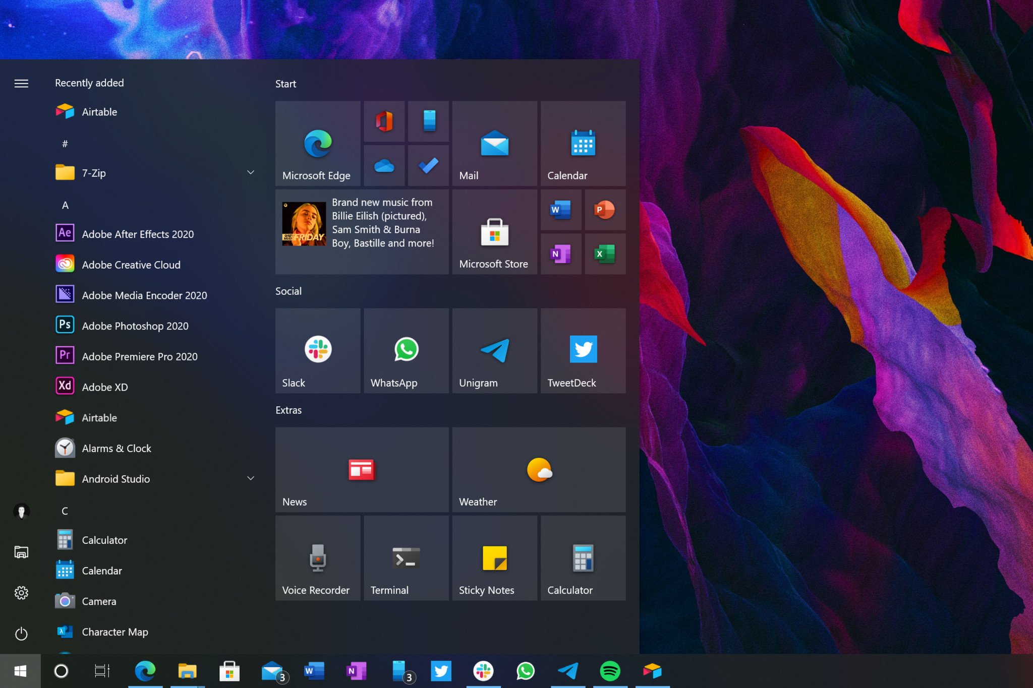
- A new video from Microsoft shows off its new icons.
- The video briefly goes through the design process of Microsoft's updated app icons.
- Microsoft has shared several videos and extensive posts breaking down its design processes.
Microsoft's design team loves sharing its passion for improving the look of its products, often in the form of videos. A new video from Microsoft showcases its "diverse and connected" icons. The icons are shown throughout the design process, moving from sketched ideas to icons on Windows 10.
Microsoft has shared several posts and videos on the development of its icons and other elements of UI.
The Office team and other design teams at Microsoft have several impressive videos. About a year ago, the Office team shared an almost cinematic video about the Office suite gaining a dark mode.
If you're a fan of Microsoft's Fluent Design language, you might also want to check out the Fluent Icon Pack for your Android device.
Windows Central Newsletter
Get the best of Windows Central in your inbox, every day!
Sean Endicott brings nearly a decade of experience covering Microsoft and Windows news to Windows Central. He joined our team in 2017 as an app reviewer and now heads up our day-to-day news coverage. If you have a news tip or an app to review, hit him up at sean.endicott@futurenet.com (opens in new tab).
-
Neumorphic will be a thing...
-
Did anybody catch the rainbow border on the highlight effect at the very end? Bring that to Win 10!
-
Of course everyone saw it...... and everone wants it :D
-
I don't. thats hideous.
-
RGB users say otherwise.
-
Its a little tacky, but if toned down a bit, it will look better. It also useful in terms of visibility as well as it makes highlighting on mouse hover more oblivious.
-
What is that yellow icon with the chevrons just before edge icon
-
Maybe windows security?
-
The design team at Microsoft should have been fired by now. Microsoft is all about productivity and cloud and getting things done, and there is no place for UI and icons and colors and emojis. Not anymore. Improve product performance and fix bugs. That is what they should be focusing on from now on.
-
With computing moving more and more to mobile nowadays. I have to emphatically disagree.
-
So because they focus on productivity we just let the OS environment looks unpleasant and not enjoyable to look or work on? Considering Surface seems to attract or trying to attract designers with its beautiful hardware, it's odd that OS will not follow as well. Making things pretty doesn't mean it's not productive. Nobody want to works in a office that looks and feels horrible, at least if people have a choice (sadly not always). If the environment is pleseant, that also improves productivity as well.
-
The only reason they should've been fired is the inconsistency across the OS. I for one welcome the return of skeuomorphism. Flat UIs never really scaled well on the desktop IMHO.
-
I agree, the problem is inconsistency, which just ruins everything regardless how got it looks individually when the whole looks like a mess. Any design language will look bad if implemented inconsistently. About skeuomorphism. The new Fluent Design isn't skeuomorphism, its more like what they called neumorphism. It sits between full-flat design and skeuomorphic. Fluent Design is still flat, unlike Metro Design Language which is fully flat, very digital look. Fluent Design just have more visible depth. Flat design can still look good though, and there are many websites that features flat design that looks great. The problem is that Microsoft seems to failed implementing Metro Design into Windows desktop and ruins it with inconsistency. Zune Software were flat design that lived on desktop, thing is its only a single piece of software living inside a window. But flat design can be done on desktop, but Microsoft implementation on Windows 10 were ugly. Its not even really Metro Design since the time its on Windows 10, they abandoned it and called it Microsoft Design Language, while looking like a lazy flat version of Material Design in Android with full of inconsistencies, lazy aesthetics, and lacking much animations. Microsoft Design Language in Windows 10 is the ugly example of flat design if wasn't done right. Its just a poor-mans Metro Design on a desktop while copying Android UX with Metro UX with some Windows inconsistencies on a mix.
-
Completely agree with your first point. If Microsoft spent as much time actually making a consistent, attractive OS as they have on these stupid, meaningless, splashy videos that nobody is going to care about or watch they might actually have decent OS on their hands. They’ve been talking about all these nebulous design ideals for years and all they do is hop from one idea to another every year, like they just can’t decide what they want to do. Just look at the new Microsoft Edge. After years of having working on the design language based on the old Windows Phone, they, with no actual explanation, released an Edge with a completely different design compared to literally every recent modern app on the OS (not that those others were super consistent either). It’s like they have the attention span of a rodent “OOO what about this design?! OO what about that one? OOHH let’s do this one!!” Meanwhile Apple seems to have a GUI team that actually works together and makes MacOS look like it was designed by one team instead of 40 different ones. /rant
-
They spent all this time designing icons but none of it actually improving the OS or their software. I do not understand.
-
Obviously disingenuous, possibly stupid.
-
With the world going more and more to mobile computing (Surface Duo, surface Neo, Smart Phones). This is a great idea for them to implement. To say they shouldn't work on icons, UI or other stuff and just focus on cloud, business and office etc...is nave.
-
I can't wait to use these new icons to launch the applications I've been using for years.
-
Just give us Skype and Teams for Windows on ARM already.
-
Irrelevant comment is irrelevant.
-
Although the comment is irrelevant for this article, it's still a valid point. The Surface X is a great device, but instability and low performance of some software, like Teams, ruins the experience. Microsoft real has to step up on this. The new icons are nice. They help bringing consistency to the W10 UI, which is very much needed.
-
No opinion about the icons. Mucho opinion about the videos. Man, I love these videos. The little chimes and everything. Forgive my Spanish.