You won't believe how much the Windows Start Menu has changed in 40 years — including THAT ill-fated departure with Windows 8
See how the Start Menu has evolved from Windows 95 all the way through to Windows 11 over the course of 40 years.
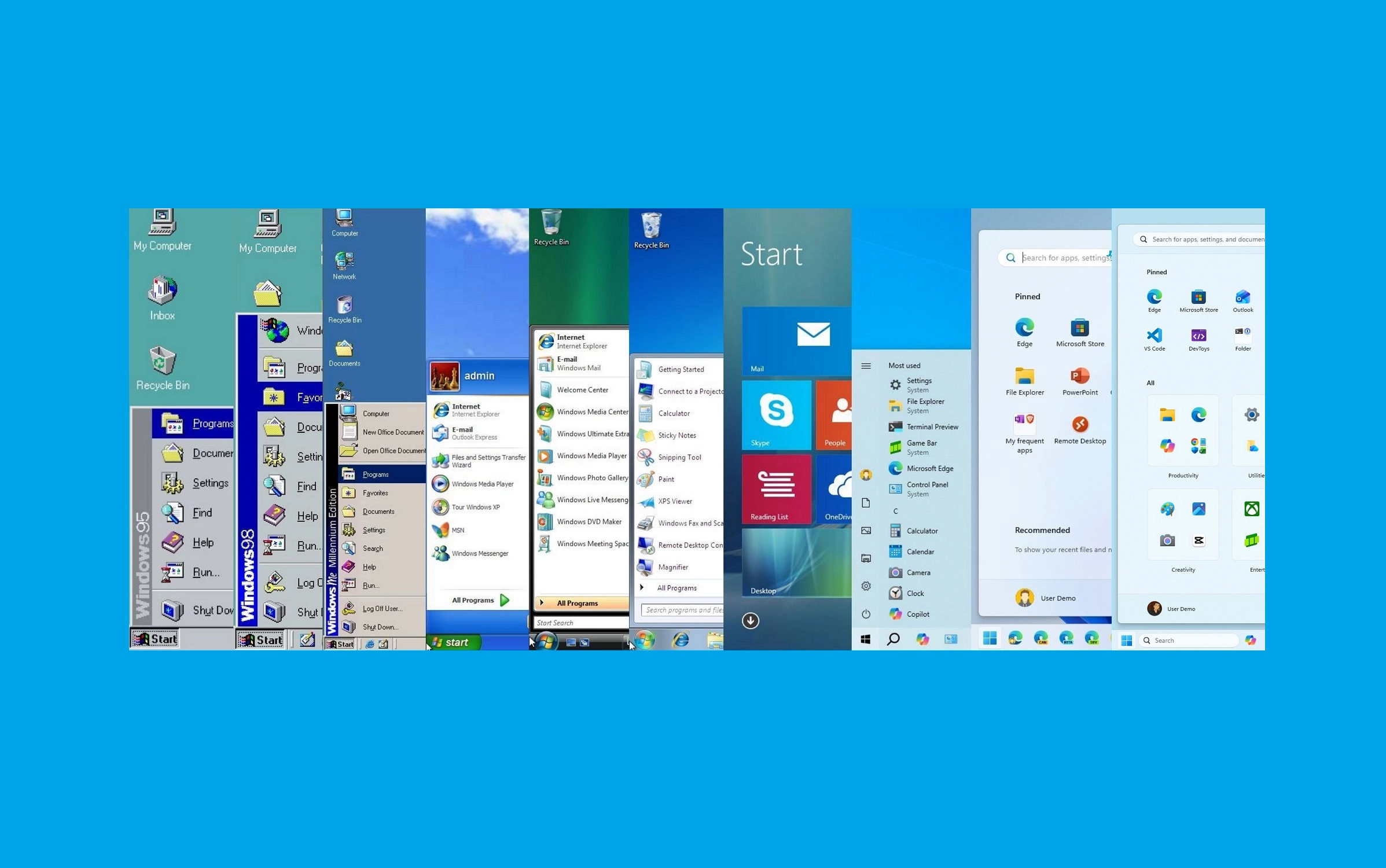
On November 20, 1985, Windows 1.0 shipped for the first time, marking the beginning of a Windows era that reshaped personal computing. Today, on November 20, 2025, Microsoft is celebrating 40 years of the operating system and using this milestone to reflect on one of the company's most enduring features, the Start menu.
Introduced with the release of Windows 95, the Start menu rapidly became a defining interface element. Over each successive release, the software giant has refined how users launch apps, access settings, and organize workflows.
However, the Start menu available on Windows 10 is arguably (by far) the best approach, as it combines modern ideas with a hint of classic elements and the best selection of customization options.
Article continues belowThirty years is a long time for any feature to be around, so let's look at how the Start menu has evolved over the years.
Windows 95: The birth of the Start menu
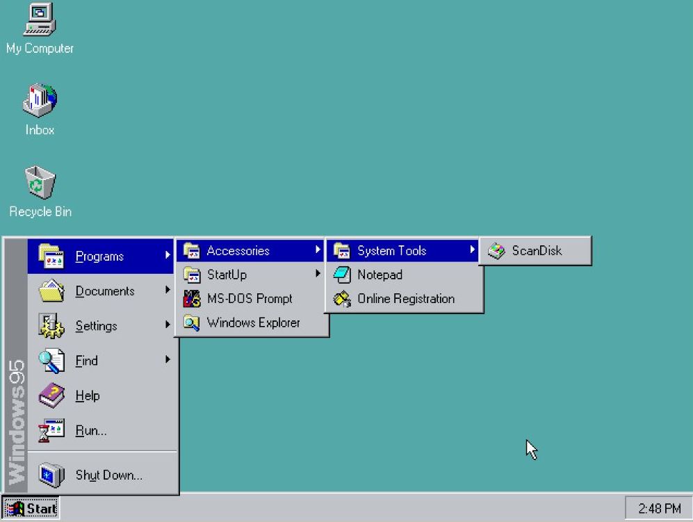
On August 24, 1995, Microsoft introduced the Start menu as a central hub for accessing programs, documents, and system settings with the launch of Windows 95.
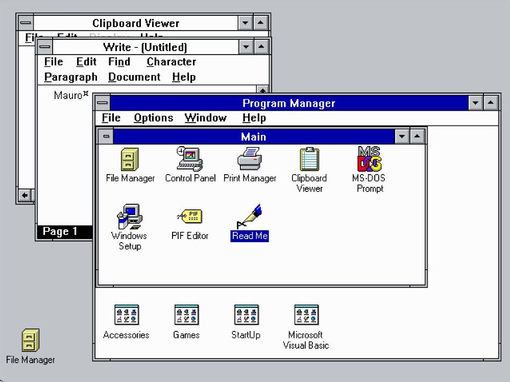
This innovation replaced the "Program Manager," offering a more intuitive and organized user experience.
In contrast, the "Program Manager" was technically something we can refer to today as a folder containing a list of items with sub-containers to access the different programs, with no real organization.
All the latest news, reviews, and guides for Windows and Xbox diehards.
An interesting fact is that the Taskbar (and Start button) also arrived alongside the Start menu with the release of Windows 95.
The menu was simple, with a pop-up in a cascading format, providing access to programs, documents, and system settings. Also, it had a left-hand sidebar that contained the "Windows 95" text.
The "Programs" folder provided a hierarchical list of installed applications, making it easy to launch programs.
The "Documents" folder displayed a list of recently opened files, allowing for quick access to frequently used documents.
The "Settings" folder provided access to the Control Panel, which allows users to configure their system. This menu also provided quick access to the Printers and Taskbar settings.
The Taskbar settings also included a few customization options for the Start menu, but the settings were limited.
The "Find" option enabled users to search for files and folders on their computer. However, the search didn't occur in the Start menu. Instead, the option would open the "Find" app on Windows 95.
The "Run" command allowed users to directly execute programs or open files by typing their names (just like we do today).
The "Shutdown" option provided a convenient way to turn off the computer.
Windows 98: Refinement and expansion
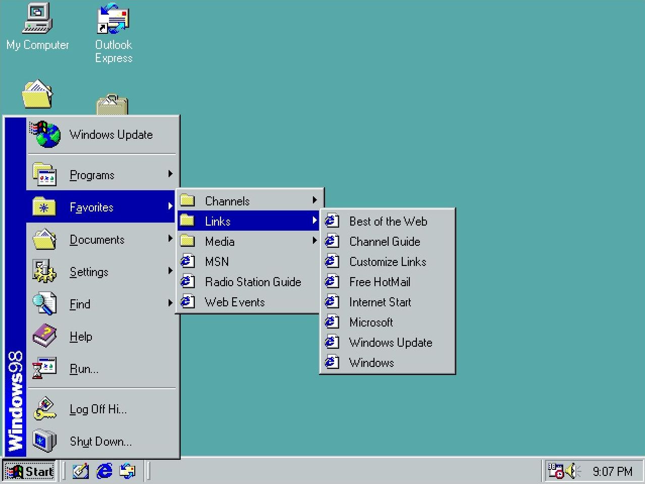
Although the Start menu for Windows 98 didn't look significantly different from the original design, the menu incorporated a new "Log off" option for the new multi-user functionality.
In addition, Microsoft added an option to access the "Windows Update" service through Internet Explorer to scan and download the available system updates.
Furthermore, the Start menu added a "Favorites" submenu to complement Internet Explorer's presence in the operating system.
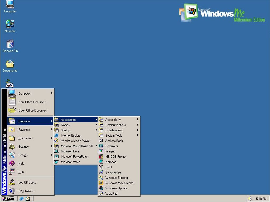
Windows Me: Minor adjustments
Microsoft launched the Windows Millennium Edition (ME) in 2000, but the design of the Start menu didn't receive any significant changes.
The menu was identical to the version in Windows 98. The only difference was the branding on the side that indicated the name of the operating system.
This was the last time we had seen this version of this menu.
It's important to note that the classic version of the menu was an option until Windows Vista.
Windows XP: A new era
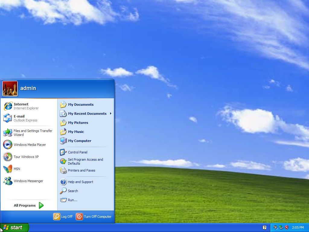
Windows XP was launched in 2001, and it unveiled a redesigned Start menu with a two-column layout. The left column featured pinned and recently used apps, while the right provided access to user-specific folders ("My Documents," "My Pictures," "My Computer," and "Control Panel") and system functionalities.
This design aimed to streamline navigation and enhance productivity.
A prominent user account picture was displayed at the top of the left column, adding a touch of personalization.
The left column dynamically displayed frequently used programs, making it easier to access commonly used apps. However, users could also pin apps to this section for quick access.
The "All Programs" menu, accessible from the left column, provided a hierarchical list of all installed apps.
The shutdown option was conveniently located at the bottom of the right column, making it easy to turn off or restart the computer.
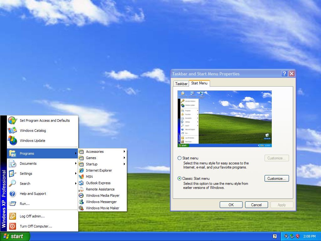
On Windows XP, Microsoft introduced the "Luna" visual style, which gave the Start menu a more modern and polished look with rounded corners and vibrant colors.
However, the operating system also allowed users to revert to the "classic" Start menu style for those who wanted a more traditional experience.
Windows Vista: Enhanced search and organization
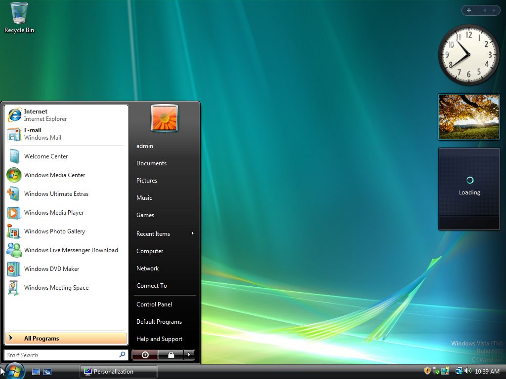
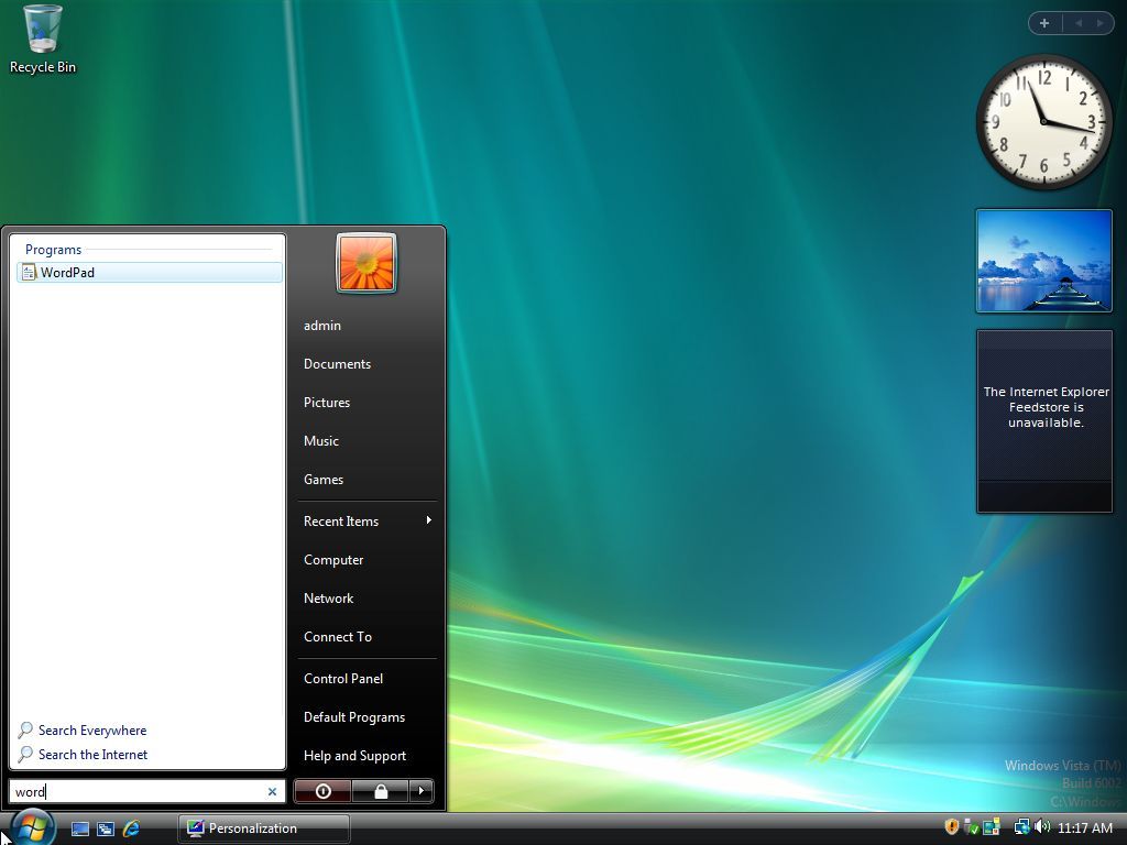
In 2007, Microsoft launched Windows Vista, a version of the operating system that also included a new Start menu version with search integration, allowing users to locate files and programs quickly without having to jump to another experience.
However, the interface and elements of the new menu were pretty much identical to the design of Windows XP.
The menu featured a two-column layout. The left column featured pinned and recently used apps, while the right provided access to user-specific folders and system settings.
In this release, the user account menu was located at the top-right corner, and elements like "My Documents" and "My Computer" dropped the "My" suffixed. So, the items became "Documents," "Computer," etc.
Windows 7: Just tweaks
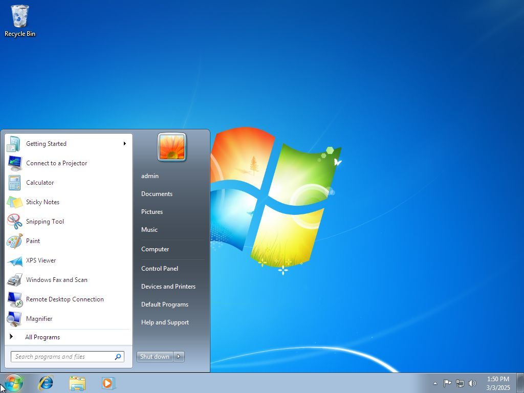
In 2009, Windows 7 was released with an updated version of the Start menu that was identical to the one available in Vista. However, it added "Jump Lists," offering quick access to recent documents and tasks directly from the Start menu.
Also, the power options removed the "Lock" item and added it to the "Shut down" menu. Furthermore, on Windows 7, you were able to change the power button action, something that wasn't available on Vista.
Finally, in this version of the operating system, Microsoft also removed the ability to switch to the classic Start menu.
Windows 8 and 8.1: A bold departure
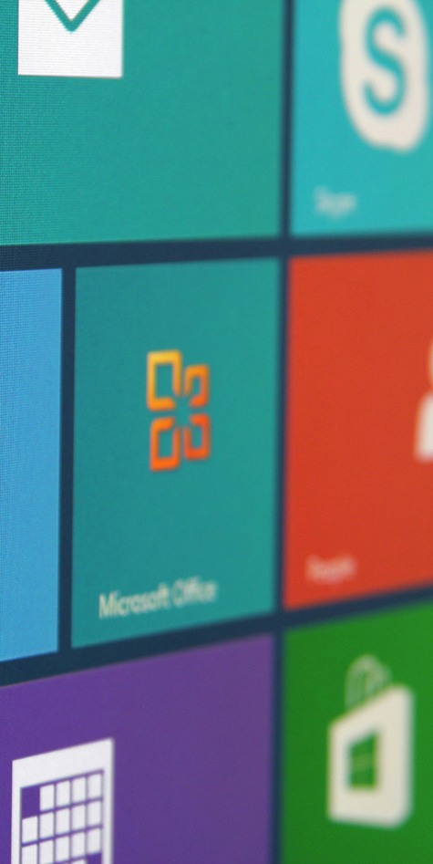
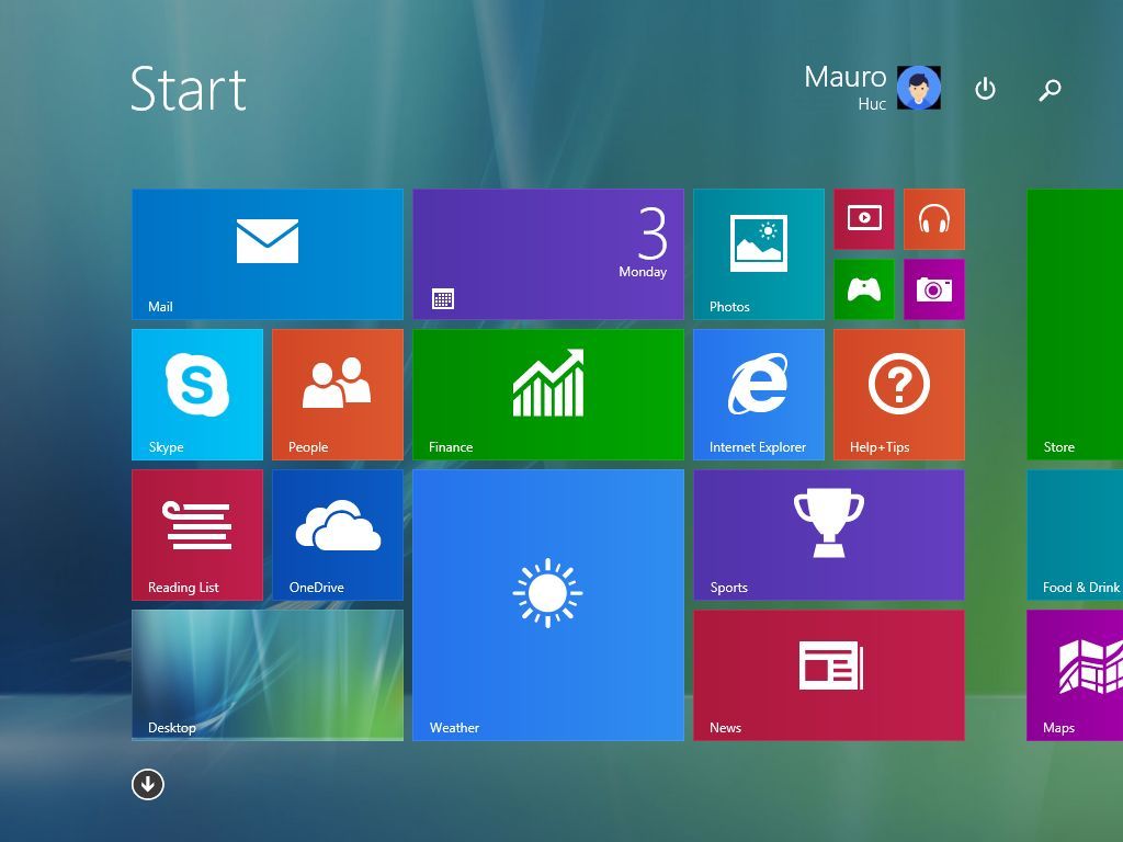
Things changed drastically in 2012 when the company released Windows 8. This version ditched the Start menu for a Start screen that covered the entire desktop and removed the Start button.
This shift aimed to create a unified experience across touch and mouse-keyboard devices, but received mixed feedback.
This is one of the biggest mistakes Microsoft made for the operating system.
This full-screen approach was a core element of Microsoft's vision for a touch-centric operating system.
The Start screen was dominated by "Live Tiles," which represented applications and websites. These tiles could display dynamic, real-time information like weather updates, news headlines, and social media feeds.
Also, tiles came in various sizes, allowing users to customize the layout and prioritize information.
In addition, the Start screen introduced the "Metro" (later "Modern") design language, which is characterized by clean (flat interfaces), bold typography, and a focus on content rather than visual chrome.
One of the many problems was that the Start screen was heavily optimized for touch input, with large, easily tappable tiles. This design philosophy aimed to provide a consistent and intuitive experience across touch-enabled devices.
However, this change was a significant source of user frustration, particularly for those using desktop computers with a mouse and keyboard.
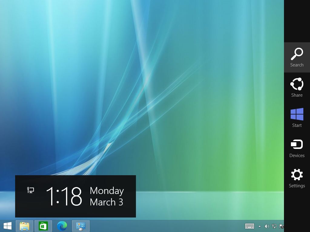
Since this version of the operating system didn't include a Start button either, Microsoft added the Charms bar, a sidebar that appeared with a swipe from the right side of the screen or by moving the mouse to the upper or lower right-hand corners of the screen. This bar contained common functions like search, settings, and share.
In a way, the Windows 8 Start screen represented a radical shift in the user interface, prioritizing touch interaction and live information. While it aimed to modernize the experience, it faced significant criticism for its departure from familiar desktop elements.
Then, in 2013, Windows 8.1 was launched; this time around, the company didn't bring back the Start menu. However, the Start button was reintroduced, linking users back to the Start Screen.
Windows 10: Merging legacy and modern design
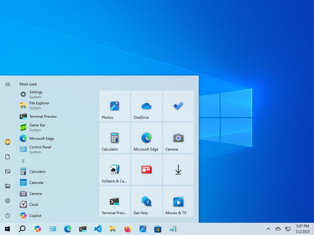
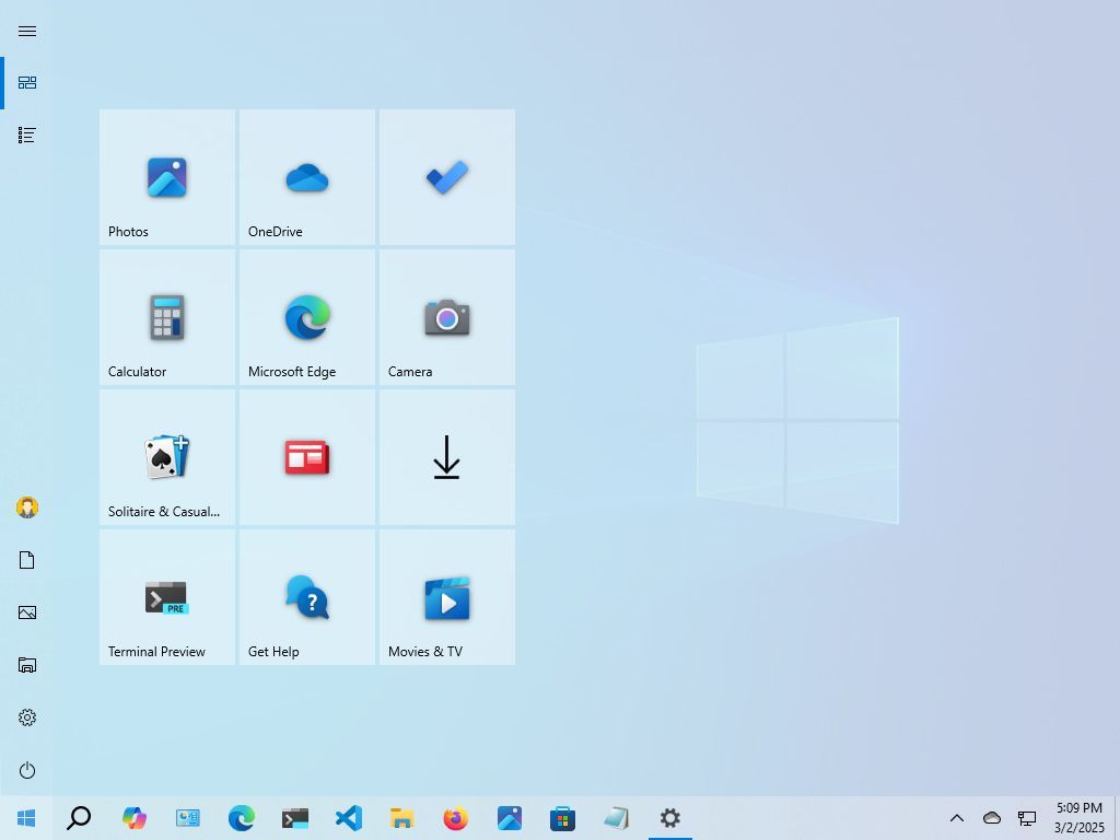
Windows 10, launched in 2015, brought back the Start menu, combining the classic menu with modern Live Tiles in a customizable two-pane design, similar to the menus for Windows 7 and Vista.
This hybrid approach was aimed at desktop and touch users, balancing familiarity with innovation with a traditional left-hand column and a tile-based right-hand section.
The left column featured an alphabetical list of all installed apps, making it easy to find programs.
The left rail included access to the profile settings and quick access to folders (such as Documents, Pictures, File Explorer, and Settings). In this section, you can also find the power options (Shutdown, Restart, Sleep).
The right column displayed Live Tiles, allowing users to pin frequently used apps and receive dynamic updates.
Using the context menu in the Start menu, it was possible to resize, rearrange, and group Live Tiles. You were also able to turn tiles on or off, giving you control over the information displayed.
Windows 10 addressed the widespread criticism of Windows 8 by bringing back the familiar Start menu, and the hybrid design provided a balance between traditional navigation and modern tile-based access.
Furthermore, this version offered (perhaps) the most control over the appearance and functionality of the Start menu I've ever seen in the operating system. You even had an option to show a full-screen version of the Start menu.
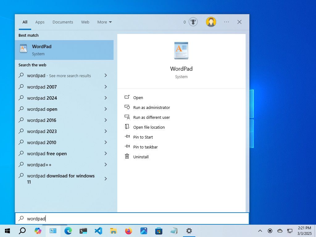
It's important to note that on Windows 10, Microsoft began to decouple search from the Start menu. Although you can start a search from the menu, in this version of the operating system, Windows Search has its own entry in the Taskbar and home interface. This also continues to be true on Windows 11.
On Windows 7 and Vista, the search occurred within the Start menu experience.
Windows 11: A centered and simplified design
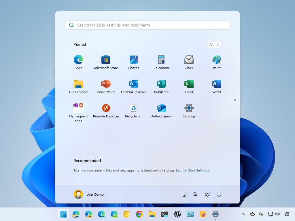
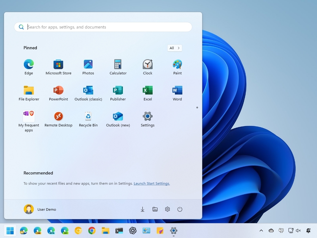
In 2021, Microsoft launched Windows 11, which also introduced a centered Taskbar and a revamped Start menu that brought a significant visual overhaul to the menu, and it's safe to say they've generated a range of reactions.
One of the most noticeable changes was the centered Start button and Taskbar items, giving Windows 11 a more modern and streamlined look.
Some have argued about this placement, as it deviates from the traditional left-aligned Start button. As a result, changing the alignment to the left is one of the first configurations that users usually apply to a new setup.
The Start menu itself features a simplified layout, with pinned apps at the top and a "Recommended" section below, displaying recently opened files and apps.
Also, Live Tiles have been replaced with more traditional static icons, and this menu emphasizes rounded corners and a cleaner, more minimalist aesthetic.
You can also pin as many apps as you want by creating scrollable pages in the menu, and you can even organize apps in groups. However, many users accustomed to the Windows 10 Start menu have expressed frustration with the lack of customization options.
A common criticism is the limited customization options compared to previous versions. For example, you can't resize the menu, remove the "Recommended" section, or show Live Tiles.
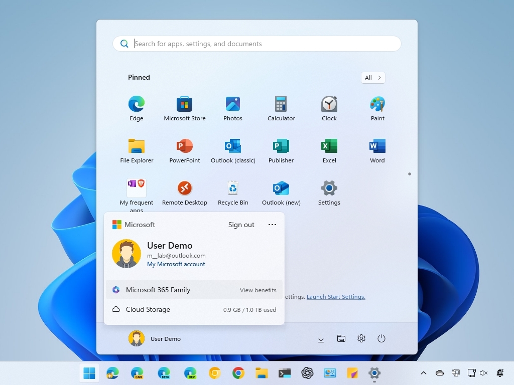
Another aspect of the Start menu is that Microsoft has been using it to push even more advertisements. Although the company has been known to promote partner apps, you only noticed this in new installations. However, on Windows 11, the "Recommended" section is also used to dynamically promote apps from the Microsoft Store.
Also, in the user menu, the company uses this area to promote its cloud services by luring users into backing up their files to OneDrive and Microsoft 365 subscriptions.
One thing you will notice about this menu is that it has a horizontal design, while the previous menus had a vertical design.
Start menu overhaul
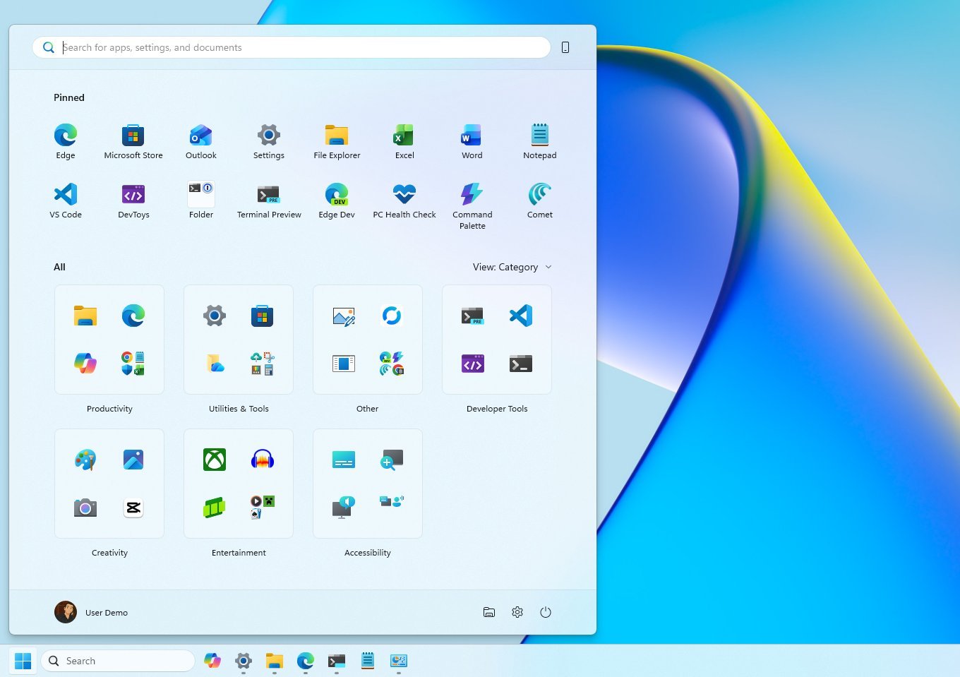
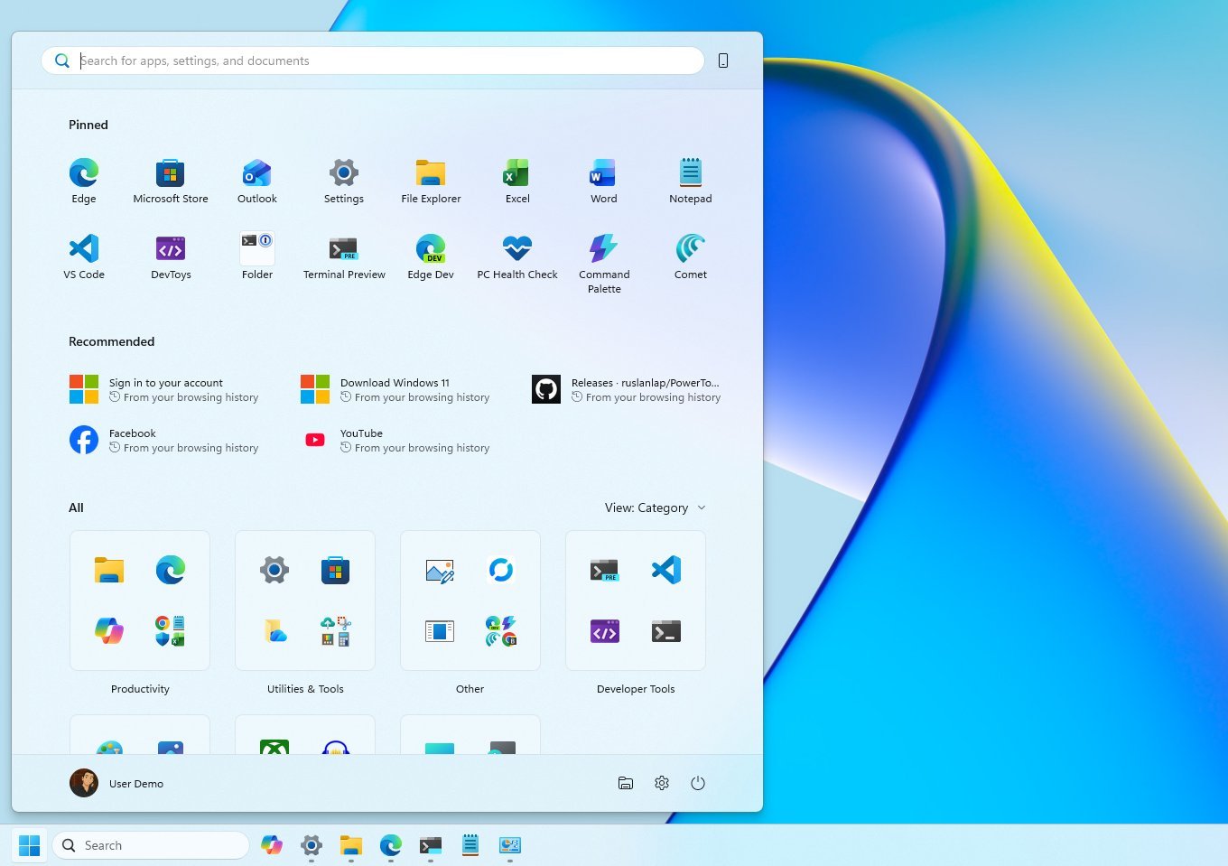
Starting with the November 2025 Security Update, the company has yet again introduced a new version of the Start menu that follows the original menu available on Windows 11, but with additional changes.
First, the new Start menu offers a larger layout that adapts to the screen resolution, but you don't have an option to resize it.
Since this new layout unifies the interface, it only provides one experience divided into three sections, including "Pinned," "Recommended," and "All."
Furthermore, if you have a mobile device connected to your computer using the Phone Link, the Start menu will also show a secondary mobile sidebar, which you can toggle on or off using the option at the top-right.
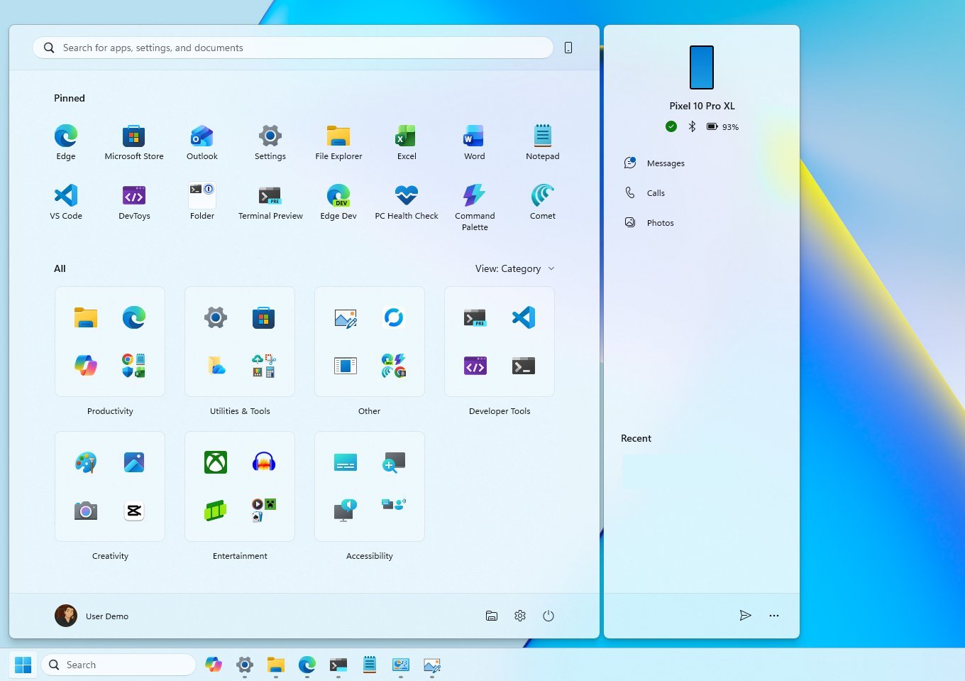
The "Pinned" section shows two rows of apps by default, and because of the larger canvas, each row can hold up to eight pins.
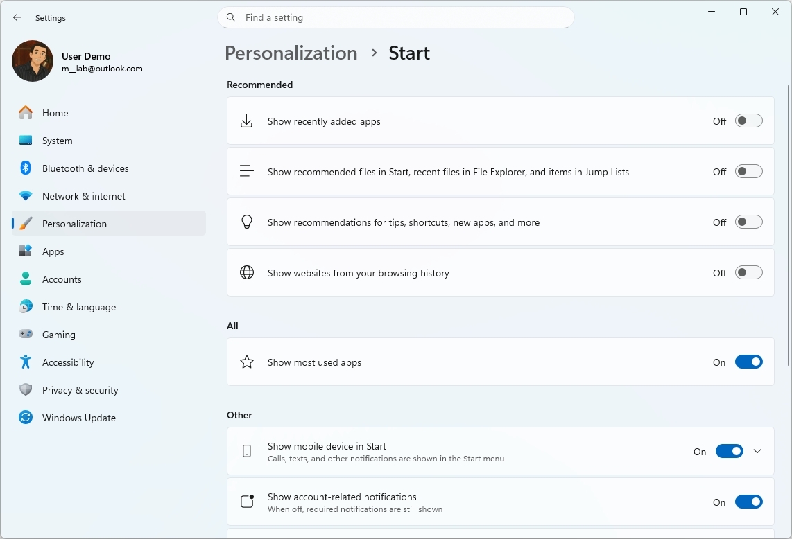
The "Recommended" section can now display up to six app and file suggestions. However, the most noticeable change is that it's now possible to disable this section.
You can do this on the "Start" settings page by turning off all settings under the "Recommended" section.
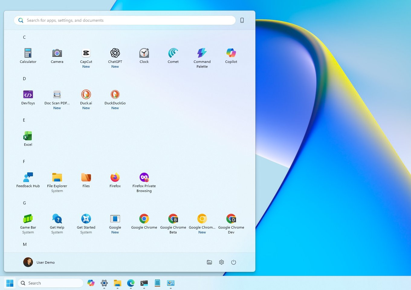
Finally, Microsoft is also bringing the "All" menu to the front of the menu, with several visual changes. For instance, the default view now is "Category," which groups similar apps into folders. This process happens automatically, and the system must detect at least three apps from the same category to create a new group. Otherwise, the apps will appear in the "Other" group.
You can still access the legacy view using the "Name list" option, and the "Name grid" will outline the apps in rows.
Although the Start menu for Windows 11 lacks customization options, you will continue to find familiar elements, such as the box to access Windows Search, the profile menu, power options, the ability to show folders, and the "All" menu to access all your installed apps.
Over the years, Microsoft's Start Menu has continually been trying to adapt, reflecting the company's commitment to evolving with user needs and advances in technology. However, the company did not always get it right.
More resources
Find in-depth guides, troubleshooting tips, and the latest updates on Windows 11 and 10 here:

Mauro Huculak has been a Windows How-To Expert contributor for WindowsCentral.com for nearly a decade and has over 22 years of combined experience in IT and technical writing. He holds various professional certifications from Microsoft, Cisco, VMware, and CompTIA and has been recognized as a Microsoft MVP for many years.
You must confirm your public display name before commenting
Please logout and then login again, you will then be prompted to enter your display name.

 Windows Central Insider


